Posts Tagged ‘ridership’

Do You Bike to Metro in Fairfax County? Your input is needed!

April 28th, 2015 Comments off

Fairfax County seeks input from bike-and-ride commuters.

Bike FairfaxAs we have discussed previously, safe and convenient pedestrian and bicycle access is critical to Metro’s success, and WMATA works closely with local jurisdictions to find ways to improve conditions for customers arriving on foot or bike. Compared with the high expense of building more parking garages for park-and-ride customers, investing in better walking and biking infrastructure is an incredibly cost-effective way of attracting Metro customers. On Metro station property, WMATA is making investments such as bike parking and path improvements.  On the public streets beyond, our local and state partners are installing their own new facilities for people walking/biking to the station. Read more…
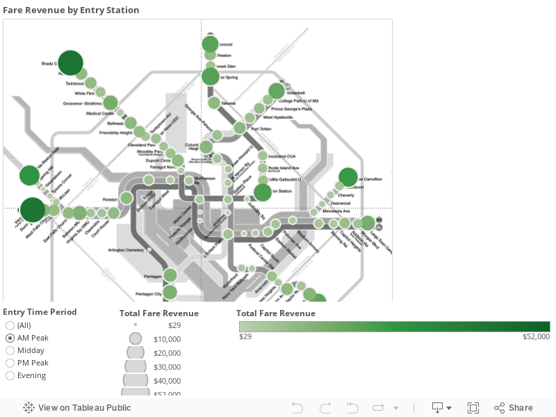
Metrorail Revenue by Station – Visualized!

April 15th, 2015 6 comments

Where and when does Metrorail generate the most farebox revenue? So far the data reinforces the notion that ours is a truly regional system with strong revenue contributions from all jurisdictions – but of course, the story is far more complicated than that…

What kind of rail system is Metrorail? Urban subway? Commuter rail? Hybrid? The answer of course is all of the above. And if that is the case, what kind of ridership and revenue patterns should its stations and system exhibit? High levels of peak revenues with heavy commuter lot usage but relative inactivity during the day? Lower levels of peak period activity but a steady stream of usage throughout the day? Depending on your perspective (and travel patterns) one might argue for either, and it might seem easy to apply a blanket classification to Metrorail and declare that “only urban stations cover their cost” or “commuter stations contribute largely to Metrorail’s revenue picture.”

Well, when you throw the data up on a map, it becomes clear that there are no easy answers, and no one right way to view the revenue picture of our tri-jurisdictional hybrid rail network. Some conclusions from the data are intuitive, some less so. Among them:

  • Differences in ridership across stations are bigger than differences in revenue, so ridership is a stronger explanation of differences in revenue than fares. For example, Shady Grove’s average fare in the AM Peak is $5, which is twice as much as the smallest average fare. On the other hand, ridership at Shady Grove is ten times higher than other stations, so the ridership better explains the station’s revenue.
  • In the AM Peak, the terminal stations dominate in terms of revenue contribution. Union Station functions as an internal “terminal station,” meaning that the commuter rail and Amtrak connections to Metro are extremely important to the overall ridership and revenue picture.
  • Other stations with strong bus or commuter park-and-ride infrastructures also pop in the AM Peak, such as Silver Spring and Grosvenor.
  • Note how well the non-Silver line stations in Virginia perform in the AM Peak, as well as the somewhat expected better performance of the Shady Grove branch of the Red Line in the AM Peak.
  • In the PM Peak, the core is king. Stations like Farragut West and North, Metro Center, L’Enfant Plaza are producing $50,000 apiece every evening thanks to their job densities, reinforcing the importance of improving their capacity for the future in Metro 2025, as well as their huge importance to revenue today. By comparison, in the AM Peak, only Shady Grove and Vienna approach these levels of revenue at roughly $40,000 per station.
  • The New Carrollton and Largo Town Center branches of the Blue/Orange/Silver Lines contribute significantly less revenue than other branches, and this directly relates to the relative lack of transit-oriented development along these spines.  The station areas on these lines enjoy a superb level of rail connectivity to the region’s primary job cores, but without sound transit-oriented investments to-date, they have not yielded the type of ridership and revenue commensurate with the capital investment. Imagine what Metro’s revenues (and farebox recovery) could look like if these segments were properly developed!

We’ve been examining the data ourselves as we continue forward with Momentum’s call for us to ensure financial stability for the Authority and have created the visualization for you to play with. We’d love to know what you see!

Monitoring (and Caring About) Customers, Not Just Trips

April 13th, 2015 2 comments

Deep explorations into the composition of Metrorail’s customer base shows that Metro has a wide reach – and that the five-day-a-week rider may not be as common as you think.

Metro (bus and rail) moves 1.1 million people per day, right? Well, technically we see that many trips (transactions) per day, but how many individual customers is that?  When you look at your fellow passengers on-board a train, how many are frequent commuters? How many rarely ride? In addition to counting trips, we’ve begun to monitor customers – the number of unique SmarTrip cards and paper tickets used on the system in a month.

We’re starting with Metrorail at first.

Metrorail typically handles roughly 730,000 trips on a weekday, which are generated by about 400,000 unique customers. Some of those customers ride frequently, and others will ride only once in the month.  As the chart below shows, of the 730,000 trips, only about two-thirds are generated by frequent customers.  Not surprisingly, frequent customers dominate more during the peak times.

Sept 2014 ridership by frequency by period_bars

Typical weekday rail ridership (trips) by customer’s monthly frequency (trips/month)

Surprisingly, over 17% of all trips are generated by customers who take eight trips/month or fewer– that’s fewer than once per week.  That may not seem like much, but in order for infrequent customers to generate so much of our ridership each and every day, there must be a LOT of them! Read more…

Going Up – Why the Construction Pipeline Means Higher Metrorail Ridership (Part Two)

April 7th, 2015 6 comments

In Part Two of this series, we forecast the impact of the region’s near-term development pipeline on Metrorail ridership, using the Land Use-Ridership model. The good news? Metrorail ridership is set to show big gains. The bad news? Your ride just got less roomy.

Just as we were putting the finishing touches on this post, we saw a flurry of news articles detailing the regional market forces that portend increased rail ridership. Millennials choosing not to drive, even as they grow up.  Office parks in far-flung places experiencing devaluations while Metrorail-adjacent areas capturing the lion’s share of new leases.  Marriott announcing that it will seek a transit-accessible location when it moves.  And even defense contractors coming to bat to argue for the economic benefits of the Purple Line. All of this free publicity set us up nicely for what we wanted to share with you – the first results of the Office of Planning’s Land Use-Ridership model as applied to near-term development projects.

The Near-Term Pipeline. Researchers at Jones Lang LaSalle have been compiling a list of actual development projects – under construction, or planned – near Metrorail stations, so that we can forecast the near-term capital needs for the system. A huge amount of development (over 105 million square feet!) is on the books for within a half-mile of a Metrorail station.

NearTermPipeline_Thumbnail

Map of near-term development projects near Metrorail, by building type (click for full image)

So, How Much Ridership? What impact will all of this have on Metrorail? We ran these projects through the Land Use-Ridership model, and what we found was both intuitive – and startling. Read more…

Going Up – Why the Construction Pipeline Means Higher Metrorail Ridership (Part One)

April 6th, 2015 5 comments

We’ve claimed that Transit-Oriented Development (TOD) projects in this region will be critical to Metrorail ridership and sustainability. The good news is that our assertions are grounded in statistically rigorous evaluations of TOD’s impact on Metrorail ridership – here’s how. (Part one of a two-part series).

While factors like fares, service, and the economy can certainly explain some changes in Metrorail ridership, one absolutely fundamental explanation of differences in walk ridership between stations is development.  Why does a station like Landover see only 50 riders arrive on foot each morning, and a station like Crystal City see over 3,000?  Why does a station like Bethesda see balanced ridership in all directions, where a station like Suitland is almost entirely one-direction? Development. Even a simple scatter plot shows that households alone near the station explain 70% of AM Peak walk ridership!

Planning studies have long-posited that transit-oriented development is such a key part of driving ridership, and if that is the case, then TOD is vitally important to Metro’s long-term financial sustainability.  We at Metro needed to quantify this link in a more sophisticated and system-specific way, and so we created a way to calculate the impact of land use changes (household growth, employment growth, new development) on ridership and revenue.

What is a Land Use-Ridership Model? To help, Metro’s Planning Office has built a Land Use-Ridership Model that will predict changes in Metrorail ridership as a result of occupancy changes (growth, decline, new development, etc.) in the station area.  This model helps us get very specific when it comes to modeling the impact of land use changes on ridership and revenue.  It helps us answer questions such as: “When developers build a new apartment building next to a Metrorail station how much ridership and revenue will Metro realize?”, and; “If an office building is proposed at one of four Metrorail stations, which location maximizes ridership and revenue without exacerbating core capacity constraints?”

LURM general flow

This tool is based on a rigorous understanding of the link between land use and the rail ridership we see today and is built on “direct ridership modeling techniques” found in academia.  It also focuses specifically on “walk ridership” (which constitutes 38% and 78% of our AM and PM peak ridership), since rides related to bus transfers, parking, and other access modes are less related to adjacent land uses.

To build this, we analyzed the actual quantity of walkable land uses from each station area, assembled detailed information about land uses and densities in those areas (households, jobs by industry type), and also controlled for other, non-land-use factors that shape ridership – like network accessibility. In all we worked through over 200 independent variables in our modeling and also brought in experts from the University of Maryland’s Center for Smart Growth, professors Hiroyuki Iseki, Ph.D. and Chao Liu, Ph.D., to bring their analytical and statistical firepower to the fray.

How We Built It. We defined the walkable area as a half-mile walk along a road network, so we account for barriers like highways and fences.  The half-mile cutoff is a bit longer than the median actual walk distance reported by our riders in the 2012 Metrorail Passenger Survey. For each station and its walk shed, we tested the following kinds of factors: Read more…

Walk This Way – Metrorail’s Walkshed Atlas 1.0

March 30th, 2015 15 comments

Station-area walkability is one of the most potent congestion-busting tools in the planner’s bag of tricks. Now we’ve mapped out in detail which stations are living up to their full potential – and where we need to redouble our efforts.

We’ve brought to you information about the power of station area walkability. Not only does better station access give mobility benefits to those who most need it, but it also boosts ridership and revenue and therefore lowers Metrorail’s operating subsidy. That means lower taxes for you and me.

Metro’s Office of Planning is wiring the science of walkability into WMATA’s Key Performance Indicators. We are committed to working with our partner jurisdictions to improving station area access and identifying the near-term and low-cost improvements that have big returns for ridership and revenue. And we have been working diligently to develop a comprehensive geodatabase of walk sheds and the land uses – existing, planned, and proposed – located within them.

Example walk shed, extracted from the Walk Shed Atlas.

We’re also happy to release for the first time a comprehensive atlas of Metrorail walk sheds that includes some of the data that the Office of Planning uses to calculate ridership potential and evaluate investment needs. You’ll notice that each station area has a unique “footprint” and that in almost every case, the walkshed footprint is related to the overall performance of the station (as defined by all-day boardings).

A few notes here: Read more…

Metrobus X2 Continues to Gain Riders

March 23rd, 2015 7 comments

Ridership on the X2 Metrobus line has jumped 14% after Metro changed the way the line is managed.

X2 Ridership growth

The X2 bus on the busy H Street/Benning Road corridor has always been one of Metro’s busiest routes at over 13,000 riders per day.  (If the X2 were a Metrorail station, it’d rank just above Silver Spring and just below Rosslyn!) 

Through most of 2014, the X2’s on-time performance (OTP) averaged about 65% – well below Metro’s goal.  Insufficient running time in the schedule, and disruptions from planned and unplanned detours along the route created uneven spacing between buses leading to “bus bunching” and long gaps between buses.   These service gaps often led to significant overcrowding, particularly during the midday period.

So to improve reliability, we made some changes in December 2014:

  • To meet demand, we increased the frequency of buses to an even 8 minutes all day long –  6:00am-7:00pm on weekdays.
  • We deployed a team of dedicated supervisors on the street (at Minnesota Avenue and Lafayette Square) and at the Bus Operations Control Center to ensure even spacing between buses on weekdays. The X2 is now a “headway-managed” route on weekdays, meaning our primary goal is to maintain buses evenly every 8 minutes throughout the day.
  • We adjusted the  scheduled running times by about 15% for all trips.

The results have been impressive: ridership has jumped 14% from 12,700/day in October 2014 to 13,800 in February, overcrowding (particularly during the midday) has been virtually eliminated, and on-time performance has grown to 83% – a remarkable achievement for a heavily congested urban corridor.

Metrorail Ridership Projections – Looking Ahead

March 11th, 2015 8 comments

Historical data and regional growth projections tell us one thing – Metrorail ridership will rebound and grow right along with the region, and the system better be ready to carry the load.

Crystal City Sta -am Rush 060912-129

Metrorail riders enter and exit Crystal City during the AM rush hour, June 2012.

Local ridership trends that seem to defy a national boom in public transit usage give some pause about the need for planned transit expansion projects.  It’s no surprise that even the most ardent of transit supporters might be caught flat-footed when trying to defend infrastructure investments against the backdrop of scarce funding.  Some have even gone so far as to question whether Metorail ridership, which just a few years ago looked poised to eclipse 800 thousand trips per average weekday, is experiencing more of a structural downshifting and may experience flat or even declining ridership for the foreseeable future.

All of this debate is understandable in a town obsessed with statistics and “horse race” leaderboards.  But when it comes to economics, demographics, mobility, and infrastructure, regional leaders need to look beyond the numbers d’jour and bet on a sure thing – Metro ridership will go up.  Here’s why:

1. Short-term snapshots of rail ridership miss the forest for the treesOr maybe even just leaves.

The graph below shows Metrorail average weekday ridership from the beginning of Metrorail. You can see that ridership grew in the first five years as the system grew from just the Red Line and four stops in 1976 to adding Orange and Blue Lines in operation by 1980. And after all of that expansion was completed, something fascinating took place – ridership declined and essentially flatlined until 1985. During that time, the region didn’t stop investing in Metro. On the contrary, during that same time period Metro built the Yellow Line and extended the Red Line from Downtown into Upper NW DC and then all the way to Shady Grove. Ridership shot up again in the late 1980s while Metro extended the Orange Line to Vienna and the Red Line to Wheaton then flat-lined and even declined through the mid 1990s, all while Metrorail added capacity on Yellow and Blue and (finally) opened up the Green Line. From 1997 through the late 2000s Metrorail saw robust ridership increases despite minimal capacity increases – largely reflective of the underlying economic and demographic resurgence of the central city and its urbane suburbs – and ridership flat-lined in tandem largely with the economic collapse of 2008 and the prolonged Great Recession.

ridership_chart_v2-01

Read more…

Silver Line Ridership Patterns – Visualized!

February 23rd, 2015 1 comment

Learn about the travel patterns of Silver Line riders in rich, interactive detail with this new tool.

Click on the dashboard below to see where Silver Line rail riders are going, coming from, and by time of day and day type.  This is simply a visualization of the October 2014 rail ridership data we recently posted.  What patterns do you see? What jumps out at you?

The Impact of a Snow Day on Ridership

February 19th, 2015 8 comments

Tuesday’s snow day cut ridership by 70-80% on rail and bus, as the region dug out from a snowstorm.

Snow and federal government closures can have a big impact on ridership here on Metro, and Tuesday February 17 was no exception. Ridership on Metrobus and Metrorail was down significantly as snow kept many buses off the roads and as many commuters stayed home. Service was reduced: Metrorail operated on a Saturday schedule, and Metrobus only began resuming operations around late morning. The numbers are preliminary, particularly on Metrobus, where not all fareboxes have reported in yet. Nevertheless, here’s what ridership by hour looked like compared to the previous Tuesday for context:

Snow Day 2.17.2015 ridership v2