Author Archive

Is the DC Streetcar Hurting Ridership on Metrobus X2+X9? No.

December 12th, 2016 Comments off

The DC Streetcar has not significantly changed ridership on Metrobus X2 and X9, even though the services overlap on H Street NE. Instead, the Streetcar appears to be serving a new, different market – and has increased net transit ridership in the corridor by 15%.

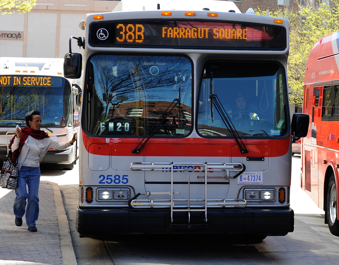
Although the new first phase of the DC Streetcar serves some of the same sections of H Street NE as the existing Metrobus routes X2 and X9, the streetcar appears to be serving almost an entirely new market of transit riders.  Ridership on the underlying Metrobus routes X2 and X9 have remained fairly steady, even as the Streetcar is serving over 2,500 new riders per weekday.

x2-v-streetcar-ridership-monthly-averages-2

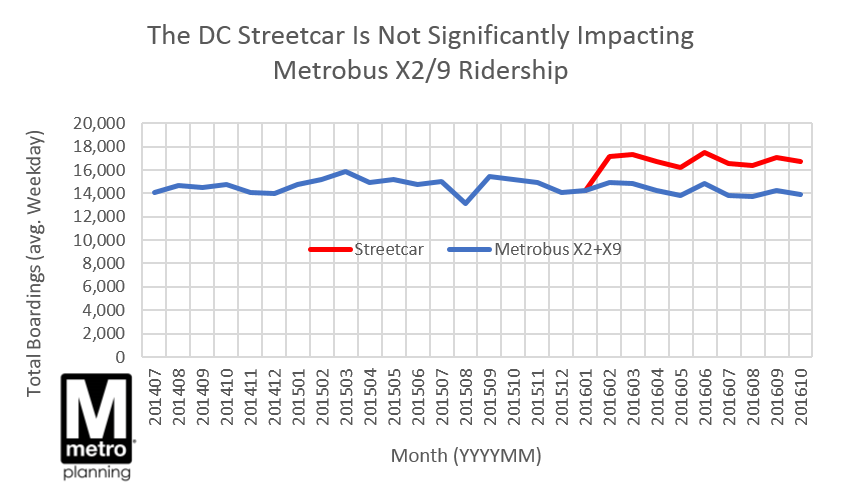
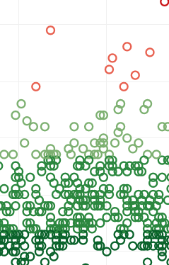
Since it opened in February 2016, the DC Streetcar’s ridership has been climbing slowly and steadily, from around 2,400 to 2,800 boardings per weekday.  The route, just over 2 miles long, runs from near Union Station down the length of H Street NE.  The X2 and X9 buses run on the same stretch of H Street NE, but stop at different bus stops and connect farther west into downtown D.C., and farther east to Minnesota Avenue.  The overlap in markets is fairly small, and the ridership data confirm that the two modes are serving distinct markets – ridership on the X2 and X9 has remained flat, or only slightly down.  Overall transit boardings between the two modes combined have risen 15%, from around 14,700/day before the Streetcar to 16,800/day now.  (Note the lift in X2+X9 ridership in June, likely due to SafeTrack Surge 2).

x29-yoy-change-in-ridership-vs-bus-systemwide

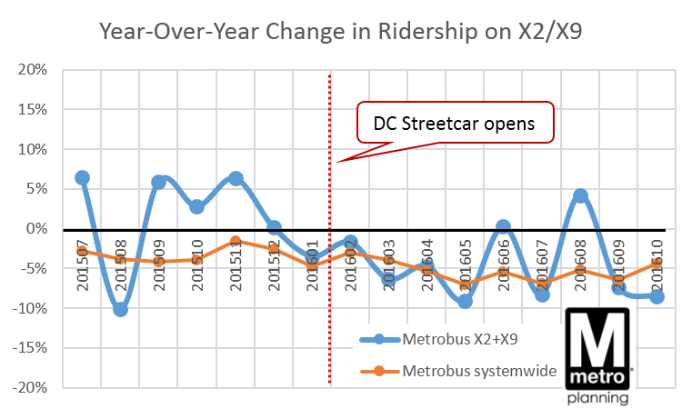
The Streetcar’s arrival does coincide with perhaps a minor shift in the rate of change in ridership on the X2+X9: monthly year-over-year change in ridership turned slightly negative last winter. But this is not dramatically different from the systemwide change in Metrobus ridership. So it’s not yet clear if this trend is due to riders switching to the Streetcar, or other forces.

Although the two modes overlap for a short stretch of H Street NE, the arrival of the DC Streetcar appears to be serving a new, distinct transit market. The Streetcar has not significantly poached riders from the existing X2 and X9 Metrobus routes, which have much higher overall ridership and serve a larger geographic area.

Marriott’s Headquarters in Bethesda Helps Metro

November 29th, 2016 1 comment

The relocation of Marriott’s headquarters to downtown Bethesda would bring new riders and revenue to Metro, without straining Metro’s capacity. A win-win!

bethesda_aerial

Downtown Bethesda

Marriott last month announced it will move its headquarters to downtown Bethesda, bringing over 3,500 employees to a location that’s now accessible to the Red Line. The move will help Metro by attracting more riders and fare revenue to the Red Line.  Using our S.W.A.R.M. model, we estimate that the new headquarters will bring about 1,200 new boardings/day on Metrorail, and over $1 million per year in new fare revenue.

What’s more, we’ve already got space for these new riders.  Since most of the new riders would be reverse-commuters (towards Bethesda in the morning) or would originate in Montgomery County, they would not strain existing crowding on-board trains at our pinch points, a.k.a. our maximum load points. Bethesda station has sufficient vertical circulation capacity for them as well.  In short, this move is a win-win for Metro, the riders, and our funding partners, and we applaud the decision.

SafeTrack’s Surge 2 Bus Shuttle Proves Bus Rapid Transit Can Work Here

June 28th, 2016 Comments off

The shuttle buses at Eastern Market during Surge 2 are arriving every two minutes at rush hour, and are moving nearly the same number of people as 3 lanes of Pennsylvania Avenue SE.  This shows how much we can achieve by giving buses priority – lanes, signal priority, and more – on busy streets. 

27234765704_310d840f17_k

Commuters transferring from shuttle buses Eastern Market station (photo by author)

For the last week, Metrobus has been operating bus shuttles between Eastern Market and Minnesota Avenue and Benning Road, to provide alternatives around SafeTrack Surge 2 while we rebuild tracks and infrastructure on that segment of Metrorail.  While still moving less than half the the riders as what Metrorail normally moves, the shuttles are moving an impressive number of people:

  • In the morning rush hours, buses are arriving at Eastern Market every 2 minutes on average
  • Shuttle buses are delivering 1,800 people per hour to Eastern Market between 8:00 and 9:00am.  This is about the same as the number of vehicles that 3 lanes of Pennsylvania Ave. SE typically moves (1,500-2,000 vehicles per hour per direction, according to TPB Regional Transportation Data Clearinghouse).
  • Around 16,000-17,000 people per day are riding the shuttles, or about two-thirds of the number of vehicles driven through the corridor in a day (25,000 average annual daily traffic)
  • Traffic Control Officers from DDOT are critical to this operation, ensuring that everyone moves safely and efficiently

Read more…

Off-Peak Fare Discounts and their Behavioral Implications

June 8th, 2016 4 comments

Metrorail riders facing a high percentage off-peak discount are motivated to delay their travel and save.

This post is guest-written by Sam Winward, a behavioral economist and Metrorail commuter who lives and works in the District. His analysis of Metro ridership patterns sheds light on the influence of off-peak pricing.

If you’ve ever waited a few extra minutes before swiping through a Metrorail faregate to qualify for the off-peak fare, you’re not alone. Within the afternoon peak / off-peak cusp period, when riders may be somewhat time flexible, Metrorail data from AprilMay 2015 confirms that some riders are delaying entry for savings.

What riders probably don’t know, is that their off-peak pricing discount could be substantially different from the riders around them. In fact, off-peak percent discounts can range from a 19% to 40% reduction of peak fares. Given the varying degree of off-peak incentive, riders are responding as we’d expect when weighing their opportunity cost of time.

As percent savings increase, riders are more likely to delay travel for off-peak fares. The graph below, derived from WMATA data, displays this ridership tendency.

Note the ridership uptick just after 7 pm. This runs counter to the natural pattern of declining ridership over this period, and the uptick steepens as the percent discount facing riders increases.

Exhibit 1_Ridership Uptick

So why is there so much variation in off-peak discounts, and who are the lucky riders allowed large savings?

Particular trips, based on mileage between origin / destination stations, are subject to off-peak fare “caps.” WMATA introduced the caps in 2012 when off-peak fares switched to incremental fee-per-mile pricing. Off-peak fares for trips of just under 7 and 10 miles were capped, as these trip distances would have otherwise seen very large increases between the old and new fare structure. A maximum off-peak fare cap of $3.60 was also implemented, affecting riders with trips lengths greater than 11 miles.

The effects of these fare caps remain in the system today, and are not mirrored in peak fares.

As displayed below, the gap between peak and off-peak fares increases over regions subject to off-peak fare caps. This makes off-peak travel more enticing for riders’ whose trip length falls within a green zone.

Exhibit 2_Fares

Notably, small tweaks in the fare structure have large behavioral effects.

Even if you decide that added off-peak savings aren’t worth the wait, at least your decision can be informed. To see the off-peak discount applicable to your route, and how it compares to the rest, check out the interactive off-peak discount calculator on my website.

The full story, including the off-peak discount calculator and a formal analysis of the delayed ridership patterns, can be found at Sam’s site.

Rail Ridership Data to Help the Region Plan for SafeTrack

May 27th, 2016 3 comments

To help the region and our partners plan alternatives and mitigate the impacts of SafeTrack, Metro releases rail ridership data applicable to this important maintenance effort.

SafeTrack example 2Rail Link Volumes: This data describes the number of customers on board trains between two contiguous stations, for a given hour of the day, then assigned to rail links.  For example, the link volume from Bethesda to Friendship Heights is the sum of everyone who boarded upstream, minus those who exited at or before Bethesda. This can be useful for planning SafeTrack mitigation efforts because it gives a first-order estimate of the potential demand for a bus bridge, for example.

Online Interactive Map of Metrorail Link Volumes, average weekday and Saturday in May 2015

Metrorail Link volumes, average weekday in May 2015, by hour, by line color (580kb, .xlsx)

Read more…

Metrobus Ridership During the Rail Safety Shutdown

May 23rd, 2016 2 comments

When Metrorail closed on March 16th, tens of thousands of rail riders switched to bus, including almost 20,000 riders who took their first bus ride in over a month! Bus-to-bus transfers spiked 45%, and ridership surged in downtown and central areas but fell in the suburbs.

Ballston Bus

Special thanks to the Systems & Performance Analysis team in Bus Planning for their help developing this analysis.

When Metrorail closed on Wednesday, March 16, Metrobus braced for impact as over 700,000 displaced rail trips sought alternatives. But there was little time or capacity to significantly alter bus service. What happened to bus ridership?

Overall ridership as tallied by the farebox came in at just 5% over the monthly average, or about 20,000 additional trips. So the changes look fairly small given the volume of displaced rail trips.

But don’t be fooled by the bottom line.  Underneath that total, a seismic shift was taking place. Read more…

Data Download: Metrorail Ridership by Station by Month, 2010-2015

March 24th, 2016 6 comments

Data_clipSee how seasons, land use, and service drive trends in rail ridership at the station level, in this new data download.

This latest data download shows Metrorail ridership by station, by month, for the last five years or so. It hints at the complex factors driving rail ridership – from short-term effects like weather or service changes, to long-term trends like real estate development and office relocations.

We see a few tidbits in this data:

  • Seasonal trends: rail ridership follows a predictable pattern each year – peaking in the summer and around Cherry Blossoms, and reaching lows around the holidays.  Compare the high seasonality of Arlington Cemetery to a more commuter-oriented station, for example.  Ridership in the summer at that station can quintuple over its winter base.
  • Weather impacts: see how the blizzard this past January lowered the average for the month as service was shut down.
  • Service changes: See how the opening of the Silver Line shifted riders from Orange to Silver in July-August 2014.
  • Land Use is key! Look at the recent growth rates at stations like Navy Yard and NoMa (formerly New York Ave.), reflecting the new jobs and residences near those stations.

Metrorail Ridership, by Station by Month, 2010-2015, Average Weekday (.xlsx, 120kb)

Metrorail Ridership, by Station by Month by Period, 2010-2015, Average Weekday (.xlsx, 630kb) (Added 3/30/2016)

Notes: these numbers are raw entries for an average weekday in the month, including snow days, excluding holidays when we did not run a weekday schedule.  The numbers are for trend analysis and will differ slightly from those we report in financial statements, which undergo additional data scrubbing and normalization.

What do trends you see?

Ridership Before and After the Blizzard of 2016

February 22nd, 2016 3 comments

What happens to ridership when a major snowstorm closes Metro?

The blizzard at the end of January dumped around two feet of snow on the Washington region over the course of a few days, making it the fourth-largest snowstorm in D.C. in over a century. To protect equipment, for the safety of employees and riders, and to focus on cleanup efforts, Metro ceased all operations for over three days. The Federal Government and schools were closed.

The chart below tells the story of the blizzard from a ridership perspective.  Actual bus and rail ridership by hour is shown as blue and red, with the orange dotted line showing a typical pattern from two weeks prior in January.

image012

Even before the snowflakes began falling on the afternoon of Friday, January 22, Metro’s ridership was impacted. That day, riders adjusted their normal routines by staying home, teleworking, or leaving early. The morning’s peak was half of normal. By Friday night, bus and rail operations ceased. No service operated Saturday or Sunday. Very limited bus and rail service was offered for a few hours on Monday, January 25 as cleanup and recovery began. Fares were not charged on rail, so we recorded very few transactions.

We recovered gradually on Tuesday and Wednesday, and nearly fully by Thursday, even as many school systems remained closed.

In the end, total ridership losses were estimated to be about 2.9 million boardings over five days, 1.6 million on rail and 1.3 million on bus. Bus took a proportionately bigger hit than rail given service restrictions from icy and unsafe road conditions.

What do you see in these numbers? Also, feel free to download the underlying data (.xlsx, 40kb) for yourself.

Four Key Questions about Metro’s Future with the Federal Worker (5 of 5)

December 9th, 2015 Comments off

The answers to these four questions will shape the future of Metro’s federal customers, and the region’s transportation future. (Fifth and last in a series of posts on Metro’s Federal customers – see posts 1, 2, 3, and 4)

The ATF headquarters adjacent to NoMa Metrorail station has helped grow ridership there significantly.

1. Will the transit benefit be restored to parity with parking? When Congress cut the transit benefit in half, it hurt Metro riders hard. 42% of Metro’s ridership – around 500,000 rail and bus trips per day – comes from riders who use the Federal Transit Benefit, including private-sector workers. At Metro, 22% of all ridership comes from commuters who spend over $130 per month on transit. Following the changes to the SmartBenefits program, Metro saw ridership losses concentrated on these riders hit the hardest, and federal employees overwhelmingly pay with SmartBenefits.

If Congress restores the maximum transit benefit to parity with parking, it would be a huge boon to Metro’s federal customers and Metro’s bottom line. Read more…

Why We Care About GSA’s Location Decisions: Lessons from the History of Metro’s Federal Customers (4 of 5)

December 2nd, 2015 4 comments

Data show that where GSA chooses to locate federal office buildings has a huge impact on Metrorail ridership from federal commuters.  But in the meantime, non-Federal riders in the inner jurisdictions are driving up ridership outside of the usual commute market. (Fourth in a series of posts on Metro’s Federal Customers – see posts 1, 2, and 3)

Growth in Metrorail Ridership from Feds by Time of DayBetween 2002 and 2012, rail ridership from federal employees has grown 15%, the same as from non-federal riders.  (N.B. this post focuses on rail only; no comparable survey data for bus is available.)  Federal employees have remained about a third of total ridership, as overall ridership ebbed and flowed. Most of these new federal riders live in the inner jurisdictions of D.C., Arlington, and Alexandria – ridership from federal employees has been much slower in the outer jurisdictions, particularly Fairfax County (growing at 5-15%, vs. 25-40% over ten years).  The growth from federal riders has mimicked existing riders – they are focused on the peak commute too, with a moderate amount of off-peak travel as well.

But over the same timeframe, non-federal customers drove up ridership much faster in the PM Peak and Off-Peak times.  These riders similarly come from the inner jurisdictions. Read more…