Posts Tagged ‘maps’

Try Out the New “Metrobus Explorer” Tool and Tell Us What You Think!

September 22nd, 2016 5 comments

We want your feedback on a new online tool, Metrobus Explorer, which allows visualization of Metrobus service frequency and geography.

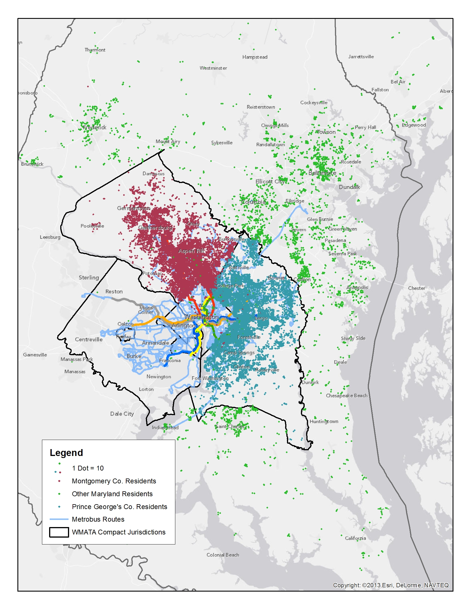
One of the biggest challenges facing bus transit is making the service extremely easy to understand.  Metrorail stations are filled with customer information, including system maps, fare and travel time tables, station-ahead lists, and passenger information display systems (PIDS) screens, leaving little guesswork for the savvy traveler.  Moreover, with limited real estate available for customer information, Metrobus stops are often at a disadvantage.  While Metro continues to improve bus stops around the region — including the design and installation of new diagrammatic bus system maps — information technology is also playing an important role in filling the bus customer information gap, including BusETA, information displays, and trip planning sites and apps.

Metro’s Office of Planning is developing a new online tool called Metrobus Explorer that is geared to answer two questions about the Metrobus network:  “How often do buses arrive at a given stop (or set of stops), and where do they go from there?”

bus_stops_freq_spider

Screen shot of the bus frequency and spider map tool. Click the image to access the live tool online.

Read more…

How Do Marylanders Use Metro?

February 2nd, 2016 2 comments

We analyzed Metrorail, Metrobus, and MetroAccess ridership for all Maryland residents in response to the Maryland Legislature’s data and analysis request. Newsflash – we have customers from across the state!

Origins of Maryland Rail Riders

Origins of Maryland Rail Riders

In the 2015 legislative session, the Maryland General Assembly passed the WMATA Utilization Study (HB300),which required the Maryland Department of Transportation (MDOT) and WMATA to analyze the utilization of Metrorail, Metrobus, and MetroAccess every five years. This year’s analysis is based on the most recent Metrorail passenger survey (2012), Metrobus passenger survey (2014), and actual ridership for MetroAccess for an average day in April 2015. Below are some findings that I found most interesting. But more importantly, here is the complete 2015 Maryland HB300 WMATA Utilization Study (native pdf), which includes all the links to the underlying survey data, interactive charts, and analysis.

  • 82 percent of Metrorail trips by Montgomery County residents are destined for Washington DC in the morning on a typical weekday;
  • 71 percent of Metrobus trips in the AM peak period made by Prince George’s County residents are for work purposes on a typical weekday;
  • 3.3 percent of all trips across all Metro services on a typical weekday are taken by Maryland residents from Frederick, Charles, Calvert, Howard, Anne Arundel, and Baltimore Counties and Baltimore City;
  • 35 percent of other Maryland residents on Metrorail access via commuter rail (MARC) and Amtrak; and
  • 17,600 residents of the District and Virginia reverse-commute into Maryland on Metrorail and bus each morning on a typical weekday (about 5 percent of total system ridership)

Any other nuggets that you found from analyzing the data? Ideas for other ways to graphically represent the findings?

Preparing for Winter: Metrobus Snow Operations Plan now available

January 11th, 2016 Comments off

Prepare yourselves for the winter season by checking out the Metrobus Snow Service Plan on the Metrobus Snow Service webpage.

MetroExtra 79 to Silver Spring

MetroExtra 79 to Silver Spring. Photo by WMATA staff.

Every year, Metrobus planners review the Snow Operations Plan for the coming winter. Snow service is a large joint effort between planning and operations. The communication between departments begins early as we make adjustments for route changes from the previous year and reflect back on what we can improve for the upcoming season.

Metrobus operates 3 levels of service during snow events:

Light snow conditions typically have less than 2” of snow without packing or ice. Most routes are expected to operate, possibly under the Light Snow Detour routing.

Moderate snow conditions mean service is suspended on many routes and any route with a snow detour route will be operating under the snow detour.

Severe snow conditions include heavy snowfall with packed snow and/or ice. Bus service will be suspended on all but the busiest routes and any route with a snow detour route will be operating under the snow detour.

In the event of a total service shutdown, no bus service will operate until conditions improve. Customers will receive as much notice as possible before service is suspended.

Example Snow Detour Map. Under Light, Moderate, and Severe Snow Levels, the T18 will not serve Bladensburg High School and will stay on Annapolis Rd.

Example Snow Detour Map. Under Light, Moderate, and Severe service levels, the T18 runs on Annapolis Rd. and does not serve Bladensburg High School.

Bus operations and communications staff will make their best effort to give notice before changing service. The best way to get information is to sign up for MetroAlerts and to check www.wmata.com and the local media for alerts.

Look up your routes on the Metrobus Snow Service webpages to see if your routes operate in Light, Moderate, and Severe service levels and whether your routes have snow detours. Then, when Metrobus announces a snow service level, you’ll be ready.

Route 42 to Metro Center last March. Photo by Ginger.

Route 42 to Metro Center last March. Photo by Ginger.

Categories: Metro 101 Tags: , , ,

Prioritizing Bike and Pedestrian Station Access Projects Near Metrorail, Part 2

November 24th, 2015 Comments off

Other than ridership potential, what are some of the other ways we can rank access projects relative to each other?

In our last post, we discussed how bike and pedestrian access projects relate back to ridership and how that relationship could be used to prioritize projects. In this post, we talk about some of the other criteria we are using to prioritize projects.

Bike and Ped. Fatalities, Sample Data Set

Bike and Pedestrian Fatalities, Sample Data Set

The first is safety. We are pulling together data about bike and pedestrian crashes near our stations that result in injuries or fatalities. We will then link these data in GIS back to the location the project, with the idea being that a new crosswalk or dedicated bike path in an area with a lot of recent crashes should score higher and deserves more attention. A safer path of travel helps not only our customers but all walkers and cyclists in these areas.

We also want to explore some other prioritization criteria. Here is what we have come up with: Read more…

Singapore MRT Rail Map Diagrams Show the Way

January 27th, 2014 2 comments

Picture 040

Paya Lebar MRT Station Map (click & zoom for detail)

Picture 041

Travel Times Between Stations

While waiting for a Metro train one day in Singapore, I noticed their rail map diagram had a big white space and then the rest of the map. Upon closer inspection the ‘white’ part was actually a grayed out part of the rail map showing the route the train had already covered. Having that information is very useful, particularly for a traveler unfamiliar with the system. One knows if they are starting at this particular station (Paya Lebar), what their options might be if he/she actually wanted to go in the opposite direction. This information gives the rider a helpful reference point in relationship to the rest of the system.  Also upon closer inspection I saw that the map gave expected travel times between stations. How great is that?

Categories: Transit Travelogue Tags: ,

Tokyo Metro Signage – You Can Find Your Way Without Reading Japanese

January 6th, 2014 2 comments

Ten years ago I moved to Tokyo for work. Unfortunately, my Japanese language skills were non-existent, so I spent much of those early months perpetually lost on Tokyo’s streets. But underground it was a different story. If you’ve ever been, you know that many of the central Tokyo stations are massive – multiple exits, mezzanines, pedestrian tunnels, and tons and tons of people. However, Tokyo Metro, the JR East Lines and the private rail lines that together create the city’s rail network have a good wayfinding system provided in Japanese and English that make it fairly easy to get around underground.

Which car should I stand in?

Which car should you use?

Read more…

NPR Story on Arlington County’s Successes and Importance of Metro

October 25th, 2013 2 comments

NPR’s Morning Edition yesterday highlighted Arlington County‘s success in tackling commuting challenges, particularly as a result of the decision to bring Metrorail and transit-oriented development to the Rosslyn-Ballston corridor.  

When the Metrorail system was initially designed in the early 1960s, the plan proposed running the Orange Line in the median of what would ultimately become Interstate 66. Arlington County officials lobbied hard and put forward county funds to bring the Orange Line to its existing home, under Wilson Boulevard. They foresaw the benefits of high capacity transit IN the neighborhoods, as opposed to adjacent to the neighborhoods. They also set forth zoning, planning, and other policies to ensure that the county would maximize the benefits from that decision. The NPR story talks about the results of those decisions, the shift from a post-World War II auto-dependent suburb to a vibrant, mixed-use community that has become the gold standard for many cities across the world.

Orange Line - Proposed and Actual Alignments

Orange Line – Proposed and Actual Alignments

For more background on the history, growth, and experience with transit-oriented development in the corridor, check out this powerpoint from the Arlington County Department of Community Planning, Housing and Development. Not only does it provide additional information, it has some terrific before and after photos of the different Arlington neighborhoods and how they have changed. Parkington, anyone?

If you’d like to contribute to the NPR series, you can share your commuting experience with Morning Edition – #NPRcommute.

Yesterday’s NPR story was the first in a multi-part series on how communities are tackling commuting challenges.

Metro Unveils Final Silver Line Map

September 12th, 2013 24 comments

Metro is pleased to release the update to the Metrorail system map that shows phase one of the Silver Line in service and phase 2 under construction.

Final Map without addresses 07 13 600x671

Final Silver Line Phase 1 system map. Click for high resolution version.

Metro’s original system map designer, Lance Wyman, began working with Metro again a few years ago when we needed to update the system map to accommodate the “Rush-Plus” service plan.  Since then, the team has been working to incorporate the Silver Line onto the system map.  After several months and extensive customer feedback, Metro is pleased to release the updated map, above. Read more…

Categories: Engage Tags: , ,

Metro’s Two Flavors of Parking

September 4th, 2013 4 comments

A handful of end-of-line stations’ parking facilities are doing the lion’s share of extending the reach of Metro across the region, while parking at most other stations primarily serves nearby residents.

Parking at rail stations is traditionally thought to extend the geographic reach of transit in the region, by giving longer-distance commuters a way to access a rail station. Based on an analysis of Metro parking customers’ origins, a handful of large end-of-line Metro parking facilities perform this function, but most Metrorail parking facilities do not. Nine Metrorail stations are capturing 70 percent of all customers who drive from more than three miles to park-and-ride, while the 26 other Metro parking facilities primarily serve the surrounding neighborhoods.

Our map of parking customers’ origins showed how far Metro’s reach extends across the region.  Now, this map shows the dominant station among Park & Ride customers, by half square-mile, for a typical weekday:

Map of dominant station of Park & Ride customers, highlighting each station's "catchment area"

Map of dominant station of Park & Ride customers, highlighting each station’s “catchment area.”

Areas where there is no clear primary station are shaded gray: for example, the dividing line between Southern Ave. and Branch Ave. stations. The dominant station is shown, regardless of how many Park & Ride customers there are for a square. There is some noise in this data, but two “flavors” of parking emerge: Read more…

Announcing 40 Days of Momentum!

June 13th, 2013 2 comments

Momentum CoverYou’ve been diligently telling us what you think our priorities should be and we’ve listened. We’ve been hard at work putting the final touches on Momentum: The Next Generation of Metro and Metro’s Board endorsed the plan today.

Starting Monday, over the following 40 weekdays, we’ll be rolling out the most interesting parts of the plan in daily posts here on PlanItMetro.

Monday Posts: Preparing for Tomorrow’s Region Today

Tuesday Posts: Metro’s Importance to the Region

Wednesday Posts: Metro’s Recent Accomplishments and Public Engagement

Thursday Posts: Strategies and Priority Actions to Make this Vision a Reality

Friday Posts: Metro 2025 – Seven Priority Capital Initiatives

If you want to read and download either the full Momentum plan or the Executive Summary, go right ahead. But if you want to stop back for a daily dose of Momentum, don’t be shy. If you notice something that strikes your fancy, leave us a comment.

Regional support is important to making Momentum a reality! A number of regional stakeholders have already endorsed Momentum. Please sign on and add your name to endorse Momentum and send the message that public transit is vital to the National Capital Region.