‘Current Challenges’

When Work Evolves – Metrorail in the Era of the Flexible Workplace

December 21st, 2015 10 comments

Between 2007 and 2012, off-peak work trips were the fastest-growing segment of Metrorail ridership.

The traditional “rush hour” remains important, but Metrorail ridership seems to reflect a broader trend regionally – people are making more and more trips during “off peak” hours. According to the 2012 Metrorail survey, rail ridership growth was stronger in its off-peak (8 percent since 2007) than the peak (5 percent over the same time period). In certain jurisdictions – including those that have fostered re-investment in dense, walkable areas – off peak growth was into the double digits while peak growth grew more modestly. In one jurisdiction, off-peak trips grew by 50% during this period while peak trips grew at less than half that clip. 

Compact Jurisdictions Peak Off-Peak
% Change % Change
District of Columbia 8.3% 12.9%
Arlington County 18.4% 9.0%
City of Alexandria 9.5% 12.7%
Montgomery County 0.1% 5.9%
Prince George’s County -7.4% -1.4%
Fairfax County -1.4% 3.0%
City of Falls Church 21.3% 46.9%
Fairfax City 32.8% 19.4%
Compact Total 3.0% 8.0%

Data sources, Metrorail ridership surveys, 2007 and 2012.  2012 is the most recent dataset we have on trip purpose. 

In the past these trips would be for theaters, late night entertainment, or shift work, but the bulk of these off-peak trips were during the midday – almost twice the number of late night trips – and the bulk of these trips were for work. Read more…

The (Hidden) High Cost of Cheap Real Estate

September 24th, 2015 6 comments

As jurisdictions balance the need to redevelop “prime” Metrobus garage sites, new facilities are located in less desirable and cheaper real estate submarkets.  That may sound like great business sense, but it has an impact on non-revenue (or “deadhead”) mileage, creating scheduling challenges and adding millions of dollars in additional operating costs to operate Metrobus service. This trend will increase into the future.

Today, Metro dispatches 1,634 buses for 315 bus routes from only nine bus garages spread throughout Virginia, the District, and Maryland. In a perfect world, Metrobuses would magically appear at the start of a bus route and no additional costs would be incurred. In reality, many bus routes begin far from their assigned bus garages, and travel long distances before they can begin service.

Excluding our two youngest bus divisions (both replacement divisions built in the last five years), the median age of our bus divisions is 61.5 years. These facilities need more than just tender loving care to keep up with today’s service demands.  For example, older garages are not equipped to deal with modern buses (the 70-year-old Royal Street bus division was literally too short for modern buses). And only two garages, Four Mile Run in south Arlington and Bladensburg in northeast DC, are equipped to handle Metro’s 457 compressed natural gas (CNG) buses.  So often times Metrobus needs new facilities despite the tantalizing prospect of simply refurbishing old ones.  These new facilities fall under the category of “LULU” – Locally Unwanted Land Use.  Many do not want to live near a bus division, but if the region wants bus service, we need bus garages.

So, bus divisions get pushed out farther and farther from central locations and the neighborhoods where the customers are.  All sounds logical so far, except for the fact that the buses now need to travel further to start revenue service.  All of this extra journey time simply to get from the division to the customer adds extra deadhead miles to each route. That deadhead is now starting to cost big bucks.
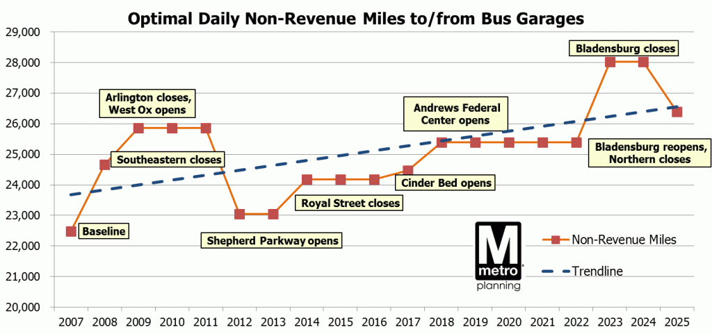
Since 2007, increased deadhead miles have added $5 million to the cost to operate Metrobus.

Since 2007, increased deadhead miles have added $5 million to the cost to operate Metrobus.

Since 2007, Metrobus’ total operating costs have increased $5 million to cover an increase of 1,700 daily deadhead miles. Closures of bus divisions have had a large impact on operations, steadily increasing daily deadhead miles from the 22,500 mile baseline. The 2008 closure of Southeastern Bus Division (now the Half Street Fairgrounds) as part of the Navy Yard/Nats Park redevelopment caused daily deadhead miles to jump nearly 2,200 miles. Most of the remaining DC garages and Southern were forced over their normal capacity limits, and some service was shifted to Montgomery Division. A year later, the World War II-era Arlington bus division closed and capacity was shifted to the new West Ox Division in Fairfax County. Shepherd Parkway Division opened in 2012, 4 years after its predecessor Southeastern closed, bringing overall deadhead miles about 600 miles shy of the 2007 baseline. Two years later, the Royal Street bus division in Alexandria closed, increasing miles once again.

Metro had intended to hold off closing the Royal Street bus division until after the opening of Cinder Bed Road. The project was substantially delayed to accommodate neighborhood concerns, and we were unable to mitigate the 1,127 mile increase in deadhead during the protracted delay.

The animated graphic below shows the change in deadheading between 2007 and current.  Read more…

Two Business Challenges Facing Metrobus

September 2nd, 2015 5 comments

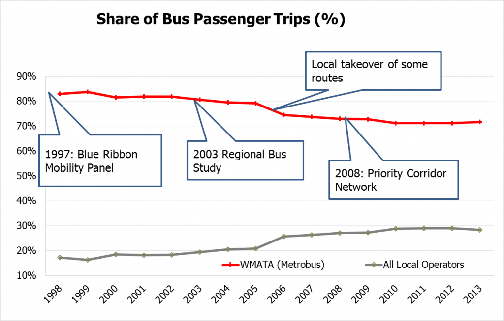
In the past 17 years, Metrobus has faced dual challenges: increased competition and increased roadway congestion.

Market Share Decline 1998-2013 v2

A past post discussed the role of the 1997 Blue Ribbon Mobility Panel in resetting the regional role and funding structure for Metrobus. In the decade-plus since then, several trends have emerged:  Local operators are rolling out more and more bus service, and buses are getting slower.

Read more…

Metrorail Ridership Projections – Looking Ahead

March 11th, 2015 8 comments

Historical data and regional growth projections tell us one thing – Metrorail ridership will rebound and grow right along with the region, and the system better be ready to carry the load.

Crystal City Sta -am Rush 060912-129

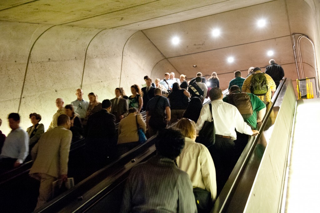
Metrorail riders enter and exit Crystal City during the AM rush hour, June 2012.

Local ridership trends that seem to defy a national boom in public transit usage give some pause about the need for planned transit expansion projects.  It’s no surprise that even the most ardent of transit supporters might be caught flat-footed when trying to defend infrastructure investments against the backdrop of scarce funding.  Some have even gone so far as to question whether Metorail ridership, which just a few years ago looked poised to eclipse 800 thousand trips per average weekday, is experiencing more of a structural downshifting and may experience flat or even declining ridership for the foreseeable future.

All of this debate is understandable in a town obsessed with statistics and “horse race” leaderboards.  But when it comes to economics, demographics, mobility, and infrastructure, regional leaders need to look beyond the numbers d’jour and bet on a sure thing – Metro ridership will go up.  Here’s why:

1. Short-term snapshots of rail ridership miss the forest for the treesOr maybe even just leaves.

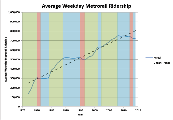
The graph below shows Metrorail average weekday ridership from the beginning of Metrorail. You can see that ridership grew in the first five years as the system grew from just the Red Line and four stops in 1976 to adding Orange and Blue Lines in operation by 1980. And after all of that expansion was completed, something fascinating took place – ridership declined and essentially flatlined until 1985. During that time, the region didn’t stop investing in Metro. On the contrary, during that same time period Metro built the Yellow Line and extended the Red Line from Downtown into Upper NW DC and then all the way to Shady Grove. Ridership shot up again in the late 1980s while Metro extended the Orange Line to Vienna and the Red Line to Wheaton then flat-lined and even declined through the mid 1990s, all while Metrorail added capacity on Yellow and Blue and (finally) opened up the Green Line. From 1997 through the late 2000s Metrorail saw robust ridership increases despite minimal capacity increases – largely reflective of the underlying economic and demographic resurgence of the central city and its urbane suburbs – and ridership flat-lined in tandem largely with the economic collapse of 2008 and the prolonged Great Recession.

ridership_chart_v2-01

Read more…

Transit Walk Sheds and Ridership

August 11th, 2014 11 comments

Metro cares about transit walk sheds because more households accessible to transit by walking translates directly into more ridership.

We’ve been focusing a lot on transit walk sheds lately. We’ve shown that the size of a transit walk shed depends heavily on the roadway network and pedestrian infrastructure, and that these sizes vary dramatically by Metrorail station. We’ve also demonstrated that expanding the walkable area can make hundreds of households walkable to transit.

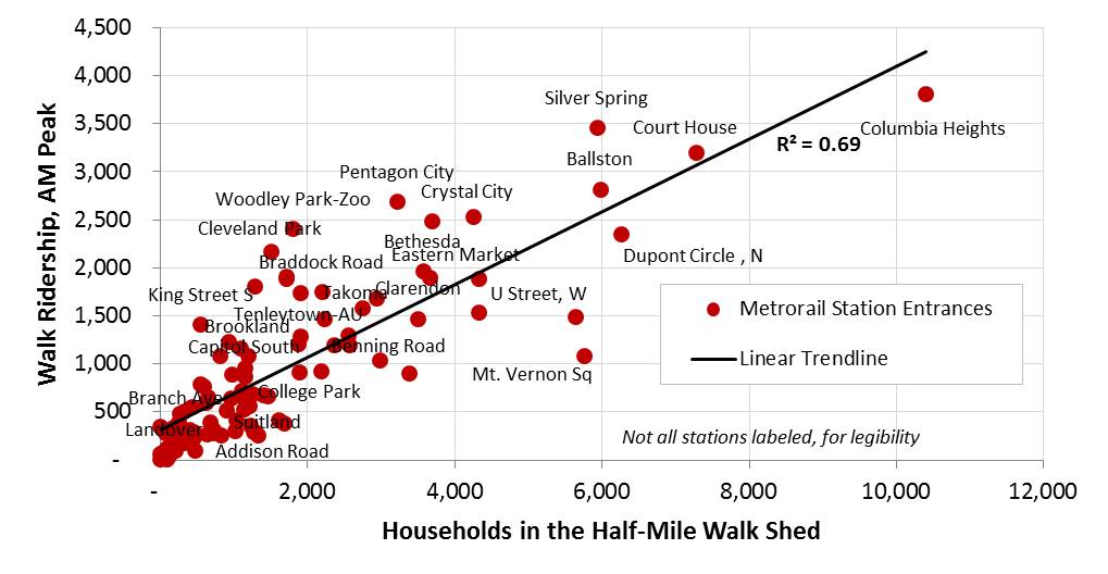
But why do we care so much about walk sheds? Because larger walk sheds mean more households in the walk shed, and that means ridership. For example, we’d be hard pressed to find many households in Landover’s small walk shed, so it’s no surprise that walk ridership at that station is low. On the other hand, thousands of households are within a reasonable walk to Takoma’s larger walk shed, and walk ridership there is much higher.

In other words, the more people can walk to transit, the more people do walk to transit – and data across Metrorail stations prove it:

Correlation between Households in the half-mile walk shed, and AM Peak ridership, by WMATA Metrorail station entrance

More households in the walkable area around a Metrorail station means higher ridership

Read more…

What’s the Ideal Size for a Transit Walkshed?

July 8th, 2014 2 comments

Large transit walksheds are great, but how big is big enough?

In other posts, we have described what a transit walkshed is, and how changes can be made to the pedestrian network to increase the walkshed area.  Here, we explore how big is big enough.

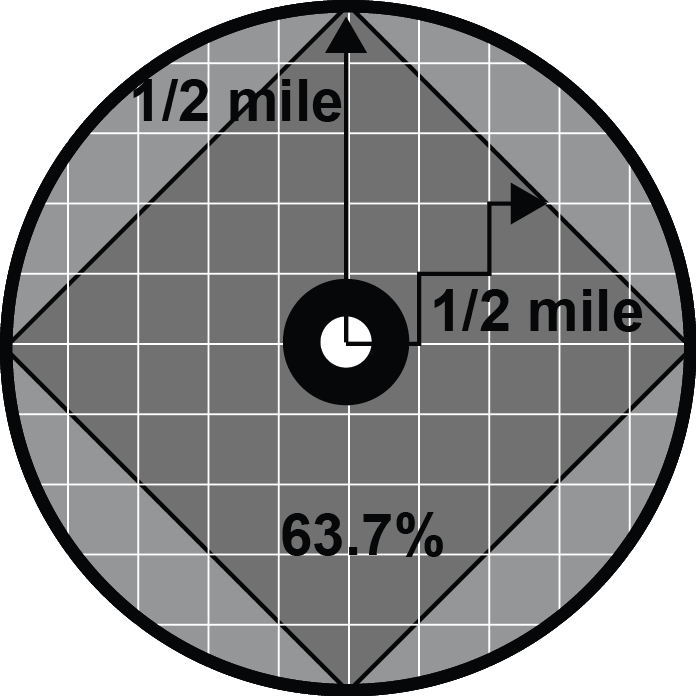
The diagram below shows a half-mile circle around a transit station.  If the station were located in a field of grass or on a massive parking lot, the walkable area of the circle would be the circle itself, 100% of the half-mile buffer around the station would be accessible by foot.  Unfortunately, that wouldn’t bode well for transit use, since there wouldn’t be any origins or destinations within that walking distance.

Ideal Walkshed DiagramNow, let’s lay a perfect grid of streets across that half-mile buffer.  The street area is where people can walk, and the remaining area contains houses, shops, mixed-use development, etc.  The resulting walkshed for the station begins to look like a diamond inscribed inside the circle.   The smaller the blocks (the closer the streets are to one another) the more the walkshed resembles a perfect diamond that has a diagonal distance equal to the diameter of the circle.  If you take the area of the diamond and that of the circle and compare them, you find the walkshed (square) covers 63.7% of the circular station area buffer.

So if you have a perfect grid and get 63.7% coverage, how can you get any better?  For one, diagonal streets can increase the coverage: if two diagonal streets were added to the grid, intersecting in the center of the circle at the transit station, the square walkshed would turn into an eight-pointed star, increasing coverage even more, but not by much.

An good example of a walkshed greater than 63.7% is that of the Takoma station.  Featured in a previous post, we recently calculated a 91% coverage for Takoma.

It is difficult to pick an ideal size for a transit walkshed.    A larger percentage could be beneficial, but the additional roadway network needed to expand the coverage beyond 63.7% may result in less area dedicated to potential transit origins and destinations.  (Remember the station in the parking lot?)

What Metrorail stations do you feel have good walkshed coverage?  In  your opinion, where can we improve?


How Can The Coverage of Transit Walk Sheds Be Increased?

July 1st, 2014 2 comments

Pedestrian infrastructure can cost-effectively increase coverage of transit walk sheds.

The roadway networks of most station areas are mostly unchangeable.  Existing structures on private property create unmovable barriers and  usually prevent new roads from being added to the network.  However, there is still opportunity to add pedestrian facilities that would increase a station’s walk shed in a relatively cost-effective way.

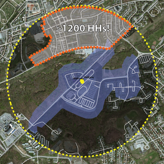
Take the example of Southern Ave Metrorail station.  We previously noted how a large number of customers drive to the station from between one and three miles away.  We discussed several reasons for this tendency to drive to Southern Ave, including the proximity to parks on both sides of the station.  The map below shows the transit walk shed of Southern Ave station.

Current walkshed of Southern Ave station.  The area with the orange dotted border contains over 1,200 households that could be within a half mile of Metrorail if a direct pedestrian connection were built.

Current walkshed of Southern Ave station. The area with the orange dotted border contains over 1,200 households that could be within a half mile of Metrorail if a direct pedestrian connection were built.


But what if a pedestrian path could be built to connect the station to the neighborhood to the north?

If a well lit, safe pedestrian path were constructed between the station and the orange-dotted area on the map, it could expand the walkshed to include up to 1,200 additional households in DC.  This new connection would likely increase ridership at Southern Ave. and might even generate enough additional fare revenue to fund the construction of the trail.

Metro’s Office of Planning is currently evaluating the walk sheds of our rail transit stations.  What other opportunities do you see for cost-effectively increasing the walk sheds around Metrorail stations?

What’s a Transit “Walk Shed”?

June 10th, 2014 6 comments

Metro will soon be measuring how much growth happens in places that are walkable to transit. Here’s an in-depth look at how we define “walkable” to Metrorail stations and Metrobus stops.

Quarter-mile walk (by the network) for regional Metrobus stops and Metrorail stations

Areas reachable on foot from regional Metrobus stops and Metrorail stations

Metro’s new Connecting Communities metric will measure annual household growth in our region that occurs within the “transit shed” – the catchment area around transit service that generates walk ridership. And improving walkability can be an incredibly cost-effective way to reduce congestion and increase transit ridership.  Let’s take a closer look at how we defined what’s “walkable to transit.”

How Far is Walkable? First, we defined walking distance as a half-mile from Metrorail, and a quarter-mile from Metrobus, for a number of reasons:

  1. Of all the passengers who walk to Metrorail each morning, the median walking distance is just under a half-mile (0.35 miles, actually).  Riders walk farther to some stations than others, but the systemwide average is just shy of a half-mile.  Since rail riders are on average willing to walk a little under a half-mile today, it is reasonable to use a half-mile as an upper limit for walking in the future. (We don’t have similar survey data on Metrobus – yet.)
  2. The land use within a quarter- and half-mile is where we see the strongest effects on ridership on Metro today. More on this below.
  3. Academic literature supports the half-mile radius from rail transit as no better than any other distance, particularly for the link between households and ridership.
  4. Practically, setting the distance any farther than 0.50 and 0.25 miles increases overlap with other nearby stations and bus stops, which increases computational complexity. Read more…

Solving the Region’s Congestion Woes – One Step at a Time (Part 3 of 3)

March 31st, 2014 2 comments

Making every Metrorail station area walkable could reduce regional congestion without breaking the bank.

This is part three of a three-part series.

In the previous two posts we’ve laid out a case for making all transit stations walkable as quickly as possible.

  1. Increasing walkability and density at station areas has huge impacts on transit mode share and can take tens of thousands of cars of the road every single day.
  2. At a regional level, walkable station areas have an equivalent impact on congestion as a quarter trillion dollars in “last mile” infrastructure (see pages 37, 38, 43, 48).

Maximizing the capacity of the existing transit network while intelligently investing in station area connectivity would combat regional congestion just as effectively as trying to “build our way out of the problem”. And unlike many potential interventions, the market actually wants to do this for us.

Perhaps it is time to harness these market forces to make the areas around our transit network walkable and implement this low-cost congestion-busting paradigm. As for where to begin – well, we have a few suggestions…

Existing Walkability Near Metrorail Stations

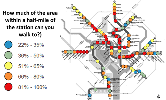
The map below shows the range of existing walkability conditions near the Metrorail network and helps answer the question of how much of a half-mile radius of each station a person can walk to. The higher the percentage, the better the pedestrian network coverage. As shown, many of the station areas are under performing relative to their potential walkability. If walkability = connectivity and connectivity = mode share, then just imagine the impact on the region’s roads if we could focus on taking station areas with low accessibility and invest in some relatively easy, short-term solutions like sidewalks, pedestrian bridges, crosswalks, and smart, transit-oriented development to take maximum advantage of the existing Metrorail system and take tens of thousands of cars off the road each day.

How walkable are our region's Metrorail stations?

How much of the area within a half-mile of our Metrorail stations can you walk to?

Read more…

Solving the Region’s Congestion Woes – One Step at a Time (Part 2 of 3)

March 24th, 2014 4 comments

Improving pedestrian connectivity takes cars off the road at a formidable clip – rivaling the power of all of the region’s planned roadway additions and “last mile” transit connections.  Cheaply and quickly. 

This post is part two of a three-part series.

The data is finally in, and we now know that walkable station areas result in fewer motorized trips, fewer miles driven, fewer cars owned, and fewer hours spent traveling. And when we improve the pedestrian and bicycle access and connectivity to Metrorail station areas, ridership goes up, putting a major dent in congestion by taking trips off the roadways. Earlier, we discussed what it means to build walkable station areas and research shows the tremendous benefits to the region of making this a priority.

First, our data confirms that when walking access to transit is improved, transit ridership goes up – way up. In the 2040 Regional Transit System Plan (RTSP), we stress tested TPB’s transportation model to improve walkability to the transit network and saw huge increases in transit linked trips.  These trips go up by about 10% region-wide and we get an increase in transit mode share for all regional trips by 0.5%.  That’s over and above the roughly one percent increase in mode share we anticipate occurring as a result of building the entirety of the CLRP, an impact about half that of constructing all of that transit.

Source: Regional Transit System Plan

Source: Regional Transit System Plan

Read more…