
Visualization of 9 Years of Metrorail Ridership
Metro planning staff understand that a picture is worth at least a thousand words, and often more. (And that a video is worth 1000 * 30 words per second.) As such, we are always looking to increase our ability to create compelling graphs, charts and video simulations.
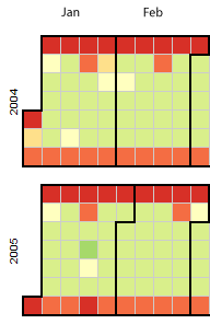
Sample image of the Metrorail Ridership Visualization. Click the image to open the viz in a new window.
Metro planning staff recently attended a Mobility Lab Hack Day, where transit planners and data geeks intersected to share ideas and techniques for visualization of the volumes of data being made available by operators around the region. One of the visualization tools discussed was D3, a javascript library for creating “data-driven documents.” One of the online examples is for a calendar view that displays stock market data.
Metro planning staff adapted this code to create a visualization of Metrorail ridership data from 2004 to the present. (Link opens in new window.) Here’s how it works:
- Each year is a horizontal stripe, sectioned off into months that go across. Both years and months are labeled.
- The days within each month are transposed, so start at the left and read down, then move right. In the sample image, the leftmost column of January 2004 is the first week, with Thursday January 1 being the darkest red square. A graphical example is also displayed in the legend at the top of the visualization.
- Each day is colored according to the ridership on that day, with darkest red being the smallest range (0 to 99,999) and the darkest green being the highest range (greater than 1,000,000).
- If you move your mouse pointer over any individual day, a small “tool tip” appears showing the date and the ridership for that day, rounded to the nearest 1,000.
Looking at ridership data this way is very intriguing. First one notices the decreased ridership on weekends, and that Saturdays are usually higher than Sundays. Next, the red-colored weekdays pop out, indicating Monday holidays such as Presidents Day, Memorial Day, and then other holidays like Thanksgiving Day or Christmas Day. Once the logic of the display is figured out, the next impulse is to look for and explain anomalies. President Obama’s first Inauguration Day was our highest ridership day ever. Snowmageddon shut down the DC region for nearly a week. A green square the last weekend of October, 2010? The Rally to Restore Fear/Sanity. The higher-than-average ridership in April 2013 including a cluster of dark green squares representing mid-week days? A surge of visitors for the Cherry Blossoms over a two week period, including the 4th Highest Ridership Day on April 10, 2013, when 871,000 trips were made on Metrorail.
Zooming out from the micro to the macro, other patterns become noticeable: Higher ridership in June and July (in the 700K range) in 2004 starts to spread to other months over the next four years. Eventually, the base weekday ridership is in the 700K range. Then, June and July are regularly in the 800K range most days of the month starting in 2008 which starts to spread to other months, peaking in 2010. Starting in 2011, the darker green starts to retract, which continues into 2012.
So far in 2013, we seem to be on track to have ridership similar to last year. Where ridership goes for the rest of the year is up to a variety of factors.
What other trends are apparent to you in this visualization? What other useful visualization techniques have you seen implemented for transit data? What other Metro data would you like to see presented in this format? Leave your thoughts in the comments below.

It took me a while to remember the snowfall we were projected to get on March 6, but to me the weirdest thing on the map is the big zero for October 29, 2012. Have there been any other days where the entire system was shut down?
One comment about the format - at first glance, I was expecting it to represent the mirror of what I’m seeing, as if I were reading a calendar tilted 90 degress to one side.
If I were to re-organize the chart, I think it might be easier to put 2004 on the bottom row and 2013 on the top row, and flip the days of the week so that Saturday is on top and Sunday is on the bottom.
Alternatively, you could arrange the years vertically, in columns, and arrange the days of the week as rows within those columns - with the days reading SuMoTuWeThFrSa.
Love this visualization. It makes it easy to pick out patterns, certain holidays, and random important events.
How about making the background data (daily ridership totals 2004-2013) from this project available on this site or the main WMATA reports/records site?
Thanks for the comments so far. As noted in the text, the code for this was adapted from a sample on the D3 website. I should have chosen custom colors that would be easier for persons with R/G colorblindness to read. Look for another iteration.
@Matt, we’re working on getting this data released.
@Michael
This is a great visualization. Is there any chance that you could upload it to GitHub for others to modify/adapt/improve?
I really like the layout, even though at first it looked like an airline seating chart :) Good job!
Thanks for releasing the data! I’m posting this here because I get a 404 if I try to go into the most recent post about the October ridership data.
@Matt Dickens
Thanks for letting us know about the 404 error. Odd. I fixed it.
Hi Michael, this is a great resource! May I ask if planitmetro could release the underlying metro ridership total count by day data for people to analyze? Thanks!
Agreed - is there some reason why it is hard to get just a CSV or Excel file with the system ridership by day? Some simple csv file must be powering this visualization.
Other large transit agencies like BART and CTA release ridership information every month. It is disappointing that WMATA is unable to do the same. Clearly this dataset is being updated regularly - this visualization now has data through the end of 2014.
Hi,
This is great. I am hoping to use this data for a class project I’m working. Is it possible to get the data as a csv file for download?
Would be really interesting if this were updated with 2015 and 2016 data.