
Silver Line Ridership Patterns – Visualized!
February 23rd, 2015
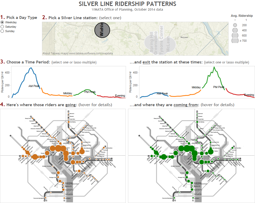
Learn about the travel patterns of Silver Line riders in rich, interactive detail with this new tool.
Click on the dashboard below to see where Silver Line rail riders are going, coming from, and by time of day and day type. This is simply a visualization of the October 2014 rail ridership data we recently posted. What patterns do you see? What jumps out at you?

The data shows the need to add more mixed use development(more residential) around Farragut Square. Commercial development is too concentrated around downtown.
The data also shows the viability of point-to-point bus service between wiehle and Farragut square. The Roosevelt bridge should be included in the I-66 inside the beltway managed lane project