We want your feedback on a new online tool, Metrobus Explorer, which allows visualization of Metrobus service frequency and geography.
One of the biggest challenges facing bus transit is making the service extremely easy to understand. Metrorail stations are filled with customer information, including system maps, fare and travel time tables, station-ahead lists, and passenger information display systems (PIDS) screens, leaving little guesswork for the savvy traveler. Moreover, with limited real estate available for customer information, Metrobus stops are often at a disadvantage. While Metro continues to improve bus stops around the region — including the design and installation of new diagrammatic bus system maps — information technology is also playing an important role in filling the bus customer information gap, including BusETA, information displays, and trip planning sites and apps.
Metro’s Office of Planning is developing a new online tool called Metrobus Explorer that is geared to answer two questions about the Metrobus network: “How often do buses arrive at a given stop (or set of stops), and where do they go from there?”

Screen shot of the bus frequency and spider map tool. Click the image to access the live tool online.
Read more…
If you are great with data and love cities and transit, we have a job for you.

We were excited to announce that a job listing for a Business Intelligence Analyst position within Planning’s Applied Planning Intelligence unit has just been posted. We are looking for a healthy overlap between a data scientist and a transit nerd. For the full job description, head over to the wmata.com/careers site, scroll down and click on View all jobs. A short description is posted below.
Currently a team of two, we work to convert Metro’s many data sources into information that can be used to inform plans, policies and procedures. Many of our projects have been featured here on PlanItMetro, including:
Read more…
Metro is committed to working with the developer community - we’ve launched a real-time train position API, are hosting developer coffee chats this Wednesday (7/27) from 4pm to 6pm, created a developer google group, and are seeking submissions for an App Gallery!
If you frequently monitor Metro news, you’ll have already seen some of Metro’s latest developments regarding the commitment to open data and third-party developers. Most notably, Metro last week released a real-time train position API, making it possible to identify the specific locations of trains in the system at a given time.
Screen capture of Metro’s internal real-time train positions map. Now, third-party developers can make their own versions of this using a recently released data feed.
We can’t wait to see what you do with the data. But we know you’ll have questions. That’s why we’re hosting an informal “Coffee Chat” this Wednesday, July 27, at Compass Coffee on F Street (near the Gallery Place-Chinatown station and 70/74/D6 buses). Stop by any time from 4pm to 6pm to say hello, show us something on your computer, or ask us questions!
Two other notable updates, Metro now has created a google group to serve as the intra-developer community forum and will be launching an “App Gallery” to showcase apps available for the Metro system.
New data download features rail ridership by origin, destination, day of week, and quarter-hour intervals.
Subset of the visualization made by BioNrd aka Mike from our October 2014 data download data.
As you’ve probably noticed, it’s been a while since we’ve released a fresh batch of Metrorail ridership data. Continuing the spirit of openness, we have recently uploaded data from October 2015 in CSV format. (The number of rows is too great for Microsoft Excel).
This new dataset includes day of week data, so you can begin to investigate impacts of evolving workplace policies such as compressed work schedules. You can also compare it to October 2014.
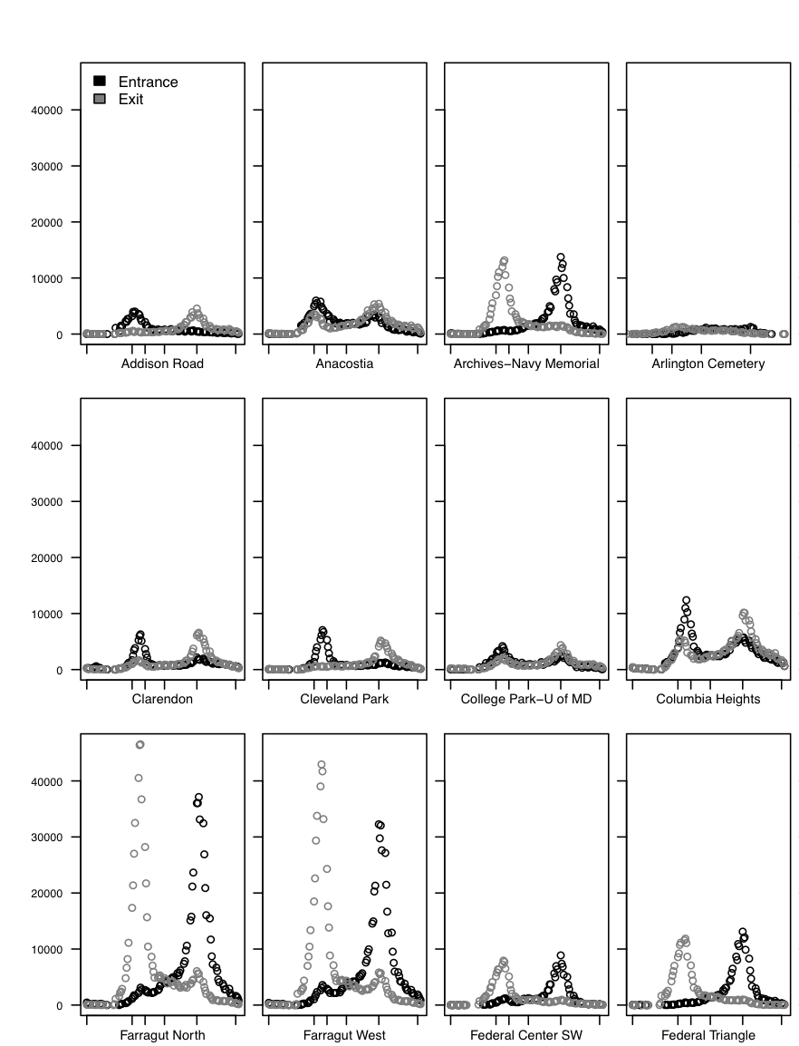
In the past, we have seen a lot of innovative analyses of the data we share. Perhaps the best so far was a visualization of Metrorail station entries and exits by station by “BioNrd” aka “Mike.” What else can we learn from this dataset?
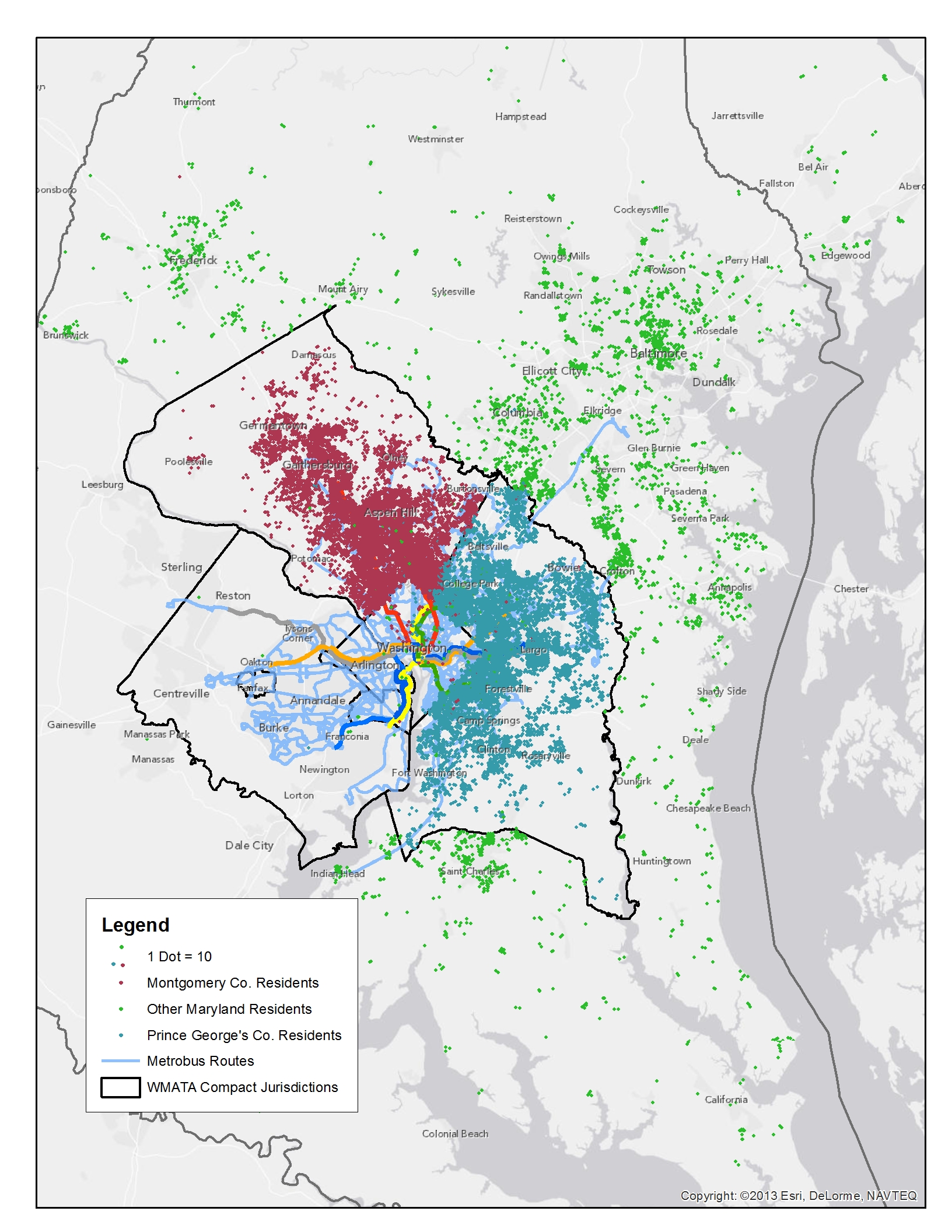
We analyzed Metrorail, Metrobus, and MetroAccess ridership for all Maryland residents in response to the Maryland Legislature’s data and analysis request. Newsflash - we have customers from across the state!
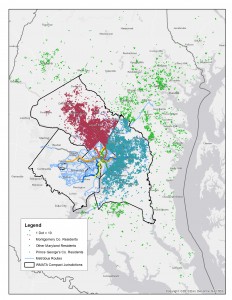
Origins of Maryland Rail Riders
In the 2015 legislative session, the Maryland General Assembly passed the WMATA Utilization Study (HB300),which required the Maryland Department of Transportation (MDOT) and WMATA to analyze the utilization of Metrorail, Metrobus, and MetroAccess every five years. This year’s analysis is based on the most recent Metrorail passenger survey (2012), Metrobus passenger survey (2014), and actual ridership for MetroAccess for an average day in April 2015. Below are some findings that I found most interesting. But more importantly, here is the complete 2015 Maryland HB300 WMATA Utilization Study (native pdf), which includes all the links to the underlying survey data, interactive charts, and analysis.
- 82 percent of Metrorail trips by Montgomery County residents are destined for Washington DC in the morning on a typical weekday;
- 71 percent of Metrobus trips in the AM peak period made by Prince George’s County residents are for work purposes on a typical weekday;
- 3.3 percent of all trips across all Metro services on a typical weekday are taken by Maryland residents from Frederick, Charles, Calvert, Howard, Anne Arundel, and Baltimore Counties and Baltimore City;
- 35 percent of other Maryland residents on Metrorail access via commuter rail (MARC) and Amtrak; and
- 17,600 residents of the District and Virginia reverse-commute into Maryland on Metrorail and bus each morning on a typical weekday (about 5 percent of total system ridership)
Any other nuggets that you found from analyzing the data? Ideas for other ways to graphically represent the findings?
Better urban planning can help save our rivers and the Chesapeake Bay—by reducing this region’s future impervious surfaces by 20%. Here’s why.
As many Washingtonians know, the Chesapeake Bay needs help. Dead zones and algae blooms appear every summer which destroy aquatic life in the Bay and threaten fishing, swimming, and economic health. A major contributor to this problem is rainwater runoff from paved roads, parking lots, and roofs. These are called “impermeable surfaces”. In contrast, permeable (or pervious) surface is one through which liquids are able to pass.
Grassy fields, woodlands and farmlands are excellent examples of this: rainwater or snowmelt soaks into the ground, pollutants in the water are filtered naturally, and excess water travels underground to streams and eventually (in the Washington region) the Chesapeake Bay.Rainfall that falls on impervious surfaces like paved roads, parking lots and roofs “runs off” unfiltered making its way to the Chesapeake Bay—along with nitrogen and sulfur oxides from vehicle emissions, motor oil, and road salt residue.
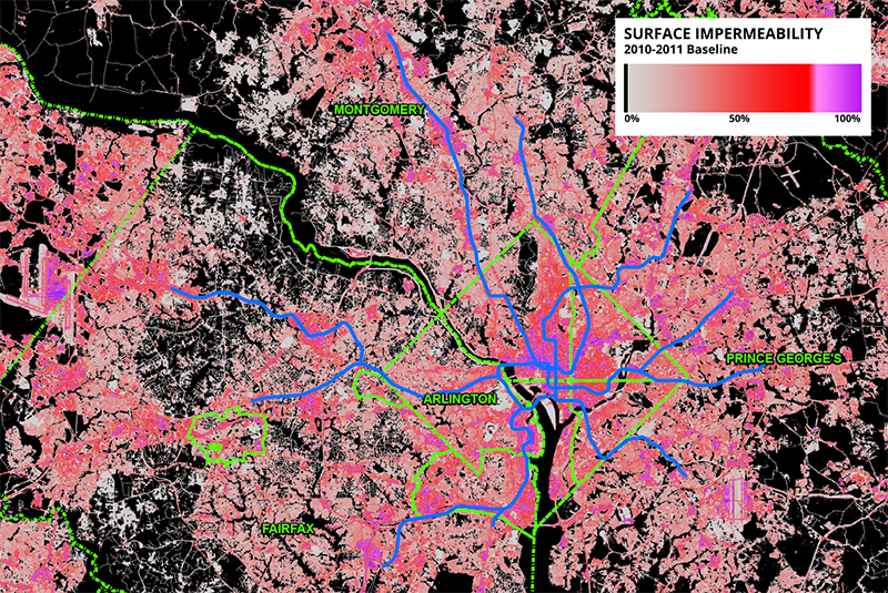
Figure 1 – Map of impermeability throughout the region with overlaid jurisdictional boundaries and Metrorail system for reference. Note the concentrations of highly-impermeable surfaces in central D.C., and at other activity centers like Dulles.
Read more…
Categories: Sustainability Tags: Chesapeake Bay, forecasts, landuse, open space, permeability, planning, stormwater, sustainability, transit, transit-oriented development, visualization, water and stormwater
Ridership from neither of the two back-to-back sold-out Taylor Swift concerts at Nationals Park this week generated as many riders as an average Nationals baseball game.

Entries at Navy Yard by fifteen-minute period, Orange and Gray were nights of the Taylor Swift concerts.
Pop star Taylor Swift brought her 1989 tour to Washington this week, playing two sold-out concerts at Nationals Park, adjacent to the Navy Yard-Ballpark Metrorail station. According to Swift, approximately 45,000 people attended each concert. That’s a lot higher than a normal Nationals game, as the concert had seating on the floor as well as in the stands. One would hope that such big crowds would bump up Metrorail ridership higher than the Nats. You might be disappointed. Read more…
Salaries of actual riders are needed to paint a true picture of Metrorail ridership by line.
The Washington Post recently featured a series of images from the You Are Here project of the Social Computing Group at MIT showing Metrorail median income by line and station. We were digging into it and realized it uses median household income within a half-mile radius, and not that of the actual riders’ households. While we’ve mapped low-income riders before, we set out to answer the question, “What is the actual average income of Metrorail riders by line and station?” Along the way, we developed this interactive data visualization.
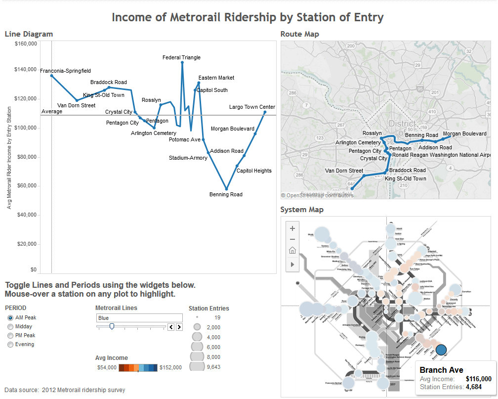
Screenshot of Metrorail rider income by station visualization. Click image for full interactive version.
The biggest overall difference between our work and that of the MIT group is higher household incomes at end-of-line stations on the eastern side of the region. These stations, while located in lower income areas, have large parking facilities that draw commuters from all over the region and beyond. Read more…
Ever wonder where rail riders are going to and from? Here’s a map that shows you.
“What are the destinations of riders at Station X?” It’s a question we get often here. Well, using October 2014 rail ridership data by origin and destination, it’s pretty easy to answer that question - click below for an interactive map.
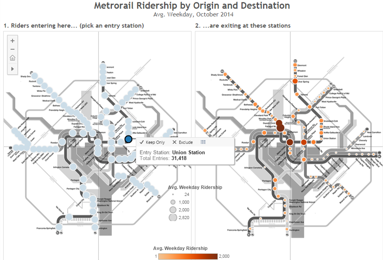
Click for a larger, interactive version of Metrorail ridership information by origin and destination station
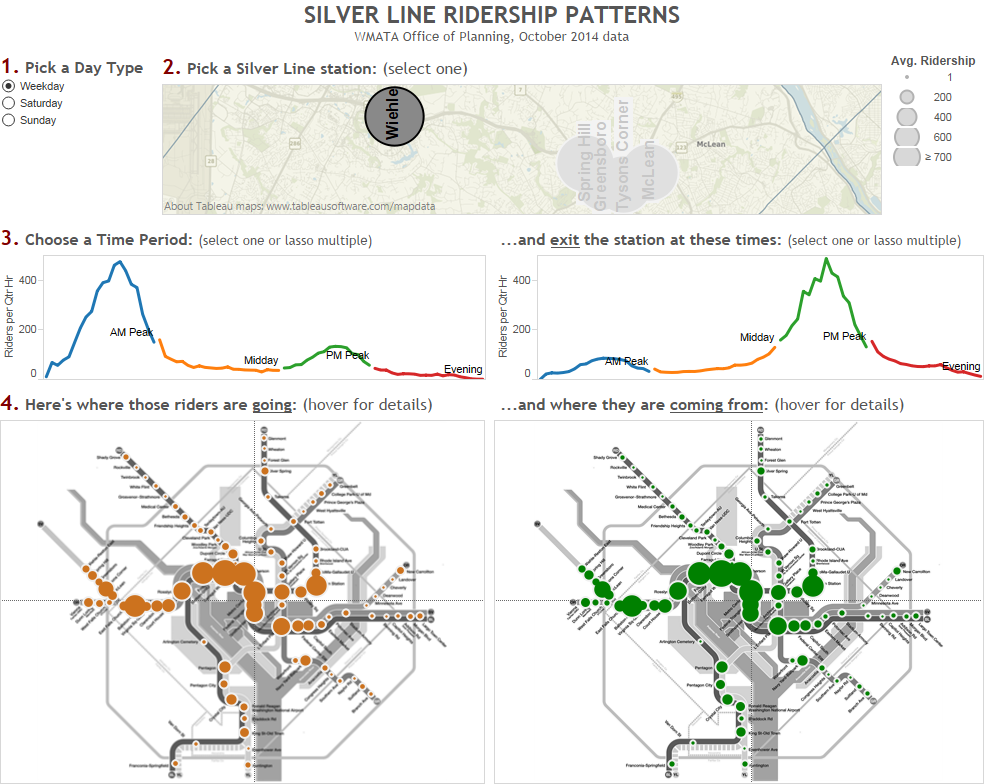
Learn about the travel patterns of Silver Line riders in rich, interactive detail with this new tool.
Click on the dashboard below to see where Silver Line rail riders are going, coming from, and by time of day and day type. This is simply a visualization of the October 2014 rail ridership data we recently posted. What patterns do you see? What jumps out at you?


Recent Comments