Metrorail Revenue by Station – Visualized!
Where and when does Metrorail generate the most farebox revenue? So far the data reinforces the notion that ours is a truly regional system with strong revenue contributions from all jurisdictions – but of course, the story is far more complicated than that…
What kind of rail system is Metrorail? Urban subway? Commuter rail? Hybrid? The answer of course is all of the above. And if that is the case, what kind of ridership and revenue patterns should its stations and system exhibit? High levels of peak revenues with heavy commuter lot usage but relative inactivity during the day? Lower levels of peak period activity but a steady stream of usage throughout the day? Depending on your perspective (and travel patterns) one might argue for either, and it might seem easy to apply a blanket classification to Metrorail and declare that “only urban stations cover their cost” or “commuter stations contribute largely to Metrorail’s revenue picture.”
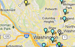
Well, when you throw the data up on a map, it becomes clear that there are no easy answers, and no one right way to view the revenue picture of our tri-jurisdictional hybrid rail network. Some conclusions from the data are intuitive, some less so. Among them:
- Differences in ridership across stations are bigger than differences in revenue, so ridership is a stronger explanation of differences in revenue than fares. For example, Shady Grove’s average fare in the AM Peak is $5, which is twice as much as the smallest average fare. On the other hand, ridership at Shady Grove is ten times higher than other stations, so the ridership better explains the station’s revenue.
- In the AM Peak, the terminal stations dominate in terms of revenue contribution. Union Station functions as an internal “terminal station,” meaning that the commuter rail and Amtrak connections to Metro are extremely important to the overall ridership and revenue picture.
- Other stations with strong bus or commuter park-and-ride infrastructures also pop in the AM Peak, such as Silver Spring and Grosvenor.
- Note how well the non-Silver line stations in Virginia perform in the AM Peak, as well as the somewhat expected better performance of the Shady Grove branch of the Red Line in the AM Peak.
- In the PM Peak, the core is king. Stations like Farragut West and North, Metro Center, L’Enfant Plaza are producing $50,000 apiece every evening thanks to their job densities, reinforcing the importance of improving their capacity for the future in Metro 2025, as well as their huge importance to revenue today. By comparison, in the AM Peak, only Shady Grove and Vienna approach these levels of revenue at roughly $40,000 per station.
- The New Carrollton and Largo Town Center branches of the Blue/Orange/Silver Lines contribute significantly less revenue than other branches, and this directly relates to the relative lack of transit-oriented development along these spines. The station areas on these lines enjoy a superb level of rail connectivity to the region’s primary job cores, but without sound transit-oriented investments to-date, they have not yielded the type of ridership and revenue commensurate with the capital investment. Imagine what Metro’s revenues (and farebox recovery) could look like if these segments were properly developed!
We’ve been examining the data ourselves as we continue forward with Momentum’s call for us to ensure financial stability for the Authority and have created the visualization for you to play with. We’d love to know what you see!


Recent Comments