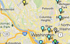
We analyzed Metrorail, Metrobus, and MetroAccess ridership for all Maryland residents in response to the Maryland Legislature’s data and analysis request. Newsflash - we have customers from across the state!
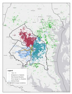
Origins of Maryland Rail Riders
In the 2015 legislative session, the Maryland General Assembly passed the WMATA Utilization Study (HB300),which required the Maryland Department of Transportation (MDOT) and WMATA to analyze the utilization of Metrorail, Metrobus, and MetroAccess every five years. This year’s analysis is based on the most recent Metrorail passenger survey (2012), Metrobus passenger survey (2014), and actual ridership for MetroAccess for an average day in April 2015. Below are some findings that I found most interesting. But more importantly, here is the complete 2015 Maryland HB300 WMATA Utilization Study (native pdf), which includes all the links to the underlying survey data, interactive charts, and analysis.
- 82 percent of Metrorail trips by Montgomery County residents are destined for Washington DC in the morning on a typical weekday;
- 71 percent of Metrobus trips in the AM peak period made by Prince George’s County residents are for work purposes on a typical weekday;
- 3.3 percent of all trips across all Metro services on a typical weekday are taken by Maryland residents from Frederick, Charles, Calvert, Howard, Anne Arundel, and Baltimore Counties and Baltimore City;
- 35 percent of other Maryland residents on Metrorail access via commuter rail (MARC) and Amtrak; and
- 17,600 residents of the District and Virginia reverse-commute into Maryland on Metrorail and bus each morning on a typical weekday (about 5 percent of total system ridership)
Any other nuggets that you found from analyzing the data? Ideas for other ways to graphically represent the findings?
November 16th, 2015
Shyam
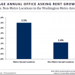
For at least the past decade, the region’s real estate has revolved around transit. That is expected to continue for the next decade, and we can already see signs of its impact along the Silver Line, according to a new report.
We’ve been highlighting the impact that Metro has on the regional economy for many years now. From the Regional Benefits of Transit study which highlighted the quarter of a billion dollars in incremental tax revenue that the jurisdictions enjoy each year solely because of Metro, to recent data which highlights that almost all of the development pipeline in the D.C. region is within walking distance of Metrorail, it’s crystal clear that this region’s economic future is inextricably linked to Metro.
Joining the library of compelling evidence of this is recent information from CoStar and Transwestern. They have been monitoring the development pipeline and activity in the region and have had a special eye trained on the Silver Line. Here’s what they found: Read more…
A new Virginia study (PDF) finds that Metro and other transit operators carry a major portion of all cross-Potomac travel in a just a few crossings, using far less space than the 57 highway bridge lanes that carry the rest. If built, an expanded bridge crossing will need transit to maximize its ability to move people across the river.

Transit’s Role is Critical
While some media outlets focused on the study’s highway expansion recommendation, the presentation acknowledged that Metro, VRE, and other bus operators plays a major role in the movement of people across the river from Virginia to DC in the core of the region. Seeing that, we thought we we’d drill down further to estimate how many people are actually crossing the river, using which bridge, and by what mode. Supplementing the study with available transit ridership data and vehicle occupancy data (PDF), we arrived at the following estimates: Read more…
Categories: Impact Tags: bus, commuter bus, commuter rail, dc, maryland, Metrobus, Metrorail, mode share, Potomac River, travel patterns, Virginia, VRE
Adding two extra cars to a six-car Metrorail train might not seem like much, but it is equivalent to widening I-66 through Arlington by two lanes. Plus, it’d likely be cheaper and faster for commuters, too.
Sometimes it’s hard to wrap one’s head around how just many people Metrorail can move. But where Metrorail operates in heavily congested corridors, seemingly small improvements can yield big results. In fact, matching the capacity of all eight-car trains system-wide would require 16-18 lanes of freeway into downtown, each way.

To match the capacity of eight-car trains on Metro, we’d have to widen I-66 in Arlington by at least two lanes. (Photo by wfyurasko, click for original)
In Arlington for instance, going to eight-car trains on the Orange Line as part of Metro 2025 is like widening I-66 by two lanes. Let’s do the math:
- One lane of highway can move around 2,200 cars per hour, at its theoretical maximum.
- Today, every morning Metrorail runs about 18 trains per hour eastbound on the Orange Line through Arlington, and about a third are scheduled eight-car trains. That’s a train every three minutes, and equates to around 121 rail cars per hour, or 12,060 passengers per hour.
- By 2025 with eight-car trains, Metrorail will be able to run 21, eight-car trains per hour eastbound on the combined Orange and Silver Lines, which equates to 168 cars per hour.
- This means Metro 2025 will bring the line’s capacity to 16,800 riders per hour, or an increase of 4,740 passengers per hour.
- To accommodate 4,740 more people on I-66 at 2,200 cars per hour, 2 people per car, we’d need 4,740 / 2 / 2,200 = 1.1 highway lanes in each direction.
That means we’d need at least two new lanes on I-66 to match the capacity of Metro 2025. In addition, eight-car trains would be cheaper, and would likely move people faster through the corridor.
- Eight-car trains on Metro would be over two times cheaper: the estimated cost to widen I-66 works out to about $3.50 per rush-hour trip over the life of the project, whereas Metro 2025 would be about $1.50.
- Metrorail would likely move travelers faster than I-66 in the end. Orange Line trains today normally run at around 35 miles per hour, while congested travel speeds on I-66 average around 18 miles per hour. While new highway lanes might move cars faster at first, the improvements would eventually be eroded by growing congestion.
Yesterday, as everyone recovered from a snowstorm, here’s what happened to Metrorail ridership.
After Monday’s snowstorm, yesterday the federal government in the Washington region issued a two-hour delayed opening, and many schools opened with a delay or remained closed. Metrobus began the morning operating on a snow emergency plan, but by afternoon had restored full service. Here’s what that meant to Metrorail ridership:
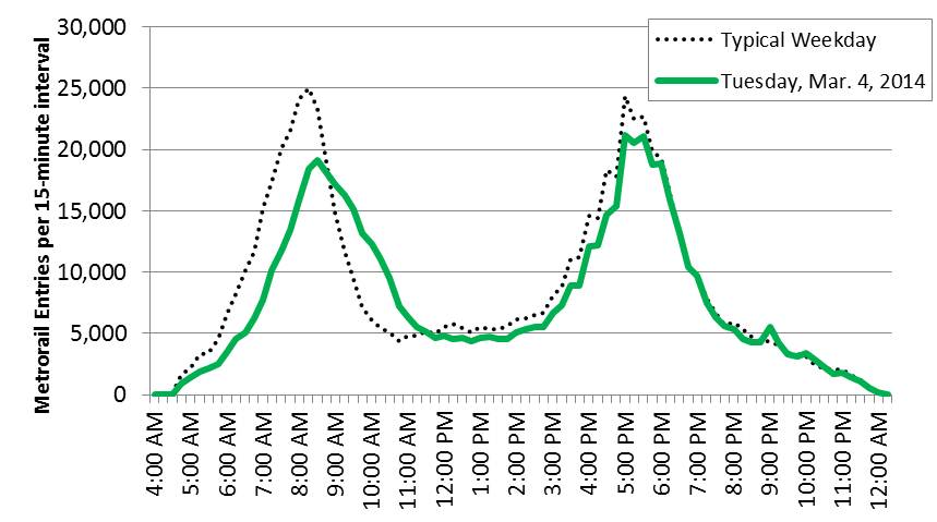
Metrorail ridership on Tuesday, when the federal government and many schools opened with a 2-hour delay.
Note: the prior Thursday (Feb. 27, 2014) stands in as a typical weekday above, for comparison.
It looks as if the apex of the AM peak period occurred 15 minutes later than usual. Many riders appeared to delay travel in the morning, resulting in a much more gradual end to the morning peak.
How was your commute different on March 4?
This data is available for download (.xlsx, 13kb).
During the National Cherry Blossom Festival, Metrorail ridership increases on average by 7% on weekdays and 50% on Saturdays.
Metrorail ridership is impacted by a variety of factors, from special events to weather to government shutdowns. One event that brings visitors to the region — and to Metrorail — in droves is the annual National Cherry Blossom Festival. In anticipation of this year’s festival, we performed some analysis on how, when and where the blossom viewers impacted ridership on the Metrorail system.
In general, Metrorail ridership increases on average by 7% on weekdays and up to 53% on Saturdays during the festival. On days with nice weather, ridership has increased up to 10% on weekdays and 70% on Saturdays!
As the figure below shows, during the weekdays there is no impact in the morning, a large (21%) increase of activity during the mid day and then a 7% increase thereafter.
Saturdays are another story all together. Ridership increases up to 63% during mid day and afternoon periods on days during the festival, with a total ridership increase above 50%. Even morning and “late” night ridership increases significantly during this period.
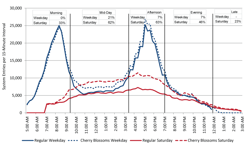
Metrorail system entries by quarter-hour interval, Regular Weekday, Cherry Blossom Weekday, Regular Saturday and Cherry Blossom Saturday. Click chart for larger version.
When looking at change in ridership by station in the maps below, some obvious conclusions can be drawn. Read more…
Without Metro 2025, the region might give up more jobs than the current size of 80 of the nation’s 100 largest downtowns.
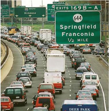
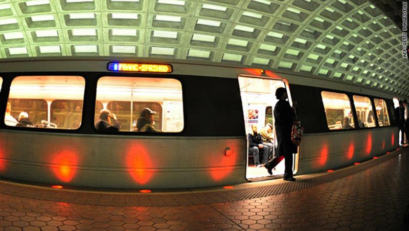
One way to alleviate congestion - limit transit funding and stymie job growth!
The Washington, D.C. region earned in 2012 the unfortunate honor of being named the #1 region in the nation – for congestion. For the workers in this region this comes as no surprise, as seemingly endless “volume delays” litter our evening traffic reports, commuters spend more than a full week and a half sitting in traffic each year, and even the public transit network – primarily Metrorail – is so crowded that commuters often have to wait for multiple trains just to squeeze onto the system. And unless proposed transportation investments keep up with projected household and job growth – MWCOG projects that the region will add 1.6 million jobs by 2040 – these commutes are only going to become more painful.
We all know that the high price of congestion is in the billions of dollars per year, a figure that would be even higher but not for transit’s impact has in reducing the region’s congestion by 10 to 15 percent, saving commuters time and money stuck in traffic, and preventing the need to build hundreds of thousands of new parking spaces and 1,000 additional lane miles of roads.
But that price pales in comparison to what may be if we don’t act now to make meaningful improvements to the regions congestion-reducing transportation infrastructure, especially in programs like Metro 2025. Turns out that we now know that when regions exceed 35 to 37 hours of delay per commuter per year – about four and a half minutes per one way free flow trip – regional job growth begins to slow. That means that expectations of continued economic growth in the region are a lot less rosy when we consider that we currently run about 72 hours of delay per commuter per year – and rising. And before you dismiss this as planning theory, remember that Hewlett Packard showed Atlanta and the nation in 1998 that congestion’s negative impact on employment growth can be economic fact. Read more…
Priority treatments speed up buses, which saves everyone time and money, uses street space most efficiently, and attracts development.
Bus priority projects, such as those begun through the regional TIGER grant and included in the Metrobus Priority Corridor Network Plan, will improve travel times, increase service reliability, and attract thousand of new riders once fully implemented.
But let’s step back for a moment. Why are these improvements needed?
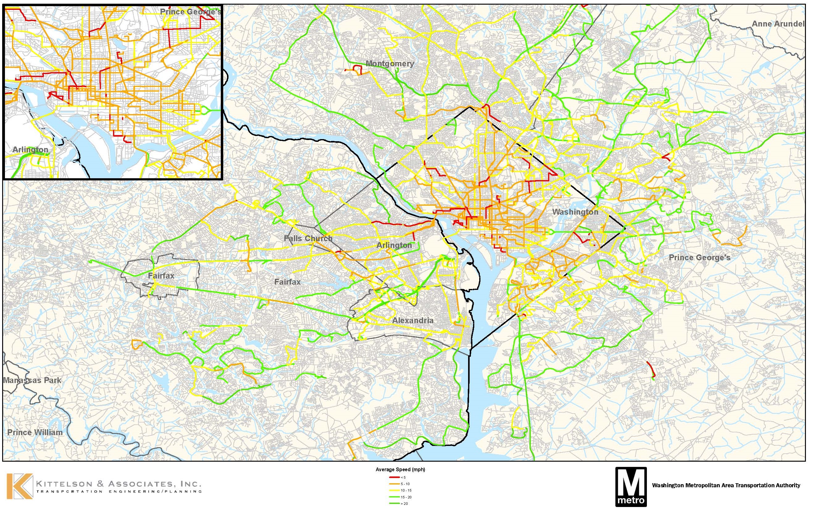
Average AM Rush Hour Bus Speeds (Nov. 2009)
Read more…
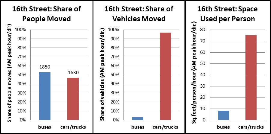
During the morning rush hour, Metrobus carries 50% of all of the people traveling on 16th Street NW towards downtown DC, despite using just 3% of the vehicles. However, it still gets stuck in traffic.
It will come as no surprise to regular riders of the Metrobus S1,2,4 (PDF), or MetroExtra S9 (PDF), but ridership has grown tremendously in recent years on 16th Street, from just over 16,000 riders per weekday in 2008 to about 20,500 this year. To keep pace, Metro has added lots of new service, most notably the S9 limited stop service in 2009.
In fact, Metro has added so much rush hour service on lower 16th Street that buses headed towards downtown DC now operate more frequently than any transit service in the region, including Metrorail, with buses arriving an average of nearly every 90 seconds.
Read more…
Metro requests feedback on draft Greenhouse Gas (GHG) calculator.
As part of the 40 Days of Momentum, a recent blog post the importance of Metro to the region, including greenhouse gas (GHGs) emissions reductions. Now it is your turn to look up your share of those GHG reductions.
Please try out our draft Greenhouse Gas Calculator, which asks for a starting and ending address, and then routes your trip via automobile and transit and displays the route and GHG emissions differences.* We are soft-launching this tool to crowd-source the quality assurance process and assess its usefulness.
Launch the GHG Emissions Savings Calculator!
What other features would you like to see? Did the tool accurately portray your travel choices? What is the difference in GHGs between driving and transit for your most frequent trip?
* Note on GHG calculations: the tool uses the Google Directions API to route your trip using both automobile and transit. The Google Directions API response includes each step of the journey, including mode and distance. We apply standard rates of GHG emissions per mile to the different modes used. As an added bonus, if your transit trip includes walking, we toss in an estimate of the calories you burned too!


Recent Comments