Search Results

Keyword: ‘walk shed’

Ask the Professors – How Local Land Use Decisions Impact Metrorail Ridership

August 24th, 2015 1 comment

This post is guest-written by Chao Liu, Hiro Iseki, and Gerrit Knaap, researchers from University of Maryland’s National Center for Smart Growth, who helped Metro develop our Land Use Ridership Model.

Even though Metro doesn’t control where new jobs and households locate in the region, these decisions are critical to the agency’s ridership and financial future. 

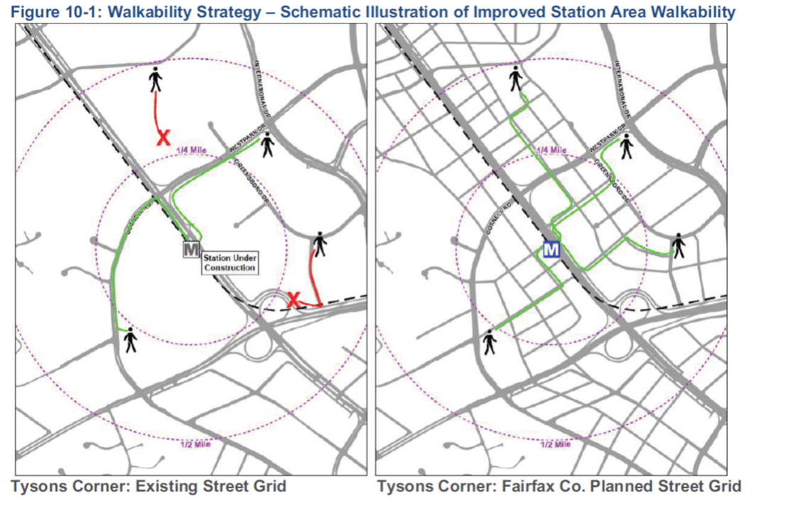
It is well known that the form and intensity of development in and near rail transit station areas can have measurable impacts on transit ridership.  For these reasons, transit oriented developments (TOD) generally feature high-density construction, mixed land uses, and bike and pedestrian friendly infrastructure.  But not all TODs are alike, and the effects of TOD on transit ridership are likely to depend on how well the station is connected both locally and regionally, whether the station is near the center or end of a transit corridor, and what kinds of jobs and household are located nearby.

To explore how different forms of development might impact ridership on the Washington Metrorail system, Dr. Hiroyuki Iseki and Dr. Chao Liu assisted Metro to develop a direct ridership model (DRM), called Metro’s Land Use Ridership Model.  A DRM uses statistical techniques to quantify the relationship between entries and exits at rail stations and land uses nearby.  This model can then be used to estimate the number of passengers who will access the station, by waking or biking, as a result of changes in land use features, transit service characteristics, and socio-demographics within the walkshed of any given station.

The direct ridership model includes a large number of variables for each station, including the density, diversity, and design of local environment; transit service and connectivity; job accessibility by auto and transit; walk score; the availability of parking; the demographics of nearby residents; the number and types of jobs nearby, and more.  The model was estimated for the AM Peak, Midday, PM Peak, and Evening travel periods.  The AM Peak model is best suited for estimating the increase in morning boardings that would result from locating more households near the station; the PM Peak model is best suited for estimating the increase in afternoon boardings that would result from locating more jobs near the station.

Pedicted AM Peak Entries per New HH

Map 1. Predicted AM Peak Entries per New Household

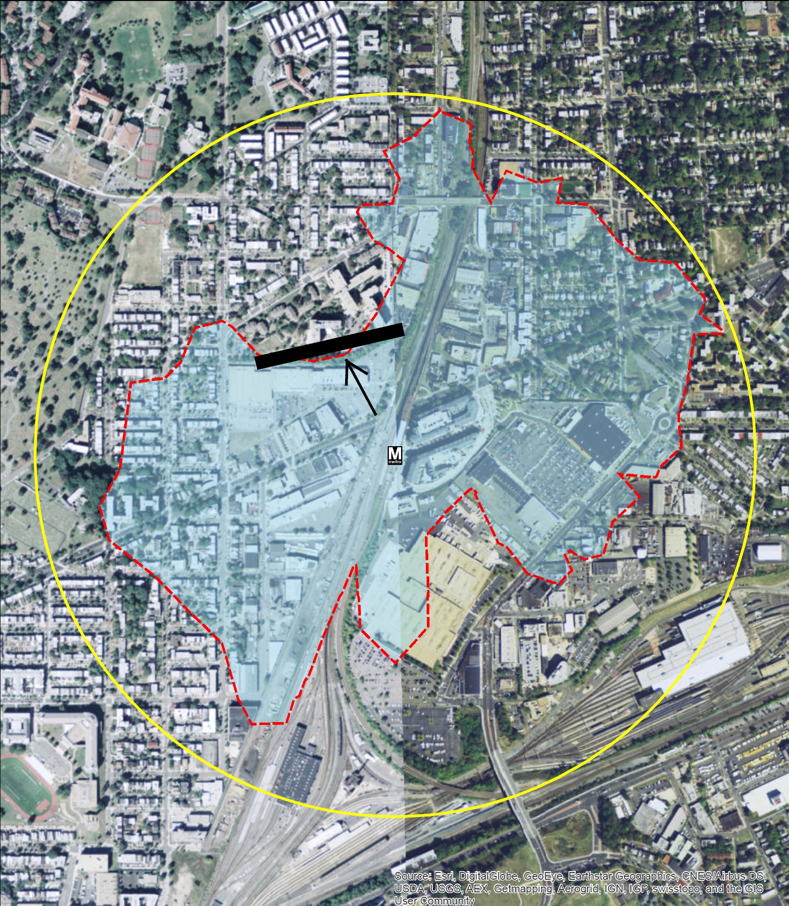
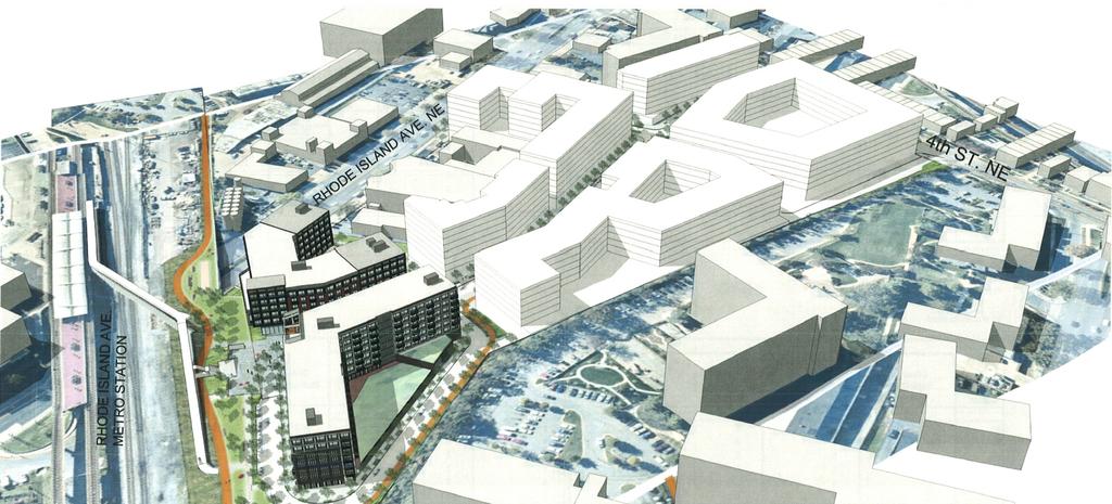
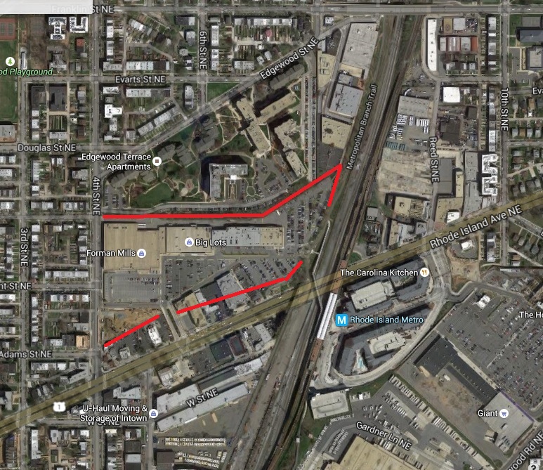
The impact of adding jobs and households near stations varies by station area.  Map 1 above, for example, shows the estimated entries per new household in the morning peak—that is, how many additional boardings would occur in the AM peak if one additional household was located in the walkshed of the station.  Stations shown by red dots gain more than 0.57 boardings per day, for each new household in the walk shed, while stations shown with green dots gain only about 0.20 boardings per day. As a concrete example, Rhode Island Row is a 274-unit, mixed-use, TOD project built on a WMATA site.  Situated along the busy Red Line, the project has long been considered as a prime location for new housing development.  According to the DRM model, adding 274 new households near the Rhode Island station would increase boardings by 144 passengers in the AM peak.  The same development at the New Carrollton station, however, would have added only 52 passengers.  This is because, compared to New Carrollton, the Rhode Island Avenue station has better job accessibility and more frequent transit service, and is thus likely to stimulate more transit ridership. Read more…

Rhode Island Avenue – an Opportunity to Truly Connect Communities (and Bolster WMATA Finances)

July 23rd, 2015 5 comments

Low-cost planning maneuvers could increase transit-accessibility for one thousand households and save the region $1.3 million per year!

We recently covered an exciting development project in Northeast D.C., one that will create housing and jobs right next to the Rhode Island Avenue Metro station. Because the site is located within the station’s half-mile walk shed, all those new residents, employees and shoppers are likely Metro customers, whose fares will help improve the system for everyone.

But is that the end of the story?

In our analysis of station walk sheds — the area within a half-mile walk of the station — we discovered that the Rhode Island Avenue walk shed is constrained by physical barriers that force pedestrians to make lengthy detours. The most notable of these is a retaining wall along the northern edge of the redevelopment site (currently the Rhode Island Center shopping mall):

RIExisting+Barrier

Current walk shed of Rhode Island Ave station, with illustration of the retaining wall.

For Edgewood residents living immediately to the north, walking to the Rhode Island Avenue Metro requires a detour around the barrier that inflates the walking distance by up to half a mile – making the total walking distance a full mile or more. While some choose to make the long hike to the station, we know that people are significantly more likely to use Metro if the station is within the half-mile walk shed.

This led us to ask: What if we make a pedestrian connection through that wall part of the large-scale redevelopment? Read more…

All Aboard! Metro Welcomes New Development Planned at Rhode Island Avenue

July 22nd, 2015 Comments off

A redevelopment project planned for Rhode Island Avenue Metro station, one of the largest such projects in the District, could bring $2.3M per year in new fare revenue for Metrorail.

A venture led by MRP Realty is proposing a mega project near the Rhode Island Avenue metro station, which when constructed would add over 1,500 residential units and retail to that transit-oriented community.  That’s fantastic news for the District, which needs household growth to resolve its structural fiscal deficit, and also for Metro and the region, which benefits each time we add transit-oriented development that drives ridership and revenue.

Image Courtesy MRP Realty

Image Courtesy MRP Realty

At Metro we find this especially exciting because it is yet another example of how changes in development are in part fueling a ridership resurgence.  Our Land Use-Ridership model conservatively suggests that this project will yield an additional 3,200 rail entries per day systemwide, generating rail fare revenues of around $2.3 million per year. Whether this ridership actually materializes – or is even higher – depends on the developer building good pedestrian connections to the Metro station and the Met Branch Trail.

In addition, this project could be a good opportunity to create a pedestrian connection between the station and the neighborhoods to the north, where potential Metrorail riders are blocked from the station’s “walk shed” today.  The current conditions include a challenging combination of grade changes and physical barriers behind the shopping mall, creating pedestrian barriers outlined in red below. The key question will be whether the development will help fix the barrier along the north side of the site, which would only increase the ridership- and revenue-generating potential of this project.

Image Courtesy Google Maps

Pedestrian barriers in red. Image courtesy Google Maps

The property tax benefits of the project all accrue to the District, and the increased revenue to WMATA doesn’t come for free – the system will need to handle the additional passengers and incur additional operating costs and potential wear and tear on the system.  Right now there isn’t a defined mechanism for WMATA to recoup the value of real estate property taxes to fund capital renewal or expansion.  But certainly anything that contributes to the operating health of the transit agency through increased ridership and revenues goes a long way to promoting financial stability for the Authority, as well as lowering the operating subsidy burden it requires to run the system.

Vast Majority of New Office in Region Near Metro

April 22nd, 2015 2 comments

Approximately 86% of the region’s new office construction is occurring within one-quarter mile of Metrorail stations, 93% within the half-mile walk sheds.

A Washington Post article from October 2013 made a staggering assertion:  That 84% of new office construction in the region is occurring within one quarter mile of a Metrorail station, according to Jones Lang LaSalle and other data sources.  As we continue to dig into walk sheds and the land-use/transportation connection, we thought we would revisit this assertion and update it for 2015.

Since the Post article was written, we have begun to plan for near-term capacity constraints that might result from increased ridership caused by new households and jobs near Metro.  And part of this planning is gaining insight as to where and when new housing units and office space may come online through real estate industry data sources.   Through this research, we are able to update the statistic above:

86% of new office construction in the Washington region is occurring within one-quarter mile of a Metrorail station. 

UnderConstructionMap-01

New office currently under construction in the Washington region. All but four projects are within a half-mile of Metrorail.  Data from Jones, Lang, LaSalle.

Read more…

Going Up – Why the Construction Pipeline Means Higher Metrorail Ridership (Part One)

April 6th, 2015 5 comments

We’ve claimed that Transit-Oriented Development (TOD) projects in this region will be critical to Metrorail ridership and sustainability. The good news is that our assertions are grounded in statistically rigorous evaluations of TOD’s impact on Metrorail ridership – here’s how. (Part one of a two-part series).

While factors like fares, service, and the economy can certainly explain some changes in Metrorail ridership, one absolutely fundamental explanation of differences in walk ridership between stations is development.  Why does a station like Landover see only 50 riders arrive on foot each morning, and a station like Crystal City see over 3,000?  Why does a station like Bethesda see balanced ridership in all directions, where a station like Suitland is almost entirely one-direction? Development. Even a simple scatter plot shows that households alone near the station explain 70% of AM Peak walk ridership!

Planning studies have long-posited that transit-oriented development is such a key part of driving ridership, and if that is the case, then TOD is vitally important to Metro’s long-term financial sustainability.  We at Metro needed to quantify this link in a more sophisticated and system-specific way, and so we created a way to calculate the impact of land use changes (household growth, employment growth, new development) on ridership and revenue.

What is a Land Use-Ridership Model? To help, Metro’s Planning Office has built a Land Use-Ridership Model that will predict changes in Metrorail ridership as a result of occupancy changes (growth, decline, new development, etc.) in the station area.  This model helps us get very specific when it comes to modeling the impact of land use changes on ridership and revenue.  It helps us answer questions such as: “When developers build a new apartment building next to a Metrorail station how much ridership and revenue will Metro realize?”, and; “If an office building is proposed at one of four Metrorail stations, which location maximizes ridership and revenue without exacerbating core capacity constraints?”

LURM general flow

This tool is based on a rigorous understanding of the link between land use and the rail ridership we see today and is built on “direct ridership modeling techniques” found in academia.  It also focuses specifically on “walk ridership” (which constitutes 38% and 78% of our AM and PM peak ridership), since rides related to bus transfers, parking, and other access modes are less related to adjacent land uses.

To build this, we analyzed the actual quantity of walkable land uses from each station area, assembled detailed information about land uses and densities in those areas (households, jobs by industry type), and also controlled for other, non-land-use factors that shape ridership – like network accessibility. In all we worked through over 200 independent variables in our modeling and also brought in experts from the University of Maryland’s Center for Smart Growth, professors Hiroyuki Iseki, Ph.D. and Chao Liu, Ph.D., to bring their analytical and statistical firepower to the fray.

How We Built It. We defined the walkable area as a half-mile walk along a road network, so we account for barriers like highways and fences.  The half-mile cutoff is a bit longer than the median actual walk distance reported by our riders in the 2012 Metrorail Passenger Survey. For each station and its walk shed, we tested the following kinds of factors: Read more…

Solving the Region’s Congestion Woes – One Step at a Time

March 17th, 2014 1 comment

One solution to the region’s crippling congestion could be right under our feet – literally.

This post is part one of a three-part series.

Illustration of possible walkability improvements that could occur in/around Tysons Corner. From Regional Transit System Plan


The region is abuzz with $220B of planned new transportation investments – the Purple Line, HOT Lanes, new streetcar lines, and additional roadways. Though there is not one dollar currently pledged to add capacity to Metro, these other investments may help the region chart a course away from leading the country in congestion (pdf).

However, for a quarter trillion dollars, one would expect that collectively these projects would have significant impacts on the region’s congestion. While there are some benefits – vehicle miles traveled (VMT) per capita are expected to decline and  transit mode share may increase by one percent – overall increases in VMT are expected to outpace road construction, leading to a 38% increase in the number of lane miles of congestion (pdf). But is there another way to get more bang for our buck?

Make station areas walkable. Every one of them. Now.

Read more…

Transit Supportive Densities – What Do They Look Like?

October 5th, 2016 3 comments

A visual of what transit supportive densities look like for different transit modes

Recently, GreaterGreaterWashington blogged about density, using Google maps 3D images to show what different densities look like in Washington, DC. Visuals like these are so important because most people hear “density”, think “Manhattan” and can’t say “no” quickly enough. Last fall, we completed work as part of ConnectGreaterWashington and the Transit Corridor Expansion Guidelines that illustrated the differences in desired employment and/or residential densities within a transit walkshed by each mode.

As is typical for planning projects, especially when expanding transit service along new corridors, density is discussed and jobs and/or households per acre targets are tossed around. But most people (full disclosure, that includes me) do not know what 4 households per acre or 150 jobs per acre looks like. It is especially important because a residential target of 12 households per acre within a half-mile of a suburban Metrorail station, for example, does not mean that every residential dwelling needs to meet that target. Instead, within the half-mile radius, the overall density should be 12 or more households per acre. That gives plenty of room to have less dense single family homes (on small lots) and more dense high rise apartments with studios and one-bedrooms.

Below are example stations for each mode and the employment and/or residential density targets, along with images of the different building types that combine to meet or exceed the targets. We’d appreciate your feedback on whether they make sense to you and if they would resonate with the general public.

Metrorail (Suburban) Densities
Note, because of the variability in density across the Metrorail system, we created two types of Metrorail stations to estimate densities.

Employment Density - Metrorail Suburban

Read more…

Introducing S.W.A.R.M. – Another Tool For Your TOD Toolkit

August 11th, 2016 1 comment

A new tool helps estimate ridership and revenue from transit-oriented development projects near Metrorail stations.  Download it for yourself!

Waterfront Sta aerial

For months we have been detailing our work that quantifies the relationship between land use and rail ridership. This is important because Metrorail has been experiencing large changes in ridership, and we were interesting interested in understanding why certain station areas – like Navy Yard and NoMa – were showing ridership gains while the system as a whole is experiencing losses in the long arc of ridership growth.

To get to the bottom of this, we worked with researchers from the University of Maryland’s National Center for Smart Growth to analyze how walk ridership at a Metrorail station relates to its surrounding land uses, and create a tool that accurately estimates the likely change in ridership from changes in land uses. This tool, the Station Walk Area Ridership Model (or S.W.A.R.M., for short), helps us estimate the potential impacts of land use changes – new households, new jobs (by type of employment!), and even changes in the station’s walkshed – on ridership and revenue to Metrorail. Read more…

Metro Planners Share Innovations in Transit Delay Calculation at TRB

February 25th, 2016 5 comments

Adopted from queueing theory, this new method of assessing delay on transit systems with tap-in-tap-out fare systems accounts for natural variations in customer behavior.

As you may have heard, Metro is testing out a new customer-oriented travel time performance indicator. Many departments here at Metro have been collaborating on this effort. Metro has decided to initially pilot a measure where we define delay as anything greater than train run time, a headway, and the 1-3 minutes it takes to travel from the faregates to the platform. However, as we began our research into customer travel time, we got to asking the question, “How do we define customer delay on the rail system?”

tortoise_and_hare

As we quickly learned when digging into the data, on good days with no delay on the rail system, there is still a wide variety of “normal” customer travel times. Some variation in travel time is because customers arrive at random to the origin station, but all leave the destination station more or less at once.  Additional factors influencing this variation include walking speed, use of elevator vs. stairs, escalator or elevator outages, and customers with suitcases and strollers.

We could start with a threshold for “on time” but by definition we know on a good day there were no rail delays so we would be counting slower customers as “late.”

Additionally, on a day when we know a disruption has occurred, we might count very quick customers as “on time” when in fact we know that everyone experienced some delay.

So we set to determine a method for calculating delay that accommodated for the natural variation in customer speeds.  These travel time curves started reminding me of delay calculations from queueing theory from grad school. Read more…

Categories: Engage Tags: , , , ,

Buses and Trains and Vans, Oh My! – How Metro’s Operating Budget Pays for Service

February 22nd, 2016 Comments off

Ever wondered how much service your transit fares pay for, or how your tax dollars are spent? Read all about the intricacies of Metro’s operating budget!

How to Get Involved

Do you want a say in Metro’s budget? A public comment period on the FY17 budget (both capital and operating) is now open, and it will end 9am on Monday, February 29th. Please submit your feedback the following ways:

  • Take an online survey at wmata.com/budget.
  • Email your written comments at writtentestimony@wmata.com.
  • Attend a formal public hearing at Metro Headquarters, 600 5th St NW, Washington DC, on Monday, February 22. An Open House will begin at 6 p.m. and the Public Hearing will begin at 6:30 p.m.

Additional communications and outreach efforts will continue over the next few weeks, including notification to local stakeholders and community based organizations; signs posted in Metrorail stations, Metrobuses, and MetroAccess vehicles; surveys sent to a statistical sample of registered SmarTrip® cardholders; ads in local English and non-English publications; and other media efforts including advisories, press releases and social media. The online survey and legal notice will also be available in seven languages.

Staff will summarize and present community feedback to the Board in March, and the Board will use that feedback as a vital input in budget negotiations before adopting a final budget in April.

So be on the lookout for opportunities to learn more about next year’s budgets and to have your voice and ideas heard!

Operating Budget Basics

This is the last of three related posts that attempt to simplify the complex world of transit system funding, and to give Metro’s riders and regional residents some tools to engage in budget discussions. The first post focused on the Capital Funding Agreement (CFA, PDF) and the Capital Improvement Program (CIP, PDF), which together establish a six-year framework for funding projects that improve the Metro System’s safety, reliability, and performance. The second post focused on the annual capital budget, and this post discusses the annual operating budget.

If you walk away from this post with nothing else, the graphic below summarizes the most important points about Metro’s operating costs and who ends up paying the bills:

Metro Ops Funding Scale

The capital budget pays for projects where Metro is building something or buying equipment: purchasing new buses and rail cars, building a new station entrance, improving a bus stop, or buying new parts for escalators. The operating budget pays the costs (salaries, fuel, utilities) of running the system on a daily basis, including all the customer services highlighted in the graphic below:

MetroSystem_v2

Metro’s costs of doing business have been rising steadily every year, but unfortunately Metro’s revenues have either grown at a slower pace or been flat. This dynamic tension has created an intense need to fill the gap between costs and revenues, but that need runs up against an opposing pressure not to reduce service levels, increase fares, or impose higher costs on the counties and cities Metro serves (the Compact jurisdictions). Metro staff have developed a draft FY17 budget that appears to balance these conflicting forces, and we are currently running a public engagement process to gather feedback on that recommended budget.

Read more…