
Metro Planners Share Innovations in Transit Delay Calculation at TRB
Adopted from queueing theory, this new method of assessing delay on transit systems with tap-in-tap-out fare systems accounts for natural variations in customer behavior.
As you may have heard, Metro is testing out a new customer-oriented travel time performance indicator. Many departments here at Metro have been collaborating on this effort. Metro has decided to initially pilot a measure where we define delay as anything greater than train run time, a headway, and the 1-3 minutes it takes to travel from the faregates to the platform. However, as we began our research into customer travel time, we got to asking the question, “How do we define customer delay on the rail system?”
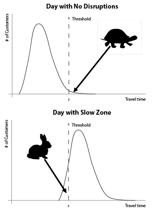
As we quickly learned when digging into the data, on good days with no delay on the rail system, there is still a wide variety of “normal” customer travel times. Some variation in travel time is because customers arrive at random to the origin station, but all leave the destination station more or less at once. Additional factors influencing this variation include walking speed, use of elevator vs. stairs, escalator or elevator outages, and customers with suitcases and strollers.
We could start with a threshold for “on time” but by definition we know on a good day there were no rail delays so we would be counting slower customers as “late.”
Additionally, on a day when we know a disruption has occurred, we might count very quick customers as “on time” when in fact we know that everyone experienced some delay.
So we set to determine a method for calculating delay that accommodated for the natural variation in customer speeds. These travel time curves started reminding me of delay calculations from queueing theory from grad school.
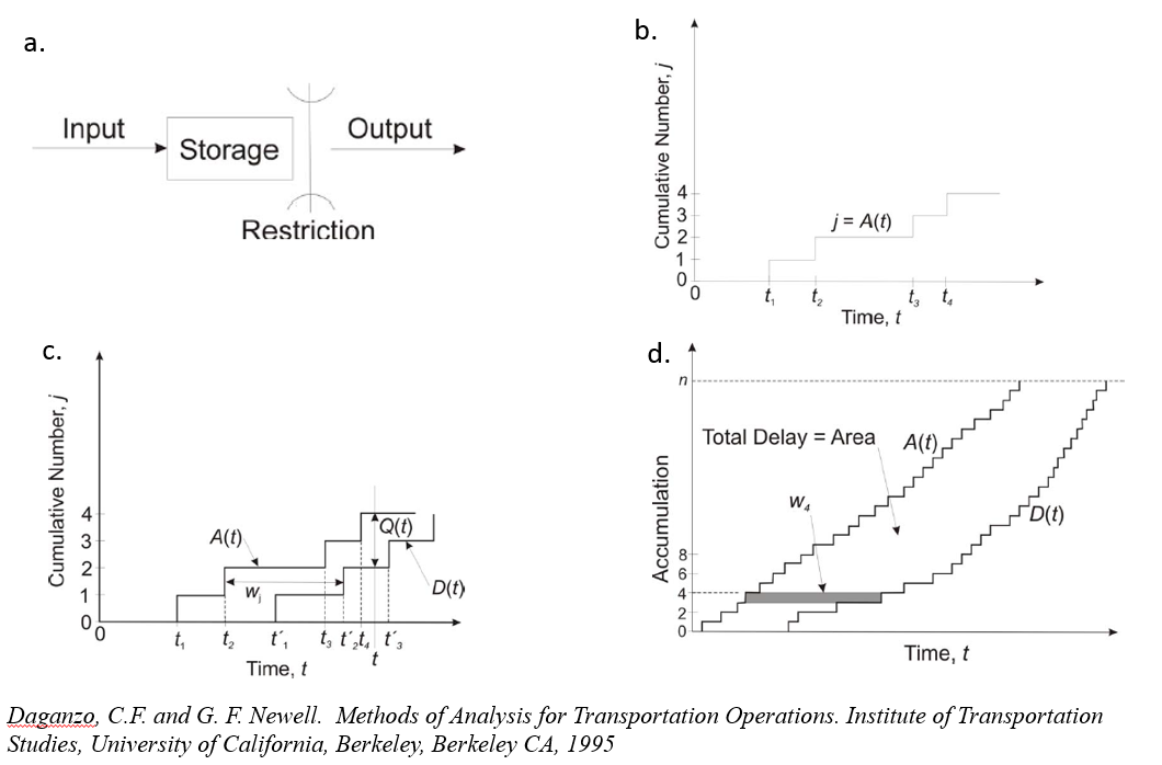
Illustrations from Daganzo/Newell. Click for original paper, PDF.
Basically, you have some system where things go in, they get stored and then they come out the other end (a). Like riding Metro: you enter, sit on a train and then exit. If you take the entry times and plot them (b) and then plot the exit times (c), you end up with a set of curves, and the results are pretty clear (d):
- the area between the curves is the total delay of the system,
- the delay to any individual is the width between the curves at the point that represents that customer
- the total number of customers delayed is the high of the area where the curves depart
- In the example above, all were delayed
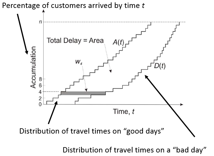
We were able to adapt this pretty quickly to Metrorail ridership data, as in the graphic below.
This is the crux of the work I presented at TRB in January, as Wendy previewed last month. In the paper we submitted, we provided an example of using this method to assess the impacts of trackwork on customer travel times. The paper is currently being reviewed for publication so we don’t want to put any spoilers online. Once published, we will let you know.
In the short term, Metro is evaluating a variety of methods for assessing delay for inclusion in the new performance metric. How do you think we should measure delay?
Note: neither the text nor the graphics included here are part of the original TRB submission.
Update, 2/25/2016: The paper has been accepted for publication in the Transportation Research Record, Journal of the Transportation Research Board.

Interesting stuff – can’t wait to see the full report. In the mean time and somewhat related, is Metro looking at any mechanisms of taking into account “the train is overcrowded and people can’t get on” or “there’s so many people on this train that we’re getting delayed by the amount of time it takes people to get on and off”?
@Anthony
Thanks for the comment, Anthony. At the Metro Hack Night on Tuesday we discussed the possibility of adding to our data feeds some estimation of train or car crowding. It’s a great idea and we are definitely looking into it.
I think a decent metric would be to look at all station exits within a hour (by station, by line, by system) and calculate what percentage of the trips were completed within “n” minutes, where “n” is the TripPlanner travel time + max stated headway time + 1-3 minutes for within-station travel time. The delay of a median rider (and other percentile riders) could be calculated.
That is the minimum customers expectation. The metric should be set at something like 95% to account for the tortoises. As a rider, I don’t really care how well the trains move. I care how well the system moves people.
@Anthony
I would assume that since this data is based on faregate entry/exit times, it would actually take that into account because it’s tracking the people rather than the trains.
@Andrew
Good point, and the initial metric we will report will indeed define “n” minutes as a full headway, scheduled train travel time, and 1-3 minutes of walk time to the faregates. This post (and TRB paper) was one alternative to this method that we explored.
You’re right – this metric will be focused squarely on the passenger experience, not the movement of trains.