Transit Supportive Densities - What Do They Look Like?
A visual of what transit supportive densities look like for different transit modes
Recently, GreaterGreaterWashington blogged about density, using Google maps 3D images to show what different densities look like in Washington, DC. Visuals like these are so important because most people hear “density”, think “Manhattan” and can’t say “no” quickly enough. Last fall, we completed work as part of ConnectGreaterWashington and the Transit Corridor Expansion Guidelines that illustrated the differences in desired employment and/or residential densities within a transit walkshed by each mode.
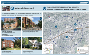
As is typical for planning projects, especially when expanding transit service along new corridors, density is discussed and jobs and/or households per acre targets are tossed around. But most people (full disclosure, that includes me) do not know what 4 households per acre or 150 jobs per acre looks like. It is especially important because a residential target of 12 households per acre within a half-mile of a suburban Metrorail station, for example, does not mean that every residential dwelling needs to meet that target. Instead, within the half-mile radius, the overall density should be 12 or more households per acre. That gives plenty of room to have less dense single family homes (on small lots) and more dense high rise apartments with studios and one-bedrooms.
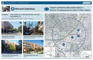
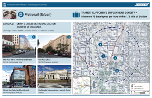
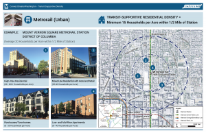
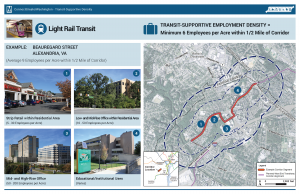
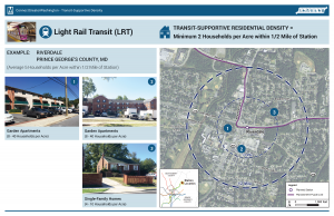
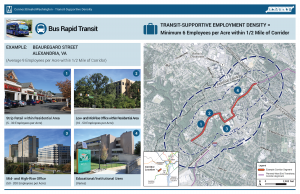
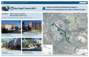
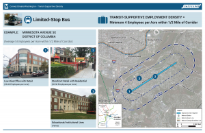
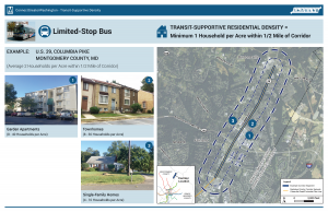
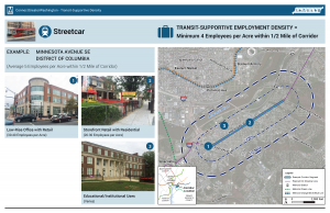
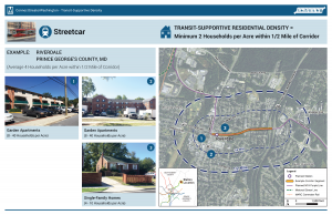
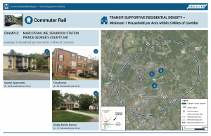
Below are example stations for each mode and the employment and/or residential density targets, along with images of the different building types that combine to meet or exceed the targets. We’d appreciate your feedback on whether they make sense to you and if they would resonate with the general public.
Metrorail (Suburban) Densities
Note, because of the variability in density across the Metrorail system, we created two types of Metrorail stations to estimate densities.
Metrorail (Urban) Densities
Light Rail Transit (LRT) Densities
Bus Rapid Transit (BRT) Densities
Limited Stop Bus Densities
Streetcar Densities
Commuter Rail Densities
Note that we only measured residential densities for commuter rail stations as very few have much if any employment, unless it is a terminus.

This is indeed helpful for visualizing the variety of neighborhood types and densities. Thank you.
One thing: Are there supposed to be more images? There are two different thumbnail images for each density type (except for the Commuter Rail section). However, different thumbnails link to the same image. I can’t find a way to see the larger version of many of the thumbnails.
@Milan Glad to hear that these are helpful. Also, thanks for noticing the error. I’ve gone through and fixed all the images so that they refer to a media file. Strangely, even though they were the correct images, they were pointing to the same URL.
2 comments - first, what about other uses, such as night life and planned special events? Second, it would be helpful to compare these residential or employee densities against ridership totals, rush hour vs non rush boarding and departure stats. Whether a station is a net trip originator or net attractor, or net balanced, would speak to the quality of jobs housing balance or imbalance. The type of density is important too, not just a single isolated measure thereof.
In short, these are interesting and valuable but they invite a lot of questions that they don’t answer, and suggest by implication that simple density measures are sufficient to assess transit ridership. Their potential to educate on key concepts is very high and I applaud the effort.