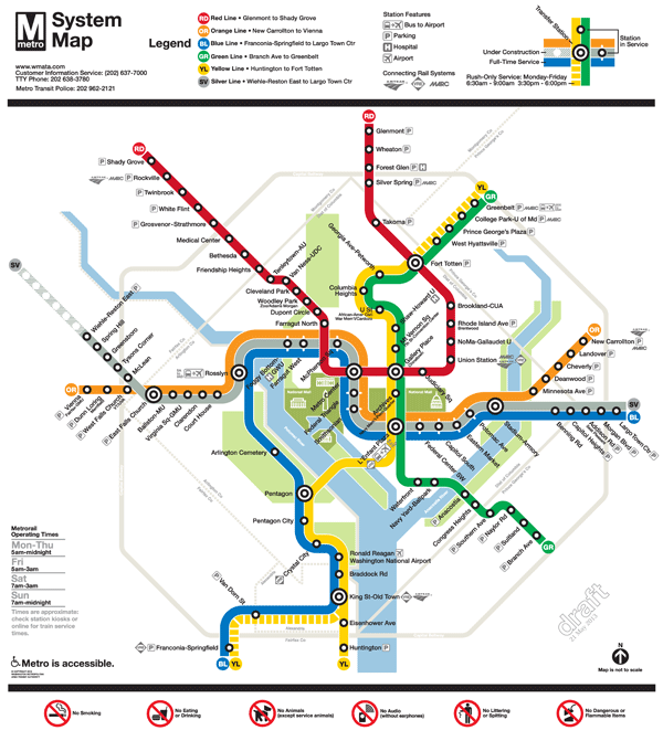
Placed a darkened Silver Line between the Blue and Orange lines; and
Lightened the Beltway and jurisdiction borders.
We are now down to selecting the icon to represent a three-line station. When we asked for feedback in the last round, some of you said that you didn’t like the idea of a completely new, third type of icon on the map (i.e., the capsule). Others said you liked the capsule, but it was too thin. It was recommended that we try to make the capsule the same width as the current station dot, but stretch it into an oval.
After reviewing your comments, Lance Wyman went back to his drawing board and came up with these two options:
Map #1: Retains the current station dot with thin, white extenders
Map #2: Stretches the current station dot into an oval
Take a look at these final versions and let us know which one you prefer. All comments welcome! Please provide feedback in the comments section below or on our MindMixer site. Thank you for your input.
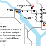
Metro is focused on solving one of the region’s most pressing mobility issues – increasing the capacity of the system to handle more trips through the core (defined below) of the Metrorail system. While Metro’s planning staff has been conducting technical analyses and searching for the best solutions for some time, we also asked for ideas for increasing core capacity from you as well as discussed the potential for new lines, new connections and expanding to all 8-car trains during peak periods.
There are also operational strategies Metro could employ to provide more trips on the rail system without expanding capacity. Among the various options is to promote and encourage more “reverse commuting” where commuters travel opposite the peak travel direction in seats that would otherwise be empty. Data show that reverse commuting has already increased over the past 10 years and many speculate that it will only increase further as the region builds more suburban town centers near Metro and as Metro begins operations on the Silver Line later this year. Read more…
Metro regularly exports all of the data from our Trip Planner into a separate GTFS file which we share with COG/TPB for updating regional transit schedules in their travel demand model. We are working to make this file publicly available. In the mean time, we were able to share it with STLTransit who kindly created the updated fully regional visualization of Washington area transit, embedded above.
As with last time, this visualization is best viewed full-screen and in HD mode.
Some interesting things to note:
Frederick County TransIT service use of timed transfers (or pulse points) at transit centers is very noticeable.
MARC and VRE commuter rail are illustrated as white tadpoles, not to be confused with the colored tadpoles representing Metrorail service.
The expansiveness of the commuter rail network becomes very apparent, as those white tadpoles shoot towards the edges of the map to the northeast, northwest and south.
STLTransit apparently cranks out one or two visualizations of a city or regional transit system every few days. Check out their YouTube channel and subscribe.
A few weeks ago we posted a video visualization of one day’s worth of Metrorail, Metrobus and Circulator created by STLTransit. Upon first seeing this video, contacted them to thank them for their work and also asked whether the Metrorail could be made to stand out more in the video, to differentiate it from Metrobus and Circulator. This morning, I received a link the updated video embedded below, a great improvement. Metrorail trains are now shown as “tadpoles” instead of dots, which allows them to be more visible and better represents the carrying capacity of a train (800+ people) versus a bus (60+). Check it out.
70% of the participants felt that expanded investment in public transit is key to continued economic growth in the Washington region.
Over the past decade there have been many significant efforts to promote regionalism in the National Capital region.Endeavors including Reality Check, COG’s Region Forward and the work of the 2030 group, have envisioned a region that is more accessible, prosperous, sustainable and livable.
Building on these plans and visions, on November 13th, ULI Washington hosted “Regional Leadership: Vision to Action,” an invitation-only event for the region’s leaders in business, land-use and real estate. The purpose of the event was to examine regional strategies for improving economic development and quality of life in the National Capital Region. A report summarizing the content of the event is being developed by ULI Washington and will be published in December 2012 at www.washington.uli.org. Read more…
The Washington, D.C. MSA added 275,000 households and 295,000 jobs between 2004 and 2010. Of that growth, 6.4% of these households and 13.8% of these jobs located within one-half mile of suburban and one quarter-mile of urban Metro station[1]. This is despite the fact that the land area around these Metro stations comprised only 0.5% of the MSA land area, and suggests that TOD locations in the region are capturing 2.76 times their “fair share” of growth when normalizing for land area.
Household growth patterns from 2000 to 2010 illustrate that the number of households around almost all of the Metro stations grew, and Metro-proximate households grew at a faster rate than the MSA as a whole. While the Washington D.C. MSA grew by 1.4% from 2000 to 2010, the number of households around Metro stations grew by 4.8% annually.
Employment growth patterns show that employment growth in suburban areas of the MSA has been most pronounced around Metro stations, with office-using employment demonstrating a particularly strong inclination to locate near Metro. From 2000-2010, 12% of MSA office employment growth located near transit, and three sectors:Computer systems design and related services; Management, Scientific and Technical Consulting Services; and Other Professional, Scientific and Technical Services represented 41% of office-using employment growth in metro station areas.
This capture rate is a sharp departure from historical growth trends in the region. Until the 2000s, growth in households and employment had emanated due west from the epicenter of Washington, D.C., and some would argue that outside of growth adjacent to Metro Stations in the historical path of growth – which could arguably include the Rosslyn-Ballston corridor – growth was largely agnostic to transit proximity.
What is driving these shifts? At least two factors:
Regional and national trends indicate that much of the housing growth through 2030 will come from younger, smaller households that are increasingly choosing higher density homes in transit-accessible, infill locations with easy access to employment and entertainment. Over 67% of the household growth during the 1985-2000 time period had been comprised of one- and two-person households, and the Census projects that upwards of 85% of the future household growth will be comprised of these “smaller” household types. These households have a built-in demand for walkable, urbane environs that offer multiple opportunities for unplanned human interaction and what Bob Putnam calls “social capital”. Almost half of all housing consumers express a desire to live in a walkable community, as evidenced by data compiled by the National Association of REALTORS ® in 2004 and again in 2011.
Employers seeking competitive advantages in an increasingly-tight market for high-quality labor are returning to urban locations – where their employees want to be – in order to increase retention and attraction prospects. In addition, research conducted by the Brookings Institution confirms that urbane, walkable communities exhibit calculable and significant value premiums that drive net operating income and asset-level value for developers and investors.
[1] Urban Metro stations include all D.C stations, plus the Rosslyn-Ballston Corridor, Alexandria, and Braddock Road and Pentagon City. All other Metro stations are classified as suburban.
Metrorail congestion in 2040 with and without all eight-car trains.
Metro is planning to alleviate these crowded trains and platforms by investigating the potential of running 100% eight-car trains, among other options. This option would require not only planning, but at the very least purchasing more cars, finding places to store and service these cars, and upgrading our power network to power the vehicles. Going “All 8s” is a major capital investment, which includes powerupgrades, vehiclepurchases and storagefacilities. Additional operating (recurring) costs are also associated with running all 8-car trains, including increased car maintenance staff and additional power.
If we can reach this goal, each of the current six rail lines entering the DC core in the peak direction could handle a huge volume — upwards of 20,000 passengers per hour, up from between 14,000 to 17,000 depending on the line. Even with the growth expected through 2040 this would mean much less severe crowding than would occur without those additional cars. The graphic on the right, above, illustrates the additional system throughput provided by running 100% eight-car trains.
To read more about Metro’s future and join the conversation, visit www.wmata.com/momentum.
This great video shows one day’s worth of Metrorail, Metrobus and DC Circulator moving across the region.Metrobus and Circulator are both shown as white dots, while the Metrorail dots are keyed to line color.
The video should be viewed in full screen mode in order to really see Metrorail.
This video was created using the data from the Metro GTFS data feed by STLTransit, who have made similar videos for a variety of other cities.
Inset of graphic showing top ten stations by absolute ridership growth, 2008 to 2012. Station #8, Morgan Boulevard, is off the map. Click the image above to download the full graphic in PDF.
While rail system ridership is up nearly 2% over 2008 levels, this growth in ridership is not spread evenly across the Metrorail service area. This map illustrates the locations of the stations in the top-ten for absolute ridership growth, 2008 to 2012.
In general, the Green Line corridor in DC is responsible for much of the station ridership increases.
Much of the ridership growth illustrated on the map can be attributed to redevelopment around some of our more recently opened stations, such as Georgia Ave-Petworth, Columbia Heights, Morgan Boulevard (off of image above), and NoMa-Gallaudet.
Additionally, redevelopment near Foggy Bottom-GWU, Waterfront and Shaw-Howard U has contributed to increased ridership at those stations.
The increase at Pentagon could be due to increased express bus and commuter bus activity, with federal workers heading to new BRAC-related work sites along the I-95/395 corridor.
Photo courtesy Josh Bancroft (click for original context)
Every day, Metro gathers a vast amount of information on how customers use the system – where and when they pass through turnstiles and board buses, how they pay, and more. There’s much to be learned from this data, and many in the pasthavedoneso. We’ve heard through MindMixer, Metro’s new online community engagement site, that more detailed ridership statistics would be useful. So in the spirit of open data and collaboration, here’s a data download of rail station-to-station passenger counts, by time period, by day of the week, for May 2012.
This data can answer many questions, such as: Where do passengers entering at one station go? Where do late-night riders enter the system? How does Saturday ridership differ from Sunday? Which stations are most commuter-oriented, and which are most lively at midday and evening hours?
What does this data tell you? Do you see any patterns? Feel free to post a link in the comments!
What other data that would help answer additional questions?
Technical notes about this data:
The data show average ridership, averaged across all days in May 2012, excluding Memorial Day. (We typically use May as an “average” month, since it falls in the middle of seasonal swings, is relatively unaffected by extreme weather, etc.)
Time period shows the time the passenger entered (not the time they exited).
AM Peak = opening to 9:30am
Midday = 9:30am to 3:00pm
PM Peak = 3:00pm to 7:00pm
Evening = 7:00pm to midnight
Late-Night Peak = Friday and Saturday nights only, midnight to closing


Recent Comments