Chart of the Week: 5-Year Ridership Change By Station
November 5th, 2012

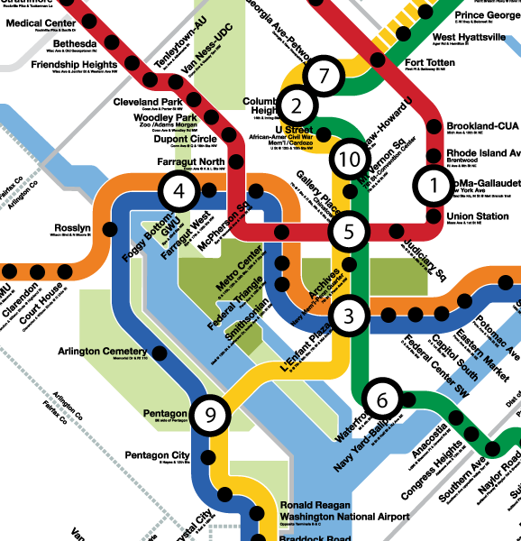
Inset of graphic showing top ten stations by absolute ridership growth, 2008 to 2012. Station #8, Morgan Boulevard, is off the map. Click the image above to download the full graphic in PDF.
While rail system ridership is up nearly 2% over 2008 levels, this growth in ridership is not spread evenly across the Metrorail service area. This map illustrates the locations of the stations in the top-ten for absolute ridership growth, 2008 to 2012.
- In general, the Green Line corridor in DC is responsible for much of the station ridership increases.
- Much of the ridership growth illustrated on the map can be attributed to redevelopment around some of our more recently opened stations, such as Georgia Ave-Petworth, Columbia Heights, Morgan Boulevard (off of image above), and NoMa-Gallaudet.
- Additionally, redevelopment near Foggy Bottom-GWU, Waterfront and Shaw-Howard U has contributed to increased ridership at those stations.
- The increase at Pentagon could be due to increased express bus and commuter bus activity, with federal workers heading to new BRAC-related work sites along the I-95/395 corridor.
For a full version of this graphic, download the PDF: Top Ten Stations for Ridership Growth, 2008 to 2012 (1 Mb)


Someone needs to connect this information back to WMATA. Since new “commuter” changes went into effect, the Green Line (I commute from Greenbelt to Navy Yard) has gotten noticeably slower, with green and yellow trains frequently pausing between stops until the next platform clears. That used to be comparatively uncommon. So the line with the most increases got the worst end of that deal.
When you’ve got people commuting from Shaw and Columbia Heights and Petworth to the Pentagon (which is almost certainly happening in this model), maybe it’s time to think about building a pocket track at Fort Totten, or better yet, procuring enough rolling stock to run the Yellow Line to Greenbelt at all times.
I’m surprised that Waterfront made the list but Navy Yard did not.
And what about showing the top 10 stations for percentage ridership growth over the last five years? What was the reasoning for showing raw number growth?