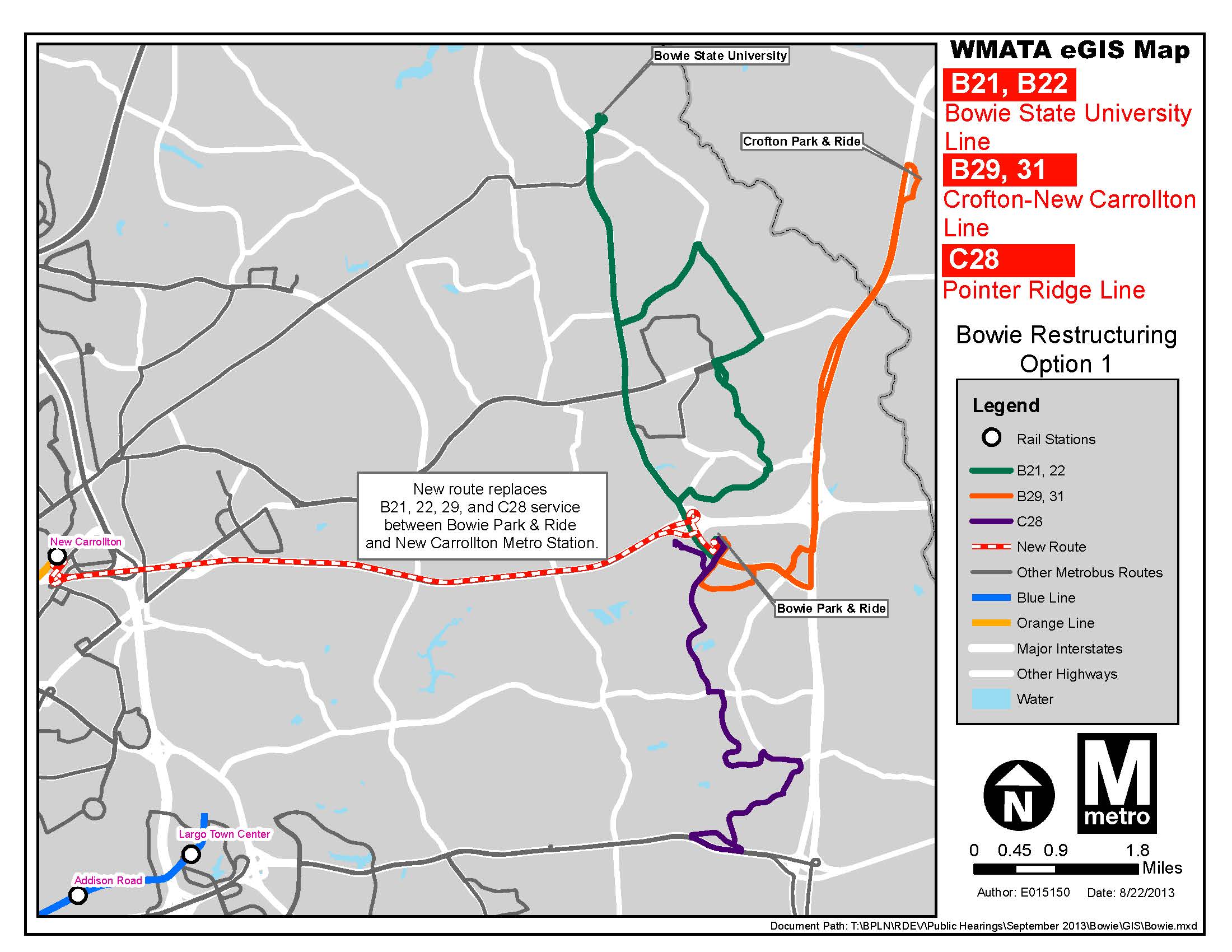
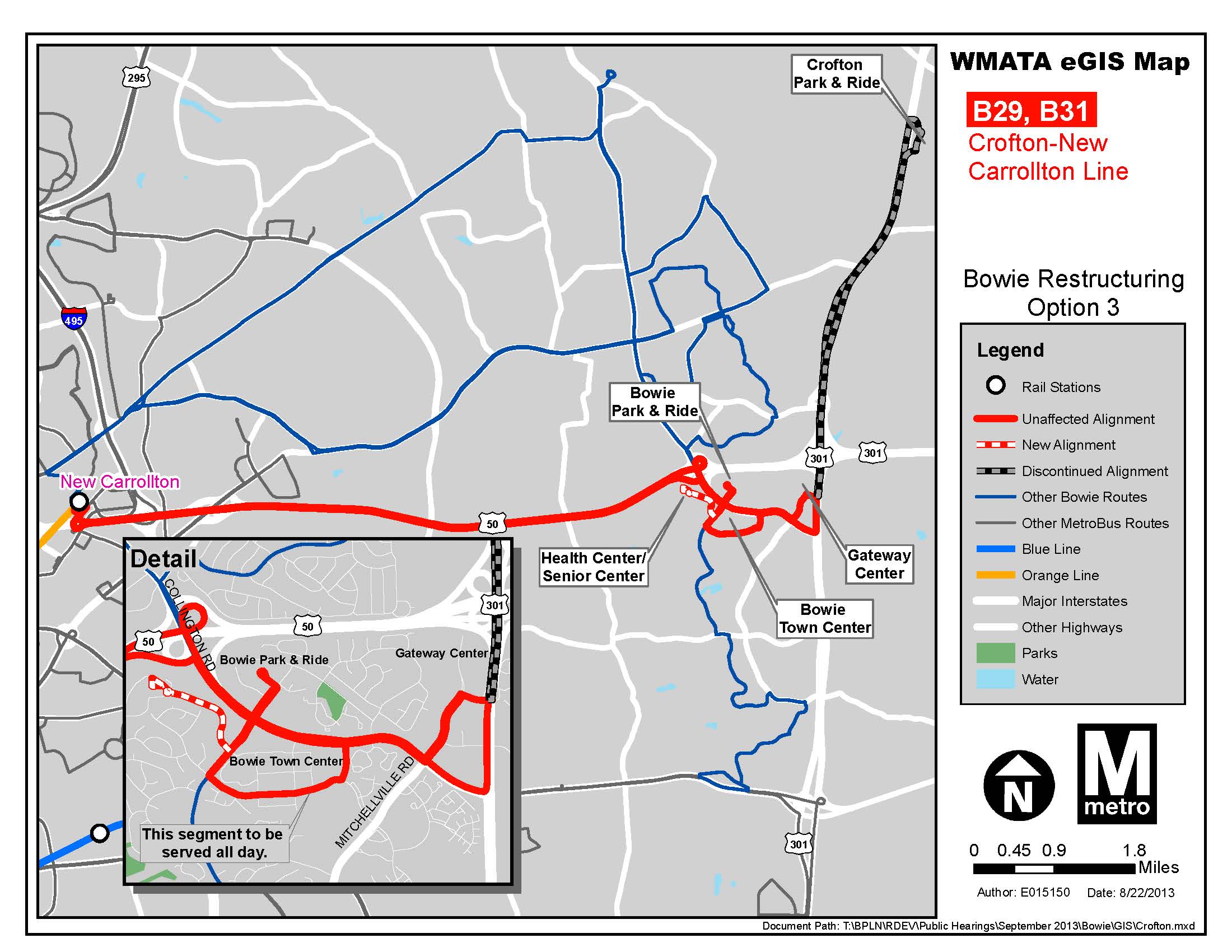
Earlier this year Metro conducted a comprehensive service evaluation study of the bus routes serving Bowie, MD. Metro is currently looking at implementing some of the recommendations that emerged from the study. Three options are under consideration:
Option 1: Instead of operating to New Carrollton Station, all service on the B21, B22, B29 and C28 routes would terminate at the Bowie Park & Ride lot. To reach the New Carrollton Station, riders on these routes would connect with a new shuttle service at the Bowie Park & Ride lot. The shuttle service would travel via John Hanson Highway and operate every 10-15 minutes.
Option 2: Routes B21, B22, B29 would continue to operate through the Bowie Park & Ride lot to New Carrollton Station. The frequency on each route would increase during rush hours to an even 30 minutes. Schedules would be coordinated between the three routes at the Bowie Park & Ride lot to provide a 10 minute service frequency to and from the New Carrollton Station.
Option 3: This option is the same as Option 2 but would also eliminate service to the Crofton Park & Ride lot on B29. This route would, instead, serve the Bowie Health Center, Bowie Senior Center, Bowie Town Center, and Gateway Center. B31 trips would also be converted to B29 trips.
The maps below illustrates the changes proposed. Please review and let us know what you think. We will also be presenting these options at our upcoming public hearings.
The Washington region is consistently in the top three “most congested traffic areas” in the country. Economic development projects, street realignments and increasing amenities for pedestrians and bicyclists result in increased traffic congestion, which affects the smooth operation and running time of buses. Further shifting the demand for bus services are workplace location changes, increasingly developed neighborhoods, and new construction projects.
In order to serve customers efficiently, Metrobus services must change as well. Metro is evaluating service changes for several of its bus routes and will be holding public hearings between September 16 and 19. For each location, Open House will begin at 6:00pm, and Public Hearing will begin at 6:30pm. All change proposals in the docket are eligible for comment at any of the six Hearing locations.
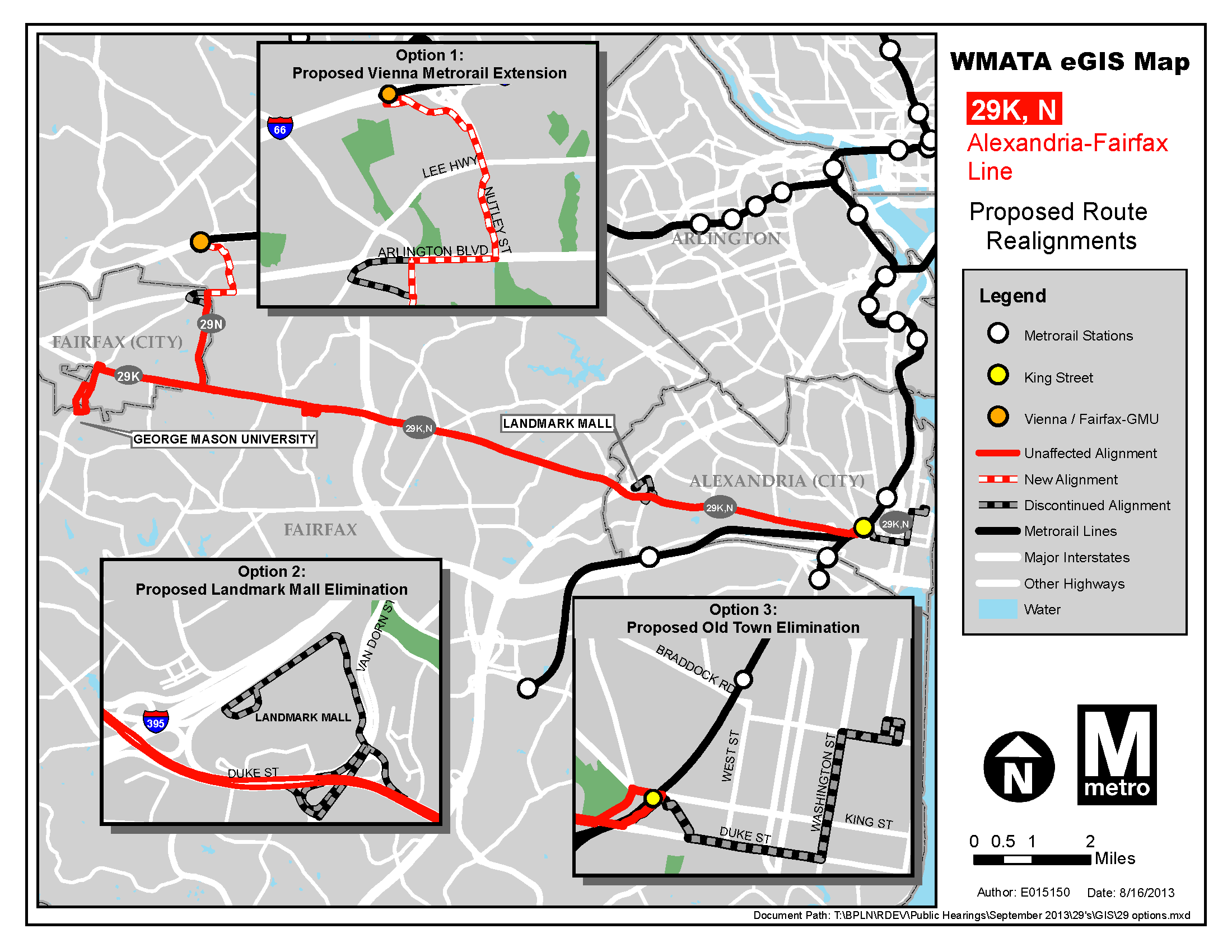
In order to improve service frequency and reliability and to reduce travel time between Fairfax County and key destinations in the City of Alexandria, Metro is proposing the following changes for Routes 29K and 29N:
Extend Route 29N to the Vienna-Fairfax Metrorail Station via Arlington Boulevard, Nutley Street and Saintsbury Drive. This would create new connections between Annandale and Northern Virginia Community College – Annandale Campus to the Metrorail Orange Line.
Terminate both routes at the King Street-Old Town Metrorail Station and discontinue service between the Metrorail station and Old Town Alexandria.
Eliminate the route diversion to service to Landmark Mall on both routes. All 29K and 29N trips would remain on Duke Street and continue to serve stops adjacent to the mall.
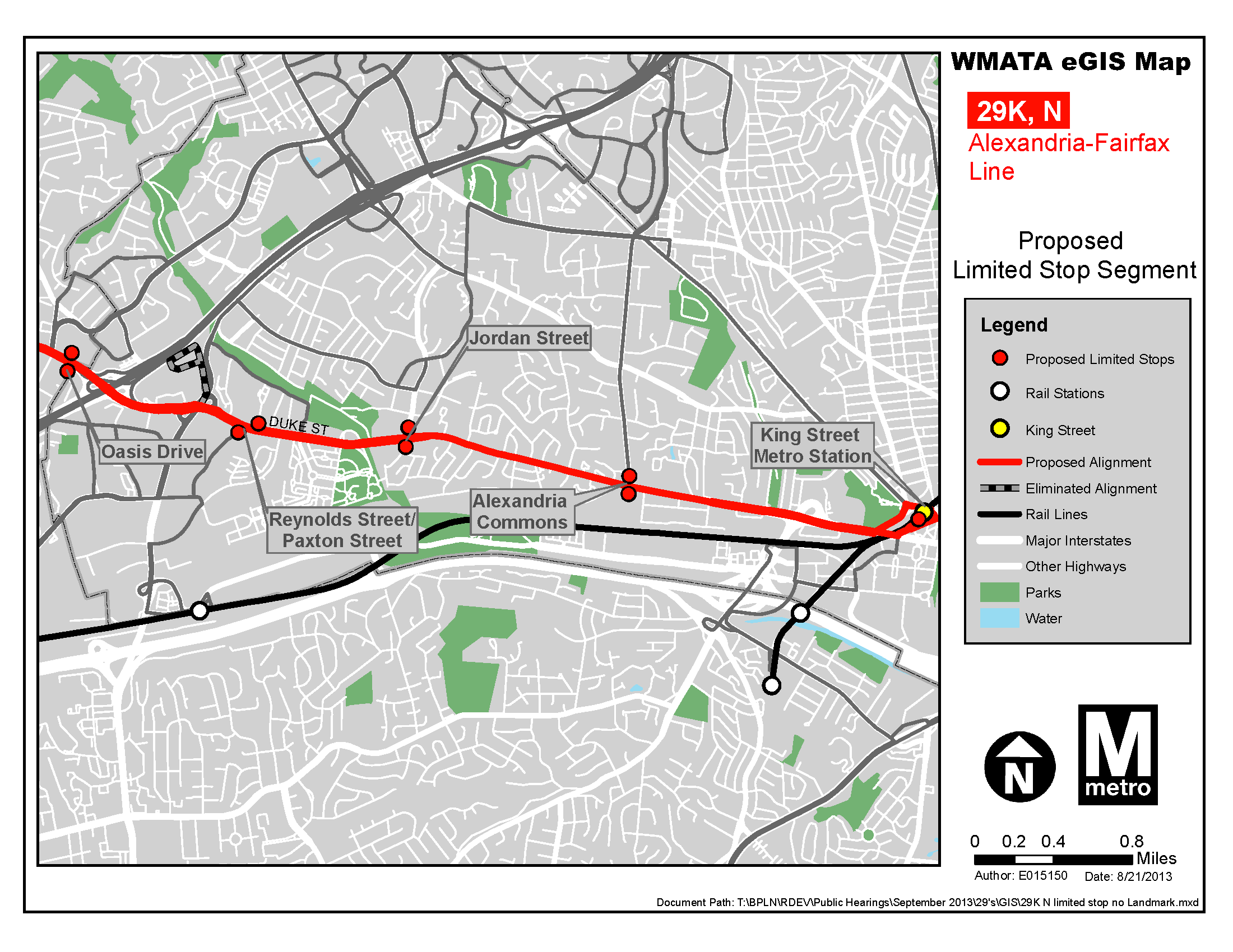
Operate both routes with limited-stop service between King Street Metrorail Station and Little River Turnpike and Oasis Drive (I-395.). The DASH AT8 will continue to serve all stops in this segment. The 29K and 29N would make stops only at King Street Station, Alexandria Commons, Duke & Jordan Street, Duke & Paxton Street, Duke & Walker Street and Little River Turnpike and Oasis Drive. All stops will continue to be served west of Oasis Drive (I-395). The DASH AT8 line provides very frequent service along the 29K,N alignment within the City of Alexandria allowing DASH to provide for all local-oriented trips and allowing Metrobus to focus on regionally-oriented trips to and from major destinations within the City of Alexandria.
The maps below illustrates the changes proposed. Please review and let us know what you think.
Map illustrating changes proposed to routes 29K and 29N. Click image for larger version.
Map showing stop locations for proposed limited-stop service. Click image for larger version.
Metro is seeking public input regarding how and when riders would like to receive information about service changes, as the transit agency continues to enhance its two-way dialogue with customers.
Metro is asking riders to participate in a survey, available online at wmata.com/servicechangesurvey, to help determine which types of service changes rise to the level of public hearings being necessary. The results will inform policy decisions on when public hearings are held. Read more…
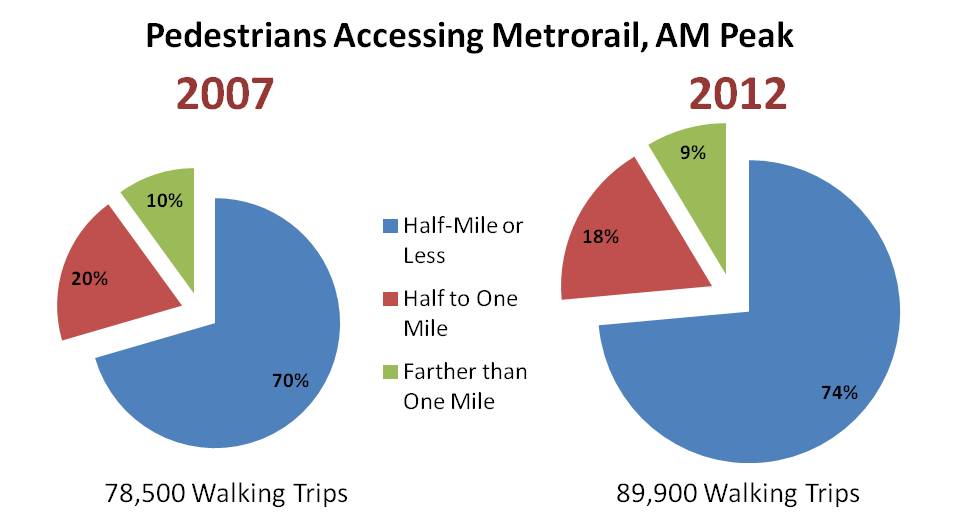
Walk access to Metrorail has increased 15% over the last 5 years, especially from those living within a half-mile of the station.
More and more Metrorail riders are lacing up their walking shoes and taking a short walk to their rail station these days. According to results from the 2012 Metrorail Passenger Survey, the number of passengers walking to Metrorail each morning grew by 15% between 2007 and 2012, from 78,500 to 89,900 in the AM peak period – far outpacing overall growth in ridership in the same period.
Where are all the new pedestrians coming from? From stations all over the network, but the growth is strongest among those walking a half-mile or less. Those walking from less than a half-mile rose by over 20% – faster than the overall growth in walk access.
Walk access to Metrorail has increased 15% over the last 5 years, especially from those living within a half-mile of the station.
Metro planning staff have been working to showcase Metro data in new and unique ways. We recently posted a visualization in a calendar format that displayed 9 years of rail ridership in one graphic. We are currently working on animations of ridership data as well. Below is our first volley into that arena, a visualization of one day’s worth of station-level activity in 15-minute intervals.
Before hitting play, please note the following:
The video is available in high definition (720p), which is the recommended viewing resolution.
The dots are sized according to total station volume (entries plus exits) per 15-minute interval.
The color of the dot represents what percent of the volume is entries vs exits. Magenta dots are 100% exits, blue dots are 100% entries, and purple dots are 50/50, with other colors representing ratios between these three.
The visualization is of data from April 10, 2013, which hit the 4th highest ridership mark that day. A combination of cherry blossom peak bloom and two sporting events ratcheted ridership up to 871,000 for the day, compared to an average weekday ridership of around 750,000. Note the high level of activity at the Smithsonian station all day long, and big dots that grow and shrink as the sports games begin and then end near Gallery Place and Navy Yard-Ballpark stations.
What other unique activity can you spot in this animation? What other types of animations of Metrorail and Metrobus would be informative?
The strongest growth in ridership for Metrorail is coming from the inner jurisdictions of the District of Columbia, Arlington, and Alexandria. In these areas, home to 43% of all rail riders, ridership has grown twice as fast as the system as a whole.
Our 2012 Metrorail Passenger Survey can tell us where rail riders live, which is a key input for determining how Metro is funded by our regional partners. But it also gives us insight into where Metro’s growth markets are and how Metro’s ridership is evolving. Overall, rail ridership in the 2012 survey increased three percent since our prior passenger survey in 2007 – but where do our new riders live?
Where do Metrorail riders live? Ridership growth has been strongest among residents in inner jurisdictions, and has been holding steady in outer jurisdictions.
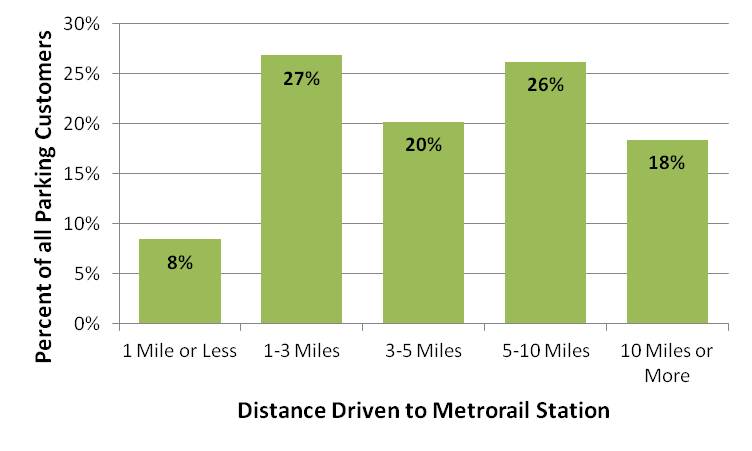
One-third of Metro parking customers drive from less than three miles to their station. But Metro’s importance can also be seen far across the greater Washington region, in this new visualization of parking customer’s origins.
Most Metrorail parking facilities primarily serve the neighborhoods immediately surrounding the station: 64%55% of parking customers come from less than five miles away, and 47%35% come from less than three miles away. However, some riders come from much farther away, particularly to end-of-line stations near major highways, such as Greenbelt, New Carrollton, and Vienna.
With approximately 60,000 parking spaces, Metro is one of the region’s largest parking operators. Our 2012 Metrorail Passenger Survey provides good insight into the travel patterns of rail customers, including those who drove and parked at any of Metro’s 35 stations offering daily parking. These parking customers represent around 15% of all rail trips on a typical weekday.
PlanItMetro saw great interest in our last full data download of O/D data last year. We thought we’d provide an update with data from October of 2012. This enhanced data download contains the following files:
Full O/D trip data MS Access, including service type (weekday, Saturday, Sunday Special), travel period (AM Peak, mid-day, etc.), entry hour, Origin Station, Destination Station, rider class (full fare or discounted), media type (SmarTrip vs paper farecard), fare instrument type (stored value vs benefits vs pass), average travel time and average number of trips.
86 MB compressed zip file containing an MS Access Database
Subset of O/D trip data “No Details” CSV, includes all trips like the first file above but doesn’t include details on rider class, media type or fare instrument
418,759 rows of data, 34 MB
This dataset can be opened in Microsoft Excel 2007 and later
Metro planning staff understand that a picture is worth at least a thousand words, and often more. (And that a video is worth 1000 * 30 words per second.) As such, we are always looking to increase our ability to create compelling graphs, charts and video simulations.
Sample image of the Metrorail Ridership Visualization. Click the image to open the viz in a new window.
Metro planning staff recently attended a Mobility Lab Hack Day, where transit planners and data geeks intersected to share ideas and techniques for visualization of the volumes of data being made available by operators around the region. One of the visualization tools discussed was D3, a javascript library for creating “data-driven documents.” One of the online examples is for a calendar view that displays stock market data.
Each year is a horizontal stripe, sectioned off into months that go across. Both years and months are labeled.
The days within each month are transposed, so start at the left and read down, then move right. In the sample image, the leftmost column of January 2004 is the first week, with Thursday January 1 being the darkest red square. A graphical example is also displayed in the legend at the top of the visualization.
Each day is colored according to the ridership on that day, with darkest red being the smallest range (0 to 99,999) and the darkest green being the highest range (greater than 1,000,000).
If you move your mouse pointer over any individual day, a small “tool tip” appears showing the date and the ridership for that day, rounded to the nearest 1,000.


 PlanItMetro saw great interest in our last
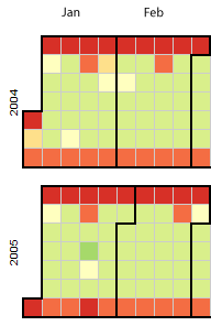

Recent Comments