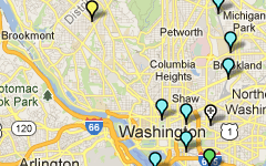
Visualization of Metrorail Station Activity
Metro planning staff have been working to showcase Metro data in new and unique ways. We recently posted a visualization in a calendar format that displayed 9 years of rail ridership in one graphic. We are currently working on animations of ridership data as well. Below is our first volley into that arena, a visualization of one day’s worth of station-level activity in 15-minute intervals.
- The video is available in high definition (720p), which is the recommended viewing resolution.
- The dots are sized according to total station volume (entries plus exits) per 15-minute interval.
- The color of the dot represents what percent of the volume is entries vs exits. Magenta dots are 100% exits, blue dots are 100% entries, and purple dots are 50/50, with other colors representing ratios between these three.
The visualization is of data from April 10, 2013, which hit the 4th highest ridership mark that day. A combination of cherry blossom peak bloom and two sporting events ratcheted ridership up to 871,000 for the day, compared to an average weekday ridership of around 750,000. Note the high level of activity at the Smithsonian station all day long, and big dots that grow and shrink as the sports games begin and then end near Gallery Place and Navy Yard-Ballpark stations.
What other unique activity can you spot in this animation? What other types of animations of Metrorail and Metrobus would be informative?
A zip file containing the base data for this animation is available for download: Metrorail Station Activity at 15-Minute Intervals, April 10 2013
Special thanks to Michael Schade at Mobility Lab for hosting the recent Data Visualization Hack Day and guiding me through some of the tricks and tips. Check out his lesson plan for animating data using Processing.


Recent Comments