Posts Tagged ‘rail’

Improving Core Metrorail Stations

June 28th, 2013 1 comment

Improving and expanding capacity at high ridership stations will ensure safe and efficient operations and facilitate passenger movements from street-level to platform as well as transfers between lines. The proposed stations, most of which are in the system’s core, already experience crowding or would reach capacity by 2025. Proposed improvements vary from adding escalators and stairs to building pedestrian passageways connecting platforms within a station and between stations.

 Table of Station Improvements

Read more…

Operating Longest Possible Trains During the Peak Period

June 21st, 2013 6 comments

Timeline to Have Sufficient Railcars to Operate 100% 8-Car Trains

Operating the longest trains possible during the peak periods will maximize the capacity of the existing Metrorail system by enabling operations of 100 percent eight-car trains. Metro will upgrade, replace or expand:

  • The rail car fleet
  • Traction power substations
  • Power cabling
  • Third rail
  • Train control systems
  • Storage tracks and maintenance bays in the yards

Purpose and Need

The Metro system’s core is the destination or transfer point for 80 percent of all rail riders system-wide. Crowded conditions during peak periods exist currently and, without rail fleet expansion, most rail lines will be even more congested by 2025. Operating 100 percent eight-car trains during peak periods and increasing the capacity of transfer stations (under a related initiative) will provide adequate capacity through 2025.

Read more…

Data Download: October 2012 Rail Ridership

June 12th, 2013 6 comments

downloadOptionA_256PlanItMetro saw great interest in our last full data download of O/D data last year. We thought we’d provide an update with data from October of 2012. This enhanced data download contains the following files:

  • Full O/D trip data MS Access, including service type (weekday, Saturday, Sunday Special), travel period (AM Peak, mid-day, etc.), entry hour, Origin Station, Destination Station, rider class (full fare or discounted), media type (SmarTrip vs paper farecard), fare instrument type (stored value vs benefits vs pass), average travel time and average number of trips.
  • Subset of O/D trip data “No Details” CSV, includes all trips like the first file above but doesn’t include details on rider class, media type or fare instrument

Download either of these data files and let us know what you find!


Categories: Engage Tags: , ,

Bluetooth Data Collection Pilot/Study

June 6th, 2013 1 comment

Sample Bluetooth Sensor

Metro, in conjunction with Traffax, Inc.,  recently hosted a Bluetooth traffic monitoring test at Fort Totten station.  Bluetooth technology has been used for years now, for monitoring vehicular traffic. Specifically, it has been used to provide travel time and origin-destination data, mostly in vehicular settings.  Some pedestrian monitoring has been tested as well.

For Metro’s recent pilot, Bluetooth traffic monitoring was used to study pedestrian movements within a multi-level environment.  The hope was that the Bluetooth data captured could tell stories about pedestrian flow within the station (including vertical movement), the train dwell times, train volumes, and the transfer rate between the Yellow/Green and Red lines. The latter is an area that WMATA is most interested in, since it is difficult to predict how people will ride Metro when given options. In this case, do people prefer transferring between Red and Yellow/Green at Fort Totten or at Gallery Place?  This kind of data would make it easier for WMATA’s planning staff to better serve its customers by understanding true crowding levels on trains at peak load points.

It was estimated that 1 in 20 passengers’ movements would be captured in the pilot.  The Bluetooth data sensors were placed in backpacks that Traffax employees were wearing.   This initial data collection test will be used primarily to develop appropriate methods for analyzing such data, and to see what potential the data has for WMATA.

Please note that no personally identifiable information can be captured by detecting Bluetooth signals, which is the electronic equivalent of viewing license plates.  Read more about privacy and Bluetooth on the Traffax website.

Stay tuned for more info!

Categories: Planning Studies Tags: , ,

Visualization of 9 Years of Metrorail Ridership

June 4th, 2013 12 comments

Metro planning staff understand that a picture is worth at least a thousand words, and often more.  (And that a video is worth 1000 * 30 words per second.) As such, we are always looking to increase our ability to create compelling graphs, charts and video simulations.

sample-image

Sample image of the Metrorail Ridership Visualization. Click the image to open the viz in a new window.

Metro planning staff recently attended a Mobility Lab Hack Day, where transit planners and data geeks intersected to share ideas and techniques for visualization of the volumes of data being made available by operators around the region.  One of the visualization tools discussed was D3, a javascript library for creating “data-driven documents.”  One of the online examples is for a calendar view that displays stock market data.

Metro planning staff adapted this code to create a visualization of Metrorail ridership data from 2004 to the present.  (Link opens in new window.) Here’s how it works:

  • Each year is a horizontal stripe, sectioned off into months that go across.  Both years and months are labeled.
  • The days within each month are transposed, so start at the left and read down, then move right.  In the sample image, the leftmost column of January 2004 is the first week, with Thursday January 1 being the darkest red square.  A graphical example is also displayed in the legend at the top of the visualization.
  • Each day is colored according to the ridership on that day, with darkest red being the smallest range (0 to 99,999) and the darkest green being the highest range (greater than 1,000,000).
  • If you move your mouse pointer over any individual day, a small “tool tip” appears showing the date and the ridership for that day, rounded to the nearest 1,000.

Read more…

Categories: Engage Tags: , , ,

Metro’s Fare Policy Principles

June 3rd, 2013 13 comments

Fare table showing peak-of-the-peak pricing, in effect from August 2010 to June 2012

Fare table showing peak-of-the-peak pricing, in effect from August 2010 to June 2012

In a recent post we described how Metrorail fares are calculated.  The previous post noted that Metro’s Fare Policy Principles have established guidelines for how fares are structured.  When it is time to evaluate changes to Metrorail, Metrobus, and MetroAccess fares, Metro staff revisit the fare policy principles to look for guidance.

Metro Fare Policy Principles, adopted November 18, 2010:

  1. Ensure and enhance customer satisfaction;
  2. Establish a mechanism to allow customers to determine their fares easily;
  3. Optimize the use of existing capacity;
  4. Establish equitable fares and ensure compliance with federal regulations;
  5. Facilitate movement between modes and operators throughout the region;
  6. Encourage the use of cost-effective media;
  7. Generate adequate revenue while maximizing ridership;

The challenge for Metro staff is to explore fare concepts that strike balance between the different principles.  For example, Metro uses surcharges to encourage use of SmarTrip™ which is our most cost-effective fare media (principle #6), but the surcharges provide challenges to easily determined fares (principle #2).

Note that Metro’s distance-based fares are considered more equitable than flat fares.  Average income increases with distance from the core in the Washington region, so a flat fare would result in the highest per-mile fares for those groups who are the least able to pay them.  Metro’s Board of Directors understands this and has emphasized fare equity (principle #4) as one of its top priorities.

Many other aspects of the current bus, rail and paratransit fares reflect these principles:

  • Surcharges for not using SmarTrip™:  Metro charges $1 per trip for using paper farecards on rail and $0.25 per trip for using cash on the bus.  These surcharges have helped push usage of SmarTrip™ up to about 90%, resulting in the reduction of  fare collection costs.
  • Different fares on different levels of service:  Metro charges $1.60 base fare for local and MetroExtra services.  Buses that travel long distances on freeway lanes cost users a higher fare ($3.65) to correspond with the greater travel speeds.  Metro’s longest distance bus routes, which travel to Dulles and BWI airports, charge a $6 fare per trip.
  • MetroAccess fares are priced at twice the fixed route fare with a cap at $7.  This fare structure is intended to encourage use of the existing fixed route capacity Metro offers, which are available to MetroAccess-eligible customers free of charge.
  • The peak-of-the-peak (POP) rail fare surcharge, enacted in August of 2010, charged customers an extra $0.20 to enter the system during the peak 90-minute periods during the AM and PM peak.  This surcharge was another example of using fares to “optimize the use of existing capacity.”   However, riders informed Metro this fare concept impacted fare policy principles #1 and #2, customer satisfaction and allowing customers to easily determine fares.  In the end, these two policy principles won out and the POP surcharge was eliminated starting July 1, 2012.

What fare concepts might help better align Metro’s fares with the fare policy principles?   What ideas have other agencies implemented that you’d like to be considered for Metro?


Categories: Fares and Service Tags: , , ,

Final Draft Silver Line Metrorail Map for Review

May 23rd, 2013 63 comments

We are down to the final two!  Based on extensive customer feedback from the latest map revisions, we made some additional improvements to the map:

  • Added the Metro Transit Police phone number;
  • Made the rail lines 24% thinner;
  • Added the Anacostia National Park;
  • Included a note that the map is not to scale;
  • Placed a darkened Silver Line between the Blue and Orange lines; and
  • Lightened the Beltway and jurisdiction borders.

We are now down to selecting the icon to represent a three-line station.  When we asked for feedback in the last round, some of you said that you didn’t like the idea of a completely new, third type of icon on the map (i.e., the capsule).  Others said you liked the capsule, but it was too thin.  It was recommended that we try to make the capsule the same width as the current station dot, but stretch it into an oval.
After reviewing your comments, Lance Wyman went back to his drawing board and came up with these two options:

  • Map #1: Retains the current station dot with thin, white extenders
  • Map #2: Stretches the current station dot into an oval

Take a look at these final versions and let us know which one you prefer. All comments welcome!  Please provide feedback in the comments section below or on our MindMixer site.   Thank you for your input.

full_whiskerfull_pill
Read more…

Categories: Engage Tags: , , ,

BART’s Core Capacity Challenge

May 14th, 2013 2 comments

Regular readers of this site know that Metro is developing a Strategic Plan, Momentum, which makes the case for additional major capital investments we’ll need to accommodate the region’s growth by 2025.  For those of you unfamiliar with the details of Momentum, one of the driving factors behind many of the initiatives is the need for improved core capacity to boost Metro’s ability to carry more riders in the system’s core.

BART System

Read more…

Categories: In The News Tags: , , ,

Share of Reverse Commute Trips Growing

May 6th, 2013 13 comments

Metro is focused on solving one of the region’s most pressing mobility issues – increasing the capacity of the system to handle more trips through the core (defined below) of the Metrorail system.  While Metro’s planning staff has been conducting technical analyses and searching for the best solutions for some time, we also asked for ideas for increasing core capacity from you as well as discussed the potential for  new lines, new connections and expanding to all 8-car trains during peak periods.

There are also operational strategies Metro could employ to provide more trips on the rail system without expanding capacity.  Among the various options is to promote and encourage more “reverse commuting” where commuters travel opposite the peak travel direction in seats that would otherwise be empty.  Data show that reverse commuting has already increased over the past 10 years and many speculate that it will only increase further as the region builds more suburban town centers near Metro and as Metro begins operations on the Silver Line later this year.
Read more…

Updated Draft Silver Line Metrorail Map for Review

May 2nd, 2013 73 comments

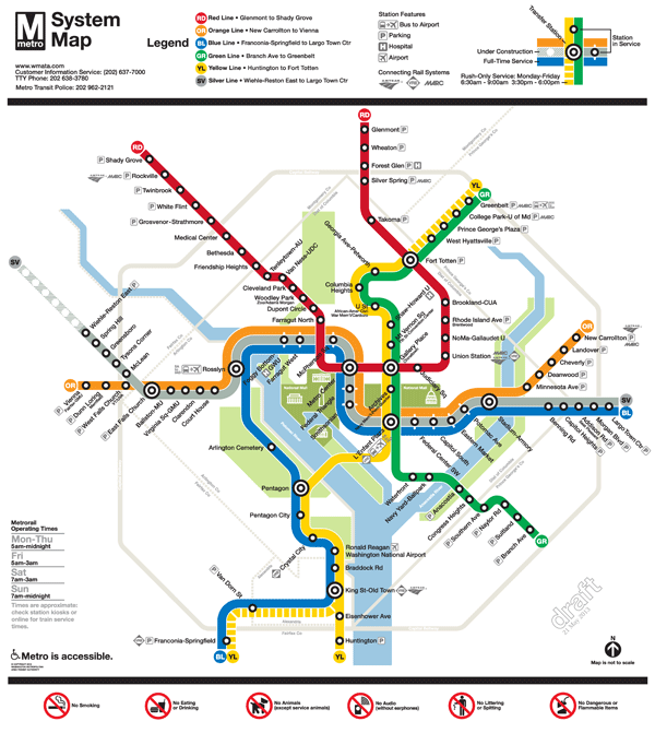
The Silver Line is coming soon, so Metro and original Metrorail map designer Lance Wyman are updating the current map.  Based on extensive customer feedback from the last map revision, we made some general improvements such as making street abbreviations consistent and improving the geographic accuracy of the stations where possible.  Cross streets will remain on the large version of the maps in stations and on trains, where it is most useful for customers as they are traveling on Metro. But in the interest of readability and streamlining, we will keep cross streets off smaller versions of the map often found online and in printed materials.

The first draft of the map (Map 1) also featured 14 percent thinner lines to help readability, now that the Silver Line will travel through DC, and a new station icon with lines that extended across all three rail colors.  This version also included the new Silver Line station names for Phase 1.

When we asked for feedback on the draft earlier this year, here’s what you told us: try even thinner lines, explore other station dot options, and “Center” and “Heights” should not be abbreviated.

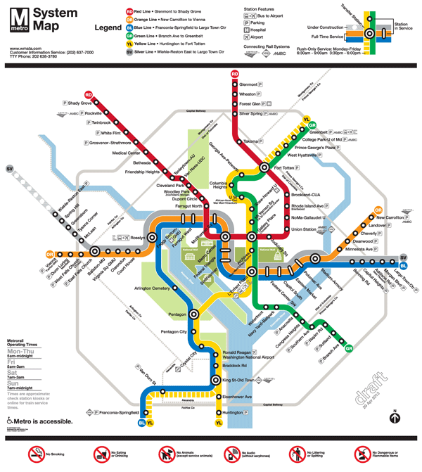
So here are two new maps for your review.  In both maps, “Center” and “Heights” are no longer abbreviated.  Map 1 below is an update of the previous draft, with slightly longer “whiskers”.  Map 2 incorporates some additional changes:

  • 24 percent thinner lines, and
  • the use of a capsule-shaped station icon.

Please compare the two maps, visible below, and let us know which one you prefer.

To compare the maps, slide the vertical bar across the image to show the differences between Map 1  and Map 2.  Further below you will find a zoom-in of both maps, also with the vertical slider bar for easy comparison.

All comments welcome!  Please comment below or on our  MindMixer site.  Also, check out Greater Greater Washington’s coverage of the updated map.  Thank you for your input.


2FinalTestMaps-04-29-13-12FinalTestMaps-04-29-13-2


Read more…

Categories: In The News Tags: , ,