Singapore MRT Rail Map Diagrams Show the Way
January 27th, 2014
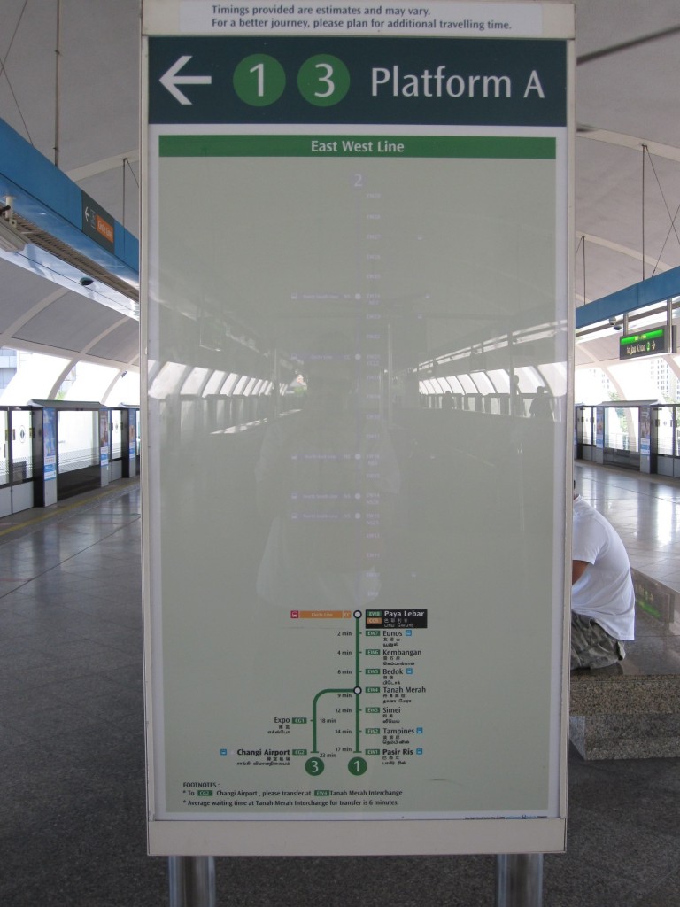
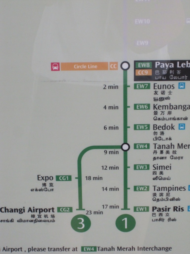
While waiting for a Metro train one day in Singapore, I noticed their rail map diagram had a big white space and then the rest of the map. Upon closer inspection the ‘white’ part was actually a grayed out part of the rail map showing the route the train had already covered. Having that information is very useful, particularly for a traveler unfamiliar with the system. One knows if they are starting at this particular station (Paya Lebar), what their options might be if he/she actually wanted to go in the opposite direction. This information gives the rider a helpful reference point in relationship to the rest of the system. Also upon closer inspection I saw that the map gave expected travel times between stations. How great is that?


Isn’t this what Metro is now doing with its wall-mounted/pylon-mounted map diagrams? They show where you are and what stations are coming up until the end of the line (as well as connections coming up and where those lines go). Inclusion of travel times is nice.
@JDC Yes, Metro is similar but I liked the faded out stations of the stations that had passed already (you have to squint and see it - the pic on the right). The times are really useful I think. Something to look into, into the future.