Search Results

Keyword: ‘Metrorail Rider’

The Drop in Transit Benefit Has Effectively Been a 20% Cost Increase for Metrorail Riders

November 6th, 2014 9 comments

The drop in the federal transit benefit is making Metrorail riders feel the pinch in their wallets, and it’s hurting ridership.

What’s happened to ridership since the benefit changed? You may have seen in the news that Metrorail riders have been heavily impacted by changes in federal tax law that discourages transit usage.  The maximum amount of SmartBenefits dropped from $240 to $130 per month in January, and since then:

  • Since the change, our traditional commuter market – full-fare customers who travel from suburban stations to the core at peak times – has fallen by about 1.5%.
  • Trips shorter than 4 miles – more likely to still be fully subsidized – are unchanged.
  • Customers able to get through the month on SmartBenefits alone are down 25%, while customers who must supplement with their own cash have doubled, and the net result has been a 10% loss in trips from this key commute market.
  • 75% of this ridership loss has been from trips over 7 miles: at an average fare of $4.10/trip equating to $165/month and up, these longer commutes now require substantial out-of-pocket contributions.
  • The average impacted SmartBenefits customer must now pay $0.84 extra per trip – this is the equivalent of a 20% fare hike.
    • For riders directly subsidized by the federal government, this was increase of nearly $2.40 per day, or over $54/month.
    • For riders setting aside pre-tax dollars, this felt like a 10% fare increase.
  • Trips paid for with SmartBenefits have dropped 1%.

Change in Ridership by SmartBenefits Class v2

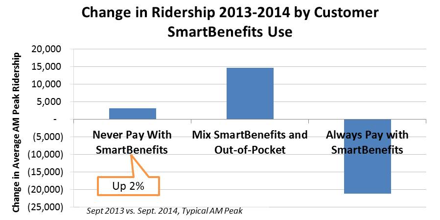
The decrease in the federal transit benefit has hurt Metrorail ridership in the last year. Ridership is up from customers who are unaffected by the policy change, but more people must supplement with out-of-pocket contributions to make it through the month, and in the process Metrorail is losing trips.

How do you know it’s not something else? Ridership could be down for a variety of reasons, and we continue to mine the data for other patterns – from the economy to demographics to fares. We can’t pin all of the ridership loss on the federal transit benefit, but the losses have been concentrated on SmartBenefits users. In addition:

  • Ridership from commuters not enrolled in SmartBenefits has actually grown by 2% in the last year.
  • We are still investigating, but customers do not appear to be reducing travel much due to telework. Metrorail has been losing both customers and trips (not just trips), and trip frequency among commuters is mostly stable.
  • In fact, we are gaining riders at stations with recent transit-oriented development, and ridership is up 3% at stations along the Green Line in D.C., the Red Line in Northeast D.C., and Courthouse/Clarendon in Arlington.

We continue to study the trends, and for a second glance see our more detailed summary of ridership trends (PDF, 710K).

Nationals Playoff Games and Metrorail Ridership

October 3rd, 2014 Comments off

When the Nationals reached the playoffs in 2012, about 12,000 fans per game took Metrorail – from all over the region, and even late at night!

Now that the Nationals have clinched a spot in the playoffs, Nationals Park will once again host October baseball beginning this afternoon. How many fans might take Metrorail to and from the game?

To answer that, let’s look back to 2012, the last time the Nats reached the playoffs. Games 3, 4, and 5 of the National League Division Series (NLDS) were played here at Nationals Park – Wednesday at 1:07 pm, Thursday at 4:07 pm, and Friday at 8:37 pm. Attendance at all three games was around 45,000 people. Here’s what ridership (Metrorail system entries) looked like at Navy Yard-Ballpark station on those days:

Nationals Ridership_NavyYard_NLDS2012_byHalfHour_v2

The sheer volume of passengers through Navy Yard station were impressive.  Sustaining over 4,000 entries per half-hour for nearly two hours is roughly equivalent to 4-lane highway, and exceeds what even the busiest stations achieve on a typical day.  For comparison, normal peak-of-peak volumes through Union Station, Metro Center, and Farragut West rarely exceed 3,000 entries per half hour. Read more…

Metrorail Riders Go Car-Free… Every Day!

September 19th, 2014 Comments off

Many pledge to leave their car at home for a day on Car-Free Day September 22,but 20% of Metrorail riders don’t own a car and go car-free every single day!

Of course, Metrorail riders from zero-car households vary significantly across the stations – from over half of all riders at places like Columbia Heights, Benning Road, and Dupont Circle – to less than 10% at more suburban areas like Rockville, East Falls Church, or Franconia-Springfield.  The diagram below shows the share of riders who live in a zero-car household, by station:

RailMap-Diagram_CarFreeHHsPCT_forweb

Of course, ridership varies across stations too, so the next diagram shows the total number of rail riders from zero-car households:

RailMap-Diagram_CarFreeHHs_forweb

In addition to riders who are completely car-free, many others come from “car-light” households of one or no cars.  58% of Metrorail riders come from “car-light” households.  For many, access to Metrorail and Metrobus and other transit services is a big reason they can drop down to one or zero cars and still get around.  In fact, DC’s zero-car households number is climbing, with 88% of new DC households car-free.  For others, car ownership is a heavy financial burden they may not be able to afford. Stay tuned for a coming post which estimates riders who are car-free by choice, vs. by necessity.

Do you live in a car-free household?  How does Metro help meet your mobility needs?

The data shown here is derived from our 2012 Metrorail Passenger Survey and the raw data is available (.xlsx, 19k).

Data Download: May 2013-2014 Metrorail Ridership by Origin and Destination

August 28th, 2014 22 comments

DataDownloadFuzzyMay 2013 and 2014 Metrorail ridership data is available: what patterns do you see?

Following up on our last data download of rail ridership from May 2012, 2013 and 2014 are now available. These data now represent three “snapshots” in time of rail ridership, at a very fine level of detail.  This data can help answer questions, such as: where is ridership growth the strongest? Which destinations are becoming more or less popular?  How has off-peak vs. peak ridership changed? 

May 2013 Metrorail Ridership by Origin, Destination, TimePeriod, DayOfWeek (.xlsx, 3.3 MB)

May 2014 Metrorail Ridership by Origin, Destination, TimePeriod, DayOfWeek (.xlsx, 3.4 MB)

We invite you to tell us what you see, in the comments.

Technical notes on the data are the same as the last post.  This time, Saturdays and Sundays are shown in the same worksheet as weekdays.

Yesterday’s Metrorail Ridership: Recovering from a Snowstorm

March 5th, 2014 3 comments

Yesterday, as everyone recovered from a snowstorm, here’s what happened to Metrorail ridership.

After Monday’s snowstorm, yesterday the federal government in the Washington region issued a two-hour delayed opening, and many schools opened with a delay or remained closed. Metrobus began the morning operating on a snow emergency plan, but by afternoon had restored full service.  Here’s what that meant to Metrorail ridership:

Metrorail ridership on Tuesday, when the federal government and many schools opened with a 2-hour delay.

Metrorail ridership on Tuesday, when the federal government and many schools opened with a 2-hour delay.

Note: the prior Thursday (Feb. 27, 2014) stands in as a typical weekday above, for comparison.

It looks as if the apex of the AM peak period occurred 15 minutes later than usual.  Many riders appeared to delay travel in the morning, resulting in a much more gradual end to the morning peak.

How was your commute different on March 4?

This data is available for download (.xlsx, 13kb).

Categories: Impact Tags: , , , ,

The Impact of Government Shutdowns on Metrorail Ridership: Budget vs Snow

February 13th, 2014 6 comments

When it comes to impacting weekday Metro ridership, meteorologists are three times more powerful than the federal government.

Many factors influence Metrorail ridership, including the weather and the status of the federal government.  As this assessment shows, extreme weather has a much bigger impact on Metrorail usage than the federal government closure for budget reasons.

In the past few months, the federal workforce was instructed to stay home for two different reasons.  The first was the failed budget negotiation that resulted in the federal government shutdown in October of 2013. (We’ll call this “shutdown closure.”)  The second was the winter weather forecast that closed federal offices in the Washington region.  (Let’s call this “snow closure.”)  These two separate government closures have had different impacts on Metrorail ridership.

First, take ridership by time of day.  The graph below shows ridership by fifteen-minute interval for three days.  The tallest, green line is the average of weekday entries.  The other two are days that the federal government was closed due to the shutdown (Oct 8, 2013) and snow (Dec 10, 2013).    Now, the purple line illustrates the ridership due to the budgetary shutdown in October 2013 and the blue line shows ridership on a federal snow day in December 2013.   The purple line (budget shutdown) is not dissimilar to the green (average), but the purple line (snow shutdown) illustrates a huge ridership drop.  Why would this be?

asdf

Metrorail ridership on an average day and two days the federal government was shut down. October 8, 2013 was part of the budget shutdown. December 10 2013 the fed was closed due to snow.


We can think of a few reasons for this difference.

  • The budget shutdown only impacted SOME federal workers, i.e. those not deemed essential.  Snow, however, impacts just about everyone.
  • On snow days, area schools are often closed.  Parents who have the luxury to do so sometimes stay home to look after their children who would otherwise be in school.  Critically, parents who may be limited in child care options – many of whom are our customers – are especially vulnerable and often are forced to stay home because of the school closures.
  • Washington is gradually evolving from a federal “company town” into a “boom town of the new economy,” a new economy less reliant on the federal government.   Many of the businesses of the “new economy” were unaffected by the budget shutdown, but during extreme weather events take their cue from the federal government and give their employees the day off.  According to Dr. Stephen Fuller of GMU’s Center for Regional Analysis, the Washington region is and will be “increasingly less dependent on federal spending as the driver of job growth and income generation in the local economy.”

Next, let’s look at change in ridership by station.  Below are maps showing the change in ridership between a regular day and one of the government shutdown days:  first budget shutdown and then snow shutdown. Read more…

Where Are Low-Income and Minority Metrorail Riders?

October 9th, 2013 5 comments

The demographics of Metrorail riders change dramatically station to station, and reflect the race and income divisions of our region.

As part of Metro’s Title VI program, we spend time making sure we don’t disproportionately impact low-income and minority riders when we change and deliver service, change fares, and other policy changes. Our 2012 Metrorail Passenger Survey tells us a good deal of information about the race and income ranges of our riders, by where they are going, and when they travel.  We conduct this research ourselves, giving us an extremely robust dataset on our riders. These survey responses are a key source of data underlying our Title VI analyses. In many ways, these results confirm that our region remains a Region Divided by income and race – across a noticeable east-west divide.

The map below shows low-income Metrorail riders by origin station, for a typical weekday in May 2012. Metro defines low-income as a rider with a household income less than $30,000 per year. Low-income ridership is somewhat concentrated in several areas, such as the inner southeast Green Line, and inner stations on the eastern Blue and Orange lines. The Green Line between Prince George’s Plaza and Shaw-Howard is also home to relatively large proportions of low-income riders.

No single station is more than 45% low-income.

hghg

Average Metrorail ridership is 11% low-income, but can range from 3% to 40% station to station.

The next map shows minority Metrorail ridership by origin station, again for a weekday in May 2012. For Title VI purposes, a minority is defined as anyone who self-identifies as other than White, Non-Hispanic on our passenger survey. Minority ridership is concentrated most heavily on the eastern side of the rail network, but is also spread across other areas of the network as well – e.g., Wheaton and Glenmont, the Green-Yellow line. No single station is less than 22% minority.

Average Metrorail ridership is 42% minority, but the rail system shows an east-west divide, similar to the divisions facing our region. Some stations are over 90% minority ridership, while others are as low as 22%.

Average Metrorail ridership is 42% minority, but the rail system shows an east-west divide, similar to the divisions facing our region. Some stations are over 90% minority ridership, while others are as low as 22%.

We remain mindful of the travel patterns of low-income and minority riders, and use this data to help avoid disproportionate impacts to these riders when we make changes to the system. For example, we analyzed the impacts of the Silver Line at the passenger-trip level, looking at impacts and demographics at the individual origin-destination (O-D) pair level.

What patterns do you see here? Does anything jump out at you?

Categories: Metrorail Studies Tags:

How Do Metrorail Riders Get to Their Station in the Morning?

September 30th, 2013 3 comments

Peds_CrystalCityTwo-thirds of Metrorail riders take transit, walk, or bike to Metrorail for their morning commute.

Every morning, thousands of people walk through the faregates and into Metrorail. Did you ever wonder how they get to their station? Our 2012 Metrorail Passenger Survey tells us the answer to this question, for the morning rush:

  • More than a third (38%) of Metrorail riders get to the station in the morning by walking or biking.
  • Another quarter arrive by bus – Metrobus, as well as other bus operators in the region.
  • Another third arrive by car – most by parking at or near the station, but some by getting dropped off.
  • Finally, about 4% of riders arrive via commuter rail – mostly at Union Station.

Of the 25,000 or so daily riders who access rail by “Other Bus,” the top three contributors are Fairfax Connector (6,700), Montgomery County’s RideOn (5,700), and private shuttles (4,900). Of those who parked at their station, one-third were driving from less three miles away. Carpooling to Metrorail is very low – we estimate average vehicle occupancy at 1.03 passengers per parked car.

Systemwide_Metrorail_AccessMode_May2012

The map below shows how the answer to “How Did They Get to the Station?” varies dramatically station to station. (For the sake of legibility on this map, I’ve simplified the access modes into 4 groups). Read more…

Where Do Metrorail Riders Live?

July 1st, 2013 1 comment

The strongest growth in ridership for Metrorail is coming from the inner jurisdictions of the District of Columbia, Arlington, and Alexandria. In these areas, home to 43% of all rail riders, ridership has grown twice as fast as the system as a whole.

Our 2012 Metrorail Passenger Survey can tell us where rail riders live, which is a key input for determining how Metro is funded by our regional partners. But it also gives us insight into where Metro’s growth markets are and how Metro’s ridership is evolving. Overall, rail ridership in the 2012 survey increased three percent since our prior passenger survey in 2007 – but where do our new riders live?

Where do Metrorail riders live? Ridership growth has been strongest among residents in inner jurisdictions, and has been holding steady in outer jurisdictions.

Where do Metrorail riders live? Ridership growth has been strongest among residents in inner jurisdictions, and has been holding steady in outer jurisdictions.


Read more…

Categories: Engage Tags: , ,

Visualization of 9 Years of Metrorail Ridership

June 4th, 2013 12 comments

Metro planning staff understand that a picture is worth at least a thousand words, and often more.  (And that a video is worth 1000 * 30 words per second.) As such, we are always looking to increase our ability to create compelling graphs, charts and video simulations.

sample-image

Sample image of the Metrorail Ridership Visualization. Click the image to open the viz in a new window.

Metro planning staff recently attended a Mobility Lab Hack Day, where transit planners and data geeks intersected to share ideas and techniques for visualization of the volumes of data being made available by operators around the region.  One of the visualization tools discussed was D3, a javascript library for creating “data-driven documents.”  One of the online examples is for a calendar view that displays stock market data.

Metro planning staff adapted this code to create a visualization of Metrorail ridership data from 2004 to the present.  (Link opens in new window.) Here’s how it works:

  • Each year is a horizontal stripe, sectioned off into months that go across.  Both years and months are labeled.
  • The days within each month are transposed, so start at the left and read down, then move right.  In the sample image, the leftmost column of January 2004 is the first week, with Thursday January 1 being the darkest red square.  A graphical example is also displayed in the legend at the top of the visualization.
  • Each day is colored according to the ridership on that day, with darkest red being the smallest range (0 to 99,999) and the darkest green being the highest range (greater than 1,000,000).
  • If you move your mouse pointer over any individual day, a small “tool tip” appears showing the date and the ridership for that day, rounded to the nearest 1,000.

Read more…

Categories: Engage Tags: , , ,