Author Archive

Data Download: October 2012 Rail Ridership

June 12th, 2013 6 comments

downloadOptionA_256PlanItMetro saw great interest in our last full data download of O/D data last year. We thought we’d provide an update with data from October of 2012. This enhanced data download contains the following files:

  • Full O/D trip data MS Access, including service type (weekday, Saturday, Sunday Special), travel period (AM Peak, mid-day, etc.), entry hour, Origin Station, Destination Station, rider class (full fare or discounted), media type (SmarTrip vs paper farecard), fare instrument type (stored value vs benefits vs pass), average travel time and average number of trips.
  • Subset of O/D trip data “No Details” CSV, includes all trips like the first file above but doesn’t include details on rider class, media type or fare instrument

Download either of these data files and let us know what you find!


Categories: Engage Tags: , ,

Visualization of 9 Years of Metrorail Ridership

June 4th, 2013 12 comments

Metro planning staff understand that a picture is worth at least a thousand words, and often more.  (And that a video is worth 1000 * 30 words per second.) As such, we are always looking to increase our ability to create compelling graphs, charts and video simulations.

sample-image

Sample image of the Metrorail Ridership Visualization. Click the image to open the viz in a new window.

Metro planning staff recently attended a Mobility Lab Hack Day, where transit planners and data geeks intersected to share ideas and techniques for visualization of the volumes of data being made available by operators around the region.  One of the visualization tools discussed was D3, a javascript library for creating “data-driven documents.”  One of the online examples is for a calendar view that displays stock market data.

Metro planning staff adapted this code to create a visualization of Metrorail ridership data from 2004 to the present.  (Link opens in new window.) Here’s how it works:

  • Each year is a horizontal stripe, sectioned off into months that go across.  Both years and months are labeled.
  • The days within each month are transposed, so start at the left and read down, then move right.  In the sample image, the leftmost column of January 2004 is the first week, with Thursday January 1 being the darkest red square.  A graphical example is also displayed in the legend at the top of the visualization.
  • Each day is colored according to the ridership on that day, with darkest red being the smallest range (0 to 99,999) and the darkest green being the highest range (greater than 1,000,000).
  • If you move your mouse pointer over any individual day, a small “tool tip” appears showing the date and the ridership for that day, rounded to the nearest 1,000.

Read more…

Categories: Engage Tags: , , ,

Metro’s Fare Policy Principles

June 3rd, 2013 13 comments

Fare table showing peak-of-the-peak pricing, in effect from August 2010 to June 2012

Fare table showing peak-of-the-peak pricing, in effect from August 2010 to June 2012

In a recent post we described how Metrorail fares are calculated.  The previous post noted that Metro’s Fare Policy Principles have established guidelines for how fares are structured.  When it is time to evaluate changes to Metrorail, Metrobus, and MetroAccess fares, Metro staff revisit the fare policy principles to look for guidance.

Metro Fare Policy Principles, adopted November 18, 2010:

  1. Ensure and enhance customer satisfaction;
  2. Establish a mechanism to allow customers to determine their fares easily;
  3. Optimize the use of existing capacity;
  4. Establish equitable fares and ensure compliance with federal regulations;
  5. Facilitate movement between modes and operators throughout the region;
  6. Encourage the use of cost-effective media;
  7. Generate adequate revenue while maximizing ridership;

The challenge for Metro staff is to explore fare concepts that strike balance between the different principles.  For example, Metro uses surcharges to encourage use of SmarTrip™ which is our most cost-effective fare media (principle #6), but the surcharges provide challenges to easily determined fares (principle #2).

Note that Metro’s distance-based fares are considered more equitable than flat fares.  Average income increases with distance from the core in the Washington region, so a flat fare would result in the highest per-mile fares for those groups who are the least able to pay them.  Metro’s Board of Directors understands this and has emphasized fare equity (principle #4) as one of its top priorities.

Many other aspects of the current bus, rail and paratransit fares reflect these principles:

  • Surcharges for not using SmarTrip™:  Metro charges $1 per trip for using paper farecards on rail and $0.25 per trip for using cash on the bus.  These surcharges have helped push usage of SmarTrip™ up to about 90%, resulting in the reduction of  fare collection costs.
  • Different fares on different levels of service:  Metro charges $1.60 base fare for local and MetroExtra services.  Buses that travel long distances on freeway lanes cost users a higher fare ($3.65) to correspond with the greater travel speeds.  Metro’s longest distance bus routes, which travel to Dulles and BWI airports, charge a $6 fare per trip.
  • MetroAccess fares are priced at twice the fixed route fare with a cap at $7.  This fare structure is intended to encourage use of the existing fixed route capacity Metro offers, which are available to MetroAccess-eligible customers free of charge.
  • The peak-of-the-peak (POP) rail fare surcharge, enacted in August of 2010, charged customers an extra $0.20 to enter the system during the peak 90-minute periods during the AM and PM peak.  This surcharge was another example of using fares to “optimize the use of existing capacity.”   However, riders informed Metro this fare concept impacted fare policy principles #1 and #2, customer satisfaction and allowing customers to easily determine fares.  In the end, these two policy principles won out and the POP surcharge was eliminated starting July 1, 2012.

What fare concepts might help better align Metro’s fares with the fare policy principles?   What ideas have other agencies implemented that you’d like to be considered for Metro?


Categories: Fares and Service Tags: , , ,

Final Draft Silver Line Metrorail Map for Review

May 23rd, 2013 63 comments

We are down to the final two!  Based on extensive customer feedback from the latest map revisions, we made some additional improvements to the map:

  • Added the Metro Transit Police phone number;
  • Made the rail lines 24% thinner;
  • Added the Anacostia National Park;
  • Included a note that the map is not to scale;
  • Placed a darkened Silver Line between the Blue and Orange lines; and
  • Lightened the Beltway and jurisdiction borders.

We are now down to selecting the icon to represent a three-line station.  When we asked for feedback in the last round, some of you said that you didn’t like the idea of a completely new, third type of icon on the map (i.e., the capsule).  Others said you liked the capsule, but it was too thin.  It was recommended that we try to make the capsule the same width as the current station dot, but stretch it into an oval.
After reviewing your comments, Lance Wyman went back to his drawing board and came up with these two options:

  • Map #1: Retains the current station dot with thin, white extenders
  • Map #2: Stretches the current station dot into an oval

Take a look at these final versions and let us know which one you prefer. All comments welcome!  Please provide feedback in the comments section below or on our MindMixer site.   Thank you for your input.

full_whiskerfull_pill
Read more…

Categories: Engage Tags: , , ,

Share of Reverse Commute Trips Growing

May 6th, 2013 13 comments

Metro is focused on solving one of the region’s most pressing mobility issues – increasing the capacity of the system to handle more trips through the core (defined below) of the Metrorail system.  While Metro’s planning staff has been conducting technical analyses and searching for the best solutions for some time, we also asked for ideas for increasing core capacity from you as well as discussed the potential for  new lines, new connections and expanding to all 8-car trains during peak periods.

There are also operational strategies Metro could employ to provide more trips on the rail system without expanding capacity.  Among the various options is to promote and encourage more “reverse commuting” where commuters travel opposite the peak travel direction in seats that would otherwise be empty.  Data show that reverse commuting has already increased over the past 10 years and many speculate that it will only increase further as the region builds more suburban town centers near Metro and as Metro begins operations on the Silver Line later this year.
Read more…

Updated Draft Silver Line Metrorail Map for Review

May 2nd, 2013 73 comments

The Silver Line is coming soon, so Metro and original Metrorail map designer Lance Wyman are updating the current map.  Based on extensive customer feedback from the last map revision, we made some general improvements such as making street abbreviations consistent and improving the geographic accuracy of the stations where possible.  Cross streets will remain on the large version of the maps in stations and on trains, where it is most useful for customers as they are traveling on Metro. But in the interest of readability and streamlining, we will keep cross streets off smaller versions of the map often found online and in printed materials.

The first draft of the map (Map 1) also featured 14 percent thinner lines to help readability, now that the Silver Line will travel through DC, and a new station icon with lines that extended across all three rail colors.  This version also included the new Silver Line station names for Phase 1.

When we asked for feedback on the draft earlier this year, here’s what you told us: try even thinner lines, explore other station dot options, and “Center” and “Heights” should not be abbreviated.

So here are two new maps for your review.  In both maps, “Center” and “Heights” are no longer abbreviated.  Map 1 below is an update of the previous draft, with slightly longer “whiskers”.  Map 2 incorporates some additional changes:

  • 24 percent thinner lines, and
  • the use of a capsule-shaped station icon.

Please compare the two maps, visible below, and let us know which one you prefer.

To compare the maps, slide the vertical bar across the image to show the differences between Map 1  and Map 2.  Further below you will find a zoom-in of both maps, also with the vertical slider bar for easy comparison.

All comments welcome!  Please comment below or on our  MindMixer site.  Also, check out Greater Greater Washington’s coverage of the updated map.  Thank you for your input.


2FinalTestMaps-04-29-13-12FinalTestMaps-04-29-13-2


Read more…

Categories: In The News Tags: , ,

A World Without Metro, Part 1: I-395 Traffic

February 19th, 2013 Comments off

Metro’s new strategic planning process, Momentum, articulates a vision for the the next generation of Metro.  One way to illustrate Metro’s vital role in the region’s transportation network is to show the impact of not having Metro.  This series will give perspective on the many real benefits that Metro conveys to the region today.

Metrorail’s Yellow Line crosses the Potomac from Virginia into DC parallel to I-395’s 14th Street Bridge.  Both the rail and highway bridges move large numbers of people into the regional core during the morning rush hour.   Between the two inbound spans, the 14th Street Bridge has six  lanes.  The Yellow Line provides the equivalent of three additional lanes.  This math is pretty simple:  one lane of freeway traffic can move about 2,420 people per hour (2,200 vehicles per hour times an average auto occupancy of 1.1 people per car) and the Yellow Line moves around 7,400 passengers from Pentagon to L’Enfant Plaza during the peak AM hour.   Another way to see it is that the Yellow Line removes 6,700 (7,400 pax / 1.1 pax per car) cars from the road.

What would happen to I-395 if some or all of the in-bound Metrorail Yellow Line customers switched to driving in the morning?  

If only 5% of Yellow Line customers drove up the freeway to the 14th Street Bridge during the AM peak hour, I-395 would fill with stop-and-go traffic for ten miles.

Map illustrating regularly recurring three-mile queue and the 10-mile queue that would regularly form if only 5% of the inbound AM commuters on the Yellow Line across the Potomac River switched to driving.

Map illustrating regularly recurring three-mile queue and the 10-mile queue that would regularly form if only 5% of the inbound AM commuters on the Yellow Line across the Potomac River switched to driving.

How is this possible?

Read more…

Categories: Impact Tags: , , ,

Metro Anchors the Region’s Growth

February 14th, 2013 Comments off

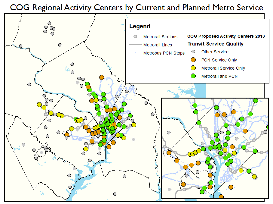
Regional Activity Centers in the core jurisdictions served by high-quality Metro service. Click the image for a full regional map.

Of the 120 COG regional activity centers in the Metro Compact Jurisdictions, 81 are now or will soon be served by high quality Metro transit, either Metrorail or the Metrobus Priority Corridor Network (PCN). That means that two-thirds of these activity centers are primed to support transit-oriented developments. The map above illustrates the activity centers in the core jurisdictions and their level of transit service. Click the image  for a full regional map.

Some jurisdictions have placed a greater emphasis on high-quality transit service when deciding upon areas to designate as regional activity centers.  The chart below shows the total number of activity centers per jurisdiction and the percentage served by Metrorail and/or the PCN.  The core jurisdictions (the District, Arlington and Alexandria) each have over 80% of their activity centers served by high-quality Metro transit.  The beltway jurisdictions (Montgomery, Prince George’s and Fairfax counties) have between 48% and 70% of their activity centers served.   Loudoun County, soon to be added to the compact with two activity centers receiving Metrorail service when the Metrorail to Dulles Phase II comes online, has the lowest percentage of activity centers served by Metro.

The relationship between regional activity and high-quality transit is no accident.  Economic activity gravitates towards areas of greater accessibility, including Metrorail station areas and commercial corridors — once streetcar routes — currently served by Metrobus. However, transit service can also be extended to areas of economic activity which developed due to good highway accessibility, such as Tysons Corner.

As the local jurisdictions continue to focus population and employment growth into these areas, Metro and other regional transit operators are working to connect them to the regional core and to one another through high-quality transit.  It is clear from the current levels of highway congestion that Metropolitan Washington needs more high-quality Metro service (bus and rail) in order to support the growth anticipated over the next 25 years.

One goal of Momentum, Metro’s strategic planning process, is increasing regional mobility and connecting communities.

About the COG Activity Centers

The activity centers list, recently updated by the Metropolitan Washington Council of Governments (COG), describes where the local jurisdictions plan to focus household and job growth in order to support regional goals of transit-friendly development patterns and sustainability. This updated list includes 120 activity centers within the Metro Compact Jurisdictions (including Loudoun County) and additional 19 within the COG planning area not served by Metro, including Charles, Frederick and Prince William Counties, and the cities of Manassas and Manassas Park.

Categories: Impact Tags: , , , , ,

One Day of Washington Region Transit

February 11th, 2013 1 comment

Recently we showed you a visualization of Metrorail, Metrobus and Circulator transit created by a STLTransit.  The developer had created the previous visualization from the GTFS file available from the WMATA developers resources page.

Metro regularly exports all of the data from our Trip Planner into a separate GTFS file which we share with COG/TPB for updating regional transit schedules in their travel demand model.  We are working to make this file publicly available.  In the mean time, we were able to share it with STLTransit who kindly created the updated fully regional visualization of Washington area transit, embedded above.

As with last time, this visualization is best viewed full-screen and in HD mode.

Some interesting things to note:

  • Frederick County TransIT service use of timed transfers (or pulse points) at transit centers is very noticeable.
  • MARC and VRE commuter rail are illustrated as white tadpoles, not to be confused with the colored tadpoles representing Metrorail service.
  • The expansiveness of the commuter rail network becomes very apparent, as those white tadpoles shoot towards the edges of the map to the northeast, northwest and south.

STLTransit apparently cranks out one or two visualizations of a city or regional transit system every few days.  Check out their YouTube channel and subscribe.

Categories: Engage Tags: , , ,

What are the Drivers for Demand of Transit Services?

February 5th, 2013 1 comment

Correlation between weekday Metrorail (monthly total) ridership and the number of jobs in the District of Columbia, FY05 – FY12. Note the “natural log” (ln) of each is illustrated.  The low-ridership outlier is due to Snowmageddon, February 2010.

Demand for public transportation services is not a direct demand, meaning that transit is a means to another end:  a traveler on transit rarely takes transit for the sake of travel but because they have a need for work, shopping, entertainment, etc.  Additionally, many factors determine whether a traveler’s demand for a good or service translates into a public transportation trip or a trip by a private automobile.  Therefore, transit demand is driven by two different sets of factors, the first being the changing demand for goods or services that result in the demand for transportation and the second being the factors that influence which transportation mode is chosen.

For example, having a job creates the need to travel to work.  Yet other factors — such as the levels of transit service between home and work locations, the price of gas, the transit fare, the relative travel time between car and transit, and car-ownership rates – may have some influence over whether the demand for travel translates into the demand for a travel trip. Read more…