Surges 3 and 4 saw the highest shuttle bus ridership of SafeTrack so far. Overall, Metrobus shuttles moved around 17,000 trips per day during Surge 3, and around 25,000 trips per day during Surge 4.
 With shuttles every 2.5 minutes and Metroway running every 6 minutes, there were about 35 buses per hour during peak periods on Route 1. Taken together, the two services moved about 31,000 passengers per day during Surge 4. As a comparison, that stretch of road serves about 41,000 cars per day.
A small portion of shuttle bus ridership was on the Franconia to Pentagon shuttle, with the remainder on shuttles between Pentagon City, Braddock Road, Crystal City, and National Airport. The sheer volume of ridership on the shuttle buses made the shuttle operation Metro’s busiest bus line, albeit temporarily. At 25,000 trips per day, the shuttles moved more riders than we typically move on any other major bus route, including some of the busiest like 16th Street NW, or the various 30’s buses.
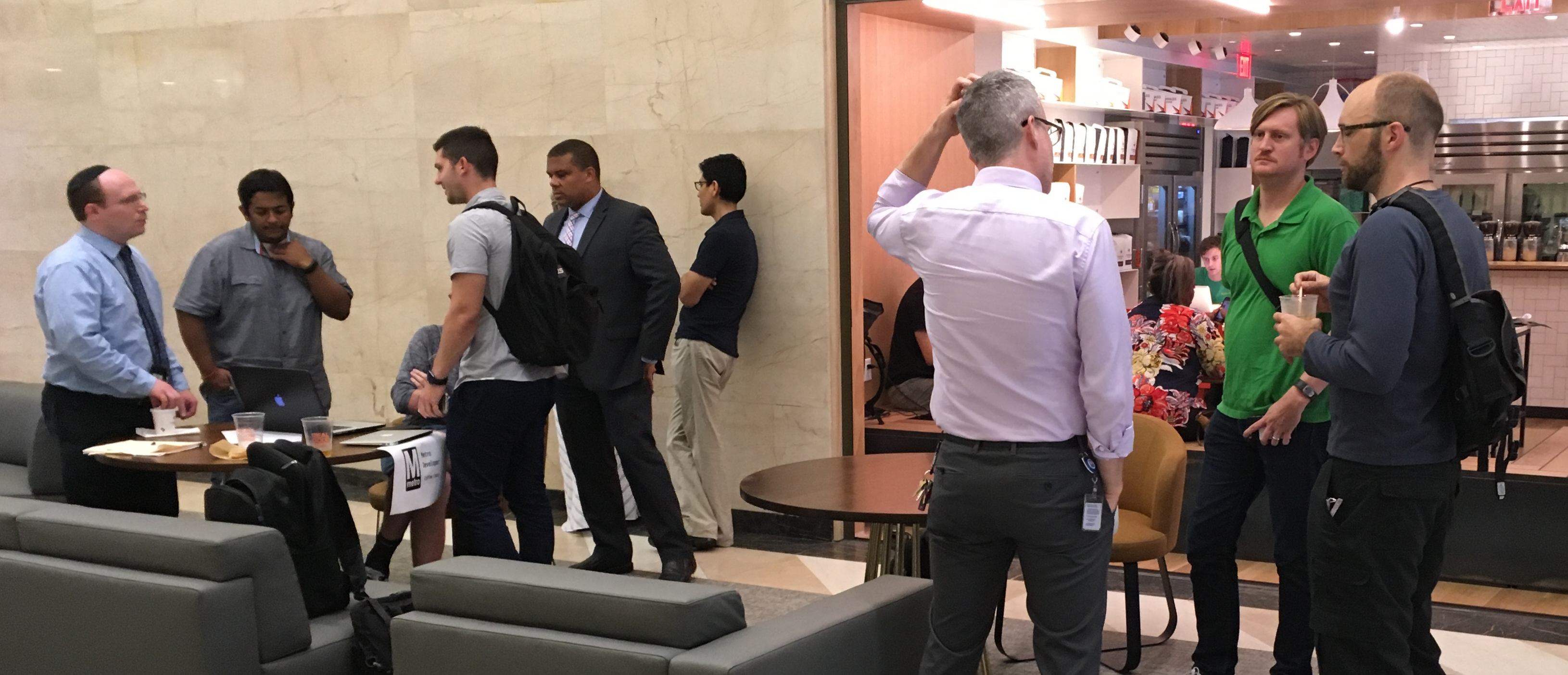
Not all rail customers chose to use the shuttles.
Some riders, especially those traveling locally, switched to other bus routes. Ridership on the Metroway premium bus service more than doubled compared to June, and during Surge 4, it nearly tripled compared to the same period last year! Ridership on the 10A was up 29-64%, and 11Y ridership was up 128-133%, or more than double. Metrobus added service on all of these alternative lines, and Metroway did not charge fares during the Surges. We will be monitoring future ridership to see if any customers decide to remain with Metroway after the surges end.
Overall bus ridership on other lines in the Surge area was up 1%.
These first SafeTrack surges highlight one of bus’ key attributes as a mode: flexibility.
Metrobus has supported the SafeTrack work by moving tens of thousands of passengers along corridors that don’t normally see that level of demand for bus service, in different locations every couple of weeks. There’s been plenty of work behind the scenes to make that happen:
- The planning and scheduling team has worked out which routes the buses should take, which bus bays they should use at the stations, what time the buses need to leave the garages, and more.
- Our customer facilities team has ensured there were signs up at all the stops and stations pointing the way to bus service.
- The bus maintenance team has kept all the buses for SafeTrack up and running.
- The street operations staff have answered passengers’ questions and worked with the Bus Operations Communications Center and the bus operators to make sure everything ran smoothly.
- Bus operators have learned new routes in a very short amount of time and safely taken tens of thousands of passengers where they needed to go.
Usually, Metrobus makes service changes only about once a quarter, since passengers count on the consistency and reliability of our service. But when it’s needed, bus service can be very nimble, allowing it to support the important maintenance work being done during SafeTrack.
Did you ride Metroway or the shuttles during Surge 3 or 4? What did you think? What other opportunities are there to capitalize on the flexibility of bus service?


Recent Comments