Chart of the Week: 5-Year Ridership Change By Station
November 5th, 2012
4 comments

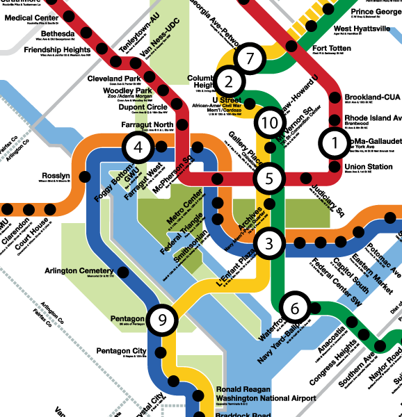
Inset of graphic showing top ten stations by absolute ridership growth, 2008 to 2012. Station #8, Morgan Boulevard, is off the map. Click the image above to download the full graphic in PDF.
While rail system ridership is up nearly 2% over 2008 levels, this growth in ridership is not spread evenly across the Metrorail service area. This map illustrates the locations of the stations in the top-ten for absolute ridership growth, 2008 to 2012.
- In general, the Green Line corridor in DC is responsible for much of the station ridership increases.
- Much of the ridership growth illustrated on the map can be attributed to redevelopment around some of our more recently opened stations, such as Georgia Ave-Petworth, Columbia Heights, Morgan Boulevard (off of image above), and NoMa-Gallaudet.
- Additionally, redevelopment near Foggy Bottom-GWU, Waterfront and Shaw-Howard U has contributed to increased ridership at those stations.
- The increase at Pentagon could be due to increased express bus and commuter bus activity, with federal workers heading to new BRAC-related work sites along the I-95/395 corridor.
For a full version of this graphic, download the PDF: Top Ten Stations for Ridership Growth, 2008 to 2012 (1 Mb)


Recent Comments