Priority treatments speed up buses, which saves everyone time and money, uses street space most efficiently, and attracts development.
Bus priority projects, such as those begun through the regional TIGER grant and included in the Metrobus Priority Corridor Network Plan, will improve travel times, increase service reliability, and attract thousand of new riders once fully implemented.
But let’s step back for a moment. Why are these improvements needed?
")
Average AM Rush Hour Bus Speeds (Nov. 2009)
Read more…
Metro is considering a small fare increase and no changes to the fare structure for the FY15 Budget.
Every autumn, Metro staff begins the process of developing the budget for the next fiscal year, which starts on July 1 of the following calendar year. Every other year, per Metro Board resolution, the budget proposal can contain a fare increase intended to match the fares to the changes in the consumer price index (CPI).
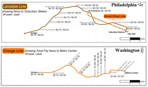
Comparison of SEPTA heavy rail and commuter rail fares and distances to Metrorail’s Orange Line, credit Matt Johnson via Greater Greater Washington. Click image for original context.
More than three years ago, Metro developed a new ridership and revenue model that allowed us to better evaluate the ridership and revenue impacts of potential changes to our fare structure. Staff used this model to evaluate concepts that could be incorporated into the FY13 budget to increase the alignment between fares and our fare policy principles.
At that time, Metro got a lot of input from the Greater Greater Washington community, as they discussed many aspects of Metro fares as compared to other system fare structures, including:
Read more…
Metrorail’s distance-based fare structure is the most equitable.
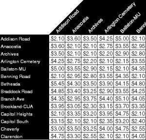
Excerpt of Metrorail distance-based fare table.
Metrorail is one of only three heavy rail systems in the United States with distance-based fares. (BART and PATCO are the other two.) And to the best of my knowledge, it’s the only one with peak and off-peak fares. With 86 stations (soon to be 91) and two fare time-periods (it used to be three), the average rider has a large number of possible fare combinations.
The benefits of Metrorail’s existing fare structure are many-fold, but chief among them are equity, efficiency, and economics.
The fare structure is fair. Distance-based and time-of-day fares allow transit riders to pay fares in proportion to the level of service they’re using. Peak period riders pay more and have more frequent service. Short distance travel is less expensive than long-distance. With flat fares, those who take short trips subsidize those who take longer trips, and people who ride during times of reduced service subsidize those who ride during the peaks when trains are most frequent. With zone-based fares, customers taking short trips that cross a zone boundary pay a larger fare than other customers taking longer trips entirely within a zone boundary.
The fare structure is equitable. A switch from distance-based to flat-fare that was revenue neutral (not losing money) would raise a Title VI equity concern. Planning staff have done a preliminary analysis, and such a switch would have a disproportionate burden on low-income riders. A switch to flat fares that was not revenue neutral would result in higher subsidies from Metro’s funding partners
The fare structure promotes economic efficiency. People use resources more efficiently if they’re priced to reflect the value of the resource. Economists love variably priced roads like the Intercounty Connector (MD-200) and the I-495 Express Lanes, as the per-mile prices are set to keep traffic flowing. The same concept applies to Metrorail’s distance-based and peak/off-peak fares. Read more…
Metro seeks to reduce delays to Metrobus caused by on-board SmarTrip card loading by installing off-board SmarTrip® Recharge Stations at key locations across the region.
Metro has been quite successful at increasing the use of SmarTrip® card usage on both bus and rail. As noted in a previous post, many initiatives — including surcharges for paying cash — have been successful at raising the the SmarTrip® use rate to about 90% on both Metrorail and Metrobus. As many readers have noted, many Metrobus customers load small amounts of cash — enough for one or two trips — onto their SmarTrip card in order to avoid the surcharge. This on-board load transaction can take between five and 30 seconds and, on average, one out of every 14 trips on Metrobus involves a small value load. On some routes it’s as frequent as one out of every seven. This behavior results in longer dwell times, slower rides, and less efficient operations of Metrobus.
One possible solution is to increase the opportunities for loading value onto SmarTrip cards before the customer boards. While SmarTrip cards can be reloaded online, at Metrorail stations and at a variety of retail outlets around the region, the frequency of on-board loading indicates the need for additional, convenient opportunities to add value to SmarTrip cards.
Example of potential SmarTrip Reload Station size and location. Image updates every 5 seconds. Click image for larger version.
Metro is seeking to meet this need by developing and deploying SmarTrip Recharge Stations (SRS) at selected bus stops around the region. In addition to facilitating the loading of fares and passes to SmarTrip cards and working with Metro’s current back-end systems, the requirements for these recharging stations include: Read more…
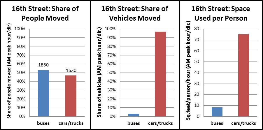
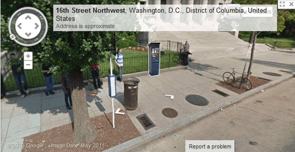
During the morning rush hour, Metrobus carries 50% of all of the people traveling on 16th Street NW towards downtown DC, despite using just 3% of the vehicles. However, it still gets stuck in traffic.
It will come as no surprise to regular riders of the Metrobus S1,2,4 (PDF), or MetroExtra S9 (PDF), but ridership has grown tremendously in recent years on 16th Street, from just over 16,000 riders per weekday in 2008 to about 20,500 this year. To keep pace, Metro has added lots of new service, most notably the S9 limited stop service in 2009.
In fact, Metro has added so much rush hour service on lower 16th Street that buses headed towards downtown DC now operate more frequently than any transit service in the region, including Metrorail, with buses arriving an average of nearly every 90 seconds.
Read more…
Metro requests feedback on draft Greenhouse Gas (GHG) calculator.
As part of the 40 Days of Momentum, a recent blog post the importance of Metro to the region, including greenhouse gas (GHGs) emissions reductions. Now it is your turn to look up your share of those GHG reductions.
Please try out our draft Greenhouse Gas Calculator, which asks for a starting and ending address, and then routes your trip via automobile and transit and displays the route and GHG emissions differences.* We are soft-launching this tool to crowd-source the quality assurance process and assess its usefulness.
Launch the GHG Emissions Savings Calculator!
What other features would you like to see? Did the tool accurately portray your travel choices? What is the difference in GHGs between driving and transit for your most frequent trip?
* Note on GHG calculations: the tool uses the Google Directions API to route your trip using both automobile and transit. The Google Directions API response includes each step of the journey, including mode and distance. We apply standard rates of GHG emissions per mile to the different modes used. As an added bonus, if your transit trip includes walking, we toss in an estimate of the calories you burned too!
NPR’s Morning Edition yesterday highlighted Arlington County‘s success in tackling commuting challenges, particularly as a result of the decision to bring Metrorail and transit-oriented development to the Rosslyn-Ballston corridor.
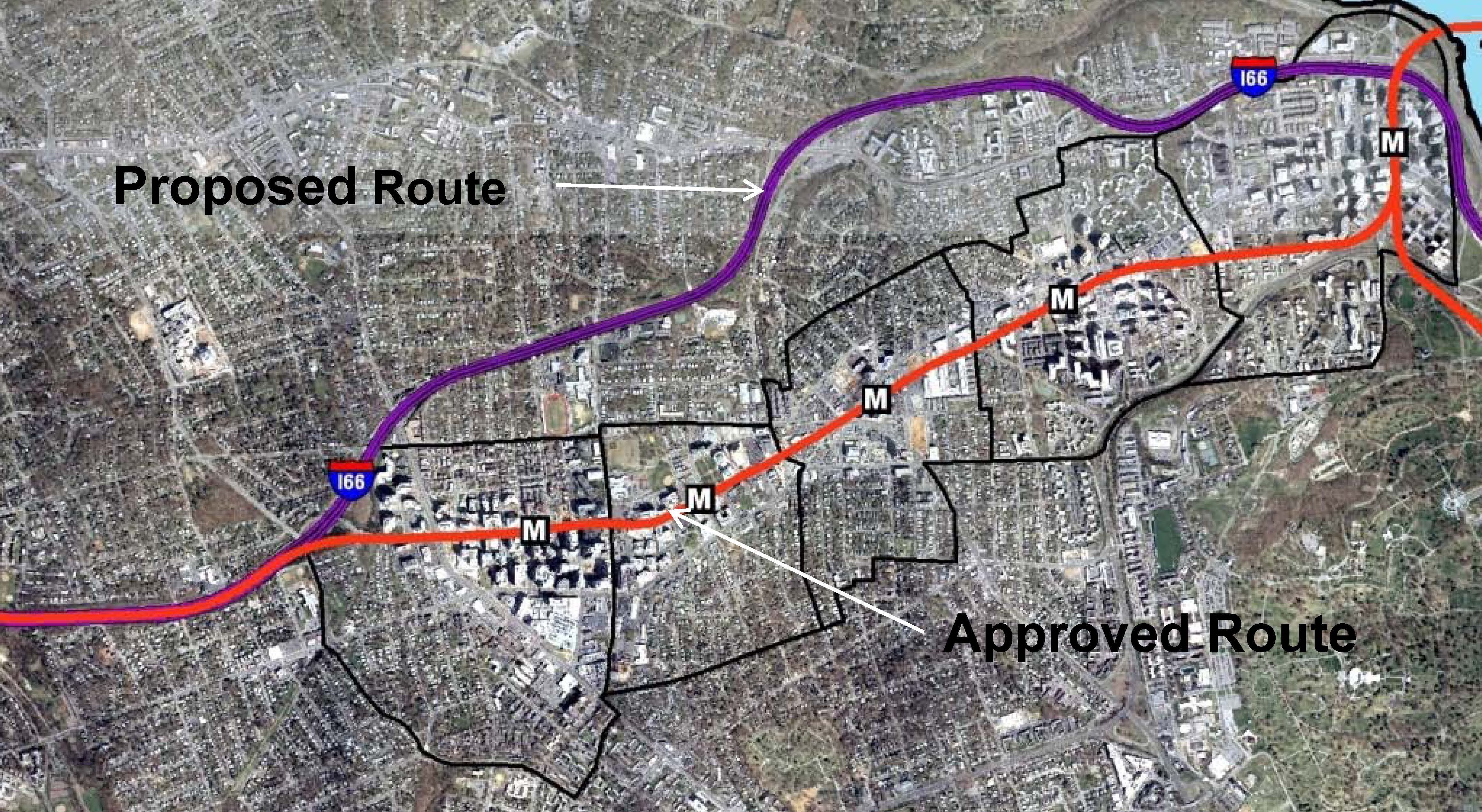
When the Metrorail system was initially designed in the early 1960s, the plan proposed running the Orange Line in the median of what would ultimately become Interstate 66. Arlington County officials lobbied hard and put forward county funds to bring the Orange Line to its existing home, under Wilson Boulevard. They foresaw the benefits of high capacity transit IN the neighborhoods, as opposed to adjacent to the neighborhoods. They also set forth zoning, planning, and other policies to ensure that the county would maximize the benefits from that decision. The NPR story talks about the results of those decisions, the shift from a post-World War II auto-dependent suburb to a vibrant, mixed-use community that has become the gold standard for many cities across the world.
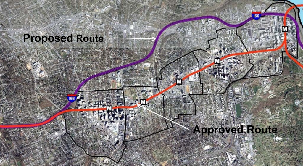
Orange Line – Proposed and Actual Alignments
For more background on the history, growth, and experience with transit-oriented development in the corridor, check out this powerpoint from the Arlington County Department of Community Planning, Housing and Development. Not only does it provide additional information, it has some terrific before and after photos of the different Arlington neighborhoods and how they have changed. Parkington, anyone?
If you’d like to contribute to the NPR series, you can share your commuting experience with Morning Edition – #NPRcommute.
Yesterday’s NPR story was the first in a multi-part series on how communities are tackling commuting challenges.
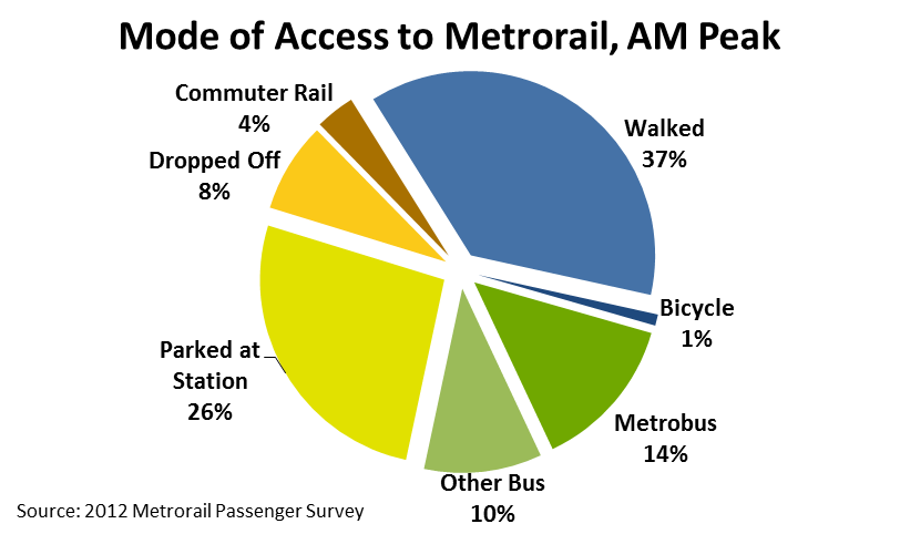
 Two-thirds of Metrorail riders take transit, walk, or bike to Metrorail for their morning commute.
Every morning, thousands of people walk through the faregates and into Metrorail. Did you ever wonder how they get to their station? Our 2012 Metrorail Passenger Survey tells us the answer to this question, for the morning rush:
- More than a third (38%) of Metrorail riders get to the station in the morning by walking or biking.
- Another quarter arrive by bus – Metrobus, as well as other bus operators in the region.
- Another third arrive by car – most by parking at or near the station, but some by getting dropped off.
- Finally, about 4% of riders arrive via commuter rail – mostly at Union Station.
Of the 25,000 or so daily riders who access rail by “Other Bus,” the top three contributors are Fairfax Connector (6,700), Montgomery County’s RideOn (5,700), and private shuttles (4,900). Of those who parked at their station, one-third were driving from less three miles away. Carpooling to Metrorail is very low – we estimate average vehicle occupancy at 1.03 passengers per parked car.
The map below shows how the answer to “How Did They Get to the Station?” varies dramatically station to station. (For the sake of legibility on this map, I’ve simplified the access modes into 4 groups). Read more…
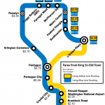
Metrorail charges you the lowest possible fare, even if other trips that seem longer are less expensive.
Recently a Twitter user asked a simple question: when traveling from King St-Old Town why does it cost more to travel to McPherson Sq than to Metro Center? As a straight shot on the Blue Line, McPherson Sq is closer than Metro Center, so why is the trip to Metro Center cheaper?
We recently described how Metrorail fares are calculated. However, the previous post failed to mention is that when there are two or more routes to travel between any pair of stations Metro uses the least expensive one.
For the example above, there are a few routes to travel between King St-Old Town and McPherson Sq. The shortest trip when considering the miles on the railway is to take Yellow to L’Enfant Plaza and then transfer to Blue or Orange, which results in 8.12 miles and a peak fare of $3.65. The fare to Metro Center is only $3.55, because it is only 7.82 miles from King St-Old Town via L’Enfant Plaza. For a rider taking the Blue Line to McPherson Sq, it might seem unfair that customers traveling one additional stop pay $0.10 less. Read more…
Recent surveys of leaders of the Washington-area business community show the current and growing importance of Metro to the region’s prosperity and competitiveness.
In March of 2013, an invitation to an online survey was sent to approximately 6,000 leaders of the Washington-area business community, including members of the DC Chamber of Commerce and the Greater Washington Board of Trade. Respondents were asked a variety of questions to gauge their perceptions of the important of Metro in succeeding in many aspects of business, including the general importance of Metro to businesses in the region.
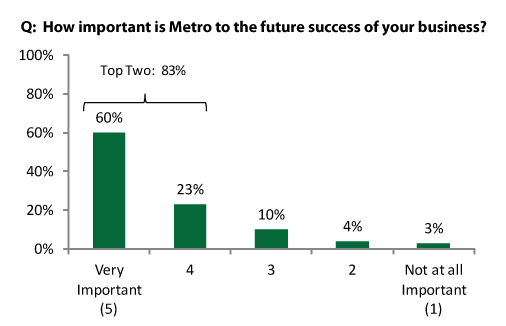
Respondents were in agreement about the importance of Metro D.C. metropolitan region businesses today and in the future.
Read more…


Recent Comments