
Off-Peak Fare Discounts and their Behavioral Implications
Metrorail riders facing a high percentage off-peak discount are motivated to delay their travel and save.
This post is guest-written by Sam Winward, a behavioral economist and Metrorail commuter who lives and works in the District. His analysis of Metro ridership patterns sheds light on the influence of off-peak pricing.
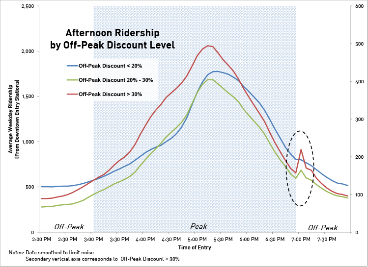
If you’ve ever waited a few extra minutes before swiping through a Metrorail faregate to qualify for the off-peak fare, you’re not alone. Within the afternoon peak / off-peak cusp period, when riders may be somewhat time flexible, Metrorail data from April – May 2015 confirms that some riders are delaying entry for savings.
What riders probably don’t know, is that their off-peak pricing discount could be substantially different from the riders around them. In fact, off-peak percent discounts can range from a 19% to 40% reduction of peak fares. Given the varying degree of off-peak incentive, riders are responding as we’d expect when weighing their opportunity cost of time.
As percent savings increase, riders are more likely to delay travel for off-peak fares. The graph below, derived from WMATA data, displays this ridership tendency.
Note the ridership uptick just after 7 pm. This runs counter to the natural pattern of declining ridership over this period, and the uptick steepens as the percent discount facing riders increases.
So why is there so much variation in off-peak discounts, and who are the lucky riders allowed large savings?
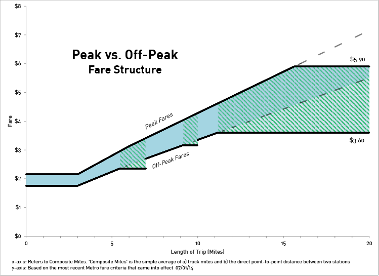
Particular trips, based on mileage between origin / destination stations, are subject to off-peak fare “caps.” WMATA introduced the caps in 2012 when off-peak fares switched to incremental fee-per-mile pricing. Off-peak fares for trips of just under 7 and 10 miles were capped, as these trip distances would have otherwise seen very large increases between the old and new fare structure. A maximum off-peak fare cap of $3.60 was also implemented, affecting riders with trips lengths greater than 11 miles.
The effects of these fare caps remain in the system today, and are not mirrored in peak fares.
As displayed below, the gap between peak and off-peak fares increases over regions subject to off-peak fare caps. This makes off-peak travel more enticing for riders’ whose trip length falls within a green zone.
Notably, small tweaks in the fare structure have large behavioral effects.
Even if you decide that added off-peak savings aren’t worth the wait, at least your decision can be informed. To see the off-peak discount applicable to your route, and how it compares to the rest, check out the interactive off-peak discount calculator on my website.
The full story, including the off-peak discount calculator and a formal analysis of the delayed ridership patterns, can be found at Sam’s site.

This is no surprise to anyone who’s seen people waiting to enter in Bethesda at 9:28.
It might be even clearer if you look at the absolute difference in fares, rather than the percentage. The time delay from waiting is the same, no matter what the trip length. So the incentive depends on the amount of money saved, not the percentage saving in fare.
@Ben Ross
Thanks for the comment. You’re right, the ‘waiters’ are often noticeable outside the faregates.
Trip length is important because it directly determines one’s peak and off-peak fares, which do not always move in tandem. Meaning people waiting to enter Bethesda station at 9:30am are subject to different off-peak savings depending on their exit-station. The most common destination from Bethesda at 9:30am is Farragut North, which happens to be a 6.48 mile trip. This trip, and others of just under 7 miles are subject to larger than normal savings since there is a cap on off-peak fares but not peak fares at these distances.
Of course the riders you see waiting may well be traveling distances subject to ‘normal’ off-peak savings as well. The larger discounts are more enticing, but not the only to entice.
The same general conclusion can be drawn by looking at absolute fare differences as you mentioned. Though saving a dollar off $3.35 or a dollar off $4.55 may not quite be the same incentive – Both of which are possible at different trip mileages. Using percentages helps to account for this.
Does this make sense given your comment?
Good analysis.
Never noticed the flat parts of off-peak fares until seeing this. Based on trip distance between OD-stations, you can actually identify OD station pairs for which off-peak fares fall into these two flat parts. Do you clearly see more substantial ridership upticks just after 7 pm for these OD station pairs in a disaggregated way, not in a disaggregated way presented in the figure?