
PlanItMetro at Metro Hack Night
I was invited to present a wide variety of data visualizations featured on the blog at a recent meeting of transportation techies.
I had the honor of being invited to present at the 2nd meeting of the Transportation Techies Meetup group, Metro Hack Night on January 2, 2014. I used this opportunity to illustrate some of the data visualizations I’ve developed using Metro data and talk a bit about the technology behind them.
The second was the visualization of one day of Metrorail station activity. This video was created using Processing, a Java-based visualization tool that takes care of a lot of the coding “grunt work” and allows a programmer to focus on the data and the visualization. I really enjoy Java so I took the opportunity this project provided to add a few flourishes such as a clock face and “sunrise” and “sunset.”
The final visualization in my presentation was of Metrorail current and future ridership demand per “link” as expressed in passengers per car (PPC). The Metro Board of Directors established a planning target of 100 PPC for rush period service and this animation illustrates the change over time of AM peak-hour PPC below and above that standard. I created this using ESRI’s ArcGIS and its built-in animation features. ArcGIS is the only commercially developed tool mentioned here, and it’s also the only one that allowed me to create an animation without writing a single line of code. This animation is still in draft form and cannot be included in this post, but a screen capture is presented below.
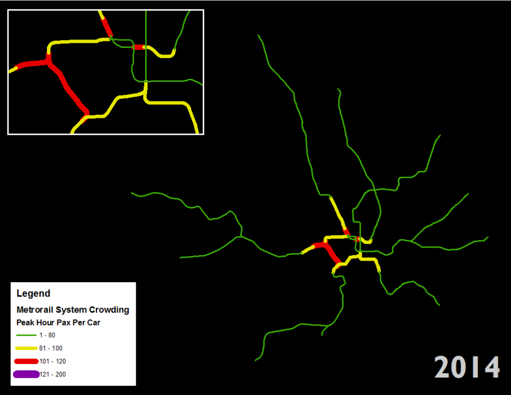
Screen shot of AM peak hour rail car crowding (PPC) for the current year.
It’s incredible that so many tools — both free and commercial — are available for the creation of robust data visualizations. Do you know of other tools not mentioned here? What about other great visualizations of transit data (like these)?
Notes and links from the meeting are available on the meeting HackPad, and the organizer wrote up a post summarizing the other presentations.

Recent Comments