Singapore MRT Rail Map Diagrams Show the Way
January 27th, 2014
2 comments
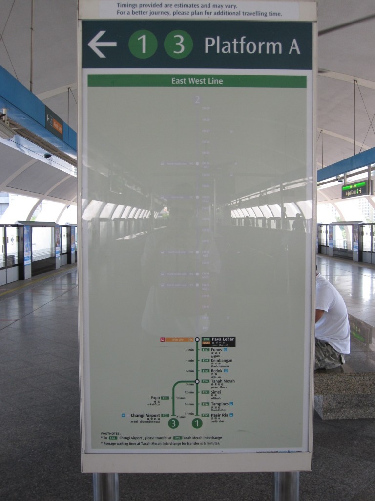
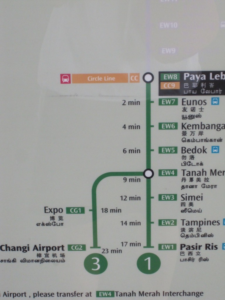
While waiting for a Metro train one day in Singapore, I noticed their rail map diagram had a big white space and then the rest of the map. Upon closer inspection the ‘white’ part was actually a grayed out part of the rail map showing the route the train had already covered. Having that information is very useful, particularly for a traveler unfamiliar with the system. One knows if they are starting at this particular station (Paya Lebar), what their options might be if he/she actually wanted to go in the opposite direction. This information gives the rider a helpful reference point in relationship to the rest of the system. Also upon closer inspection I saw that the map gave expected travel times between stations. How great is that?


Recent Comments