
What’s a Transit “Walk Shed”?
Metro will soon be measuring how much growth happens in places that are walkable to transit. Here’s an in-depth look at how we define “walkable” to Metrorail stations and Metrobus stops.
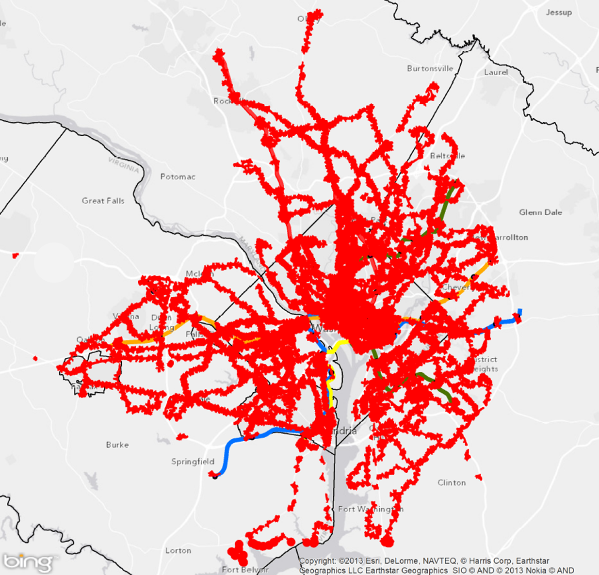
Areas reachable on foot from regional Metrobus stops and Metrorail stations
Metro’s new Connecting Communities metric will measure annual household growth in our region that occurs within the “transit shed” – the catchment area around transit service that generates walk ridership. And improving walkability can be an incredibly cost-effective way to reduce congestion and increase transit ridership. Let’s take a closer look at how we defined what’s “walkable to transit.”
How Far is Walkable? First, we defined walking distance as a half-mile from Metrorail, and a quarter-mile from Metrobus, for a number of reasons:
- Of all the passengers who walk to Metrorail each morning, the median walking distance is just under a half-mile (0.35 miles, actually). Riders walk farther to some stations than others, but the systemwide average is just shy of a half-mile. Since rail riders are on average willing to walk a little under a half-mile today, it is reasonable to use a half-mile as an upper limit for walking in the future. (We don’t have similar survey data on Metrobus – yet.)
- The land use within a quarter- and half-mile is where we see the strongest effects on ridership on Metro today. More on this below.
- Academic literature supports the half-mile radius from rail transit as no better than any other distance, particularly for the link between households and ridership.
- Practically, setting the distance any farther than 0.50 and 0.25 miles increases overlap with other nearby stations and bus stops, which increases computational complexity.
Walking Along a Network. While it’s easy to compute a catchment area “as the crow flies,” this fails to account for barriers like highways and rivers, and variations in street layout – which can be significant in our region. So, we constructed walkable areas using Network Analyst in GIS, based on an OpenStreetMap street network file. We found that OpenStreetMap’s network represented well some pedestrian-specific infrastructure like paths, trails, and overpasses – more so than other networks built primarily for routing automobiles.
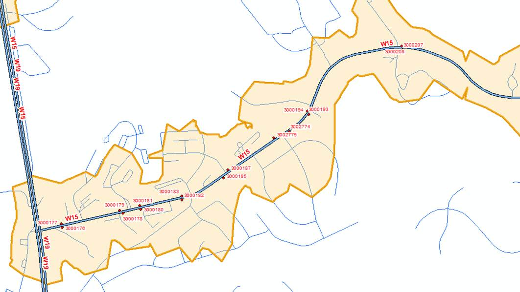
Sample quarter-mile transit sheds (in orange) around Metrobus stops (in red). Modified OpenStreetMap network shown in blue.
We modified the OpenStreetMap network somewhat to more accurately represent what’s “walkable” – removing freeways and interstates, adding short pathways at rail stations with multiple exits, and more. The resulting catchment areas are not perfect – not every pedestrian link is represented, and not all links on the road network are pedestrian-friendly, so we will be improving the network in the future.
Nevertheless, this network analysis captured the major impacts on walkability from barriers, rivers, and street grid. For example, look at the impact of the network analysis at two sample Metrorail stations below:
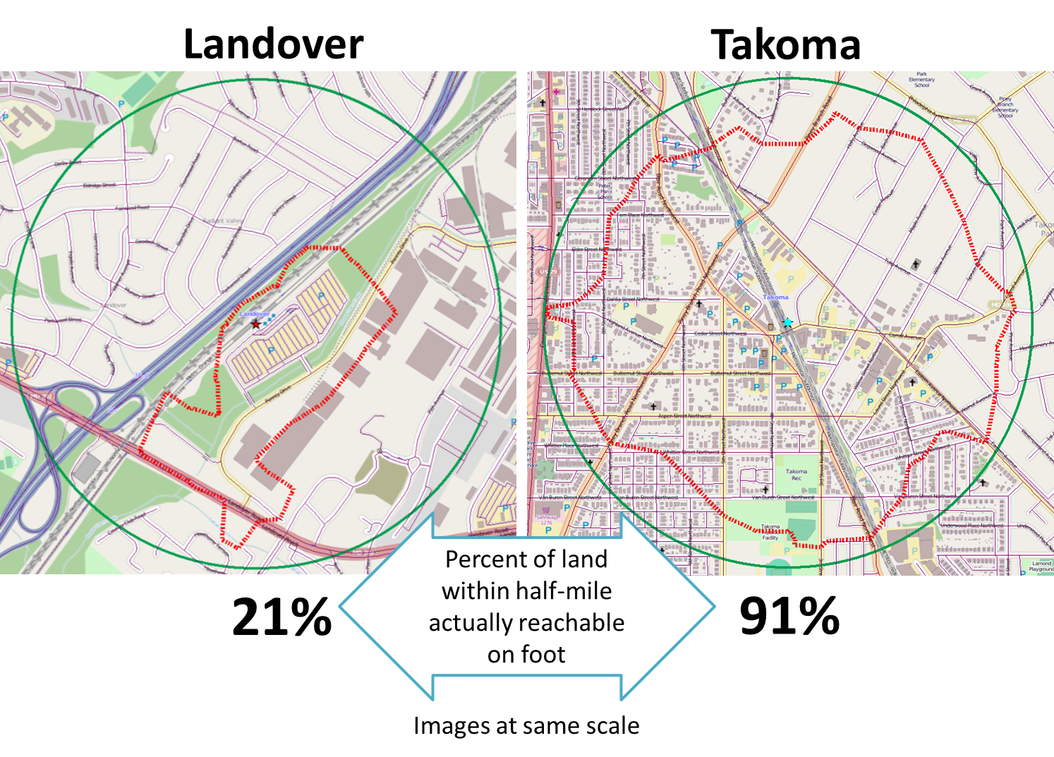
Rail riders can access very little of the station area on foot at Landover, but nearly all of the land at Takoma.
Why Does This Matter? Because Metro wants to understand how well it connects communities in our region, and the land use around transit is a huge determinant of ridership and Metro’s success. Preliminary research at Metro suggests that the number of households within a Metrorail station’s walkable area can explain over 90% of the station’s AM Peak walk ridership.
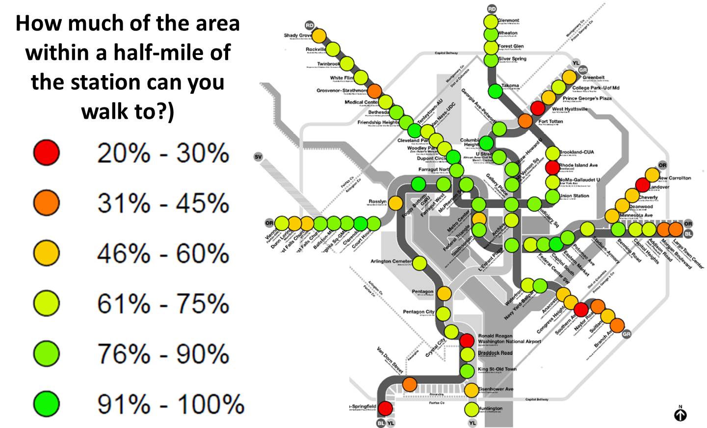
The resulting size of the pedestrian shed by Metrorail station.
Note 6/18/2014: thanks to some eagle-eyed commenters, we realized that there were some errors in the originally-published diagram above, undercounting the walkable area from several stations. We have since corrected the diagram.
What’s Next: We will use these sheds to measure growth near Metrorail and Metrobus for the Connecting Communities metric, and to explore the connection between adjacent land uses and rail ridership.

This is an excellent tool and wise approach to understanding TOD. Potentially, some pedestrian access improvements could dramatically increase TOD opportunities at several Metrorail stations.
Depending on the circumstances, such improvements could be very cheap or very expensive. Regardless, extending Metro accessibility to places that are now cut off from Metro access could enhance land values by more than the cost of the pedestrian improvements. Therefore, “value capture” should be employed to fund the improvements. If value capture produces more revenue than is required for the pedestrian connection, the remainder can be used for the Metrorail system at large, which is underfunded and which is ultimately responsible for the land value increases.
But in order for “value capture” to be successful, the mechanisms must be in place BEFORE infrastructure improvements are publicly announced. (Land values will frequently increase in anticipation of an infrastructure improvement. Waiting for the actual improvement to be constructed means that much of the value to be captured has already occurred and become a windfall to those who owned land when anticipation of the infrastructure improvement began.)
Looks like a discrepancy between the two graphics here. The first one shows Takoma at 91%; the second seems to have it colored for the 61-75% range.
@DP You’re absolutely right, thanks for catching this. Your comment and a few others over on Greater Greater Washington alerted me to a few errors in the diagram that were undercounting the walkable area from several stations. I corrected the diagram and added a note.
Does this include the area of Metro parking lots/garages as ‘walkable’?
@Bill At many stations with surface parking lots, yes. OpenStreetMap’s network often contain links for the lanes in a parking lot, so the network analysis thinks you can walk on them. The graphic of Landover above is a good example. It’s may be a bit inaccurate to call that “walkable,” but this issue will diminish when we get into the real heart of the analysis – counting the number of households and jobs within the walkable areas, and relating that to ridership. Stay tuned – another post is coming shortly!
I’m confused about 1 thing. If the the “median walking distance is just under a half-mile (0.35 miles, actually)” that means that 1/2 of the passengers walk further than the median. So shouldn’t you be using something like the 85 percentile to calculate the walkshed or the “upper limit for walking in the future”. I would think that setting the “upper limit” for walking to 0.5 miles is in fact unreasonable and under represents how far people are willing to walk.
JAB