
A Half-Mile Walk to the Nearest Metrorail Station, Mapped
August 4th, 2014
Here’s a map showing the walkable area around the nearest Metrorail station.
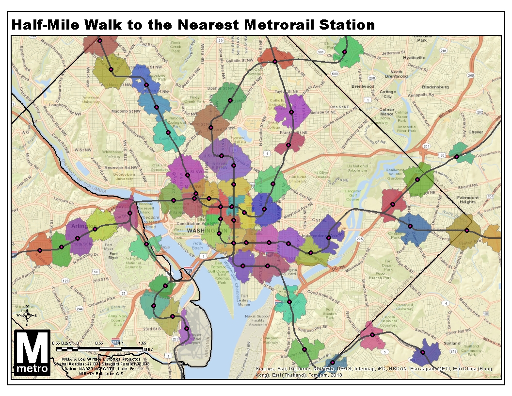
Did you ever wonder which Metrorail station is closest? Where’s the breakeven point between two stations? This map shows the areas you can actually reach within a half-mile walk along the roadway network, as we described previously. The twist this time is that I disallowed “overlap” within the GIS network analysis, so land is allotted to the closest station only, calculated by network walk distance.
What do you see in this map? Here’s a regional view with all stations, as well.
Update 9/2/2014: the GIS source file for this map is now available for download, in geodatabase (.gdb) format.

Nice analysis. Did you use single points for the stations or is each station entrance used to determine the walkshed?
Do you have those walksheds available as a shape file somewhere?
Its amazing that the map contains the wrong city/town name for each Green Line station in northern Prince George’s county
The obvious is that the neighborhoods abutting N. Capitol are isolated. Need streetcars or single lane buses or transit signal priority there. Also, the fact that there are two suburban style strip malls around the RI Ave Metro, plus very poor street access, makes that metro stop have one of the smallest footprints. The development around that has to go down as one of the worst in recent memory from a planning/walkability perspective. Good job, good effort though DC.
@Robert Catlin
What are you talking about? Only a random selection of towns are named all over the map - regardless of whether a station exists there or not, similar to how weather maps display a semi-random selection of town names that may or may not be important to anyone actually viewing the map. The towns that are named do exist in the vicinity of the label… so your comment just makes no sense whatsoever. I’m guessing you want only the towns that have stations to be named? If so, then say that.
@Robert Catlin
That’s because the town/placenames are a different map layer than the Metro stations.
The first thing I notice is that distance (even street network linear distance) can be overrated.
According to this map, I’m at the northwestern edge of the walkshed for NoMa. Experience has shown me that it’s quicker to walk to Shaw, though.
Now, that might be from the Shaw walkshed being calculated from the 7th & S entrance and not the 8th & R entrance (or maybe from a station centroid), but the dot on the map looks closer to the latter.
But something tells me the real reason is that the lights at Florida/N. Capitol and Florida/NY Ave intersections are really, really long. And that walking around ATF takes forever.
The towns that are named in northern Prince George’s have only a very few thousand people and are not located in the places that they are shown. Why would you intentionally mislocate place names on a transportation map? Pretty sloppy!
Cool map, though Federal Triangle looks overly squished. Like the walk distance calculator wasnt working for that station.
Thanks for the feedback, everyone. Here are some comments:
* For more info on how the walksheds are calculated, visit this link: https://planitmetro.com/2014/06/10/whats-a-walk-shed-to-transit/
* For Federal Triangle, the superblock where the IRS building sits creates a barrier that results a lot of the area near by being assigned to the catchment areas of other stations.
* We added many pedestrian paths to the Open Street Map network to capture the true walkability of the station areas. If you think you’ve found one that’s missing, please let us know in the comments or update the Open Street Map yourself and we’ll capture the updates in the next download. We’ll also be adding the ped links we found missing to the Open Street Map.
You ignored half the system, almost all of which is ripe for redevelopment.
@Redline SOS
Read the last sentence of the post.
Looking at the Crystal City/National Airport area, it’s a shame that there’s no decent pedestrian access to the airport from Crystal City. I’ve taken the 16H to Crystal City and boarded a train for the airport, but the off-ramp for the GW Parkway prevents me from safely walking the half-mile from Crystal City station to get to the B and C terminals. Granted, I don’t know how many people would want foot or bicycle access to DCA, but it’s such a short distance that it seems like a wasted opportunity.
Some minor pedestrian improvements would make it easy to walk from Crystal City to the airport. I ride VRE and often use the Crystal City station. I discovered that to get to the airport, rather than walk to the Crystal City Metro station and wait for a train, it was faster to walk down the Crystal City connector trail to the Mt. Vernon trail, then cut across the highway ramp and a couple of parking lots. I can walk from the water park to the airport terminal in 10 minutes without hurrying. But it’s not designed for pedestrians, and I don’t carry luggage; I mostly do it if meeting someone at the airport. A few curb cuts, paths, and crosswalks would make it an easy walk even with wheeled luggage.
Looks like a lot of this data would improve if you couldmap all entrances for each station. Woodley Park and U Street both should get larger catchments since I think most people don’t consider in-station walking to matter.
@Matt Dickens Thanks. For this analysis I started with each station as a single point, but then split several stations into multiple points for each entrance. But, because this was really an intermediate step in a ridership analysis, I only split stations where we have separate mezzanines (and thus separate ridership data), and where the entrances are meaningfully different. So, for example, I split Dupont north and south, but left Woodley Park as a single point since the elevator doesn’t have its own mezzanine. The ultimate objective of this work is to compare the land use within the station’s walk shed, with ridership, so the units of analysis need to match up.
Then, to make the map in this post, I union-ed the entrances back together to form a single polygon for each station.
Does this help clarify?
@Robert Catlin
The towns labeled in black text are not related to the Metrorail stations; they’re simply ESRI’s standard background layers to help orient the reader to the map.
@Vinnie Good observations - as a walk-to-Metro person myself, I agree that light timing can significantly change walk times, especially at peak times.
You’re right, the Shaw walkshed was calculated from the station platform centroid. Perhaps next time I should split that station?
@Froggie Yes - the GIS source file for this is now available; I linked to it at the bottom of the original post.
A commenter on GGW hypothesized that the RI Ave walkshed would increase greatly after installation of the Met Branch Trail pedestrian bridge. It would be interesting to see this analysis updated with that information.
I’m also curious if the stairs and pre-existing ramps to RI Ave were included, or if this assumed walking up Washington Pl.
Great map. Do the different colors have any significance? Also, why does it say Esri Hong Kong and Esri Thailand as sources? Does that mean that this map was calculated using data from Hong Kong sources or researchers? Thanks…