
Prioritizing Bike and Pedestrian Station Access Projects Near Metrorail, Part 2
Other than ridership potential, what are some of the other ways we can rank access projects relative to each other?
In our last post, we discussed how bike and pedestrian access projects relate back to ridership and how that relationship could be used to prioritize projects. In this post, we talk about some of the other criteria we are using to prioritize projects.
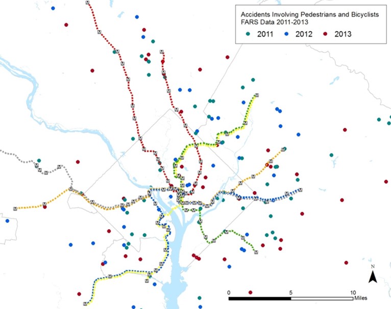
Bike and Pedestrian Fatalities, Sample Data Set
The first is safety. We are pulling together data about bike and pedestrian crashes near our stations that result in injuries or fatalities. We will then link these data in GIS back to the location the project, with the idea being that a new crosswalk or dedicated bike path in an area with a lot of recent crashes should score higher and deserves more attention. A safer path of travel helps not only our customers but all walkers and cyclists in these areas.
We also want to explore some other prioritization criteria. Here is what we have come up with:
- Close-in Parkers: In earlier posts, we’ve talked about hotspots, places where we have a high number of riders who choose to drive to Metrorail from less than a mile away. Perhaps, if the sidewalk/ bike network between these riders’ origins and the station were improved, more of them would be able to walk or bike to the station. This would, in turn, free up more parking capacity for passengers who live farther away. We’ll look at these hotspots and see if there is any overlap with the bike and pedestrian project list.
- MetroAccess Trips: We also are looking at the number of MetroAccess trips that occur within a half-mile of our station entrances. Depending on the exact nature of their disability, improvements such a new curb ramp or wider sidewalk may allow a MetroAccess customer to use the Metrorail system when they previously could not. So far we have seen only a small % of trips actually start or end near one of our stations, but we are continuing to review the data to see if any trends emerge.
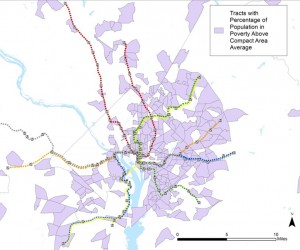
Low Income Census Tracts (U.S. Census Bureau, ACS 2005-2009 data)
- Transit Dependence/ Equity: We want projects in areas with high levels of trip making by transit-dependent populations to score higher. To do this, we are looking at two factors. First, average household income. Projects in areas with high levels of poverty relative to the regional average will score somewhat higher. The second factor involves popular destinations for transit dependent riders. We’ve mapped hospitals, schools and social service providers near our stations. Projects that improve access to these locations will score higher.
- Project Effectiveness: Projects close to a given station entrance have the ability to serve a wider number of people than something located far away, so they will score higher. Also, we want to try to identify “low-hanging fruit,” i.e. projects that are relatively easier to construct. To that end, we also will develop an index of project difficulty and group projects by their level of difficulty.
As discussed in our last few posts, we are developing a methodology to score each project using these criteria. We understand that access to transit is one of the many priorities our local jurisdictions have, and we want to be able to identify which projects provide the most benefit for our customers (both current and future) so as to better inform the development of future local capital programs.

Recent Comments