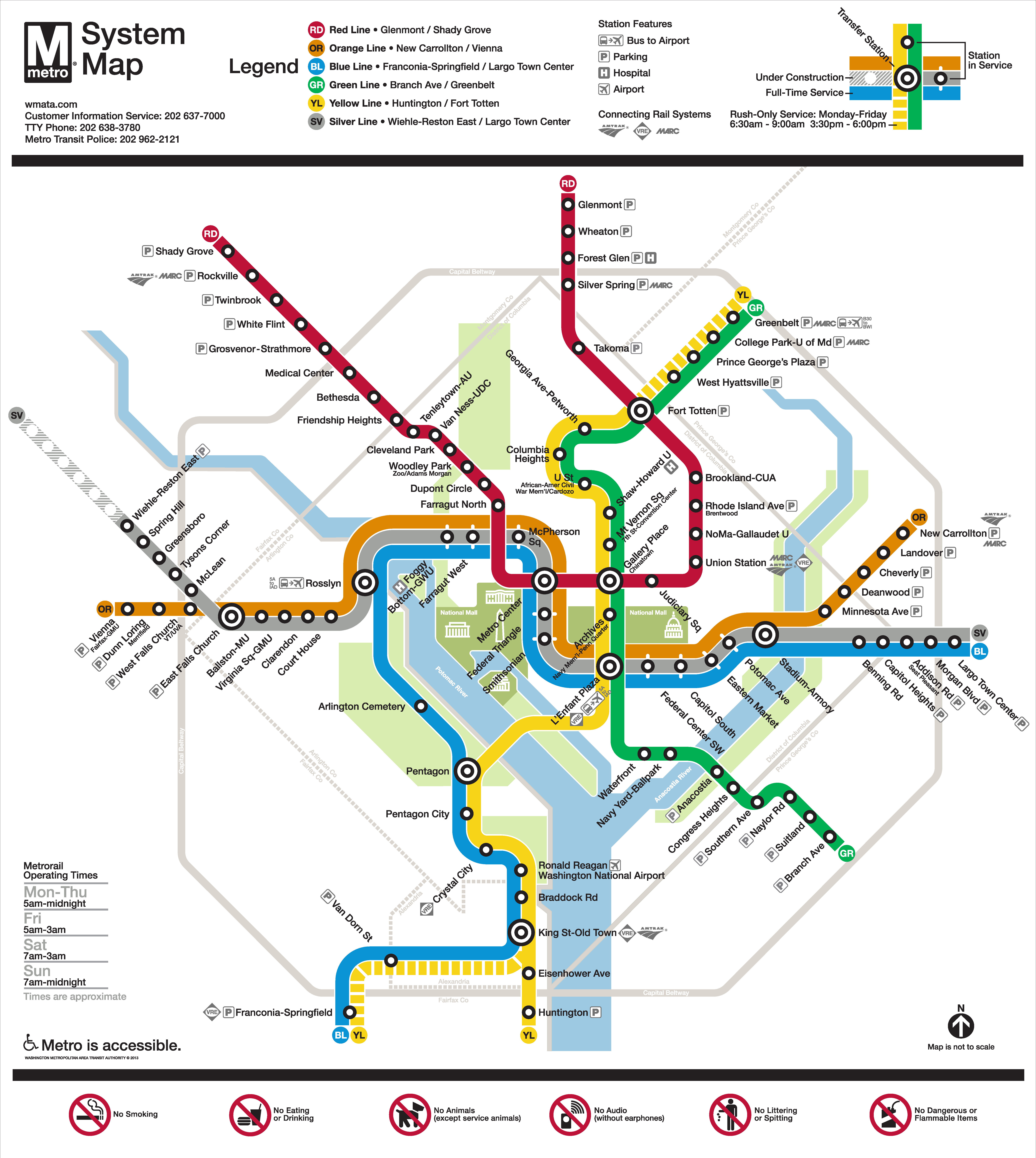
Metro is pleased to release the update to the Metrorail system map that shows phase one of the Silver Line in service and phase 2 under construction.
Final Silver Line Phase 1 system map. Click for high resolution version.
Metro’s original system map designer, Lance Wyman, began working with Metro again a few years ago when we needed to update the system map to accommodate the “Rush-Plus” service plan. Since then, the team has been working to incorporate the Silver Line onto the system map. After several months and extensivecustomerfeedback, Metro is pleased to release the updated map, above. Read more…
Metro is addresses crowding, integration of Purple Line in new Silver Spring Capacity Analysis.
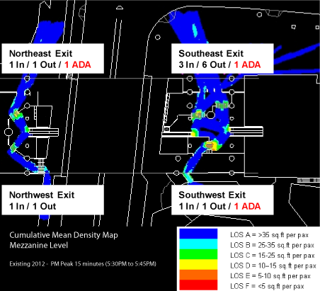
Metro staff have recently kicked off a capacity analysis of the Silver Spring station. The purpose of this study is to evaluate how well the station is functioning currently in terms of access and egress, vertical circulation, and faregate crowding. The study is also looking at how to accommodate growth in demand due to the opening of the Purple Line as well as increasing job and household density in Silver Spring and the region between now and 2030.
The current conditions assessment is nearly complete, and shows that the station is performing well under normal conditions. The graphic above is a cumulative mean density map, illustrating the average amount of “elbow room” each passenger has during the peak 15 minutes. It shows that the current configuration of faregates at the two mezzanines (north is to the upper left corner) is adequate to service PM peak period demand, with only a little crowding (orange) near some faregates.
This post focuses on the PM peak period because Silver Spring has more station exits in the PM peak than the AM peak: exiting passengers all disembark the train at the same time, which can cause queues to form at escalators and faregates. Passengers entering the station, however, tend to trickle in and don’t put as much of a strain on station facilities. These passengers can crowd the platform waiting areas, which will also be evaluated under this study.
Surveys rank Transit Crowding and Metro Repair Needs as top two transportation challenges in the region.
The National Capital Region Transportation Planning Board (TPB) recently released the draft of their Regional Transportation Priorities Plan (RTPP) for public comment. The plan, the result of a multi-year planning effort, worked to identify the top transportation challenges in the region, and pair them with near-term, long-term and ongoing strategies.
The top winner in the priorities plan is transit, as the top-two transportation challenges region-wide were identified as Transit Crowding and Metro Repair Needs and the top-rated strategy was identified as Metro Maintenance.
The study provided three long-term strategies for consideration:
A regional network of High-Occupancy Toll Lanes with new bus rapid transit (BRT) operating on them.
Concentrated land use paired with an increase in capacity of existing transit systems and enhanced bicycle and pedestrian infrastructure.
A combination of 1 and 2.
The study did not include any expansion of the transit network other than BRT on toll lanes, and opted to not include other strategies/modes in which this region has heavily invested.
Metrorail charges you the lowest possible fare, even if other trips that seem longer are less expensive.
Recently a Twitter user asked a simple question: when traveling from King St-Old Town why does it cost more to travel to McPherson Sq than to Metro Center? As a straight shot on the Blue Line, McPherson Sq is closer than Metro Center, so why is the trip to Metro Center cheaper?
We recently described how Metrorail fares are calculated. However, the previous post failed to mention is that when there are two or more routes to travel between any pair of stations Metro uses the least expensive one.
For the example above, there are a few routes to travel between King St-Old Town and McPherson Sq. The shortest trip when considering the miles on the railway is to take Yellow to L’Enfant Plaza and then transfer to Blue or Orange, which results in 8.12 miles and a peak fare of $3.65. The fare to Metro Center is only $3.55, because it is only 7.82 miles from King St-Old Town via L’Enfant Plaza. For a rider taking the Blue Line to McPherson Sq, it might seem unfair that customers traveling one additional stop pay $0.10 less. Read more…
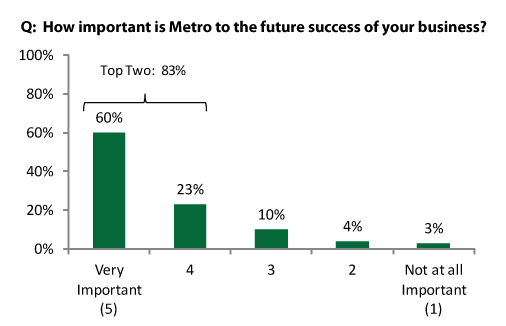
Recent surveys of leaders of the Washington-area business community show the current and growing importance of Metro to the region’s prosperity and competitiveness.
In March of 2013, an invitation to an online survey was sent to approximately 6,000 leaders of the Washington-area business community, including members of the DC Chamber of Commerce and the Greater Washington Board of Trade. Respondents were asked a variety of questions to gauge their perceptions of the important of Metro in succeeding in many aspects of business, including the general importance of Metro to businesses in the region.
Respondents were in agreement about the importance of Metro D.C. metropolitan region businesses today and in the future.
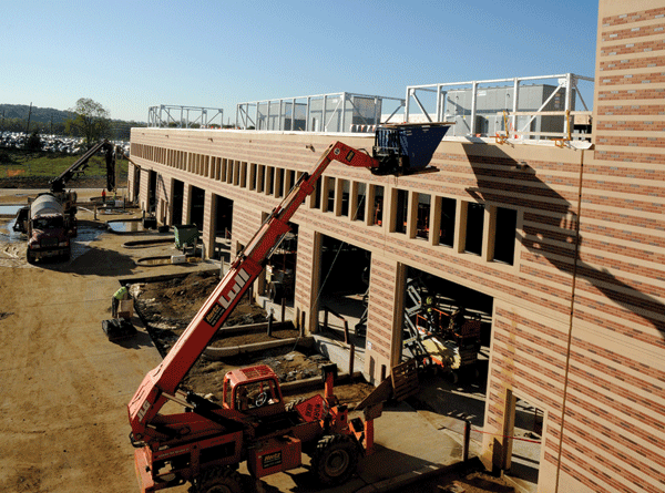
Metrobus needs to accommodate growth in demand for bus service. Simultaneously, service effectiveness and reliability are suffering due to increasing traffic congestion. In order to meet this challenge, Metro requires 400 new buses by 2025 in addition to those needed for service on the Priority Corridor Network (PCN). Between PCN implementation and service expansion on “Emerging Corridors”, a bus fleet of 2,060 is required by 2025. To support this fleet, an additional 250-space bus garage will be needed along with heavy overhaul capacity expansion from 100 to 150 buses/year.
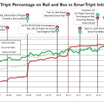
Metro first rolled out SmarTrip® on rail in 1999, breaking new ground as the first contact-less smart card used for transit in the United States. Metro began rolling out SmarTrip® on bus in 2002 and then to Metrorail parking facilities in 2004. While the utility of SmarTrip® was immediately obvious to many customers, others required a bit of encouragement to switch to the fare media that is most cost-effective for Metro and customers alike.
Usage of SmarTrip® on rail has been growing steadily since its launch, but use on bus seemed to plateau around 20% on bus starting in about July 2006 until about January 2008. That was the date when Metro began its first major initiative to encourage people to move to SmarTrip by implementing a $0.10 surcharge for using cash on bus.
Since then, Metro has rolled out new SmarTrip features and additional incentives to continue the increase in SmarTrip use rate.
The chart below illustrates the changes in SmarTrip use rate on both bus and rail, overlaid with the dates of the initiatives and feature releases that helped motivate customers to switch to SmarTrip. The usage rate now is nearly 90% on both bus and rail! Read more…
Metro planning staff have been working to showcase Metro data in new and unique ways. We recently posted a visualization in a calendar format that displayed 9 years of rail ridership in one graphic. We are currently working on animations of ridership data as well. Below is our first volley into that arena, a visualization of one day’s worth of station-level activity in 15-minute intervals.
Before hitting play, please note the following:
The video is available in high definition (720p), which is the recommended viewing resolution.
The dots are sized according to total station volume (entries plus exits) per 15-minute interval.
The color of the dot represents what percent of the volume is entries vs exits. Magenta dots are 100% exits, blue dots are 100% entries, and purple dots are 50/50, with other colors representing ratios between these three.
The visualization is of data from April 10, 2013, which hit the 4th highest ridership mark that day. A combination of cherry blossom peak bloom and two sporting events ratcheted ridership up to 871,000 for the day, compared to an average weekday ridership of around 750,000. Note the high level of activity at the Smithsonian station all day long, and big dots that grow and shrink as the sports games begin and then end near Gallery Place and Navy Yard-Ballpark stations.
What other unique activity can you spot in this animation? What other types of animations of Metrorail and Metrobus would be informative?
Mary Hynes — Board Member with Arlington County and WMATA Board of Directors Member — was recently featured by Comcast Newsmakers, discussing sustainability efforts as well as Metro’s strategic plan, Momentum.
Ms. Hynes describes Metro’s “Big Ideas” for 2025, including: the need for “all 8-car trains” during rush hour; additional crossovers and pocket tracks to provide more flexibility during peak period operations, emergencies and trackwork; and priority for Metrobus on city streets and highways.
Check out the video below and let us know your thoughts in the comments.

 The National Capital Region Transportation Planning Board (TPB) recently released the draft of their Regional Transportation Priorities Plan (RTPP) for public comment. The plan, the result of a
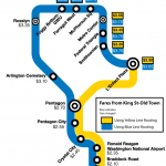


Recent Comments