
Visualization of 9 Years of Metrorail Ridership
Metro planning staff understand that a picture is worth at least a thousand words, and often more. (And that a video is worth 1000 * 30 words per second.) As such, we are always looking to increase our ability to create compelling graphs, charts and video simulations.
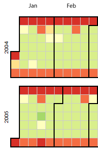
Sample image of the Metrorail Ridership Visualization. Click the image to open the viz in a new window.
Metro planning staff recently attended a Mobility Lab Hack Day, where transit planners and data geeks intersected to share ideas and techniques for visualization of the volumes of data being made available by operators around the region. One of the visualization tools discussed was D3, a javascript library for creating “data-driven documents.” One of the online examples is for a calendar view that displays stock market data.
Metro planning staff adapted this code to create a visualization of Metrorail ridership data from 2004 to the present. (Link opens in new window.) Here’s how it works:
- Each year is a horizontal stripe, sectioned off into months that go across. Both years and months are labeled.
- The days within each month are transposed, so start at the left and read down, then move right. In the sample image, the leftmost column of January 2004 is the first week, with Thursday January 1 being the darkest red square. A graphical example is also displayed in the legend at the top of the visualization.
- Each day is colored according to the ridership on that day, with darkest red being the smallest range (0 to 99,999) and the darkest green being the highest range (greater than 1,000,000).
- If you move your mouse pointer over any individual day, a small “tool tip” appears showing the date and the ridership for that day, rounded to the nearest 1,000.

Recent Comments