What Does the State of the Commute Survey Tell Us?
Last summer, the Metropolitan Washington Council of Governments (MWCOG) posted the results from the 2010 State of the Commute (SOC) Survey. Metro planners are reviewing the results now in support of our Regional Transit System Plan, which is looking to better connect areas of concentrated growth, such as the regional activity centers, and increase core capacity through 2040. The survey is conducted every three years to help MWCOG’s Transportation Planning Board better understand commuting trends and evaluate the effectiveness of its Commuter Connections program, which provides information about and benefits for commuting by transit and carpooling instead of single-occupancy vehicles (SOV).
It’s no surprise to those who endure the Washington region’s roads, that it was ranked as having the worst traffic in the country. However, the regional congestion picture provides general trends and averages, which are difficult to connect to individual choices and local decision-making. Below is some of the interesting information from the survey that is particularly relevant to Metro:
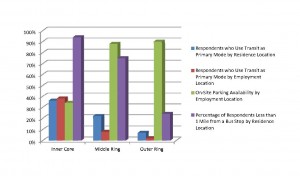
- Where transit is of high enough quality to become a viable option, large numbers of people choose to use it. Overall, region-wide transit-mode share may seem low, especially if all daily trips are considered. However, this overall number is largely a result of assessing large geographic areas of the region that have minimal transit coverage and land uses that are incompatible with transit. There are huge geographic variations, as follows:
- Mode Share by Residence: 34% of respondents who lived in the Inner Core (DC, Arlington, and Alexandria) used buses or rail to get to work, with another 9% walking or biking. 22% of respondents who lived in the Middle Ring (Fairfax, Montgomery, and Prince George’s Counties) took buses or rail and 1% biked or walked. In the Outer Ring (Calvert, Charles, Frederick, Loudoun and Prince William Counties), only 7% took bus or rail and less than 0.5% of respondents indicated that they walked or biked.
- Mode Share by Employment Location: 38% of respondents who worked in the Inner Core used bus and rail to access their jobs, while another 4% bike or walk. 8% of respondents who worked in the Middle Ring took buses or rail and 2% biked or walked. 2% of respondents who worked in the Outer Ring took buses or rail and 2% biked or walked.
- Transit’s overall commute mode share increased significantly, from 15% in 1994, to 17% in 2001 and 21% in 2010. The 2010 transit share is similar to what the 2007-08 MWCOG’s Household Travel Survey found. Some of the growth in transit mode share can be attributed to extensions in the Metrorail system in the late 1990s and early 2000s, including the Blue/Yellow Line to Franconia-Springfield, Green Line to Branch Avenue, and the Blue Line to Largo. This has resulted in a marked increase in residents in Charles County, Prince George’s County, Prince William County, and Alexandria commuting by transit. Additionally, between 1994 and 2008, there was a 43% growth in bus miles of service, which connected residents of jurisdictions in the Outer Ring to employment opportunities in the Middle Ring and Inner Core. Lastly, in 2000, SmartBenefits/MetroCheck was created, which helped to incentivize commuting by transit for all residents in the region.
- Respondents who took transit (44-52% depending upon the type of transit) or biked or walked (49%) as their primary commute mode indicated a higher level of satisfaction with their commute, than those who specified driving alone or carpooling (35%).
- There is a strong correlation between respondents’ satisfaction with their commutes and the length of their commutes, regardless of where they live or work. Also, respondents who lived close to transit reported higher overall satisfaction with transportation. For respondents who lived within a half mile of a bus stop, 44% were satisfied with transportation. 58% of respondents who lived within a half mile of a rail station were satisfied with transportation.
- Free parking at work had a strong effect on the decision to drive alone. Only 41% of respondents without free parking at work drove alone, whereas 82% of respondents who did have free parking chose to drive alone.
- 61% of employers provided commuting incentives to use other modes, with the most common being subsidies for transit and vanpools. Of those, 65% were located in the Inner Core. Over 50% of respondents whose employers offered this subsidy took advantage of it. Overall, respondents who worked for employers who offered a subsidy for non-SOV modes were significantly less likely to drive alone.
- For those who took transit or carpooled, 28% drove alone to reach the transit station or carpool origin. This is almost identical to the finding in Metro’s 2007 Metrorail Passenger Survey that 29% of AM peak surveyed rail riders used Metro’s Park and Ride facilities.
- By far, respondents indicated that the biggest reason they chose transit or carpooling was to save money on gas (55%). Avoiding stress was the second-highest personal benefit (17%).
The SOC Survey provides Metro, other transit agencies, and local policy makers with a lot of useful information. On a positive note, the region appears to be moving in the right direction. However, being number one in the country for worst traffic is not only a dubious distinction, but also a call for action. The SOC Survey results indicate a number of actions to make commuting better. These include focusing the region’s growth in areas that have high quality transit, connecting planned areas of concentrated growth with better transit service, and having more employers provide benefits to incentivize non-SOV use, preferably in lieu of subsidized or free parking. As more people commute in modes other than driving alone, more people are able to enjoy the higher levels of satisfaction brought about by these modes.


This is amazing. The ACS claims both lower and less sharply increasing mode shares (15% for DC), but being up to 21% would make DC start comparing with some non-US cities, like Toronto, Sydney, and Melbourne.