
Metro Unveils Final Silver Line Map
Metro is pleased to release the update to the Metrorail system map that shows phase one of the Silver Line in service and phase 2 under construction.
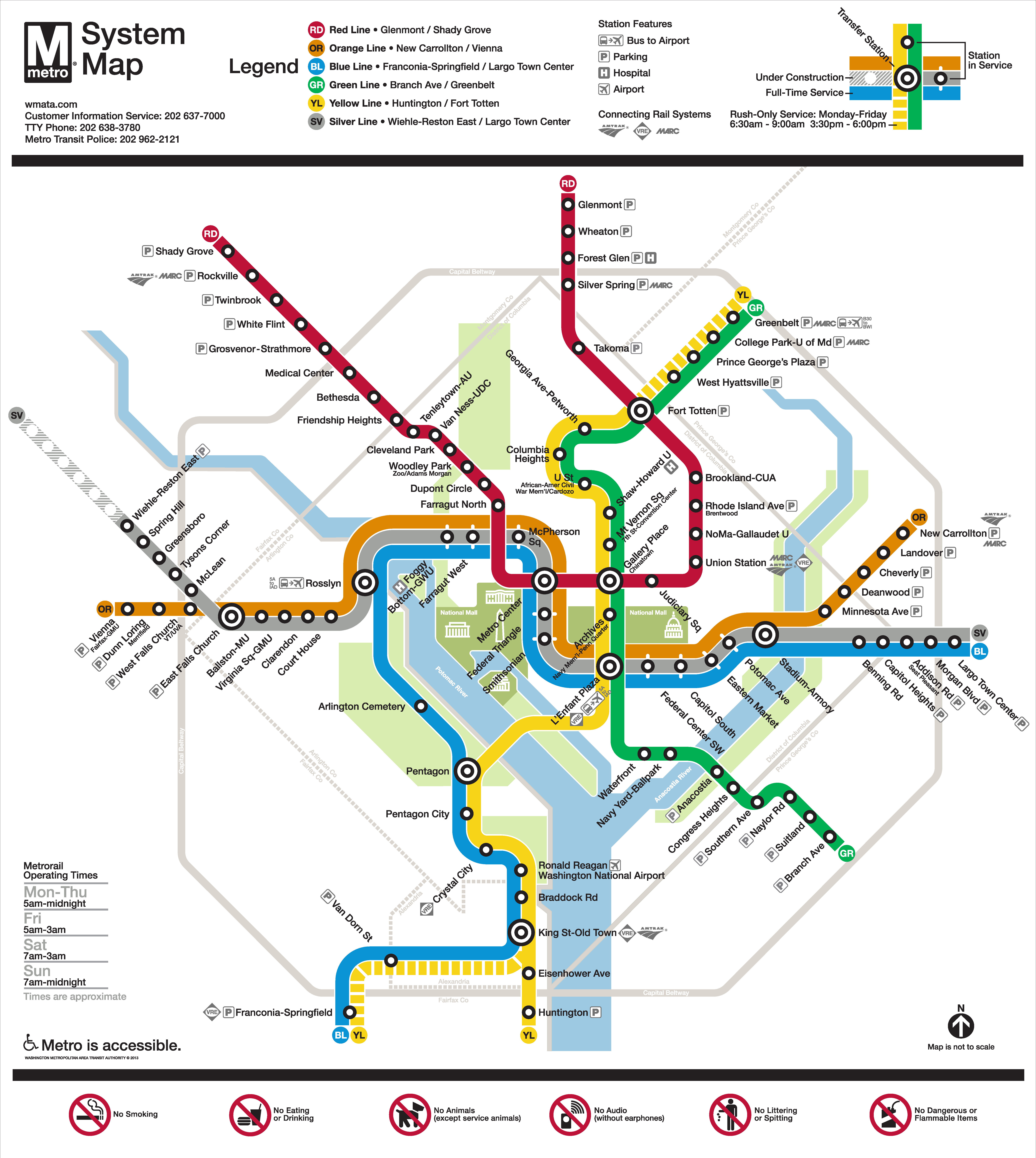
Final Silver Line Phase 1 system map. Click for high resolution version.
Metro’s original system map designer, Lance Wyman, began working with Metro again a few years ago when we needed to update the system map to accommodate the “Rush-Plus” service plan. Since then, the team has been working to incorporate the Silver Line onto the system map. After several months and extensive customer feedback, Metro is pleased to release the updated map, above.
In addition to the inclusion of the Silver Line, the map includes many improvements based on customer feedback, including:
- Made street abbreviations consistent
- Improved the geographic accuracy of the stations where possible
- New icon for stations that are serviced by three rail lines: the traditional station dot with white extenders
- Made the rail lines 24% thinner to ensure room for the Silver Line
- Added the Anacostia National Park
- Added the Metro Transit Police phone number
- Added a note that the map is not to scale
- Lightened the Beltway and jurisdiction borders to improve readability
Cross streets will remain on the large version of the maps in stations and on trains, where it is most useful for customers as they are traveling on Metro. However, in the interest of readability and streamlining, we will keep cross streets off smaller versions of the map often found online and in printed materials.
Thanks to everyone who contributed suggestions and recommendations to the map update process, via PlanItMetro, our mindmixer site, Greater Greater Washington and The Washington Post.
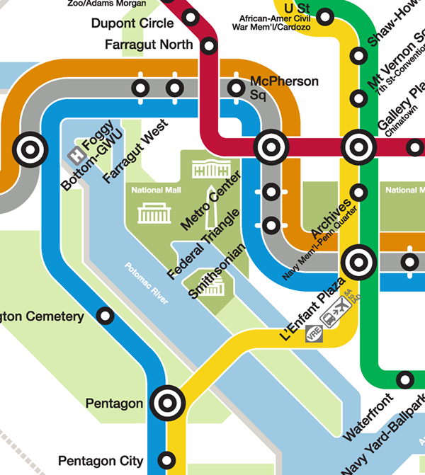
Subset of the new final Silver Line Phase 1 system map.

These are my thoughts:
1) I like the change in the location of Gallery Place, which now matches the location of Mt. Vernon Sq. and Shaw.
2) I am not sure if I like the placement of McPherson Sq. or not. It’s now really clear what location the name is tied to, but it seems disjointed compared to the other nearby B/O/S line station name placements.
3) I do not like the new Foggy Bottom. One, it’s written “Foggy” and then “Bottom” is on the next line. Two, the hospital symbol comes before the station name, whereas elsewhere it is after. Third, the Foggy Bottom station almost seems to refer to Rosslyn.
4) I like the smaller transfer station icon, but it looks silly on the 3 lines because it’s too small there.
5) I wish they had moved Crystal City’s station name, either aligning it with Reagan or Pentagon City. It just dangles there now at an odd angle.
6) I like the silver color gradient selected – I think it looks quite nice running alongside the bue on the eastern side and pretty good alongside the orange on the west.
7) This might be controversial, but I like the addition of the green on the eastern side of the map. It balances out the green on the west and center and makes the map a bit more enjoyable to look at (IMO) because it softens it up. That’s the same reason I like metro maps that have waterways indicated or other geographic features.
8) I wish they had added Loudon County markers, but maybe that will come with the next map in 2018….
9) For the reasons mentioned elsewhere, I do not like the Wiehle-Reston East station name because “Wiehle” is not a place, it’s a road. It should be “Wiehle Ave”, and then if necessary “Reston East”. You don’t just say “Benning” on the map, but “Benning Road”.
One more thing – aren’t some station names noticeably spaced further from their dot? See Takoma and Federal Center for example – both are noticeably spaced far off or not level with their assigned dot. Several names on other lines are also “off”.
What happens if, as proposed, the 5A Metrobus completely goes away? You’re then left with thousands of system maps in rail cars and stations that show a non-existent bus on the map.
The Foggy Bottom and Farragut West station names don’t seem to line up with their respective stations. Also, is it just me or does the new map not reflect the orange line “rush plus” service? Is that service no longer available?
@ ATC – There will be no more Rush Plus Orange line service.
@ Aaron – They will either have to re-issue all the maps, or they can use a sticker to cover it up (they’ve done that before when stations were still opening in the 80s/90s).
Thanks for all the comments. I’ll address a few points:
1) Wiehle: Place names and station names are like the chicken and the egg. No body called Metro Center “Metro Center” until the Metro station was built. Same with “Gallery Place.”
2) Name placement: One of the challenges with three lines running parallel is that it forces the station name to be further from the station icon, and when that station name is illustrated at a 45-degree angle, it further extends the perceived distance.
3) 5A: Good point, Aaron. I’ll make sure we know the decision about the 5A. If nothing else, we can place a sticker over the maps if the 5A is eliminated.
4) Rush Plus Orange: The new Silver Line service replaces the Rush Plus Orange Line service to Largo Town Center. So, yes, it’s no longer available.
Thanks again for the feedback!
Michael – But people do call it “Wiehle Avenue” because that refers to a real thing, the road. “Wiehle-Reston East” is 50% a real thing, Reston East, and 50% something that does not exist “Wiehle”.
@JDC
Planners in Fairfax County chose the names Wiehle-Reston East, Spring Hill and Greensboro and intentionally left the “Avenue”, “Road” and “Drive” from each in hopes to create new names for future places. Metro has a long history of creating new places that take on the name of the station they spring-up around, and Fairfax County hopes to continue that tradition around these new stations.
I still do not like the fact that you mislead people about yellow line service between Mt. Vernon Sq and Fort Totten. According to the legend, full-time yellow line service occurs from system opening to system closing. This is not accurate and has not been accurate for some time. Yellow line service does not run between Mt. Vernon Sq and Fort Totten during the rush hours, EXCEPT if it is a Rush-plus train. During the rush hour periods, non-Rush-plus trains begin and terminate at Mt. Vernon Sq.
Now you can make the argument that certain Red line trains stop at Silver Spring and Grosvenor-Strathmore before turning around. However, ALL of the stations on the Red line between Shady Grove and Glenmont are serviced during ALL of the hours that Metrorail is open and operating (minus closures for rebuilding/maintenance) as indicated in the Metrorail map. Conversely, some stations are not serviced on the Yellow line during certain times even though it is indicated on the Metrorail map as full-time service. Please make a final decision as to where consistent full-time yellow line service begins and terminates and then reflect that decision accurately on the Metrorail map. It is rather annoying and most likely confusing for tourists who visit the area.
To me it would make more sense to operate the Silver Line between New Carrollton and Whielle Avenue because eventually, when the line serves Dulles Airport, Amtrak & MARC Penn Line riders could ride Metrorail to the Airport without having to take the Red Line from Union Station and make a transfer to the Silver Line at Metro Center. Amtrak, MARC, and Metrorail might wish to consider “joint ticketing” options if this were to happen.
Furthermore, it seems to look neater on a map with the Silver Line operating to New Carrollton and the Orange Line operating to Largo Town Center (hopefully someday Six Flags) that way the Silver Line won’t have to “cross over” the Orange Line near East Falls Church.
Shouldn’t the Silver line station names be horizontal, not angled? The Silver line appears to be at the same angle as the western Red line, which has horizontal station names.
@Dave Linn
The southeastern Green Line (Naylor Rd, Suitland, etc…) is also at the same angle as western Red and western Silver but has the “angled” name labels.
You’re missing the orange rush line…
Oh, just saw the other note… never mind…
Why have you all changed the hue of the red and orange lines? The orange line looks gross like the old 1000 series cars and the red line almost looks burgundy now. Please change the line colors back to what they should be!!!
How soon will it be before we know the pricing and time between stations for the Silver line?
I’d have to agree with JDC that the placement of “Foggy Bottom – GWU” is closer to Rosslyn than it is the actual station. This is going to be quite confusing for tourists!
Wiehle was a town in the area before Reston was developed. The map looks nice, but I wish the color of the silver line was more silvery.
i like the metro map and it will be interesting to see how much people use the Silver Line.
The Metro maps are very useful and are fun to read! I have no problem with the angled names of the stations or the fact that the maps are not to scale.
Keep up the good work!
@SJB YES YES YES AMEN! I hate that the map CLEARLY indicates that *ALL* yellow line trains northbound should go to Fort Totten and yet still, during rush hour, NONE of them do! Make a decision and stick to it!
@Martha J. Gavaghan
I think lots of people will use the silver line. I for one, will happily start flying out of Dulles exclusively once it’s opened that far. I hate taking the bus to the airports and Reagan doesn’t have flights to all of the places I travel. Once the silver line opens getting to Dulles will be a breeze and I’d never use BWI again.
@JDC I completely agree about the Metro Center and Fed Triangle names being far off, I think there should be some small arrows pointing to certain stations so people who don’t ride Metro much don’t get confused.
I wonder if it’s too late to add to the map, but Metro Police now has a number that customers can text for non-emergency situations – http://www.wmata.com/about_metro/news/PressReleaseDetail.cfm?ReleaseID=5584