
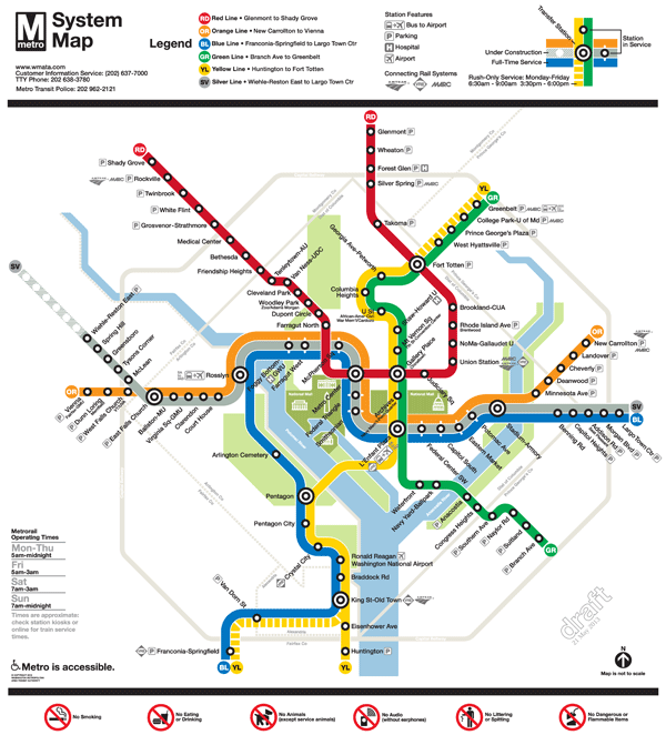
Final Draft Silver Line Metrorail Map for Review
We are down to the final two! Based on extensive customer feedback from the latest map revisions, we made some additional improvements to the map:
- Added the Metro Transit Police phone number;
- Made the rail lines 24% thinner;
- Added the Anacostia National Park;
- Included a note that the map is not to scale;
- Placed a darkened Silver Line between the Blue and Orange lines; and
- Lightened the Beltway and jurisdiction borders.
We are now down to selecting the icon to represent a three-line station. When we asked for feedback in the last round, some of you said that you didn’t like the idea of a completely new, third type of icon on the map (i.e., the capsule). Others said you liked the capsule, but it was too thin. It was recommended that we try to make the capsule the same width as the current station dot, but stretch it into an oval.
After reviewing your comments, Lance Wyman went back to his drawing board and came up with these two options:
- Map #1: Retains the current station dot with thin, white extenders
- Map #2: Stretches the current station dot into an oval
Take a look at these final versions and let us know which one you prefer. All comments welcome! Please provide feedback in the comments section below or on our MindMixer site. Thank you for your input.


Map #2: More Capsule!
I think the oval-capsules look great.
The capsule is better, but ALL stations should have thinner black outlines. The proportion between the inner white circle and black outline is not aesthetically pleasing.
THANK YOU for adding the MTPD phone number!
The “ovals,” or capsule shapes, need to be LONGER. As they are, it practically looks like only the Silver Line serves those stations.
The capsules are preferable. The white extender lines are hard to see, and make it appear that the orange and blue lines run express with only the silver line stopping downtown.
I like map #1 more. I realize that both the circle and oval station identifiers are included in the legend of map #2, but it makes it look like they might denote different things.
Is there any chance a note could be added that rush service on the yellow line only extends to Mt. Vernon Sq? This note was removed with the Rush Plus maps and having it can add some clarity for out of towners. You tend to look to the exterior of the map for the destination stations listed on trains (Huntington, Shady Grove, etc.). Since Mt. Vernon is right in the middle of the map, it confuses some people (at least I’ve seen enough confused tourists to remember it now).
Thanks for soliciting feedback.
What an improvement. All the changes on this one are for the better, the big one being the thinner lines. Lance did a great job.
I still prefer the icons of #2.
The only other oddity I notice here (which I didn’t notice before) is the scale on the BL/YL route; it is peculiar how there is more distance between P City and C City than there is between Reagan & Braddock. I realize it’s not to scale, but this might come back to bite if the Potomac Yard station is ever built. Where will it go? Everything above it will naturally have to shift north.
I really pushed for capsules, but seeing the white whiskers is actually sort of appealing to me, especially because I dislike the thing black lines of the capsules (and also the circles and bulls eye – ugh). Love the Police phone number and the Anacostia park! Makes that side of the river look inviting.
I appreciate the thinner lines, though I think they could go even thinner – then you wouldn’t need the capsules or the extenders (which I prefer to the capsules, but they’re still not an ideal solution.) I’m really not keen on having the Silver Line slip over the Orange at Falls Church instead of at Stadium-Armory, as it was before. Neither is physically accurate, which is fine, but in the current arrangement, West Falls Church and McLean look way too close together, as if you could walk from one to the other.
I can’t stand the capsules — they make the center of the map much too busy. Simple is better. Please keep the circles.
The capsules are best, but they need to be longer to cover more of the orange and blue lines. It’s a little confusing as drawn, but overall well done!
The silver line needs to be silver in color, not gray.
A few thoughts:
I do like the refined capsules better. It would be better if they were a little longer.
McLean and WFC are *way* too close together. They almost overlap.
The YL Line north of Mount Vernon Square should be dashed. Rush hour service between Mount Vernon Square and Fort Totten is only every 20 minutes. That doesn’t deserve a solid line. A dashed line would indicate that riders should check service information. It would also make Mount Vernon Square stand out more.
The short-turn terminals (Silver Spring, Grosvenor, Fort Totten, Mt. Vernon Sq) need to be better indicated, either through boldface or a different icon.
The icon for Eastern Market is not 45 degrees. It’s the only thing on the map that is not. Please make it conform to a 45-degree or 90-degree angle.
Some of the station names are still kind of far from their dots. For example: Smithsonian and Capitol Heights.
The Maryland/Virginia state border is *still* missing south of the district.
The lines should still be narrower. The labels are so far away from the dot/capsule that it looks like Roosevelt Island is identified as Foggy Bottom.
@Tim
I have been saying the same thing for months.
@Ed F
I mean I have been saying the ovals need to be longer because it isn’t clear that the blu and orange trains stop there.
Also, what’s the deal with circles at Foggy Bottom and at McPherson Sq.? Why are there different shapes there? That really suggests the stops are just for the Silver Line.
Oh I get it –duh — it’s a comparison. Well, the ovals are better, but they still need to be longer. And the circles at the transfer stations ought to ve wider.
If the lines were brought down an additional 9% from their original starting size, the 3 line segments would be equal in width to the old two line segments, and better able to fit in the same spaces as before. Just a thought.
Both the Foggy Bottom and Farragut West stations need to move over to the right. ThelFarragut West station should almost be where the red line is, and the Foggy Bottom station should be clear of the light green line that indicates a park.
Braddock Rd. through Eisenhower Ave. should be brought farther south. Braddock Rd. should be closer to King St. station, allowing for the Potomac Yard station. And the segment running horizontol to Franconia-Springfield can be closer to the beltway.
The Eastern Market and Potomac Ave. curve should be farther east, closer to the Stadium-Armory station icon.
The pill-shaped stations at Frederal Triangle and Smithsonian are wider than the ones at Foggy Bottom and McPherson Sq. They can be evened out.
I know things aren’t to scale. But, eventually, I’d like to see McPherson Sq. and Columbia Heights aligned north and south.
I’m glad Metro worked out moving the Silver Line between the Orange and Blue Lines, and mostly content with the other changes that were made.
One vote for lozenges.
Map #2 is better – the white oval dot should be entirely surrounded by black, not a regular white dot extended with the white line.
I prefer the extenders. Lines should also be a bit thinner.
The Beltway has now become a real obstacle to clarity and needs to be removed. Without the Beltway: (1) the Orange Line can be extended to the west to separate West Falls Church from the Orange Line, (2) the stations between Silver Spring and Glenmont can be spaced better, (3) the north end of the Green Line and the east end of the Orange Line can be extended so that the station names are easier to read.
Why show a highway on a transit map, anyway? Before Metro was built, when the map was first drawn, the Beltway was a useful device to give a feel for where stations would be. But today few new riders access Metro by the Beltway, the main auto access routes for visitors are I-270, I-95, and I-66.
Also, I prefer the pills.
Dot with white extenders.
i say go with the white whiskers, but on ALL stations that serve more than 1 line. this will make the map look uniform. otherwise it makes it look like there’s something special about the 3 line area and there’s not.
the pills, if used, should be the width of the outer ring of a transfer station. that will help somewhat.
eastern market has GOT to be fixed to be 45 degree angles, regardless of choice.
I like the new changes. I think the white whiskers are a big improvement. I really like them. However, what about tilting the remainder of the Orange line past East Falls Church down at a 45 degree angle, to mirror the Silver Line that tilts upwards? I think this would even out the map, provide more visual space, and it would also more accurately represent the geography of the area. Just a thought.
Both are a real improvement. On balance, I prefer the ovals.
What happens to the old signage when it comes down? I’m talking about stuff like the Platform Station Name signs with the end station destination, old maps from the Illuminated map cases, the maps on the platform that show just a map of the Stations Ahead.
I’m sure there are many of us, including myself, who would love to pay much more than the scrap/recycling value to get such a unique piece of decoration for our homes! I’m sure this could be a source of revenue for WMATA out of stuff that otherwise wouldn’t.
I hate the capsules. I love Map 1.
the whiskers are great with the white!!!
I wish the new map would more accurate reflect where the bend in the Anacostia River is… which is further upstream than where the Metro map shows it. The bend occurs directly south of the Capitol South and Navy Yard stations, not south of Waterfront.
Also, I would like to see some green space shown to depict the existence of Yards Park and Diamond Teague Park on the north bank of the Anacostia River in the Navy Yard neighborhood. I am very pleased to see the Anacostia Park green added, but the green space in the Navy Yard neighborhood is a huge regional draw and should be depicted as well.
1. Capsules should be longer to make it clear that those are stops for all 3 routes.
2. Union Station needs to be pulled closer to the U.S. Capitol (David Alpert has made this comment, too.) It does not appear walkable in the current map.
3. Agree with Matt Johnson and others that the Yellow line between Mt. Vernon Square and Fort Totten should not be shown as a solid line. It should also not be shown as a broken line in the same manner as the Rush+ service, either.
4. The spacing of the stations on the Silver line do not reflect the fact that Wiehle Ave. is considerably removed from Spring Hill. The portrayal should resemble the Red line spacing between Fort Totten and Takoma.
They should make the lines skinnier and the orbs slightly bigger. Every station should have one indicator unless it is a transfer-specific station
It’s close, but I like the whiskers as long as they’re on every station served by more than one line.
If you have the capsules or ovals at some stations and not others, people not familiar with the system will not comprehend quickly. Round dots = stations (And, that they serve all lines that come in and out will be easily noted at the first station a person uses.) Double round dots are transfer points. It is an easily understood two dot system – add another feature and you complicate something that need not be. There are two users for the MAP – us and them and by them I mean tourists. I, and I am sure the rest of the group, want them to understand it “quickly” so not as to be in the way – at any time of the day, but particularly during rush hours.
Map# 1
NO ovals please ; adds another level of confusion
At first I liked the capsules, but know I really like the dot with extenders. I agree with those that suggest using the dot with extender for all stations serving 2 or 3 lines to make it more uniform.
The circle with the dashes instead of the ovals. More standard.
As a Cartographer, and knowing the limitations of people’s vision, I say the oval method is better.
And it should be done for all stations a transfer is possible, not just the middle of the city. The white hashes are too hard to read especially in a rush.
Metro should seriously investigate the options of extending the Silver Line to either the Pentagon or Pentagon City, by continueing due-southeast on its own line via Falls Church and Baileys Crossroads and into Arlington in order to expand the metro rail service system. Metro is wasting time, money, and other resources by extending the Silver Line into DC and MD, where as we already have multiple connections from VA and the Silver Line will share the same tracks with two other lines and further crowd those metro stop platforms and (usually broken) escalators.
First, I’m not sure why this is a major issue — stations serving one and two lines have always looked the same (except where a two-line station’s lines diverge, in which case the icon looks the same as a three-line station… huh?). Solution: put whiskers on all two- AND three-line stations. (Perhaps the capsule-haters who keep collapsing perfectly inoffensive comments with multiple “dislikes” might agree with this… who knows?)
Please rename last silver line stop as “Reston East”. We don’t have to call as Wiele-Reston East. The name Wiele is unnecessary. In phase 2, call the next station as “Reston West”. Also call the last station as “Ashburn”, not route 772.
Thank you
Frank
Ashburn
Definitely #1, much more consistent w/the current look and the rest of the elements on the map. The blobs in #2 look out of place relative to the rest of station circles.
I think Map 2 is easier to understand – for both locals and tourists.
Definitely Map #1. The aesthetics are better and are a lot less cluttered for the tourists of the Greater Washington Area.
#1! The capsules look weird and draw too much attention.
Along with my other comments above, I’d like to suggest Metro move the YL and BL arm between Reagan National and Huntington stations further west. The section between that segment and the Potomac River needs more coastal room. The coastal segment between Navy Yard station and the Anacostia River shows more room than the Virginia segment, and it, in actuality, has just as much if not more so in some areas.
The circles with whiskers is more consistent and elegant, so long time riders will like it better. But the ovals may be easier to understand for first time riders. Metro should test the map with first time riders to find out which one is easier to understand. First time riders are the ones who need an easy to understand map the most.
I vote for: Map #2: Stretches the current station dot into an oval
I don’t find either the white whiskers or the ovals satisfactory. The ovals in particular make it look as though the Silver Line runs local while the Orange and Blue run express downtown (a la New York). The ovals should encompass the entire length of the Orange/Blue/Silver lines. But that might make them look pretty tacky.
I think this shows that it’s really time to adopt a more radical approach to redesigning the map and especially new station icons.
Definitely Map #2 – The whiskers on Map #1 are too thin to see easily, and the oval better expresses the idea that the lines are connected at the stations. Use the ovals on all stations serving more than one line.
The circle with extenders was clearer to me that the stop was available on all lines it touched.
My vote is for the ovals. That said, I dont think either option is great. The ovals look weird and inconsistent, and the whiskers dont easily convey that the station serves three lines. Another approach may be better. Did you try 1) three dots with whiskers (ala london) or 2) bigger dots all around
@Peter D
Seriously? Somehow, lots of people who have never ridden the “Tube” arrive in London every day… and they use both tick marks and white circles to indicate stations without any legend at all.
http://www.tfl.gov.uk/assets/downloads/standard-tube-map.gif
Give people some credit for having some basic inferential intelligence.
I like the one without the ovals also. The ovals seem to add too much emphasis to the stations where you can transfer between the Blue, Silver, and Orange lines; which are basically all of them.
I agree with a previous commenter on the last revision: all multi-line stations should have capsules (even though I think they look too much like surgical staples).
I still prefer the pill form for the station icons. I also think that the silver line should be taken back to the darker shade that it was previously. By making it so light, it seems out of place. The beltway should be light but not the silver line. I have no opinion on the addition of the Anacostia parks, that’s fine. Glad that the silver line swapped with the orange line but it does make West Falls Church station dot look a little awkward, maybe move that left a tad bit. Otherwise it’s shaping up well.
Stick with the capsules, the etches out of the Orange and Blue lines look like printing errors. Glad to see it’s come around to a product which is more uniform and understandable.
Maybe the Silver and Orange lines on the map can cross at the curve between Court House and Rosslyn. It may be a bit easier than east of Stadium-Armory, and it would help add space between McLean and West Falls Church stations on the map.
Definitely go with the dots with white whiskers over the capsules. The capsules look like they’re trying to denote a station that is operationally different when that isn’t the case.
I’d like for Metro to bring the east to west segment of the Orange/ Silver/ and Blue lines, carrying Foggy Bottom, Farragut West, and McPherson Sq. further south. That segment should be closer to Roosevelt Island. In addition, there shouldn’t be so much of the lines north of Rosslyn station before the line turns west.
I’ve mentioned it before, but I’d still like Metro to look into making the WFC station a transfer station. Eventually switch the transfer station from EFC to WFC. If the will is there; if there is a vision; it’s possible to create that vision. Metro should look into possibly straightening, putting the tracks closer to each other, and making level a portion of the tracks just north of I-66 on the Silver Line. Then build a platform, connect that platform with escalators leading to a pedestrian walkway which would lead to the original WFC gates. Many a passenger would love to save 5 minutes or more in their travels from west stations to other west stations in Fairfax and Loudon Cos. They would also appreciate not having to travel so long between Silver Line stations, and would like having the ability to exit a WFC station–close to route 7 shops in Falls Church. I know I would.
I am a person who often visits Faifax, Virginia (suburb of Wahington D.C) and gets addicted to the metro when I visit. I am visiting right now. I am a fan of map #1 because I think the ovals look to weird and unusual.