
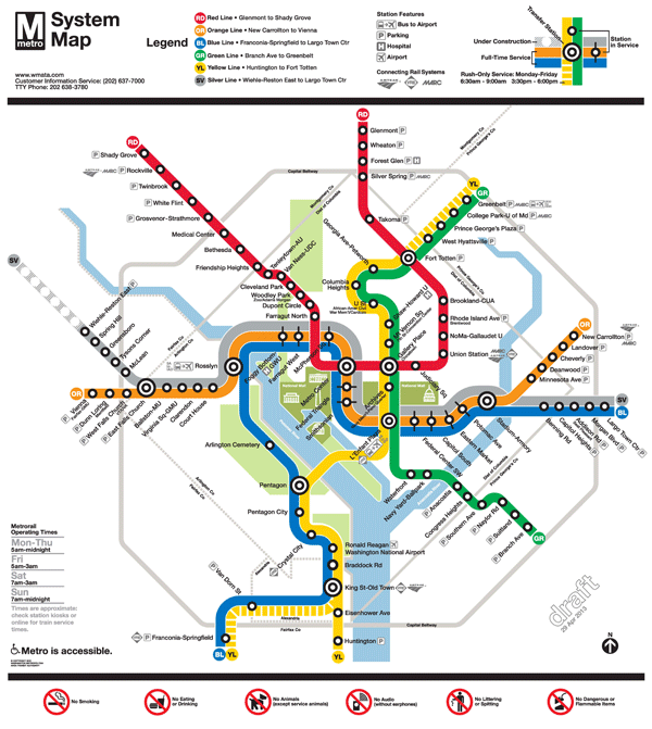
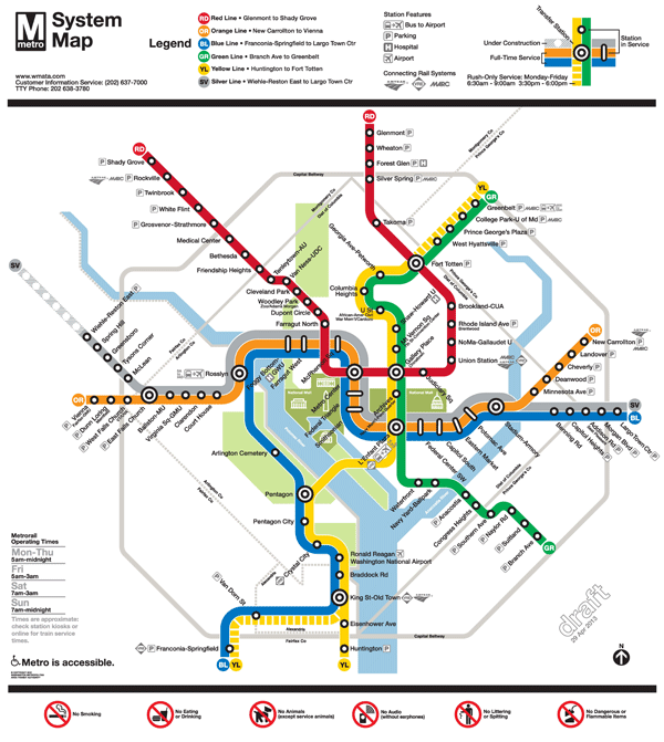
Updated Draft Silver Line Metrorail Map for Review
The Silver Line is coming soon, so Metro and original Metrorail map designer Lance Wyman are updating the current map. Based on extensive customer feedback from the last map revision, we made some general improvements such as making street abbreviations consistent and improving the geographic accuracy of the stations where possible. Cross streets will remain on the large version of the maps in stations and on trains, where it is most useful for customers as they are traveling on Metro. But in the interest of readability and streamlining, we will keep cross streets off smaller versions of the map often found online and in printed materials.
The first draft of the map (Map 1) also featured 14 percent thinner lines to help readability, now that the Silver Line will travel through DC, and a new station icon with lines that extended across all three rail colors. This version also included the new Silver Line station names for Phase 1.
When we asked for feedback on the draft earlier this year, here’s what you told us: try even thinner lines, explore other station dot options, and “Center” and “Heights” should not be abbreviated.
So here are two new maps for your review. In both maps, “Center” and “Heights” are no longer abbreviated. Map 1 below is an update of the previous draft, with slightly longer “whiskers”. Map 2 incorporates some additional changes:
- 24 percent thinner lines, and
- the use of a capsule-shaped station icon.
Please compare the two maps, visible below, and let us know which one you prefer.
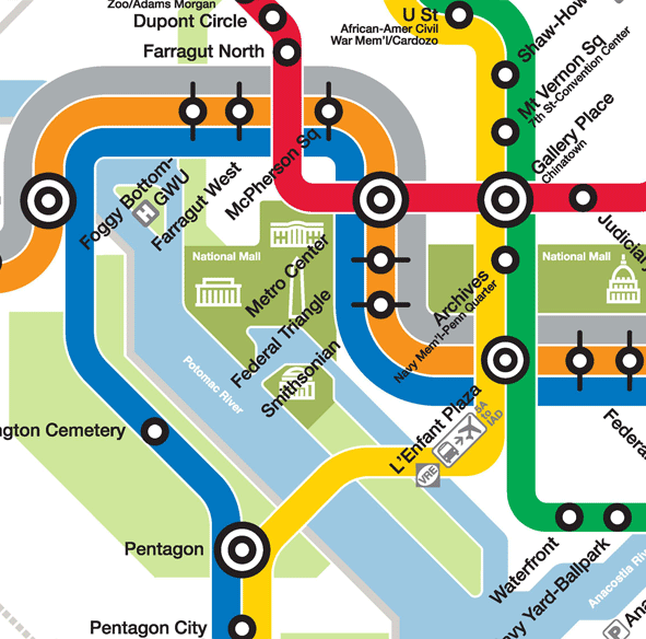
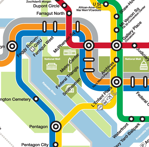
To compare the maps, slide the vertical bar across the image to show the differences between Map 1 and Map 2. Further below you will find a zoom-in of both maps, also with the vertical slider bar for easy comparison.
All comments welcome! Please comment below or on our MindMixer site. Also, check out Greater Greater Washington’s coverage of the updated map. Thank you for your input.

Map 2, by far. Makes better use of the allotted space, and gets rid of those silly “tick”-marks on the core B/O/S stations.
I like the thinner lines but I don’t like the capsule-shaped icons at all. They are confusing, they look like transfer points.
I very much like the pill-shaped dots for the Metro stops, but I think for uniformity, ALL of the stops should be more pill shaped. It still looks like the stops that are on all three lines are special.
With the latest draft, we have circular station icons where one or two lines run together, but capsule station icons where three lines run together. This needs to be consistent–perhaps by using capsule station icons whenever more than one line runs together (even the circular icons with tick marks were more clear). We all pay the price if the map is confusing for tourists.
Much improved! Though since the District boundaries moved a bit maybe Silver Spring should be moved down the red line so it doesn’t interfere with the Beltway markings.
I like the capsules with #2 but it gives the impression the silver line will on a different right of way than the other trains. If you go with capsules it should be consistent for all transfer stations. I do think the circles are a little too small on this version.
Good on Metro for not abbreviating Heights. I see “Ctr” is still used at Largo, but it seems to work OK. I preferred the “tick” marks vs. the elongated pill shaped station markers but either of the two work.
I don’t like the pill shaped icons because they aren’t uniform in design and look out of place with the other stop circles, as if they are more important or different kinds of stops, when they are just stations where you can catch one of three lines as opposed to one of two. That happens with two lines (green and yellow for example) many times on the map. The shape of the icon that designates a metro stop should be consistent throughout. The hashes on either side of the circles are enough to communicate that three lines share that station. The thinner lines make the map more readable and a bit less crowded looking, which is good.
Map 2 better. Can you fix the crossing of Rock Creek Park under the Red Line? It doesn’t cut between Woodley and Cleveland, it cuts between Woodley and Dupont. I think tourists may be confused.
I like the thinner lines, but not the capsule icon. I find the capsule icon inconsistent and confusing. Don’t know that the whisker dots work either, but they’re preferable to the capsules. Perhaps a slightly larger dot that covers all three lines, similar to the station icons that cover two lines?
Map 2. In my opinion, the thinner lines are better, and the capsules (for stations that cover multiple lines) are more clear than the circles with lines; that’s a common convention for subway maps. I think it would be more clear if the capsules were larger so that they covered the width of all the lines serviced by the station. In addition, I think that it would be even more clear if the stations that service two lines were delineated by a capsule icon (as is the case with the stations that service 3 or more lines) instead of a circle. That way it would be a consistent icon for all of the multiple-line stations across the map. Consistency and clarity are important, I think.
Love many of these changes. A few more critiques (many of which GGW beat me to):
– Love the pill icons but need to be wider; match radius of circles. As-shown they appear inconsistent with the established aesthetic.
– For consistency: *consider* using shorter pills across 2-line corridors, such as Yellow+Green or Blue+Yellow. I’m not sure if this would be positive or negative, but would be good to see for comparison.
– Ensure all station text+icons properly aligned. Some have been since the last iteration, but a few still aren’t.
– Remove Pentagon park; add Anacostia parks
– Consider a band connecting both Farraguts; possibly clarifying in legend. Here’s one example of a solid band; and another of a dotted (at the top).
– Consider a virtual tunnel between Metro Center & Chinatown, again potentially with a band connecting the two.
– Shift Silver+Orange+Blue further south from Mall
(will also help better align Fed Triangle / Smithsonian w/ respective stations; and equalise separation toward Capitol as compared to Union Station’s proximity)
– A larger radius for the Silver Line as it curves beneath Orange east of Stadium-Armory.
– Increase the spacing of Red Line stops on its eastern run through Maryland. Bring SS closer to the border; Forest Glen closer to Beltway; spread out Wheaton & Glenmont accordingly to match spacing.
– Work w/ bus providers to ensure IAD routes will not be modified in response to Silver Line. Makes sense 5A may still service L’Enfant and Rosslyn, but might it also hit Silver Line through/past Tysons? Should MWAA’s Washington Flyer be included, and will that still serve WFC?
Map 2 is definitely better. The crossover for the Orange and Silver lines is a little awkward. Why not just show them crossover at Stadium-Armory? Better yet, show the silver line coming below the Orange line at East Fall Church.
I would also consider the longer “pill shaped” stations on all the shared routes.
The text for Smithsonian and Federal Triangle don’t seem to match up to the stations.
I definitely like the bar-shaped stations on Map 2 over the dots-with-whiskers design on Map 1. I agree with other commenters that the bar-shaped station icons should be used uniformly across the entire map. The bullseyes for transfer stations should remain, but the single dots should all become bars for the sake of consistency.
If you keep the pill shapes, then (on this map draft at least) Farragut West could be moved closer to Farragut North. Also Metro Center and Gallery Place feel too far apart, given that in reality there’s only like 3-4 city blocks between them.
I still think it’s annoying that Grosvenor-Strathmore, Silver Spring, and Mt Vernon Square don’t get some acknowledgement as terminal stations. The old call-out boxes were annoying, but tourists should be able to quickly see on a map where the different terminal stations are so they can know where the heck their trains are going.
Map 2. The more universal symbol for a same track transfer station is the white lozenge, not the tick mark. Also, the sleeker lines are just damn sexy.
map 1 all the way. why the funny tick marked stations only on blue/orange/silver? also, am i the only one who calls the gallery place stop chinatown? can’t seem to unlearn that one….
I personally like the map 1. The map already has circles to representing the stations, why would you now add a new shape. I thought the Silver Line only connected at West Falls Church; why do both maps look like the silver line is going to go from Loudon County through the District of Columbia and out to Prince George’s County? On map 1, what is the purpose for the lines through the circles, just use the same type of circles that are on the original metro map.
Much better! I’m a big fan of Map 2 for the greatest amount of clarity at a glance in terms of which lines serve which stations. Now please just make those dashed lines on Orange and Yellow 75% thinner … rush-hour service is such a small part of the time, you don’t need to make the service that prominently featured.
This is a comment aimed more generally at the way the system map works, or rather how the direction of trains is identified in each station. I feel there should be a better way of identifying which direction each platform is heading in the stations, other than the end terminals. I’m not totally familiar with each line, and there have been many times when I’ve entered a station in a hurry needing to go only a few stops in a certain direction, but based on the end terminal markings have had no idea which one to choose, and thus missed an arriving train because I’ve had to consult the maps. In New York they use things like “Brooklyn Bound,” or “Bronx Bound,” to identify south and north-bound trains. Obviously some DC lines begin and end in the same state. Perhaps, then, an alternative would be to mark which cardinal direction any given platform is heading by using parenthesis in-station. For example, if you’re at the Metro Center station and want to go Union Station, you look for the sign that says, “Towards Glenmont (Westbound)”, or if you’re at Columbia Heights and want to get to Gallery Place, look for “Towards Branch Ave./Huntington (Southbound).” It’s not perfect, but it’s an idea that might seriously help tourists.
I don’t like capsules but the whisker style ones don’t make sense to me. For a tourist, it really isn’t going to make sense.
I’ve asked for this each time a new map has come up since 2010: PLEASE put the MTPD phone number at the top with the Customer Service number. It’s not an easy number to remember and these maps will be EVERYWHERE which makes them the PERFECT medium to get the number in reach of riders.
I definitely think that Map #2 is an improvement over #1. But I’d suggest a few changes:
*Errors*
–The station titles for Federal Triangle and Smithsonian are nowhere near the station lozenges.
–The Maryland/Virginia border is missing south of the Wilson Bridge.
–Largo Town Ctr still has “Center” abbreviated.
*Stylistic Issues*
–I think the lozenge statons should be the same width as the diameter of the circle stations.
–The lozenge for Eastern Market is at an odd angle, whereas everything else on the map is at 45 degrees or right angles. It stands out like a very sore thumb.
–The short turn stations are still not indicated in any way on the map. Silver Spring, Grosvenor, and Mount Vernon Square really need to be easier to find on the map. A boldface name would be a good start.
–Based on my personal observations, people would have an easier time navigating the Mid-City section of the system if the Yellow Line was shown as dashed north of Mount Vernon Square. Yes, the part between Mt Vernon Sq and Fort Totten is always served by the Yellow Line, but the service is intermittent and only to Franconia during rush hours, and only to Huntington off-peak. A dashed line would indicate to riders that they should investigate the service, and perhaps take whatever comes first and transfer at Mount Vernon Square.
–The use of subtitles is still haphazard. All of the stations should have only one concept in their primary name, and the rest should be subtitled. *NoMa* / {Galluadet} | *Navy Yard* / {Ballpark}.
–Farragut Crossing should be shown on the map. Even regular riders don’t know about it.
Thanks for listening to our feedback and sharing your revisions!
@Jason Sumler
The reason both maps look like the silver line is going to go from Loudon County through the District of Columbia and out to Prince George’s County is because the Silver Line *is* going to go from Loudoun County all the way to Largo.
If you get on a Silver Line train at Wiehle Avenue you’ll be able to ride all the way to Largo. You will not have to change trains. You can just sit right down and ride all the way. Unless a pregnant lady gets on. Then you should give her your seat. But you can still stay on the train all the way to Largo.
Map 2 is better. I’d vote for even thinner lines, similar to some of the earlier drafts I’ve seen in the past.
I like map #1 because the pill-shaped stops are confusing. Also, should Union Station include a “transfer” logo for the streetcar that will open at the end of 2013? I’d actually like to see the street cars incorporated into the map somehow.
Between the two options; I will lean toward Map #2 WITH some modifications (most of them have been mentioned already).
* Be consistent with the pill design at ALL muti-line stations
* At the top left place a contact us block w/ customer service #; TRANSIT POLICE #; website; and twitter handle.
* Adjust station names to match station locations (consider possible use of numbers for downtown DC stations with a box located near Branch Ave as key)
*Change the typeface for terminal stations to BOLD for standard terminals and possible BOLD ITALIC for special terminals (ie; Ft. Totten w/ a YL indicator)
*Place a dashed mark between the Farragut Stations. And be proactive and do the same for Metro Center – Gallery Place and implement the “virtual” transfer there as well now
* Next to the hours of operations you could place the train frequencies 3/6/12 mins. {Personal Opinion there should be 3 service levels: 5 min headway for Rush Hour/ 10 min headway for Regular service/ 15 mins for Reduced service}
*Please adjust the overall geometry to be more aligned with the DC area georgraphy
Map #2 is certainly the better one over the thicker lines and circles in Map #1. I agree with most of the above and a few cosmetic changes
* Metro Center-Chinatown and Farragut West-Farragut North are not miles apart. In revising the map, Metro Center and Chinatown stations should be closer together, even though it gives lesser white space to the adjacent Silver Line. The sharp 90-degree turn north and distance between Farragut North and Metro Center indicates at least a 2.5-3 mile walk if you compare it between Van Dorn-Franconia and the Red Line stops north of DC. The appropriate geographic layout shouldn’t be abandoned for better visualization.
*Instead of having the Silver Line join the Blue at Stadium Armory, shift it to slightly west of East Falls Church.
*Consistency is key. Make sure all lines that serve multiple lines (excluding major transfer poiints) have the pill design.
*Franconia-bound and Greenbelt-bound Yellow line trains should be marked with a diamond, which is the case for the and trains or the earlier days on the MTA NYCT system for add-ins or modified runs. The usual Yellow line service should maintain the yellow indicator between Huntington and Fort Totten.
Just as an added feature with the new 7000 series cars and hoping for automated announcements. Just as in NYC, have the next stop announcement show up at the stop and not after departing the station. Such as the R143/R142/R160 train sets, the automated announcement should indicate the direction of the train. An example for the Blue in VA: “This is a DC-bound Blue line train, the next stop is Rosslyn.” At Rosslyn: “This is Rosslyn. Transfer is available to the Orange line to Vienna and Silver-Dulles line to Wiehle Avenue.” At Foggy Bottom: “This is a Largo Center Center-bound Blue Line Train. The next stop is Farragut West.”
Map #2, but with edits (I agree with most that have already been stated, but I’ll emphasize a few essentials):
> UNIFORM use of the capsule station markers anywhere there is more than one line; the only exception I would make is at Rush-Plus stations–perhaps keeping those as dots will further distinguish those stations on the map as ones that are shared only part-time.
> CONSISTENT text formatting: some station names overlay the track line and are very proximate to the station markers–notably at the shared green/yellow stations and McPherson Square, whereas at other places the text almost seems “afraid” to touch the line (Federal Triangle and Smithsonian being the most extreme examples, caused in turn by Metro Center’s “off-color” placement). As a result there is distance between the station and its name, which can be problematic where there is a line of stations in close proximity (the northern-most green line stations, for instance). All station names need to be one or the other: due to the limited space, overlay the text on the track line where necessary and get the name as close to the station marker as possible.
> Even THINNER lines will make everything less crowded and more readable, and may even make it easier to resolve that awkward cross-over of the orange and silver lines east of Stadium-Armory.
> MTPD CONTACT INFO: this should already be EVERYWHERE, starting with the maps! The anti-sexual harassment/assault ad campaign doesn’t hold much water if someone who has been targeted cannot IMMEDIATELY find the MTPD phone number to call for assistance…
get rid of the pill shape icons. I have no clue what or why they are there. it’s confusing to me, think about the poor tourist that take your death rides
Amen to: thinner lines by another 50%; uniform use of either the whiskers or the pills (I don’t love either, but with thinner lines maybe a new option will emerge); illustration of the out-of-system transfer at the Farraguts; listing phone number for Transit Police; listing train headway times under various circumstances (why was this never here in the first place is beyond me); better geographic placing of stations; fixing Center abbreviation at Largo. Ideally, I think the suggestions re: downplaying Rush Plus and illustrating the Yellow Line to Mt. Vernon vs. Ft. Totten should be implemented too. That is all :)
@Samuel Wong
That would be very, very helpful. Having the “bound” added would, I think, help most of the lost tourists who, despite signage (albeit not good signage) cannot figure out which way (inbound/outbound, northbound, southbound etc) a train is heading.
Hate the capsule icons! They look radically different from the station indicators on other lines. The circles with the extenders on map 1 are much better (bit even close). I like the thinner lines but please don’t use the capsules!!
map 2.
Map 2 FTW.
I also like the new darker red.
Agree with David re: location of Union Station, though I don’t think you could move Gallery Place and Metro Center any closer.
Also like David’s idea about a strip of green along the Anacostia. A lot of people derive their impressions of local geography from this map, and that’d introduce to a lot of people that there’s tons of parkland there.
Definitely agree that Map 2 with the capsule-shaped stations is much more readable and usable. However, I’d suggest making the 2-line and single line station icons a bit more oval to tie into the capsule-shape for the 3-line station icon.
One other comment — why not take the opportunity to standardize College Park-UM (versus -U of Md)? And if you are going to keep the U of Md — you should make it U of MD.
Thanks everyone for all the great input so far! If you have an opinion, please share it in the comments even if someone else has already said it in a previous comment. We want to hear from everyone!
Question re: Silver Line. Is the reason it’s going at that angle to match the Orange line at the opposite side of the map? Symmetry alone should not guide that decision. Not sure to what extent the Orange line is actually in that straight of a line, but if we bend the Red at Van Ness and the Green at Southern Ave./Naylor Rd, why doesn’t the Silver line reflect its actual path, with a bend at Tysons and than a more easterly jog until Wiehle Ave???
I like Map 2. Great work!
I like the thicker lines in Map 1 but prefer the capsules and other features of Map 2.
Map 1 is much better. Consistent with the current circles that show lines running together. The capsule shape is too distracting from the overall design of the map.
Map 2 is an improvement, but there are still a few items I would like to see:
1) Thin the lines on the Rosslyn-Stadium corridor to, at most, the current thickness of OR/BL. 3 full size lines next to each other takes up way too much space, almost 10 city blocks. Anyone can tell that O/B/S all follow that same corridor. This will also allow the use of the current sized station dot, instead of the new oval design.
2) Mark the short turn stations (Grosvenor, SS, Mt. Vernon, perhaps even West Falls) with a different icon, or mark the line beyond them in a different manner, similar to the current dashed design. Also, some sort of notation (perhaps even on the line itself to indicate that all YL peak trains turn at Mt Vernon.
3)
I like map 2 no question. I think the capsules look much better, and i like the thinner lines and crisper typography of map 2.
I prefer map 2. I like the thinner lines, and I like the capsules.
Map 2, with the capsules.
@Rich Frangiamore
Not all Yellow Line trains turn at Mount Vernon Square during peak periods. Each hour, 3 run from Greenbelt to Franconia while 10 run from Mount Vernon Square to Huntington. That’s why the Yellow Line is dashed between Fort Totten and Greenbelt – to indicate the every-20-minute Yellow Line service that operates during peak.
I think the pill shapes need to be a bit longer and the circles at transfer or line merge stations need to be larger so that it is clear that all 3 lines stop all stations. Prefer the pills over the wiskers.
My wife and I agree that both are very usable and good and clear designs. We have a slight preference for the “whiskers” design (Map 1) over the “capsule” (Map 2), since it’s more familiar.
I do not like the color of the silver line. It looks gray. It needs to be a proper metallic silver please.
In map 2, the three-line stations look like a completely unrelated symbol to the dual-line stations, not part of a continuum. In part this is due to using a different line weight and a different inner and outer diameter, but another part is the overall appearance not so much of a lozenge but of a rounded line.
Using the capsule look for all stops would solve this, and it might give the map a charming “railroad” appearance, since the capsules look a bit like railroad ties. I would further suggest that the transfer stations be converted to a crossed-capsule design instead of the current double-circle design (which also fits a railroad theme — it’d look a bit like a railroad crossing sign).
Can’t wait to see map 3!
Map 1 is far superior because of the much better symbol for multi-line stations. However, there’s no reason not to do a combination of the best features of both. The narrower lines of Map 2 make sense.
A problem with old Metro maps, which probably exists with these maps altho I can’t tell for sure because of the miniature nature of the full maps which makes them largely unreadable, is failing to indicate that for both ends of the Red Line, only some trains go to the end of the line. People who don’t regularly ride Metro, like visitors to the area, are given no clue that half the trains stop short on both sides of the Red Line. The map should clue them into that. Metro needs to fix this problem.
I suggest yet another option all together. That would be that a circular DOT centered over each line that stops in that station with a thin like joining those DOTs. So in a station that has TWO lines would have TWO DOTs each centered over the line then a thin line connecting the DOTs to show that you can transfer between those DOTs. In a station that has THREE lines running throug it would have THREE DOTs over each line with a thin line connecting the three DOTs to show that you can transfer between the lines. I like the look of the PILL SHAPE but I don’t think it is clear enough to show a connection BETWEEN the lines even for frequent riders, and it is vague for new riders like tourists who need all the help they can get. To drive my point home … whatever icon you choose must make it CLEAR that you can get off one line and onto another regardless if it is a TWO, THREE and in the future perhaps FOUR or more !!! I believe that the first thing that new comers must learn is the concept of TRANSFER POINTS. A new comer might think that once they board the train they simply wait for their stop WITHOUT realizing they need to TRANSFER. Perhaps consider a ‘ T ‘ inside the DOT that shows that it is not just a STOP but a TRANSFER Point. I am not sure I like this idea myself because it might muddy up the clean look of the map and not really make the point that ‘ T ‘ is for TRANSFER. Perhaps the line joining the DOTs would be a thin double arrow instead of a thin line. This might visually depict that you get off one train and move to another.
I have an observation about the SIZE of the DOTs at METRO CENTER and other LARGE CENTERS. I believe the DOTs need to be more consistent in their SIZE to cover all LINES at that Station to the very EDGE with more PRECISE PLACEMENT or CENTERING over those LINES. For example … take L’Enfant Plaza. IF I were too interpreted MAP2 above I would think that the ORANGE, YELLOW and GREEN Lines STOP there and would assume to be TRANSFER Points between the THREE … BUT that the BLUE and SILVER Lines PASS THROUGH that Station and do not STOP there.
I do not see the entire MAP using the MAPS above so I am going to make a point based on memory. I believe you could take advantage of the unused area around the map for more information to benefit riders … especially new customer. You should embellish the Map Nomenclature. Keep in mind that the maps on the TRAIN are invaluable and are normally used as a last ditch effort by riders like me who wait till the last minute to plan their trip or recover from a mistake. This is a good time for Riders to study the map while standing there on the Train so all pertinent information placed there would be of value.
Yet ANOTHER thought I have !!! LOL Would you consider updating these SAMPLE maps above with current suggestions and to include the Map Nomenclature and other Information that appears on the Map so we can comment on that also. I believe that the Nomenclature plays a part in the choice of ICONS and the describtion of the ICONS might lead us to a better selection of the ICONS or their Imbellishment.
After reading remarks by other participants and giving it more thought … I believe that if you end up using the capsules that you change/redesign ALL icons including those at METRO Center and other LARGE Stations.
I suggest that you either use the Bulls Eye all the way OR use the Capsule ALL the way through for consistency. One or the other, no mix and match.
If you use the Capsule at the individual STOPS then I believe you should RE-DESIGN all of them, all the way back to METRO Center.
That said lets use METRO Center as an example … I can envision a new design that is the written word ‘Transfer’ diagonally across all LINES on the map in an opaque font with THREE Capsules on top of that word ‘Transfer’. The THREE Capsules would be the COLOR of each LINE at that station … in this case ORANGE, BLUE and RED.
@Rick Pike – U of Md should be removed entirely from the station name. In a few years there will be a Purple Line station that is in the middle of campus and you’ll have to transfer here. Time to prepare people for the change.
Silver Line looks like the Grey Line. I feel that you need to use a different ink for the Silver Line versus the grey used throughout the map. The Silver Line in the District doesn’t stand out. I barely noticed it.
i like the whiskers, it keeps the uniformity. the pills just stick out like a sore thumb.
1) Map 2 is the much better than Map 1, but the capsule usage and intended meaning is confusing. See comment (2) next.
(2) Why have capsules on the Blue/Orange/Silver stations in DC, but NOT have capsules on the Orange/Silver stations in VA or on Blue/Silver stations in MD ? This is silly and confusing.
The capsule-shaped station icons should be used consistently — to indicate stations where it one easily can change between different lines and also change directions (e.g. stations with a centre platform and trains on either side). This would be more consistent with other mass-transit systems.
The Hong Kong MTR system map provides uses capsules in a clear and consistent manner, and their notation makes clear which station to use to make which change of direction or change of line:
(3) Silver line does not run along VA Route 7 as shown. It runs NNW along the Dulles Toll Road, through Tysons squiggle to Spring Hill, and then nearly due west to Wiehle Avenue. The segment between Spring Hill and Wiehle avenue should be at 270 degrees (i.e. horizontal, flat, NOT at a 45 degree angle to the northwest). I realise that the metro map is stylised, but this fix would be consistent with the rest of the metro map and MUCH more clear to Metro users (especially new users likely to be more reliant on the system maps).
Please keep working and come up with a Map version 3.
Web comment system stripped out the URL for the Hong Kong MTR system map that I supplied with the May 7th, 17:15 comment. I’ll try again below to provide that URL. Strip out the various space characters below and the resulting URL should work fine.
www. mtr. com. hk / eng / getting_around / system_map.html
I’m a bit concerned that the “Foggy Bottom-GWU” station name appears to be even closer than it was before to the dot for Rosslyn station. While the name has always been between the Rosslyn dot and the Foggy Bottom dot, with the three train lines running along the same line, it makes it harder to visually distinguish which station that floating “Foggy Bottom-GWU” name is attached to. It almost seems like Foggy Bottom is hanging out on Roosevelt Island!
I think this could be solved by moving both the “Foggy Bottom-GWU” and “Farragut West” names up and to the right a bit to be closer in proximity to their corresponding dots (just as the “McPherson Sq” name currently sits almost on top of its dot).
It’s also worth considering making the “GWU” small (like “Chinatown” is now displayed int the “Gallery Place” name)
How about teaching the conductors how to turn around a train safely in a pocket track so the Silver Line doesn’t have to go all the way to Largo?
I like all the work you have done. I would really like to see a combination of things. I think you should keep the old round stations not the capsule or the whisker. I think you can do so by making the lines even thinner (than the 24% thinner ones) and making the circles a little bit larger. Eliminate that weird bump out in the silver line near Stadium Armory. No other transfers look like that they all take place under the icon not around it. Also I think it would look better if the silver line was in between the orange and the blue instead of on top. If that is done the transition to the north can be made at Falls Church East instead of Stadium Armory and is easier to cover by the station dot when only two lines are under the station dot.
Isn’t the Purple line far enough along that it can be shown as proposed ?
Also you could make the station dots where there are 3 lines 6 ring dots instead of 4 ring dots and leave the other ones 2 ring dots. This would expand the dot to all three lines and cover the 3 lines completely as it should be ….
I like the map with the thinner lines and the capsul shaped station icons. I can’t stand those “whisker” icons–they look ridiculous! As a side note, I wish there was some other way to align the silver line as it crosses the river so that it doesn’t go underneath the orange, that just looks sloppy. But I suppose the only way to fix it would be to align the orange line to go to Largo permanently and make the Silver go to New Carrollton but that seems like a lot of unneccessary change for a visual map issue.
@Kevin
No I’m sorry but that would just be too busy and too much. That would look awful!
You know, what about making capsul icons for stations serviced by two lines as well (such as green/yellow or green/blue)? You could make them narrower in proportion to the width of two lines vs. three. That way you would have a little more consistency and customers would know that any capsul shaped station serves multiple lines; any small circle services only one line. And large circles with multiple rings are official transfer stations. I’d like to see how that would look…
I actually have no clue what the icon is trying to communicate? Why is it different than the dots on the Blue/OJ Yellow/Green? As a person who just glanced at it I don’t understand. Just as an FYI.
I like the “whiskers” better but I kind of like the thinner lines too. I also would suggest putting an upward”bend” in the Tyson’s Corner area (Greensboro and Spring Hill stations) and then return to the diagonal path. Bends are used in other parts of the map to better replicate the line paths and there is a sharp curve at the point. Plus, a bend would give the map more graphic room to space out the dots to Dulles when Phase 2 opens.
@Anne Nrown Well if you think about it, they are transfer points. At any of these stations you can transfer between the Silver, Orange and Blue lines.
Spell out “Street” for U Street station. The “pills” look cray-cray. I prefer the whiskers, if we must.
Please spell out “Street” for the U Street station name. Second, I guess I prefer the “whiskers” approach to the “pills” The pills look cray-cray.