Metrobus System Map Redesign

Ask anyone in the transit industry, from any country or any city, and they’ll be quick to tell you that WMATA’s bus system is one of the most complex in the world. So many lines, so many routes, so many variations, so many streets, so many buses! It really all speaks to the great lengths that Metro takes to ensure premium bus service is provided to its many customers spanning a vast service area. As you might expect, if such a system has been coined complex by transit industry “experts,” then surely the system would be thought complex by the average bus customer. Therein lies the challenge:how do you take this complex, complicated, extensive bus network and relay it to customers in a clear, simple, yet fairly detailed manner? Well, there’s not just one answer to that question. But, one of the main tools Metro uses to inform bus customers of their travel options is the Metrobus System Route Map.
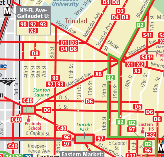
The current pair of System Route Maps, DC/MD (PDFs) and DC/VA (PDF), display the travel patterns for each Metrobus route in each jurisdiction (MD, DC, VA). In short, they answer the question, “How can I get there on the bus?” These geographically detailed maps chart out the complex routes Metrobus travels, leading customers from the origin to the destination of their trip, calling out street names, shared routes, schools and points of interest along the way.
While these maps have served their purpose over the years in acclimating customers to Metro’s bus network, there is room for improvement. For instance, while the current system maps display all the bus service for Metro, there is no consideration given to frequency of service, i.e. how often a bus runs. This could cause problems in that while the map might show that a bus route services a particular area, it does not relay information that the bus might only service that area during the a.m. rush or on the weekend. In addition, while the maps are geographically detailed, this detail comes at a high price; cluttering the map with many lines in many directions that make it difficult for customers to follow along and actually trace the pattern of the route they need.
These and other deficiencies in the current system map have been the impetus for WMATA looking into different ways to illustrate our bus service. In November of 2010, Metro’s Office of Long Range Planning released a draft “Metrobus High-Frequency Corridors Map” on this site, to gather feedback on how we might better explain our complicated bus system to users. The feedback received was incorporated into additional planning work on a Metrobus map design.
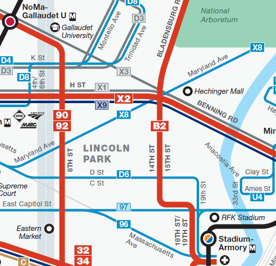
Following extensive design work, Metro is pleased to announce revised draft system maps that more clearly depict bus routes and delineate frequency of service, all part of our ever evolving efforts to provide richer and clearer travel information to our customers. Click the links below to view samples of the new maps. Feel free to give us your feedback, and note that these maps will be revised based on feedback from customers.
- Draft DC Metrobus system map
- Draft Montgomery County Metrobus system map
- Draft NoVA Metrobus system map
- Draft Prince George’s County Metrobus system map
Below, you will find some key features of the system map redesign: Read more…


Recent Comments