Author Archive

Vast Majority of New Office in Region Near Metro

April 22nd, 2015 2 comments

Approximately 86% of the region’s new office construction is occurring within one-quarter mile of Metrorail stations, 93% within the half-mile walk sheds.

A Washington Post article from October 2013 made a staggering assertion:  That 84% of new office construction in the region is occurring within one quarter mile of a Metrorail station, according to Jones Lang LaSalle and other data sources.  As we continue to dig into walk sheds and the land-use/transportation connection, we thought we would revisit this assertion and update it for 2015.

Since the Post article was written, we have begun to plan for near-term capacity constraints that might result from increased ridership caused by new households and jobs near Metro.  And part of this planning is gaining insight as to where and when new housing units and office space may come online through real estate industry data sources.   Through this research, we are able to update the statistic above:

86% of new office construction in the Washington region is occurring within one-quarter mile of a Metrorail station. 

UnderConstructionMap-01

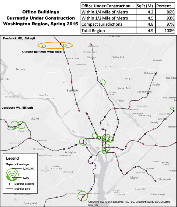
New office currently under construction in the Washington region. All but four projects are within a half-mile of Metrorail.  Data from Jones, Lang, LaSalle.

Read more…

Two-thirds of Metrorail Trips Cross a Boundary

February 3rd, 2015 19 comments

A large majority of trips on Metrorail cross jurisdictional boundaries, illustrating that Metro is indeed a regional service.

We’ve mentioned before how the station improvements in Metro 2025 will benefit riders from all jurisdictions.  In fact, Dupont Circle is the only station identified in Metro 2025 with a majority of users living in DC.   We thought we’d take another look at ridership that crosses jurisdictional boundaries.  The table below illustrates the percent of trips, by jurisdiction of origin, that cross into another jurisdiction on Metrorail, sliced by Weekday AM Peak, Weekday PM Peak and Weekend.  Data is from October 2014 and includes the new Silver Line stations.

A few things pop out: Read more…

Metrorail Data Download, October 2014

January 26th, 2015 26 comments

This new data download from October 2014 includes ridership from the five new Silver Line stations.

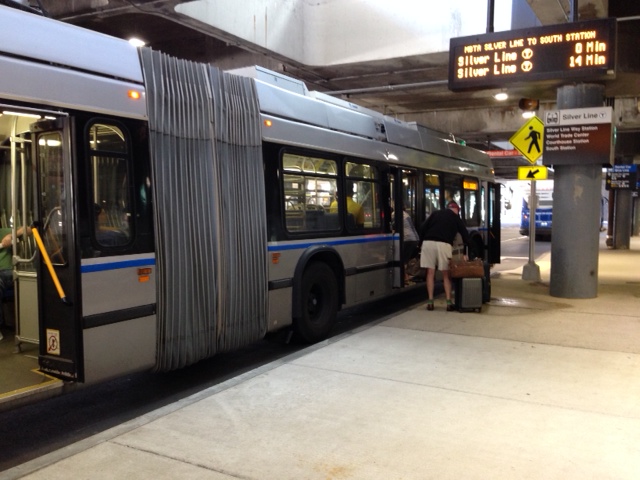
Over the past few years we’ve been making ridership data available for download and analysis by the online community.  We have received some requests for full origin-destination (O/D) data sets that include the new Silver Line ridership.

These data sets include ridership from October of 2014, and are available by period (AM Peak, midday, etc.) or by quarter-hour interval, for all stations including the five new Silver Line stations.  Both sets include daily averages for weekdays, Saturdays, Sundays and Columbus Day.

Note, the quarter-hour data file is to big to open in Microsoft Excel.

Have fun playing around with this data and let us know in the comments what you find.  Make sure you check out  the other assessments of Silver Line ridership  we’ve done.

Jan 29, 2015, 10:00 AM Update:  Files have been updated to include total and average travel times for each station pair.

Feb 02, 2015, 11:00 AM Update:  Files have been updated to separate Columbus Day from Saturdays using a new column “Holiday”.


Tysons-Area Stations Show Unique Ridership Patterns

January 19th, 2015 No comments

The four new Metrorail stations in the Tysons Corner-area of Fairfax County illustrate diversity of land uses.

Tysons Corner, the archetype of an Edge City, is a mix of office towers, apartment buildings and single-use retail in a suburban, auto-oriented setting.  As such, one would expect to see ridership at the new Tysons-area stations reflect the diverse land uses.   Ridership data (station entries) from October, 2014, illustrate this perfectly.

McLean

This station shows more AM Peak entries than any other time period, showing its station area is more like a typical “bedroom” community than the rest.  However, very strong PM Peak station entries reflect many employment sites near the station, providing a near-perfect balance between AM and PM peak entries.  As would be expected at stations with limited retail, mid-day and evening ridership is low at McLean.

Tysons Corner

This station has perhaps the most unique ridership pattern, with PM Peak ridership dwarfing all other time periods, and evening ridership higher than even AM Peak.  This station is located adjacent to two of the region’s largest shopping malls, and the ridership likely reflects both shoppers and retail employees using the station heavily throughout the day.

Greensboro
This station has the greatest number of entries in the PM Peak.  This pattern reflects the suburban employment center-nature of this section of Tysons Corner.  Midday and evening ridership are significantly lower than the peaks, reflecting lower numbers of transit-accessible retail.  

Spring Hill
This station is similar to McLean with the greatest number of entries in the AM Peak, reflecting large residential complexes nearby. However, this station also draws a fair number of PM Peak entries, nearly as many as in the AM, reflecting the variety of job sites within walking distance of the station.

Tysons-Area Stations versus Other Fairfax County Stations

Perhaps what’s most unique about these ridership patterns is that they differ from those of the other stations in Fairfax County. Below is a graphic showing percentage of system entries by period for Tysons-area stations versus the other stations in Fairfax County. At the other Fairfax County stations, system entries are concentrated (two thirds!) in the AM Peak. Ridership at the Tysons-area stations is more diverse, with 37% of the entries in the PM Peak and another 29% in the AM Peak.

These graphics and the data behind them are available for download from the Tableau Public site. What other patters can you find?

“Virtual” Tunnel Yields Real Benefits

November 4th, 2014 16 comments

Use of the “Farragut Crossing” virtual tunnel is strong, averaging around 18,000 trips per month during the more temperate months, dropping to 15,000 during the winter.

Users of the Metrorail system come up with a lot of different ideas for how Metro can better serve their needs.  Ideas often come from the blogging community and are sometimes considered by Metro planners, researchers and leadership.  One such idea was the virtual tunnel between Farragut North and Farragut WestNow dubbed “Farragut Crossing” via a Facebook naming contest, this fare policy update allows transfers between the two Farragut stations without being charged two separate fares.

Farragut Crossing was first opened in October of 2011 and monthly usage increased from just a few thousand trips in its first few months to a max of over 21,000 in May of 2014.  Since then, it’s settled to around 18,000 during the fair-weather months.

Read more…

Discovering the Other Silver Line

September 1st, 2014 5 comments

MBTA’s Silver Line Bus Rapid Transit (BRT) is impressive and efficient, but could be easier to use for visitors.

photo 2

Boston’s Silver Line BRT at one of its Logan Airport stops. Photo by the author.

I recently flew to Boston for the first time in years and had the opportunity to ride their Silver Line BRT  that provides service between Boston Logan Airport and south Boston.  The service features some dedicated right-of-way, real-time arrival signage and a few actual stations.

The Silver Line has real-time arrival screens at Boston Logan, easing the wait time for customers excited to explore a city or return home.  The buses used are dual-power, meaning they run on electricity via overhead wires at some times and on diesel when there are no wires.  The switching between the two takes a few minutes but it really wasn’t very noticeable.

I was very impressed with the stations.  For example, the World Trade Center station is a significant and impressive structure, and felt more like a traditional rail station that a bus stop by far.  It features a multi-story tower topped with the “T” logo.  The station interior features side platforms, escalators and stairs, real-time arrival screens and public art.  A station like this makes a statement that high quality transit service will be operating here for a long time, despite not having rails in the ground. Read more…

Categories: Transit Travelogue Tags: , , ,

Silver Line’s Smiling Faces

August 18th, 2014 Comments off

Metro planner captures some smiles of excited Silver Line customers on camera opening weekend.

photo 1

Baby’s first Metrorail trip on SV’s first day.

I offered up my Saturday on a recent weekend to participate in something really cool, the opening of the new Metrorail Silver Line. Metro has a program where employees can help out during special events or scheduled trackwork to guide customers through the fare vending machines or navigate bus bridges. I took advantage of this opportunity because I knew it would be something special.

During my six-hour shift at McLean, I saw a lot of happy people excited to be among the first to ride the new rail line. There were only a few times that I was moved enough to capture the moment on camera. The first is the picture above, a one-month baby with his Silver Line commemorative SmarTrip card, taking his first trip on Metro. Let’s hope it will be the first of many to come. Read more…

Fans Take Metro Home From Soccer Game

August 13th, 2014 12 comments

Over 7,000 customers took Metro home from the soccer game at Fedex Field on Tuesday night, July 29th, and some used the Silver Line!

While researching the ridership patterns of customers using Silver Line and comparing the usage on Monday, July 28th, to Tuesday, July 29th, we started to see an interesting pattern:  a lot more customers were traveling from Morgan Blvd to Wiehle-Reston East.  When we drilled down into the data, we found that these trips were occurring in the evening, well past the end of the PM Peak.  A few web searches later we discovered that a well attended soccer game had been held at FedEx Field on that night.

We then wanted to know, how many and where did they travel?  The chart below compares entries at Morgan Blvd on the 29th and contrasts it against the entries of the previous Tuesday, July 22nd.  It is pretty obvious that except for the soccer game, it was a pretty normal day at Morgan Blvd, good for comparison.  This data tells us that around 7,500 customers took Metro home from the game.  But where did they go?

The chart below shows the stations that our Morgan Blvd customers used to exit the system after the game.  There are a lot of unreadable data points on there, true, but a few really stand out, as annotated.  Most of the big spikes are end-of-line stations, including our newest, Wiehle-Reston East.  This graph also tells us that customers traveling to Wiehle-Reston East made it to their home station faster than those going to Franconia-Springfield.  In total, over 500 customers took the Silver Line home to one of the five new stations after the game.

This chart also raises the question, why were so many soccer fans going to Eastern Market, Metro Center, Foggy Bottom and Pentagon City?  Those are the earlier spikes shown on the graph.   Perhaps those are the neighborhoods where high densities of soccer fans live, or maybe the locations of good sports bars for post-game refreshment.

Did you attend the soccer game and take Metro afterwards?  Where did you go and what was your trip purpose?


Transit Walk Sheds and Ridership

August 11th, 2014 11 comments

Metro cares about transit walk sheds because more households accessible to transit by walking translates directly into more ridership.

We’ve been focusing a lot on transit walk sheds lately. We’ve shown that the size of a transit walk shed depends heavily on the roadway network and pedestrian infrastructure, and that these sizes vary dramatically by Metrorail station. We’ve also demonstrated that expanding the walkable area can make hundreds of households walkable to transit.

But why do we care so much about walk sheds? Because larger walk sheds mean more households in the walk shed, and that means ridership. For example, we’d be hard pressed to find many households in Landover’s small walk shed, so it’s no surprise that walk ridership at that station is low. On the other hand, thousands of households are within a reasonable walk to Takoma’s larger walk shed, and walk ridership there is much higher.

In other words, the more people can walk to transit, the more people do walk to transit – and data across Metrorail stations prove it:

Correlation between Households in the half-mile walk shed, and AM Peak ridership, by WMATA Metrorail station entrance

More households in the walkable area around a Metrorail station means higher ridership

Read more…

Ballston and the Silver Line: A Big Opportunity

July 30th, 2014 Comments off

This is a guest from Paul Mackie, communications director at Mobility Lab.

A new short video by Mobility Lab details the economic benefits that Ballston stands to reap from this week’s opening of Metro’s Silver Line.

In the video, Ballston Business Improvement District CEO Tina Leone says, “We see the Silver Line as making Ballston the center of the universe. It makes everything even better here. We already have a very active Metro stop, with 26,000 trips per day. We see that growing to 38,000 trips per day along with the Silver Line by 2020. So that’s coming very, very fast.” Read more…