 May 2013 and 2014 Metrorail ridership data is available: what patterns do you see?
Following up on our last data download of rail ridership from May 2012, 2013 and 2014 are now available. These data now represent three “snapshots” in time of rail ridership, at a very fine level of detail. This data can help answer questions, such as: where is ridership growth the strongest? Which destinations are becoming more or less popular? How has off-peak vs. peak ridership changed?
May 2013 Metrorail Ridership by Origin, Destination, TimePeriod, DayOfWeek (.xlsx, 3.3 MB)
May 2014 Metrorail Ridership by Origin, Destination, TimePeriod, DayOfWeek (.xlsx, 3.4 MB)
We invite you to tell us what you see, in the comments.
Technical notes on the data are the same as the last post. This time, Saturdays and Sundays are shown in the same worksheet as weekdays.
Improving pedestrian connectivity takes cars off the road at a formidable clip – rivaling the power of all of the region’s planned roadway additions and “last mile” transit connections. Cheaply and quickly.
This post is part two of a three-part series.
The data is finally in, and we now know that walkable station areas result in fewer motorized trips, fewer miles driven, fewer cars owned, and fewer hours spent traveling. And when we improve the pedestrian and bicycle access and connectivity to Metrorail station areas, ridership goes up, putting a major dent in congestion by taking trips off the roadways. Earlier, we discussed what it means to build walkable station areas and research shows the tremendous benefits to the region of making this a priority.
First, our data confirms that when walking access to transit is improved, transit ridership goes up – way up. In the 2040 Regional Transit System Plan (RTSP), we stress tested TPB’s transportation model to improve walkability to the transit network and saw huge increases in transit linked trips. These trips go up by about 10% region-wide and we get an increase in transit mode share for all regional trips by 0.5%. That’s over and above the roughly one percent increase in mode share we anticipate occurring as a result of building the entirety of the CLRP, an impact about half that of constructing all of that transit.
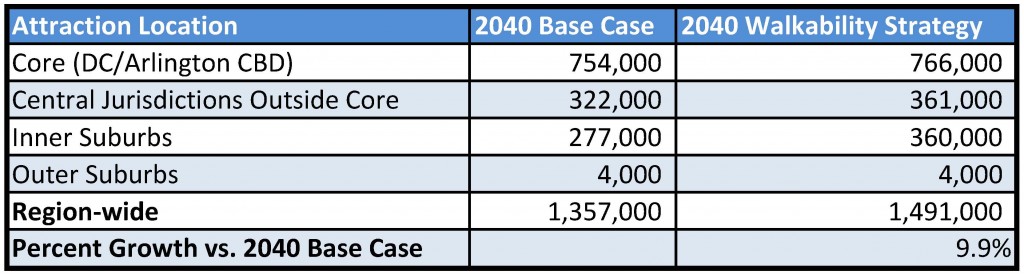
Source: Regional Transit System Plan
Read more…
During the National Cherry Blossom Festival, Metrorail ridership increases on average by 7% on weekdays and 50% on Saturdays.
Metrorail ridership is impacted by a variety of factors, from special events to weather to government shutdowns. One event that brings visitors to the region — and to Metrorail — in droves is the annual National Cherry Blossom Festival. In anticipation of this year’s festival, we performed some analysis on how, when and where the blossom viewers impacted ridership on the Metrorail system.
In general, Metrorail ridership increases on average by 7% on weekdays and up to 53% on Saturdays during the festival. On days with nice weather, ridership has increased up to 10% on weekdays and 70% on Saturdays!
As the figure below shows, during the weekdays there is no impact in the morning, a large (21%) increase of activity during the mid day and then a 7% increase thereafter.
Saturdays are another story all together. Ridership increases up to 63% during mid day and afternoon periods on days during the festival, with a total ridership increase above 50%. Even morning and “late” night ridership increases significantly during this period.
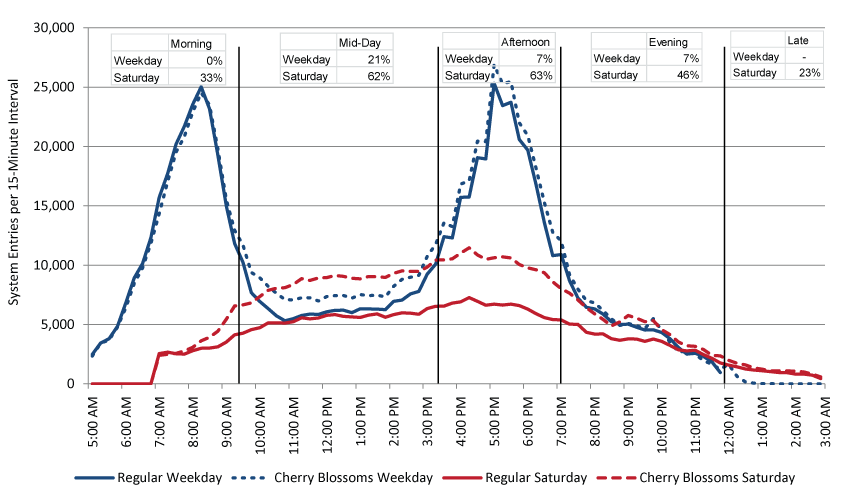
Metrorail system entries by quarter-hour interval, Regular Weekday, Cherry Blossom Weekday, Regular Saturday and Cherry Blossom Saturday. Click chart for larger version.
When looking at change in ridership by station in the maps below, some obvious conclusions can be drawn. Read more…
I was invited to present a wide variety of data visualizations featured on the blog at a recent meeting of transportation techies.
I had the honor of being invited to present at the 2nd meeting of the Transportation Techies Meetup group, Metro Hack Night on January 2, 2014. I used this opportunity to illustrate some of the data visualizations I’ve developed using Metro data and talk a bit about the technology behind them.
The first was the the
visualization of 9 years worth of rail ridership data. This visualization was created in
D3 (“data driven documents”) using code originally developed by “
mbostock” posted on the D3 examples page. D3 is a javascript library that allows the creation of really
powerful and interactive visualizations. The downside of D3, as I noted, is that the code itself can be confusing and hard to follow. So much of learning a new coding language is looking at what others have done and learning from it. D3’s simplified notation makes it really hard for me to follow. (
NOTE: this visualization has recently been updated to include daily Metrorail ridership for all of 2013.)
The second was the visualization of one day of Metrorail station activity. This video was created using Processing, a Java-based visualization tool that takes care of a lot of the coding “grunt work” and allows a programmer to focus on the data and the visualization. I really enjoy Java so I took the opportunity this project provided to add a few flourishes such as a clock face and “sunrise” and “sunset.” Read more…
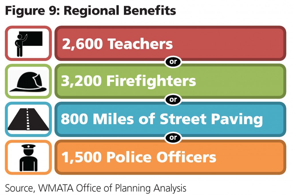
Proximity to transit, especially high-quality, frequent, high-capacity rail, increases property values, attracts development and provides mobility choices. Property values are higher near Metro’s high-quality, high-frequency, high-capacity services, and deliver an incremental increase in total tax revenue to the Compact jurisdictions.
- Property taxes on land around Metrorail stations generate $3.1 billion annually in revenues to the jurisdictions.
- Of these revenues, $224 million is extra value that would not exist without Metro. This amount is equivalent to providing the following public services.
 PlanItMetro saw great interest in our last full data download of O/D data last year. We thought we’d provide an update with data from October of 2012. This enhanced data download contains the following files:
- Full O/D trip data MS Access, including service type (weekday, Saturday, Sunday Special), travel period (AM Peak, mid-day, etc.), entry hour, Origin Station, Destination Station, rider class (full fare or discounted), media type (SmarTrip vs paper farecard), fare instrument type (stored value vs benefits vs pass), average travel time and average number of trips.
- Subset of O/D trip data “No Details” CSV, includes all trips like the first file above but doesn’t include details on rider class, media type or fare instrument
Download either of these data files and let us know what you find!

Sample Bluetooth Sensor
Metro, in conjunction with Traffax, Inc., recently hosted a Bluetooth traffic monitoring test at Fort Totten station. Bluetooth technology has been used for years now, for monitoring vehicular traffic. Specifically, it has been used to provide travel time and origin-destination data, mostly in vehicular settings. Some pedestrian monitoring has been tested as well.
For Metro’s recent pilot, Bluetooth traffic monitoring was used to study pedestrian movements within a multi-level environment. The hope was that the Bluetooth data captured could tell stories about pedestrian flow within the station (including vertical movement), the train dwell times, train volumes, and the transfer rate between the Yellow/Green and Red lines. The latter is an area that WMATA is most interested in, since it is difficult to predict how people will ride Metro when given options. In this case, do people prefer transferring between Red and Yellow/Green at Fort Totten or at Gallery Place? This kind of data would make it easier for WMATA’s planning staff to better serve its customers by understanding true crowding levels on trains at peak load points.
It was estimated that 1 in 20 passengers’ movements would be captured in the pilot. The Bluetooth data sensors were placed in backpacks that Traffax employees were wearing. This initial data collection test will be used primarily to develop appropriate methods for analyzing such data, and to see what potential the data has for WMATA.
Please note that no personally identifiable information can be captured by detecting Bluetooth signals, which is the electronic equivalent of viewing license plates. Read more about privacy and Bluetooth on the Traffax website.
Stay tuned for more info!
Metro planning staff understand that a picture is worth at least a thousand words, and often more. (And that a video is worth 1000 * 30 words per second.) As such, we are always looking to increase our ability to create compelling graphs, charts and video simulations.
Sample image of the Metrorail Ridership Visualization. Click the image to open the viz in a new window.
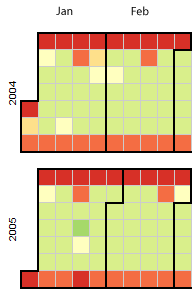
Metro planning staff recently attended a Mobility Lab Hack Day, where transit planners and data geeks intersected to share ideas and techniques for visualization of the volumes of data being made available by operators around the region. One of the visualization tools discussed was D3, a javascript library for creating “data-driven documents.” One of the online examples is for a calendar view that displays stock market data.
Metro planning staff adapted this code to create a visualization of Metrorail ridership data from 2004 to the present. (Link opens in new window.) Here’s how it works:
- Each year is a horizontal stripe, sectioned off into months that go across. Both years and months are labeled.
- The days within each month are transposed, so start at the left and read down, then move right. In the sample image, the leftmost column of January 2004 is the first week, with Thursday January 1 being the darkest red square. A graphical example is also displayed in the legend at the top of the visualization.
- Each day is colored according to the ridership on that day, with darkest red being the smallest range (0 to 99,999) and the darkest green being the highest range (greater than 1,000,000).
- If you move your mouse pointer over any individual day, a small “tool tip” appears showing the date and the ridership for that day, rounded to the nearest 1,000.
Read more…

 May 2013 and 2014 Metrorail ridership data is available: what patterns do you see?
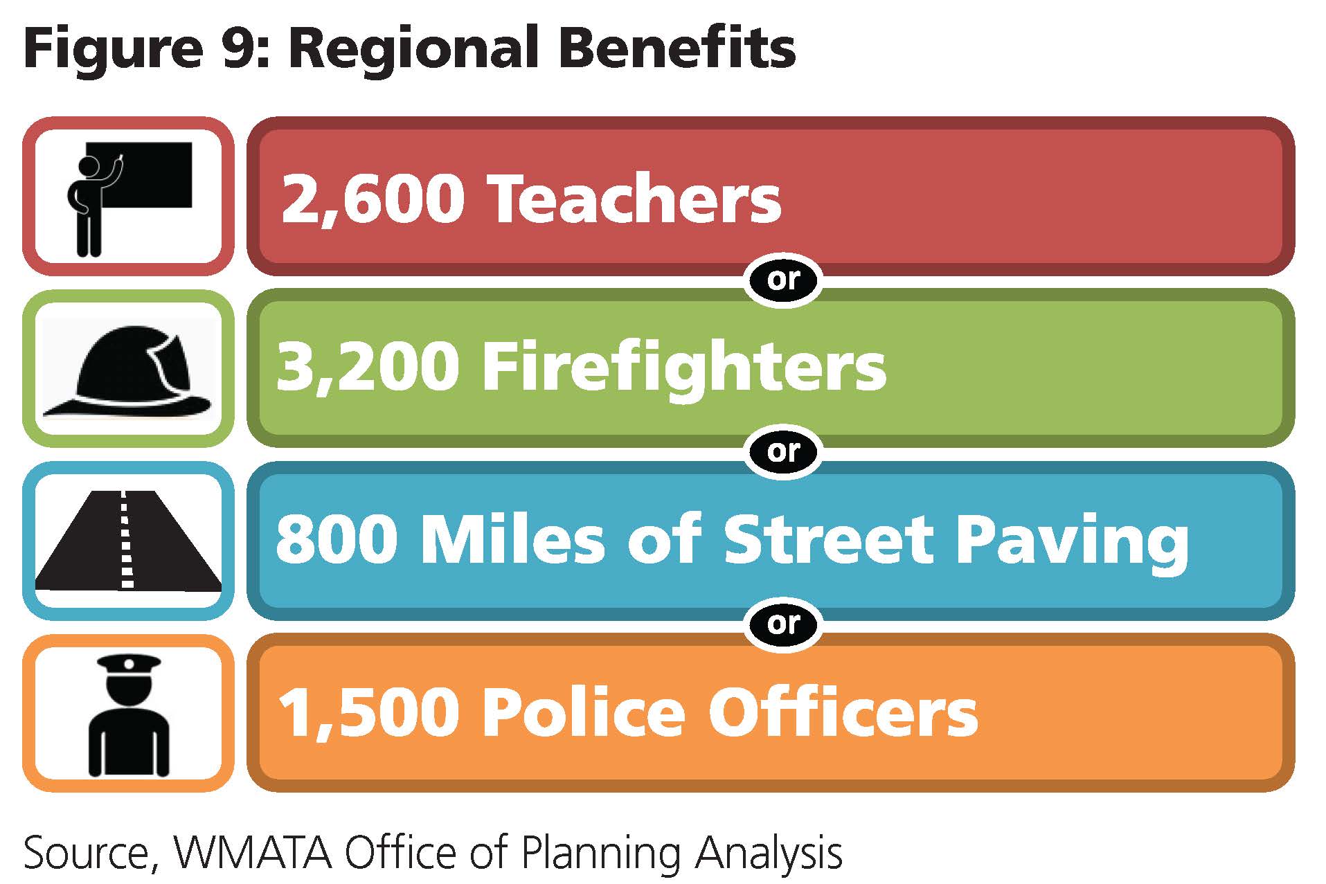

Recent Comments