Author Archive

Where Are Metro’s Federal Customers Going? (2 of 5)

December 1st, 2015 Comments off

Employees of the federal government comprise 27% of Metro’s weekday ridership, but what rail stations and bus routes are they using?

(Second in a series of posts on Metro’s Federal Customers – see post 1)

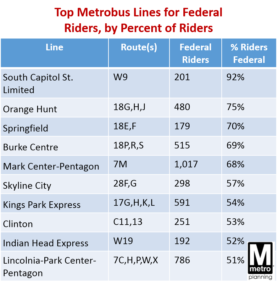
On Metrobus, federal workers are about 10-20% of most bus routes’ ridership, with a few logical exceptions. Federal ridership is higher on bus routes that are more “peaked” and commute-oriented, and/or on routes that directly serve federal facilities.

Top Metrobus Lines for Feds, by Pct of Riders

Read more…

How Metro’s Federal Customers Pay Fares, and Why It Matters (3 of 5)

November 30th, 2015 3 comments

Metro’s federal customers pay fares a little differently than other riders. Why is that such a big deal for Metro’s financial future? 

(Third in a series of posts on Metro’s Federal customers – see posts 1 and 2)

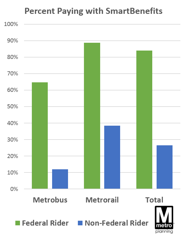
SmartBenefits Feds vs NonCompared to other riders, Metro’s federal customers are much more likely to pay their fare using SmartBenefits.  SmartBenefits are the type of funds you load onto your SmarTrip card – usually through your employer, either as direct subsidy, or a certain amount of pre-tax dollars you set aside for transit fares. Metro riders in the Washington region may know the program manager WageWorks.

 (Importantly, SmartBenefits is not exclusively a federal government benefit!  On the contrary, non-federal workers are nearly half the overall enrollment in the SmartBenefits program, and 42% of Metro’s overall ridership comes from riders paying with SmartBenefits.  We’ll make clear the difference between SmartBenefits and SmartTrip in an upcoming Metro 101 post – stay tuned.)

84% of federal employees on Metro pay their fare with SmartBenefits, compared to 27% of non-federal customers. In addition, federal customers tend to pay higher fares on rail – because federal workers typically take longer trips and ride more at peak times (average peak fare $3.00, vs. $2.87 non-federal customers).

Finally, 87% of Metro’s federal customers pay using “stored value” (pay-as-you-go funds), rather than a weekly or a monthly pass. Very few still use paper tickets or passes – but this is similar to other riders.

Read more…

Metro’s Federal Customers: A Snapshot (1 of 5)

November 19th, 2015 Comments off

Think Metro is all about getting the federal commuters to work? Think again!

(First in a series of posts on Metro’s customers who are Federal Government employees)

Just as the workforce in the Washington region has a sizeable share of federal workers, so has Metro’s ridership.  Metro serves major federal employment centers downtown, and even boasts stations named for the federal sites they serve, like Federal Triangle, Medical Center, and Pentagon. But while Metro has a long supported the federal government, it’s a myth that Metro is all about federal government commuters and nothing more. Federal workers are a minority of riders and have been for years, and federal funding is playing an increasingly smaller role in Metro’s finances.

So just who are Metro’s federal customers?  When and what do they ride? Where are they coming from and going to, and how has this changed in the last decade? The next series of posts seeks to answer just that, using passenger survey data (bus and rail) where customers identified as employees of the federal government or not (contractors excluded).

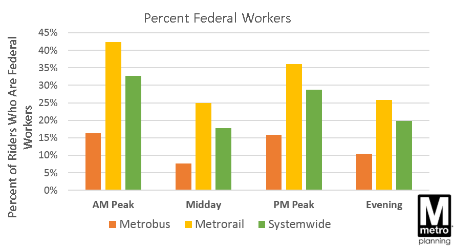
How Many, Where, and When? About 27% of all Metro weekday trips are made by federal workers – a total of 317,000 boardings across bus and rail.  These federal employees can be anyone from a nurse at Walter Reed Medical Center, to a military officer at the Pentagon, to a Congressional staffer on Capitol Hill.  The majority of these trips (255,000) are made on Metrorail, where federal workers make up 35% of all boardings (all-day).  The remainder – just over 60,000 boardings from federal workers – happen on Metrobus, where riders are generally less likely to be federal workers (14% of all bus boardings are federal).

Pct Fed Workers by Mode and Period Read more…

Three Tidbits: What The Metrobus 2014 Survey Can Tell Us

October 26th, 2015 7 comments

The latest survey of Metrobus riders is a gold mine of information about who our bus riders are, why they travel, and more. Here are the answers to just three questions:

Who’s on the Bus on 16th St. NW? Metro planners and DC residents alike have advocated for a possible bus lane on 16th St. NW, where Metrobuses carry over 50% of the people, are scheduled for about every two minutes, and are frequently bunched and overcrowded. The survey can tell us what kinds of riders use that corridor – giving us clues to what kind of new riders a bus lane might attract.

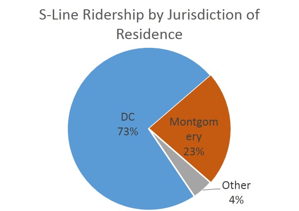
S-Line Ridership by Juris of Residence

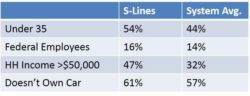
 S-Line demogs

Survey says:

  • Three quarters of S-Line (S1, S2, S4, and S9 combined) riders live in D.C., while the rest hail primarily from Montgomery County
  • S-Line riders are younger and more affluent, than the system-wide average for bus riders.
  • They are slightly more likely to be car-free and employed by the federal government, but the difference is very small.

Read more…

The Long View: Fiscal Year 2015 Bus and Rail Ridership Summary

September 22nd, 2015 Comments off

As Fiscal Year 2015 drew to a close last month, we figured it’s time to take the long view: how did ridership do this year?

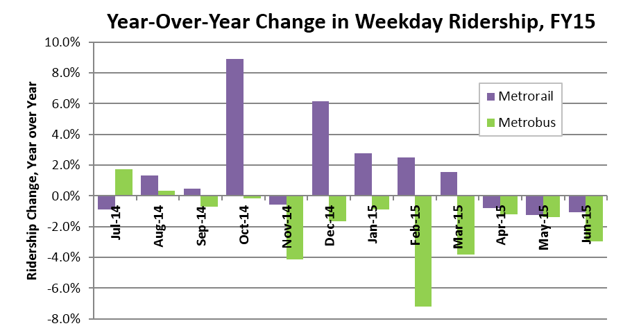
On the whole, for an average weekday over the last year:

  • Rail ridership was up by 1.5%, in part due to the introduction of the Silver Line.
  • Bus ridership was down by 1.4.
  • Rail ridership was up largely due to the federal government shutdown in October of FY14.
  • Metrorail had a good fall and winter, while Metrobus started the fiscal year well but struggled in the winter and spring months.

FY2015 Ridership Year in Review

Seasonal Trends. All changes in ridership are best shown as a comparison to the same time last year, because ridership rises and falls as the seasons change. Traditionally, ridership is lowest in the winter, and peaks twice: one in late March/early April for the Cherry Blossoms, and then again in June and July when tourists and outdoor activities are in full swing. August is usually slow, and then ridership levels stabilize again in the fall. Read more…

Ask the Professors – How Local Land Use Decisions Impact Metrorail Ridership

August 24th, 2015 1 comment

This post is guest-written by Chao Liu, Hiro Iseki, and Gerrit Knaap, researchers from University of Maryland’s National Center for Smart Growth, who helped Metro develop our Land Use Ridership Model.

Even though Metro doesn’t control where new jobs and households locate in the region, these decisions are critical to the agency’s ridership and financial future. 

It is well known that the form and intensity of development in and near rail transit station areas can have measurable impacts on transit ridership.  For these reasons, transit oriented developments (TOD) generally feature high-density construction, mixed land uses, and bike and pedestrian friendly infrastructure.  But not all TODs are alike, and the effects of TOD on transit ridership are likely to depend on how well the station is connected both locally and regionally, whether the station is near the center or end of a transit corridor, and what kinds of jobs and household are located nearby.

To explore how different forms of development might impact ridership on the Washington Metrorail system, Dr. Hiroyuki Iseki and Dr. Chao Liu assisted Metro to develop a direct ridership model (DRM), called Metro’s Land Use Ridership Model.  A DRM uses statistical techniques to quantify the relationship between entries and exits at rail stations and land uses nearby.  This model can then be used to estimate the number of passengers who will access the station, by waking or biking, as a result of changes in land use features, transit service characteristics, and socio-demographics within the walkshed of any given station.

The direct ridership model includes a large number of variables for each station, including the density, diversity, and design of local environment; transit service and connectivity; job accessibility by auto and transit; walk score; the availability of parking; the demographics of nearby residents; the number and types of jobs nearby, and more.  The model was estimated for the AM Peak, Midday, PM Peak, and Evening travel periods.  The AM Peak model is best suited for estimating the increase in morning boardings that would result from locating more households near the station; the PM Peak model is best suited for estimating the increase in afternoon boardings that would result from locating more jobs near the station.
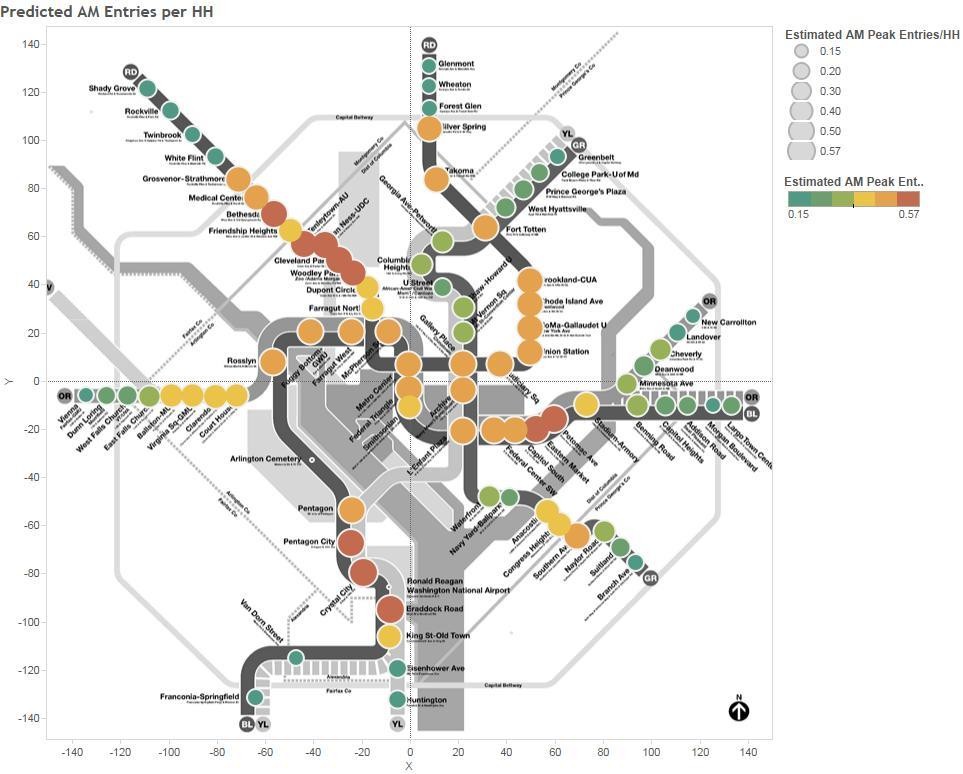
Pedicted AM Peak Entries per New HH

Map 1. Predicted AM Peak Entries per New Household

The impact of adding jobs and households near stations varies by station area.  Map 1 above, for example, shows the estimated entries per new household in the morning peak—that is, how many additional boardings would occur in the AM peak if one additional household was located in the walkshed of the station.  Stations shown by red dots gain more than 0.57 boardings per day, for each new household in the walk shed, while stations shown with green dots gain only about 0.20 boardings per day. As a concrete example, Rhode Island Row is a 274-unit, mixed-use, TOD project built on a WMATA site.  Situated along the busy Red Line, the project has long been considered as a prime location for new housing development.  According to the DRM model, adding 274 new households near the Rhode Island station would increase boardings by 144 passengers in the AM peak.  The same development at the New Carrollton station, however, would have added only 52 passengers.  This is because, compared to New Carrollton, the Rhode Island Avenue station has better job accessibility and more frequent transit service, and is thus likely to stimulate more transit ridership. Read more…

Does Transit Yield its Promised Economic Benefits? A 1969 Perspective.

June 25th, 2015 1 comment

The actual economic benefits of Metro far exceed what planners estimated in 1969, and it’s worth remembering as we consider future transit investments.

In the late 1960s, when Metrorail was nearly about to begin construction, Metro published a forecast of the economic benefits of Metrorail.  The report made rosy projections of the all the travel time and costs the network, then a 97-mile proposed rail system, would bring.  (It also included photos of the pretty awesome 3-D model of a station, including maybe a one-car train?).  Now, four decades later, were the projections right?  Has Metrorail produced the benefits we thought?  The answer is yes, and then some.

Economics_of_metro_cover

Cover of a 1969 report estimating the economic benefits of Metrorail

At the time this report came out, the region was about to make a substantial investment in public transit , probably not unlike today, where we face real choices about whether to invest in Metro 2025 initiatives such as 8-car trains, the Purple Line, or bus lanes.  To quote the report,

Metro is ready for construction. The routes have been selected. The program for local financing has been approved.

How feasible is Metro? Who will benefit?  Will the benefits justify the costs? Is Metro a good public investment for the National Capital Region and its financial partner, the federal government?

The report tallied up all the time savings to riders – former motorists, former bus riders, and truckers – as well as the travel cost savings like avoided parking, vehicle savings, operating cost savings, and more.  It concluded that Metro would save $186 million per year in 1990$, roughly equivalent to $310 million/year in today’s dollars after adjusting for inflation.  Read more…

Where Are Those Rail Riders Going?

May 12th, 2015 4 comments

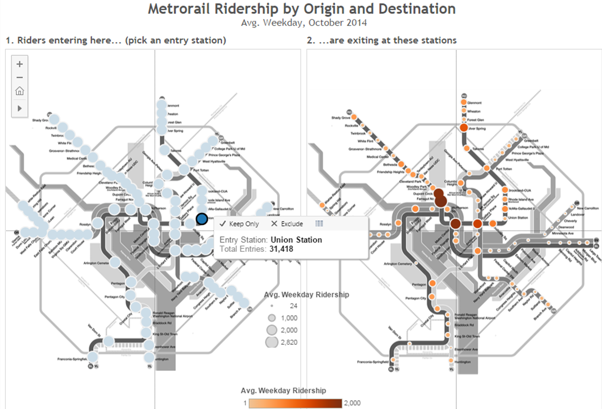
Ever wonder where rail riders are going to and from? Here’s a map that shows you.

“What are the destinations of riders at Station X?”  It’s a question we get often here. Well, using October 2014 rail ridership data by origin and destination, it’s pretty easy to answer that question – click below for an interactive map.

OD Rail Viz preview

Click for a larger, interactive version of Metrorail ridership information by origin and destination station

Monitoring (and Caring About) Customers, Not Just Trips

April 13th, 2015 2 comments

Deep explorations into the composition of Metrorail’s customer base shows that Metro has a wide reach – and that the five-day-a-week rider may not be as common as you think.

Metro (bus and rail) moves 1.1 million people per day, right? Well, technically we see that many trips (transactions) per day, but how many individual customers is that?  When you look at your fellow passengers on-board a train, how many are frequent commuters? How many rarely ride? In addition to counting trips, we’ve begun to monitor customers – the number of unique SmarTrip cards and paper tickets used on the system in a month.

We’re starting with Metrorail at first.

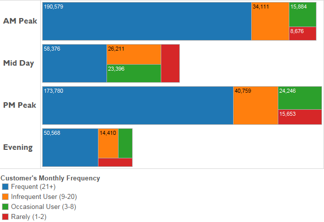
Metrorail typically handles roughly 730,000 trips on a weekday, which are generated by about 400,000 unique customers. Some of those customers ride frequently, and others will ride only once in the month.  As the chart below shows, of the 730,000 trips, only about two-thirds are generated by frequent customers.  Not surprisingly, frequent customers dominate more during the peak times.

Sept 2014 ridership by frequency by period_bars

Typical weekday rail ridership (trips) by customer’s monthly frequency (trips/month)

Surprisingly, over 17% of all trips are generated by customers who take eight trips/month or fewer– that’s fewer than once per week.  That may not seem like much, but in order for infrequent customers to generate so much of our ridership each and every day, there must be a LOT of them! Read more…

Going Up – Why the Construction Pipeline Means Higher Metrorail Ridership (Part One)

April 6th, 2015 5 comments

We’ve claimed that Transit-Oriented Development (TOD) projects in this region will be critical to Metrorail ridership and sustainability. The good news is that our assertions are grounded in statistically rigorous evaluations of TOD’s impact on Metrorail ridership – here’s how. (Part one of a two-part series).

While factors like fares, service, and the economy can certainly explain some changes in Metrorail ridership, one absolutely fundamental explanation of differences in walk ridership between stations is development.  Why does a station like Landover see only 50 riders arrive on foot each morning, and a station like Crystal City see over 3,000?  Why does a station like Bethesda see balanced ridership in all directions, where a station like Suitland is almost entirely one-direction? Development. Even a simple scatter plot shows that households alone near the station explain 70% of AM Peak walk ridership!

Planning studies have long-posited that transit-oriented development is such a key part of driving ridership, and if that is the case, then TOD is vitally important to Metro’s long-term financial sustainability.  We at Metro needed to quantify this link in a more sophisticated and system-specific way, and so we created a way to calculate the impact of land use changes (household growth, employment growth, new development) on ridership and revenue.

What is a Land Use-Ridership Model? To help, Metro’s Planning Office has built a Land Use-Ridership Model that will predict changes in Metrorail ridership as a result of occupancy changes (growth, decline, new development, etc.) in the station area.  This model helps us get very specific when it comes to modeling the impact of land use changes on ridership and revenue.  It helps us answer questions such as: “When developers build a new apartment building next to a Metrorail station how much ridership and revenue will Metro realize?”, and; “If an office building is proposed at one of four Metrorail stations, which location maximizes ridership and revenue without exacerbating core capacity constraints?”

LURM general flow

This tool is based on a rigorous understanding of the link between land use and the rail ridership we see today and is built on “direct ridership modeling techniques” found in academia.  It also focuses specifically on “walk ridership” (which constitutes 38% and 78% of our AM and PM peak ridership), since rides related to bus transfers, parking, and other access modes are less related to adjacent land uses.

To build this, we analyzed the actual quantity of walkable land uses from each station area, assembled detailed information about land uses and densities in those areas (households, jobs by industry type), and also controlled for other, non-land-use factors that shape ridership – like network accessibility. In all we worked through over 200 independent variables in our modeling and also brought in experts from the University of Maryland’s Center for Smart Growth, professors Hiroyuki Iseki, Ph.D. and Chao Liu, Ph.D., to bring their analytical and statistical firepower to the fray.

How We Built It. We defined the walkable area as a half-mile walk along a road network, so we account for barriers like highways and fences.  The half-mile cutoff is a bit longer than the median actual walk distance reported by our riders in the 2012 Metrorail Passenger Survey. For each station and its walk shed, we tested the following kinds of factors: Read more…