
King St-Old Town to McPherson Sq: Fare is Fair
Metrorail charges you the lowest possible fare, even if other trips that seem longer are less expensive.
Recently a Twitter user asked a simple question: when traveling from King St-Old Town why does it cost more to travel to McPherson Sq than to Metro Center? As a straight shot on the Blue Line, McPherson Sq is closer than Metro Center, so why is the trip to Metro Center cheaper?
We recently described how Metrorail fares are calculated. However, the previous post failed to mention is that when there are two or more routes to travel between any pair of stations Metro uses the least expensive one.
For the example above, there are a few routes to travel between King St-Old Town and McPherson Sq. The shortest trip when considering the miles on the railway is to take Yellow to L’Enfant Plaza and then transfer to Blue or Orange, which results in 8.12 miles and a peak fare of $3.65. The fare to Metro Center is only $3.55, because it is only 7.82 miles from King St-Old Town via L’Enfant Plaza. For a rider taking the Blue Line to McPherson Sq, it might seem unfair that customers traveling one additional stop pay $0.10 less.
For many riders, the most logical trip from King St-Old Town to McPherson Sq is to take the Blue Line all the way for a one-seat ride. This trip results in 8.40 miles — 0.28 miles more than the other routing — which translates to a peak fare of $3.70, $0.05 higher!
Metro has no way of knowing which routing you take through the rail system so it’s not currently possible to charge different fares based the actual mileage of your trip. Instead, the shortest possible mileage is used for fare calculations.
For trips from King St-Old Town to McPherson Sq, you’re paying the cheaper Yellow Line fare even if you’re using the Blue Line. And traveling one station further results in a cheaper fare, since the fare you are paying is based on the mileage of the Yellow Line routing. See the diagram below for the different fare calculations (Blue vs Yellow) from King St-Old Town to downtown DC’s Blue Line stations.
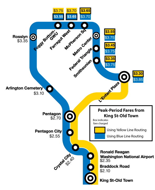
Peak-period fare calculations from King St-Old Town to downtown DC. Metro charges the fare from the least expensive routing, resulting in fares calculated using Blue Line routing for Foggy Bottom and Farragut West and the others using the Yellow Line routing.

I bet a map with the fares on it like this would be 100x’s easier for newcomers (or anyone who doesn’t blindly swipe their smartcard) than to read than the lists that are on the fare machines now.
does this include a double transfer, for example, u street to rosslyn… does the price calculation assume a transfer on red from gallery place to metro center? or does the rider get charged for going down to l’enfant?
agreed with John! this type of map would be awesome in each station instead of the listing.
@guest
The fare is based on the shortest trip possible. In the example you give, it would include the double-transfer, yes.
@John
And how exactly would a map like this work when your fare is determined by your origin?
@E
I would assume each map would be specific to a Metro station … which would be tedious to develop/maintain, but quicker for fare look-up with respect to visually identifying one’s destination.
@E – I believe each station already has individualized fareboards, showing cost to each station from where you are….this would be in addition to that and much easier to see.