
Time for Those Walking Shoes, Part 1
Walk access to Metrorail has increased 15% over the last 5 years, especially from those living within a half-mile of the station.
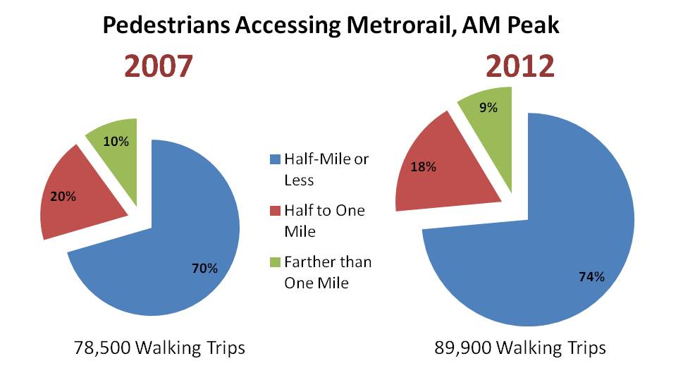
More and more Metrorail riders are lacing up their walking shoes and taking a short walk to their rail station these days. According to results from the 2012 Metrorail Passenger Survey, the number of passengers walking to Metrorail each morning grew by 15% between 2007 and 2012, from 78,500 to 89,900 in the AM peak period – far outpacing overall growth in ridership in the same period.
Where are all the new pedestrians coming from? From stations all over the network, but the growth is strongest among those walking a half-mile or less. Those walking from less than a half-mile rose by over 20% – faster than the overall growth in walk access.
Walk access to Metrorail has increased 15% over the last 5 years, especially from those living within a half-mile of the station.
Where is pedestrian access, by station? The map below shows walk access, by station of origin, for the AM Peak. Want to see more? Download the data and take a look! (.xlsx, 17 kb).
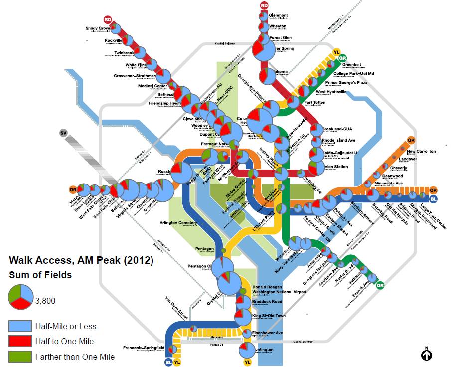
Walk access to Metrorail, by station, 2012 (click for larger). The larger the pie chart, the more pedestrian access.
What do you think this means for Metro? What stands out for you in these graphics? Let us know in the comments.
A future post will talk about some of the characteristics of those walking to Metrorail.
Notes: the median straight-line walk access distance for all Metrorail stations in 2012 was approximately 0.35 miles. Note that walk distance is calculated using straight line distance as-the-crow-flies rather than using a street network, so actual walk distance is likely even longer.

This clearly shows where transit-oriented development (TOD) has worked (OL corridor in Arlington) and is working (Silver Spring) and growing (Waterfront/Ballpark). I expected to see much larger circles on the Green Line, both southern and northern, and also on the Orange and Blue lines in Maryland….but I guess the larger garages there dissuade walkers when driving is so easy? This definitely shows where TOD can be implemented, and where anti-pedestrian station placement and surroundings impact the walkable Metro.
Outstanding data visualization! I have been interested in the idea of whether or not what I call “continuous urban fabric” creates exponential gains in walkability. Put another way, the bigger the uninterrupted safe-to-walk, plenty-of-destinations zone, the more powerful the internal capture of walking trips any subzone will be.
I would love to see you explore this idea if possible. Some ways to do it? Identify stations with high “long walk” percentages. Then, look up walkscore gradients for those stations and the number of intersections per square mile in the street/ped grid at the 1/2 mile, 1 mile, and maybe 1.5 mile bands. Clearly, some of them are the big transfer hubs- L’Enfant, Union Station. But what’s up with East Falls Church? That’s pretty interesting.
The best outcome would be to figure out what makes “long walk” stations that aren’t hubs great at collecting extra people, and exporting those qualities to other station areas. Just some food for thought.
The stations at the end of the lines appropriately are built for parking. They are very unfriendly for pedestrians. It seems that Metro needs to think of making these stations more pedestrian friendly. My guess is that the number of pedestrians would increase significantly. I wonder, however, how many residents within a 1/2 mile, 3/4 mile, 1 mile of these stations take buses. What are the patterns of bus ridership in these neighborhoods?
Station-by-station data suggest that, among residents of inner suburbs and suburb-like areas of DC, there has been little or no increase in Metrorail’s mode share for commuting trips over the last 15 or 20 years. Stations with no new housing, such as Cleveland Park, Forest Glen, and even Ballston have seen no increase in am peak boardings.
These data seem consistent with that observation. New housing around Metro stations has generally been in the immediate vicinity, within less than half a mile. So walk access from housing more than half a mile from the station has been approximately constant, in gross number of passengers, while it has increased for close-in distances where there is a lot of new housing.
Where transit mode shares are increasing is for evening and weekend travel (at least prior to the service reductions that have accompanied repairs) and for travel to work from outer suburbs (where income levels have declined relative to inner suburbs).
@MBC Good question. Can you elaborate? Are you wondering how many residents near a Metrorail station take buses to the rail station, or take bus generally?
@CityBeautiful21 Thanks! Very interesting idea. What more data would you need to research this? The linked excel file should show “long walk” stations, and Walkscore is publicly available (actually a GIS shapefile for DC is free here). Census ACS data might be another way to measure the “internal capture of walk trips” too?
Or, you could set up a regression to see what variables best predict walk access, and see if continuousness sticks?
Thanks Ben! This may well be true, but I’m not sure I’ve looked at this data in a way that supports the claim. Wouldn’t we want to look at station-level ridership over time (or, specifically, walk access by station over time)? Or, perhaps Census-based rates of transit usage for commuting?