
Share of Reverse Commute Trips Growing
Metro is focused on solving one of the region’s most pressing mobility issues – increasing the capacity of the system to handle more trips through the core (defined below) of the Metrorail system. While Metro’s planning staff has been conducting technical analyses and searching for the best solutions for some time, we also asked for ideas for increasing core capacity from you as well as discussed the potential for new lines, new connections and expanding to all 8-car trains during peak periods.
There are also operational strategies Metro could employ to provide more trips on the rail system without expanding capacity. Among the various options is to promote and encourage more “reverse commuting” where commuters travel opposite the peak travel direction in seats that would otherwise be empty. Data show that reverse commuting has already increased over the past 10 years and many speculate that it will only increase further as the region builds more suburban town centers near Metro and as Metro begins operations on the Silver Line later this year.
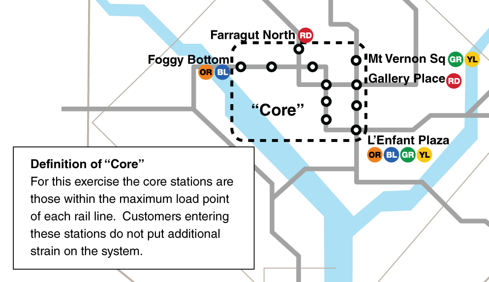
As a primer, allow us to define what Metro means by “the core.” Because we’re interested in assessing growth of trips that don’t impact core capacity, we consider the “core” as the stations and tracks just inside the maximum load point of each rail line. Therefore, we won’t consider a trip a “reverse commute” trip if it starts just outside the max-load point, travels through the core and out the other side. This definition of “core” is more restrictive than that used in other analyses as it is defined by the maximum load points on each rail line.
The next step is to define different trip types, including types of Reverse Commute trips. The diagram illustrates the six different types of trips defined for this assessment, including one traditional trip type and two reverse commute trip types:

Once the trip types are defined, each Origin-Destination (OD) pair is assigned one trip type. For example, a trip from Foggy Bottom to Metro Center is a #6, core-to-core trip and a trip from Shady Grove to Gallery Place is a #1, traditional commute into the core. Once the trip typology is applied, we can then assess the number of trips making each type of trip. This was done for the 2002 and 2012 Metrorail Ridership Surveys, with the results below.
AM Peak Ridership is up about 10% system wide between 2002 and 2012, but the traditional commute pattern (suburb to core) which makes up 50% of our AM Peak ridership only increased by 2% over the same time frame. Reverse commute trips are up to 8% of all AM Peak Metrorail trips from 6% in 2002. The percent change in absolute trips has increased by 34% to 49% depending on the trip origin. See the table below:
| Commute Types | 2002 Share | 2012 Share | % Change 2002 to 2012 |
| Traditional | 54% | 50% | 2% |
| Suburb-to-Suburb | 30% | 29% | 7% |
| Non-Core Peak Direction | 8% | 11% | 45% |
| Same Line Reverse | 3% | 4% | 49% |
| Core-Out Reverse | 3% | 4% | 34% |
| Core-to-Core | 2% | 2% | 19% |
| Total | 100% | 100% | 10% |
Basically, the number of trips using Metrorail out-of or away-from the core increased dramatically by approximately 40%, though their share of all trips remains relatively low.
Looking at the destination stations of reverse commute trips can give some insight as to why this pattern has changed. The map below shows the Top 10 destinations for AM reverse commute trips in 2012. Seven of the top 10 are suburban work locations in Montgomery and Arlington Counties and the City of Alexandria. The remaining three are stations closer in. Several factors are likely at play here:
- Job growth near Metro stations in suburban centers.
- An increase in interest in living in walkable, urban communities has increased the number of residents near these “core” stations.
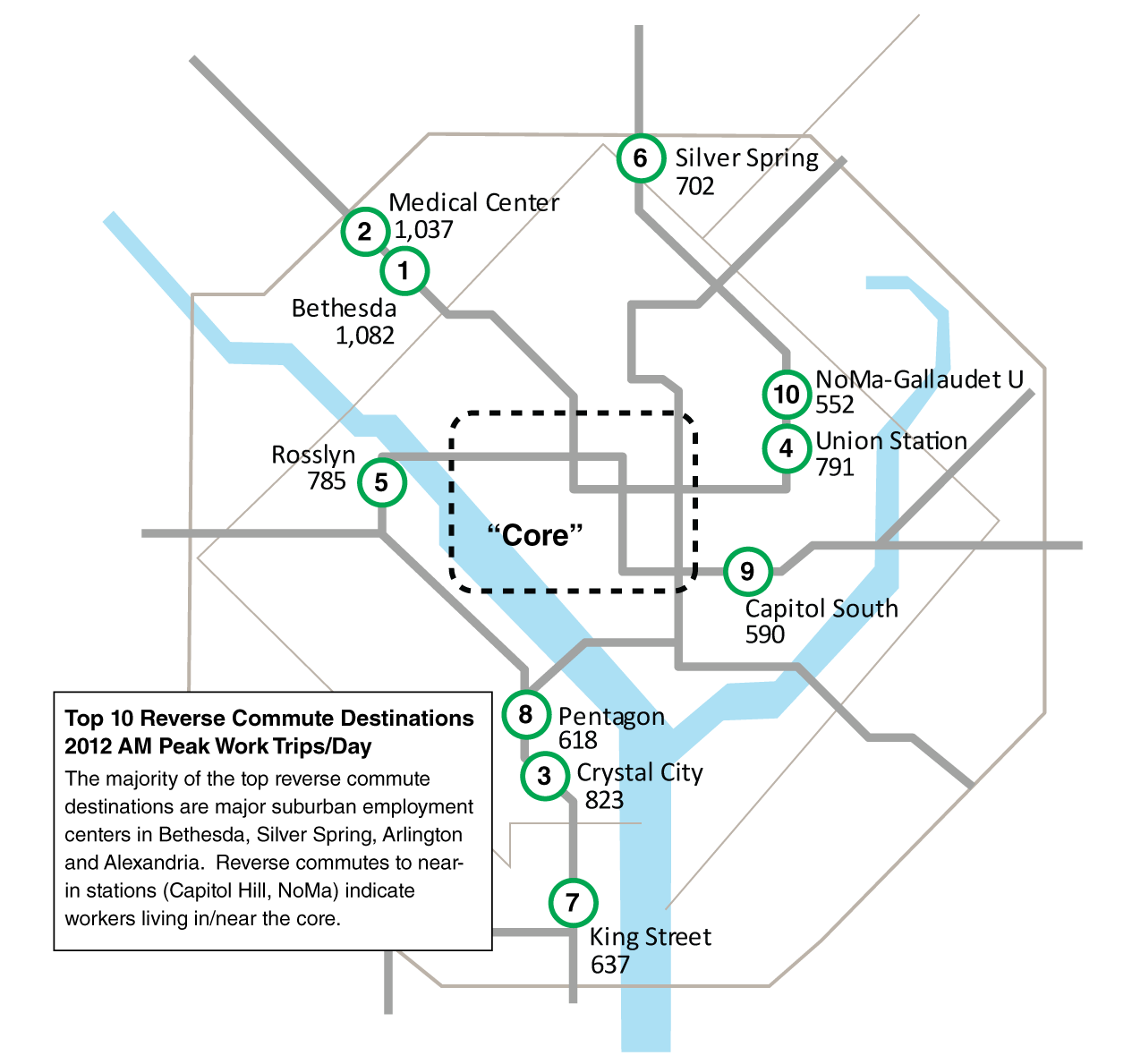
Stations in DC, Bethesda, Silver Spring, Arlington and Alexandria account for the top reverse commute destinations in 2012.
The data used for this analysis is also available for download.What other changes in trip patterns can you find between 2002 and 2012? What reasons might you propose for these changing patterns?

Regarding the typologies, it may not matter, but due to the design of the system, there is a variant of #2. In fact, it’s the trip I make.
I commute suburb-to-suburb, but I do not pass through the core. My trip takes me from Greenbelt to Silver Spring. Because the Green and Red Lines cross at Fort Totten, I do not have to travel downtown to get back out to the burbs.
Additionally, how do you account for “choice” in these numbers?
For example, someone commuting from Columbia Heights to Union Station could either be a core trip (via Gallery Place) or a non-core trip (via Fort Totten). Since O/D data won’t tell you waypoints, I assume you estimate somehow?
Good point, Matt’. Suburb-to-suburb trips that avoid the core are another class of trip that doesn’t add to crowding at max load points. Feel free to download the data and reclassify these routes. Let us know what you find.
What’s the rationale for not having Union Station and Capitol South (and even NoMa) not be core?
They’re both major jobs centers, right?
Hi, Nick:
From the post: “Because we’re interested in assessing growth of trips that don’t impact core capacity, we consider the “core” as the stations and tracks just inside the maximum load point of each rail line. “
Yes, Union Station and Capitol South are major AM destinations, they’re outside the maximum load points on the Red and Blue/Orange lines, respectively. Someone traveling from, say, Fort Totten to Union Station doesn’t cross the max load point and therefore doesn’t add additional strain to the system. However, someone traveling from Union Station to Gallery Place DOES cross the max load point (between Judiciary Square and Gallery Place) and therefore does add to core capacity constraints. As such, we’re not counting them as in the “core” for THIS exercise, but as noted this is a different definition than in other studies and analyses.
As a “core-out reverse” commuter, I enjoy the un-congested ride from Downtown out to Northern Virginia; there’s a bit of pleasure in watching half the rail car dump out at Farragut West or McPherson Square before I board. I can usually find a seat, which is a bonus.
That said, I recognize that we’d maximize system efficiency by increasing the balance in ridership between train directions, and I’m glad to see that “core-out reverse” commutes have increased by 34% over the past year.
Let’s hope that the new FBI headquarters goes to some Metro-accessible location, because it will support more balance.
Has Metro consider lowering the fares on reverse commutes? WhenI see relatively empty Blue and Yellow Line trains running south in the AM, all I’m thinking is “unused capacity”.
Obviously Metro is better off having a train of some people paying a reduced fare, as opposed to an empty train of people paying full fare.
@Matt’ Johnson
I think you’re picking at semantics, Matt. How many hypothetical trips, other than the one you presented (and ride on), present the opportunity for a choice in transfer points (assuming the commuter does not back-track).
Appendix D of the Station Access & Capacity Study (2008) provides good visual representations of what & where the peak load points are:
http://www.wmata.com/pdfs/planning/Appendices_Station Access & Capacity Study 2008 Apr.pdf
@Michael
Got it, thanks.
@Matt’ Johnson
Matt, your commute sounds like #3: “Non-core, peak direction”
Michael,
I would argue that all trips in Categories 1, 2 and 3 affect Core Capacity rail service. 1s enter the Core, 2s pass thru the Core (except for the limited number of trips raised by Matt Johnson) and 3s impact Core rail service to some degree, depending on where those riders exit and how crowded the train is at their exit points. 1s and 2s combined impact the Board-adopted Rail Service Guidelines for peak periods.
Michael,
Does your reverse commute map also take into account VA suburb to suburb commutation? If so, it seems to discredit the arguement that the Blue line riders in VA are suffering greatly from the reductions in Blue line service to accomodate the Orange and soon Silver lines. Rosslyn is the fifth busiest reverse commute destination but the total numbers are not very large and there are no VA Orange line stations in the top 10 reverse commute list.
@Steve Strauss
Thanks for your comments, Steve.
#3 does not impact core capacity since we intentionally defined the “core” here as the max load points. Trips categorized as #3 do not cross that max load point.
As for the Rosslyn question, trips from Blue/Yellow to Rosslyn are categorized as #3, non-core peak direction. The classification as fifth busiest is based solely on trips leaving the “core” as defined and going to Rosslyn.